Home › Forums › The HeroMachine Art Gallery › Hawk's Nest
- This topic has 189 replies, 39 voices, and was last updated 8 years, 3 months ago by
hawk007.
-
AuthorPosts
-
August 10, 2016 at 5:26 am #137319
hawk007ParticipantYour’s is good. You’re style just isn’t as flashy. Thanks, though!
August 12, 2016 at 9:42 am #137358
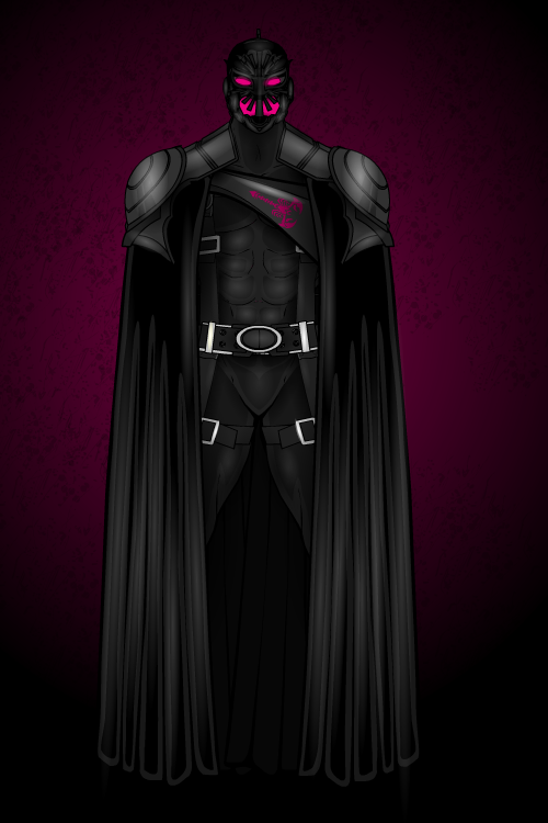
hawk007ParticipantThis costume/pose was originally created for a batman remake. But, because of the copyright rules, I can’t post it here. But you can still see the batman remake on my Deviantart page (cbhawk007).
Anyway, here’s Night Stinger.

Attachments:
You must be logged in to view attached files.August 12, 2016 at 3:36 pm #137378
LullabyOfTheSinParticipantwoho! Great night/dark-themed hero/character!
And btw… Not sure why, but i for a second looked at his belt, and i was thinking there is a “LOL” writed on it. Laughter moment later (it made my last 25 minutes of this day! [23:35 over here])
+1 for you, simply great piece of HM-art!
August 13, 2016 at 2:14 am #137380
VengeanceParticipantloving Night Stinger very cool design
August 13, 2016 at 6:37 pm #137394
VampyristParticipantHe is astounding! I love his face, it has a shape I haven’t really seen before. Fantastic work!
August 13, 2016 at 7:01 pm #137396
hawk007ParticipantThanks!
@Vampyrist Yeah, I just kinda mixed a bunch of different helmets together.August 18, 2016 at 1:52 pm #137512
Herr DParticipantHadn’t really been through this one, somehow. Nice works. I’d like to see you make a picture of one or two characters moving between shadow and light.
August 18, 2016 at 2:56 pm #137516
hawk007ParticipantThanks! What exactly do you mean, though, with the shadow and light?
August 19, 2016 at 1:31 pm #137527
Herr DParticipantI’ve seen you do great pictures of char’s mostly in shadow and a few in light. Maybe a building in the background with a bright light source behind it is the backdrop for someone dragging someone else from light to dark or vice versa?
EX. 1: Unknown thing with one smoking claw pulling someone around the corner?
Ex. 2: Man pulling hurt man into sunlight toward ambulance in background?
BTW, what are you in school for?
August 19, 2016 at 5:19 pm #137535
hawk007ParticipantOk, I get it now. Thanks, I’ll try that.
I’m actually still in highschool, so I’m in my second to last year before I go to college (or university, depending on where you live). But I am going to a career center, for graphic design if that’s at all surprising.
August 19, 2016 at 5:28 pm #137536
Delirious ALParticipant August 27, 2016 at 5:47 am #137740
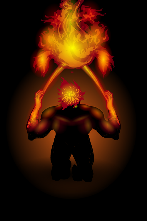
TiberiusMemberWow! Great works here, Hawk! Your designs are just amazing. One thing that stands out to me above everything else (as small as it may seem), is the way you made the fire in ‘Destroyers’ hand. It looks flawless and realistic to me.
I made a character (I’ll be posting soon) who is made of a mix of energy and fire and I feel the look of the flames that I made has lots of room for improvement.
Again, great works of art here!
August 28, 2016 at 6:39 am #137761
hawk007ParticipantThanks! The fire actually isn’t that hard. The key is to just use color and shading it make it darker on the outside and lighter on the inside. For instance, with that fire, and did the outside color red, the inside color orange, and put a yellow gradient (for shading) over it. Also, don’t forget to make the actual color piece semi-transparent and glowing.
August 28, 2016 at 7:00 am #137762
TiberiusMemberThanks! The fire actually isn’t that hard. The key is to just use color and shading it make it darker on the outside and lighter on the inside. For instance, with that fire, and did the outside color red, the inside color orange, and put a yellow gradient (for shading) over it. Also, don’t forget to make the actual color piece semi-transparent and glowing.
Excellent information on making fire look good, thank you for that! I’m looking forward to seeing more characters/art from you.
September 5, 2016 at 9:47 am #138052 -
AuthorPosts
You must be logged in to reply to this topic.


