Home › Forums › The HeroMachine Art Gallery › Gargantua’s ideas
- This topic has 190 replies, 37 voices, and was last updated 9 years, 9 months ago by
Vectorman316.
-
AuthorPosts
-
July 29, 2013 at 12:34 pm #28699
GargantuaParticipant July 29, 2013 at 1:38 pm #28702
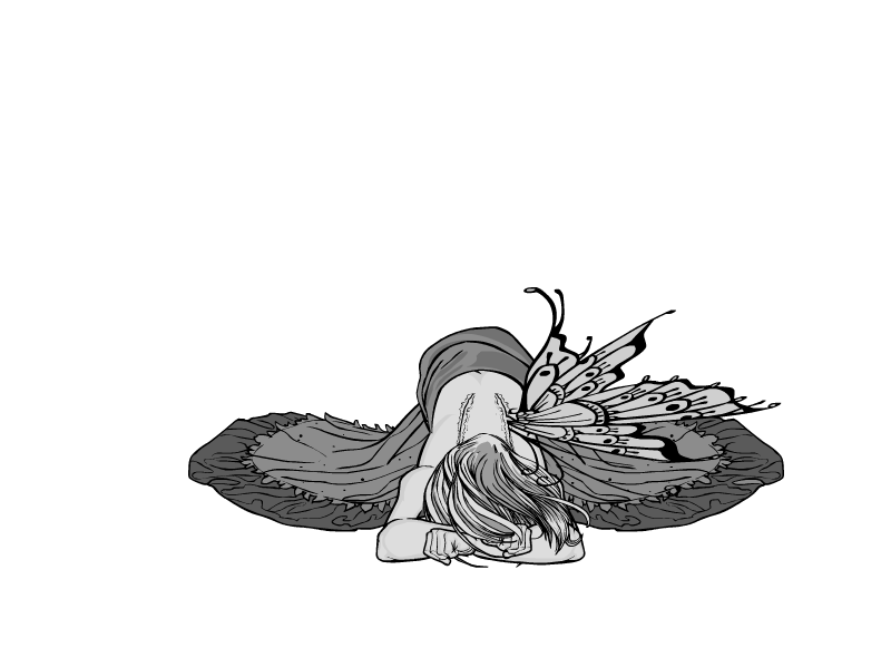
JR19759KeymasterOh wow. That is incredible.
July 29, 2013 at 1:47 pm #28703
RobMParticipantThat
Is
AwesomeJuly 29, 2013 at 1:53 pm #28705
TrekkieParticipant…
Wow!
July 29, 2013 at 3:23 pm #28710
The Atomic PunkParticipantAmazing, except… I believe her hands are backward? Thumbs should be facing toward her.
July 29, 2013 at 4:00 pm #28714
AnarchangelParticipantReally beautiful. But yeah…the hand is awkward. But other than that, it’s brilliant.
July 29, 2013 at 4:00 pm #28715
TrekkieParticipant@The Atomic Punk said:
Amazing, except… I believe her hands are backward? Thumbs should be facing toward her.
Must you ruin everything Atomic?!
 July 29, 2013 at 11:42 pm #28727
GargantuaParticipantDamn it. How i could miss this………..fix
July 30, 2013 at 7:47 am #28741
The Atomic PunkParticipantJuly 30, 2013 at 9:14 am #28744
NugParticipantLooks much better now! That’s too awesome!
July 30, 2013 at 11:40 am #28751
GargantuaParticipantHands thing was surprise for me because i use to pay a lot of attention to this particular thing. I grateful to Atomic Punk for pointing this.
@The Atomic Punk said:I wish I could figure out Gargantua’s use of gray-scale. The contrasts fit so well.
I used to use gray-scale because i am color blind (not litterally). Also in gray-scale you have a lot shades without making your own.
As for use of gray-scale I have few rules. Generaly you have to decide general shade for whole picture and color every large obiect in shades around one you choose (5 – 6 darker and brighter). Other shades may and even should be use for small elements to emphasize details. It is also important to make contrast between all adjacent objects especially body and cloths . Shadows on body and cloths usually shoud not be to much darker them rest of obiect. I also avoid using six darkest colors because they make lines difficult to see.July 30, 2013 at 1:10 pm #28755
TrekkieParticipant@Gargantua said:
I used to use gray-scale because i am color blind (not litterally). Also in gray-scale you have a lot shades without making your own.
As for use of gray-scale I have few rules. Generaly you have to decide general shade for whole picture and color every large obiect in shades around one you choose (5 – 6 darker and brighter). Other shades may and even should be use for small elements to emphasize details. It is also important to make contrast between all adjacent objects especially body and cloths . Shadows on body and cloths usually shoud not be to much darker them rest of obiect. I also avoid using six darkest colors because they make lines difficult to see.Ooh, this is helpful! Next time I try using greyscale I’ll try it.
July 30, 2013 at 1:23 pm #28756
JeimuzuParticipantReally, really well done! The pose is excellent as well as the design. Love it!
July 31, 2013 at 12:37 am #28791
MyroParticipant@Gargantua said:
I used to use gray-scale because i am color blind (not litterally). Also in gray-scale you have a lot shades without making your own.
As for use of gray-scale I have few rules. Generaly you have to decide general shade for whole picture and color every large obiect in shades around one you choose (5 – 6 darker and brighter). Other shades may and even should be use for small elements to emphasize details. It is also important to make contrast between all adjacent objects especially body and cloths . Shadows on body and cloths usually shoud not be to much darker them rest of obiect. I also avoid using six darkest colors because they make lines difficult to see.Yeah, I’ve got some slight color blindness as well. I remember my color choices would sometimes not work well for others back when I was Heromachining.
July 31, 2013 at 6:25 am #28810
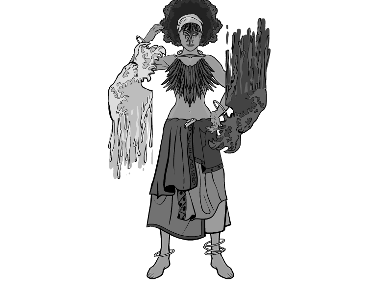
GargantuaParticipantWater magic

-
AuthorPosts
You must be logged in to reply to this topic.


