Home › Forums › The HeroMachine Art Gallery › Funkmachine’s art.
- This topic has 228 replies, 29 voices, and was last updated 1 year, 7 months ago by
Funkmachine7.
-
AuthorPosts
-
September 13, 2016 at 6:51 am #138436
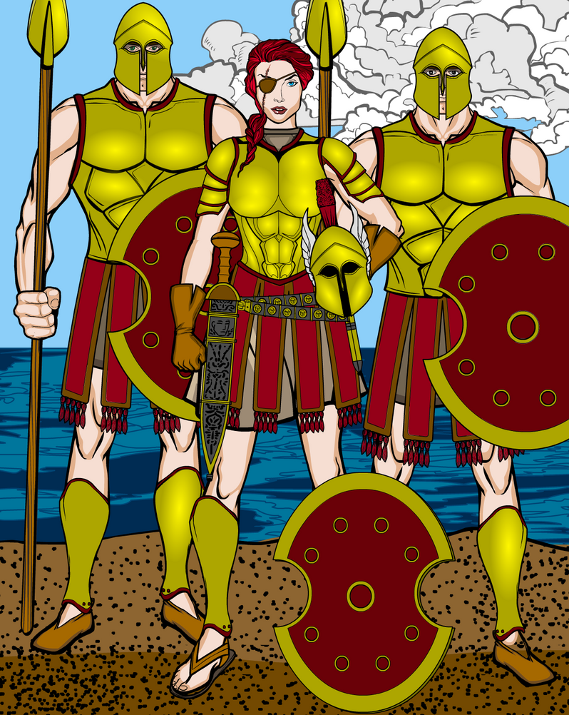
LullabyOfTheSinParticipantQuite good piece of work! (the 3 Hoplites thing)
overall climate is very good, also the body differences of the two male hoplites made me really happy, thanks to it, they don’t look like twins/clones/aliens, and creation feels more natural and accurate!
Armor desing is good ofc (not like i know anything about armors, or how good armor should look like, but that’s my opinion)
Overall, everything looks fine. But then, after a while, i noticed something. Not sure what, but there is one strange piece between female hoplite hips and right male hoplite hips. It doesn’t make creation bad, since it’s proably here by mistake or something, and it isn’t that visible.
But anyway, this piece deserves very nice shiny (+1) in my opinion!
September 13, 2016 at 5:08 pm #138451
Funkmachine7ParticipantThere not meant to be an arm there..
Now there shiny Hoplites.

Still not there with the high lights.September 14, 2016 at 5:59 pm #138499
Funkmachine7ParticipantAnd now i see that i forgot to add a foot.
As for armour have a look at Hellenic armors
and The koryvantes, Association of Historical Studies.September 26, 2016 at 8:06 pm #138947
Funkmachine7Participant
Another multi person shot, it was for three part challenge.
<h1>SWAT officer</h1>
Yep a swat officer in full
A recreation of an old work, i like the way the red head’s top came out, i think she’d planed to go danceing, but now she got an UZI, why?
Even more trip to the northern reaches art.
This time Ragnheior, Iarrarl’s sister.September 27, 2016 at 7:39 am #138956
Alex KingParticipantReally, really good stuff!
October 2, 2016 at 7:59 pm #139094
Funkmachine7Participant
Been binge reading the manga Lady devil man, and well there’s a lovely Cheongsam and that inspired me to have a go at one.
October 5, 2016 at 12:37 am #139159
Funkmachine7Participant November 5, 2016 at 4:36 pm #139944
Funkmachine7Participant
 November 8, 2016 at 10:51 am #139994
Funkmachine7Participant
Finally a reference pose and an end to the mystery of what Emaile Le Mort looks from behind.I’m not that happy with the back, anyone got know how to make it better.
Trying out some new tops, i think she now cursed to never wear a normal top.
Really happy with how the mask came out on this one.
The face is in front of silver surround and the refecltion is from the neckware collar thing with some alpha work.
—————–
The Blood Phoenix
Part: 3?
—————–
July 24, 2014
The lobby of a called “massage pallor” owned by Tony ‘Two Toes’.Katherine was here for one reason only money, ‘Two Toes’ kept a counting room on the top floor.
She had to take care, there where dozens of innocent men and women in here.Quickly she unbuttoned her shirt and pulled the mask down over her face….

August 3, 2014
The basement of our hero’s hide out.
“Juanita! there’s twenty of them at least!, how are we going to get of this?”
The thud echoed down the stairs as the door started to shake.
November 15, 2016 at 3:44 pm #140122
Funkmachine7Participant
“Find them! Where are those frelling women!”Yep i need some kind of thug leader
———–

I still can’t seem to get saddle to fit right, maybe furtherer back.November 27, 2016 at 2:19 am #140435
Funkmachine7Participant
 November 27, 2016 at 6:02 am #140436
darkvaticanMemberYour space-faring military-esque uniform is designed very well. it is a simple, but solid, composition, and that’s the way military uniforms generally are. Cheers!
November 29, 2016 at 3:58 pm #140477
Funkmachine7ParticipantGlad you like it, i was aiming to have it come off with a militaristic vibe, hence the multiple buttons on the jacket/top’s breast segment which was kind of inspired by a Hussar’s dolman jacket.
(Ok really i was binge watching farscape, that gave me some ideas and forced me in to a black and red colour scheme.)
This one’s a bit iffy in my view, the grenade works but the red blue and white strip clash too much with the tiger strips, and the hat doesn’t fit at all.
The same image but with sensible boring cameo colours, now the strip stands out to much and i think the buttons down the leg is a step too far, what do you all think?December 2, 2016 at 6:55 pm #140556
KericParticipantFunky, I think that part of the problem with the Merc girl could be the pose? Yes, the tiger stripes are not working, but even not working, it is still really good(and kinda works!)
I liked the first version of her the best.
December 6, 2016 at 4:42 am #140664
Herr DParticipantThe camo one might need a clay tone instead of the white strip. Maybe duller buttons, too. But I look at the two versions and think ‘character concept.’ Maybe there’s a character who is always fighting against both sides in the situation she’s in. There was a Clint Eastwood movie where he just kept killing people on one side and then defecting to it? Tweak the situation so the mountain is molded to Muhammed. Mix the metaphors till you’ve got the place for her. Both costumes belong in a story somehow. I can just tell. It’s a good work.
-
AuthorPosts
You must be logged in to reply to this topic.


