Home › Forums › The HeroMachine Art Gallery › DJuby Gallery – Volume 2
- This topic has 897 replies, 66 voices, and was last updated 2 years, 4 months ago by
djuby.
-
AuthorPosts
-
December 18, 2012 at 9:13 am #15740
Blue BlazerParticipantNot gonna lie, I selfishly hope it’s my redesign thread that you plan to continue competing in, but I understand your dilemma. There was a while when the only reason I went to the Heromachine page was to enter contests, and I was ignoring my characters that I love so dearly. I admire your conviction to keeping it fun and personal.
January 1, 2013 at 5:15 pm #16367
djubyParticipantCode Red – Blood Eagle, Flatline, Armory, Manx
January 2, 2013 at 5:54 am #16377
WeilynMemberBreathtaking
 January 2, 2013 at 7:55 am #16388
ScatmanMemberalright!!!hope your back for good1that is just a n amazing crew!the colors are great!red is oviously one of my favorite colors.Question…did you ever think of saving your files to ping instead of jpg.It will definitly clear up the reds and othercolors.your call just a suggestion.Good to see a peice from ya,cheers!!
 January 2, 2013 at 8:55 am #16399
djubyParticipantClear up in what way exactly? Usually I just use a snipping tool as the images seem to shift up and over especially when there are multiple bodies involved, and few things bug me more than parts of an image lost to a border.
January 2, 2013 at 10:47 am #16406
HammerknightParticipantI think Scat was talking about saving the file as a png.file it makes the picture look a lot better and it saves some space.
January 2, 2013 at 11:55 am #16412
djubyParticipantI’ll give it a try – thanks.
January 2, 2013 at 5:38 pm #16437
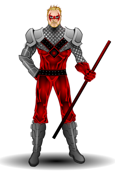
djubyParticipantRemake of a BlueBlazer character…in png.
 January 2, 2013 at 5:41 pm #16438
djubyParticipantJust had access denied to my own thread…hmmm. There appears to be a page 12 for no reason.
January 2, 2013 at 6:12 pm #16441
ScatmanMember@djuby said:
Just had access denied to my own thread…hmmm. There appears to be a page 12 for no reason.
hmmm?That don’t make no sense!anyway did you see anything different with the clear lines and color depth?It IS a preference of course,just wanted your opinion on it.
January 2, 2013 at 6:28 pm #16443
djubyParticipantYeah – everything seems more pronounced. Thanks man.
January 2, 2013 at 6:47 pm #16444
ScatmanMember@djuby said:
Yeah – everything seems more pronounced. Thanks man.
Your work should be treated like a babies buttom!
 January 2, 2013 at 6:58 pm #16446
djubyParticipant@Blue Blazer said:
Not gonna lie, I selfishly hope it’s my redesign thread that you plan to continue competing in, but I understand your dilemma. There was a while when the only reason I went to the Heromachine page was to enter contests, and I was ignoring my characters that I love so dearly. I admire your conviction to keeping it fun and personal.
Contests from now on must have one simple criteria: they have to speak to me in some way. Love the style of the Quick and Easy challenges, and Hammerknight is coming up with great design challenges. Pride in my work is WAY more important than its volume…as it should be.
January 3, 2013 at 7:31 am #16471
HammerknightParticipantJanuary 3, 2013 at 8:31 am #16473
djubyParticipantlol
-
AuthorPosts
You must be logged in to reply to this topic.


