Home › Forums › The HeroMachine Art Gallery › Delirious AL’s stufffffffffffffffffffffff.
- This topic has 156 replies, 48 voices, and was last updated 9 years, 6 months ago by
LullabyOfTheSin.
-
AuthorPosts
-
August 28, 2013 at 6:24 am #30506
CantDrawParticipantMan, that’s cool!
August 28, 2013 at 6:55 am #30507
Herr DParticipantYou’ve asked repeatedly for critiques–I want to see an ornate background from you. Your characters are great. It’s time to make a background with the same level of care. Your ‘Drunk Dragon,’ for example, is close to Pixar level while the fire he breathes looks more like it’s painted on the set behind him. You know, like maybe he’s breathing a tiny bit of fire in front of a photo-op cutout. I know you could have done better fire. Split is great, but what about the arena or ‘dugout’ behind her? Rags she wiped her blades on? Cheering silhouettes behind her?
Maybe you should start by making a boring-looking character reacting to a Delirious Al background.
August 28, 2013 at 1:14 pm #30527
TrekkieParticipantWow, that’s brilliant!
August 28, 2013 at 8:58 pm #30556
Delirious ALParticipantThanks!
@HerrD I appreciate the critiquesseseeseses. I’m really bad at backgrounds and scenery (you could probably gather that from the few that I’ve done) so I generally like to focus on the characters themselves. I have a hard time putting balance in a scene to where the environment doesn’t take away from the character and vice versa. But I agree that there’s definitely room to grow in that respect. And in reference to Rum and his fire breathing, I think I just got lazy there. You’re right, I could’ve done that better. Ha! Perhaps making an uber lame character in a crazy land of awe would be a good start. I may take you up on that… Hmmmmm.
  September 1, 2013 at 4:11 pm #30839
ScatmanMemberbrilliant coloring,looks great!
September 14, 2013 at 7:18 pm #31607
Delirious ALParticipantLife is busy busy busy! *spoken like the bad dude from Frosty the snowman*
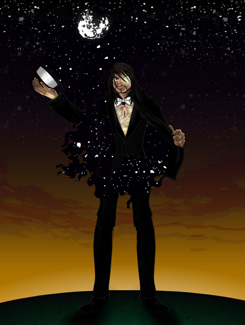
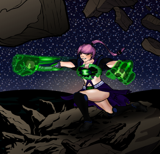
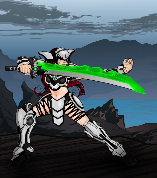
I managed to sneak a few characters in though. Been experimenting a tad with working a bit of a background into things. Sometimes the environment takes away from the characters being showcased, so I tried hard not to stumble into that.Midnight Magician

Coup de Grâce

Jaguar
 September 14, 2013 at 7:40 pm #31610
The Atomic PunkParticipantWelcome back, Delirious! Those three are so awesome!
September 14, 2013 at 8:25 pm #31614
CantDrawParticipantGreat stuff! I love it!
September 15, 2013 at 1:41 am #31629
JR19759KeymasterLets see: Awesome, Magnificent, Brilliant. I think that is just about right for this last trio.
September 15, 2013 at 2:03 am #31633
TrekkieParticipant@JR19759 said:
Lets see: Awesome, Magnificent, Brilliant. I think that is just about right for this last trio.
Pretty much. The stars on Midnight Magician are especially awesome.
September 15, 2013 at 2:30 am #31637
Mad JackParticipant@Delirious AL said:
Coup de Grâce

 September 15, 2013 at 5:24 am #31643
djubyParticipantReally beautiful work!
September 15, 2013 at 8:48 am #31652
amsParticipantLove your concepts and construction of items. Cheer!
September 15, 2013 at 10:21 am #31662
prswirveParticipantWhat more can i say when ams and djuby already said it all? I’m always a fan of your work and has kept an eye on your gallery since.
September 15, 2013 at 1:46 pm #31681
Herr DParticipantThose backgrounds definitely count as an upgrade. The ones for Coup and Midn actually contribute to the character, and that’s the goal–Jag’s background was worth the effort. It gives her a context. Keep it up, and you might start making panels like RobM!
-
AuthorPosts
You must be logged in to reply to this topic.


