Home › Forums › The HeroMachine Art Gallery › Collex Rolodex
- This topic has 10 replies, 8 voices, and was last updated 11 years, 1 month ago by
hawk007.
-
AuthorPosts
-
January 29, 2014 at 9:06 pm #938
collexMemberHi everyone.
I’m Collex. And welcome to my Rolodex. For those who have no idea what a Rolodex is, it was a little contraption that people used back in the ancient days of Pre-Internet to keep track of their contacts. In this case, I’m using it to mean “character repository” just cause it rhymed
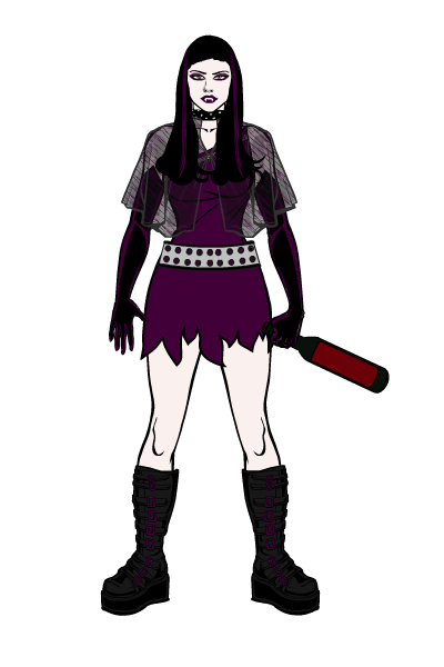
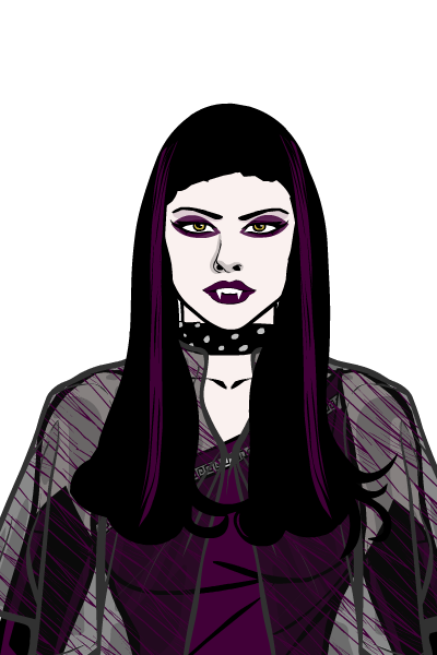
So I’ll try to post one new character a week to get some feedback. I’ll start with my latest creation, the Vamp. This is a character that has no real backstory – I made her during the holidays to kill some time. I would like feedback on it, anything you can give, and maybe tips on how to do shading, cause I have absolutely no idea where to start with that.

 January 30, 2014 at 1:20 am #36984
JR19759KeymasterLooks nice.
Welcome to the forums.January 30, 2014 at 5:04 am #36990
SulemanParticipantCool! I like what you did with the cloak. The combination of the pattern and the transparency is pretty smart.
January 30, 2014 at 8:24 am #36996
HammerknightParticipantGreat job. She is very Addam’s family.
January 30, 2014 at 1:43 pm #37012
Herr DParticipantGood thread title. Highlighting / shading takes practice, or at least a lot of trial and error or copying how other people do it, but I can tell you the basic principle easily enough. In Backgrounds / Shapes last section, there are two circle gradients. Take the leftmost with colors 1 and 3 at alpha 0% and turn color2 to white for highlighting or black for shadowing. Vary transparency or color for desired effect and don’t be afraid to try everything–pixels don’t cost much to replace! CantDraw put up a tutorial for “sparkles” which is pretty good. You might try to imitate headlessgeneral, JR#, and some others too; they’ve done some of the best lighting / shadowing work on humanoid faces.
January 30, 2014 at 6:47 pm #37048
hawk007ParticipantGood start! The proportions are right, and I think that the character is pretty good. The only thing is that I don’t get what she’s holding. Anyway, good character. I would just advice you not to try to do “one character a week.” I’m not saying it’s too much. I mean, I could probably do 1 a day. I’m just saying, do it at whatever pace feels right. Don’t feel like you have to do one each week. Do more, do less, do whatever you want. I’m just saying, you don’t have to stick to the schedule.
But, it doesn’t really matter. The point is, that I think your character is a good start, and I hope you continue.January 30, 2014 at 7:40 pm #37059
VampyristParticipantWelcome and nice vampire.
February 1, 2014 at 2:20 pm #37196
collexMember@Herr D said:
Good thread title. Highlighting / shading takes practice, or at least a lot of trial and error or copying how other people do it, but I can tell you the basic principle easily enough. In Backgrounds / Shapes last section, there are two circle gradients. Take the leftmost with colors 1 and 3 at alpha 0% and turn color2 to white for highlighting or black for shadowing. Vary transparency or color for desired effect and don’t be afraid to try everything–pixels don’t cost much to replace! CantDraw put up a tutorial for “sparkles” which is pretty good. You might try to imitate headlessgeneral, JR#, and some others too; they’ve done some of the best lighting / shadowing work on humanoid faces.
Thanks for the tip. I will try my hand at it on my next character. Thanks!
@hawk007 said:
Good start! The proportions are right, and I think that the character is pretty good. The only thing is that I don’t get what she’s holding. Anyway, good character. I would just advice you not to try to do “one character a week.” I’m not saying it’s too much. I mean, I could probably do 1 a day. I’m just saying, do it at whatever pace feels right. Don’t feel like you have to do one each week. Do more, do less, do whatever you want. I’m just saying, you don’t have to stick to the schedule.
But, it doesn’t really matter. The point is, that I think your character is a good start, and I hope you continue.It is supposed to be a bottle of wine (read: blood). I’m not 100% happy with this particular bit, but changing ti would have required changing the arm pose and I was too scared to screw the whole ensemble up if I did that.
Yeah, the one character a week is mostly a motivator for me. I will try to stick to it as much as possible, at least for a bit. I need goal like that to be disciplined
 February 14, 2014 at 9:26 pm #37840
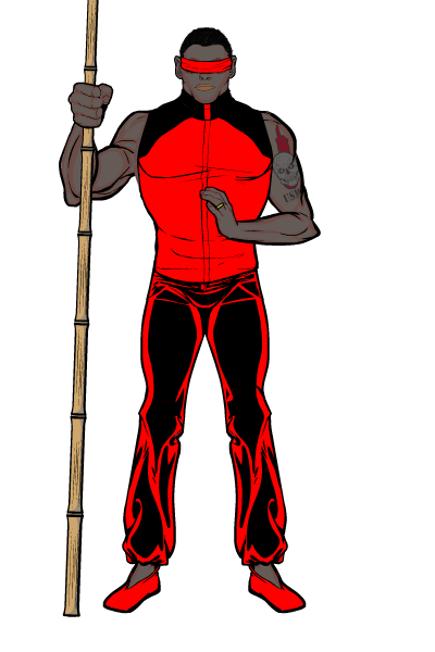
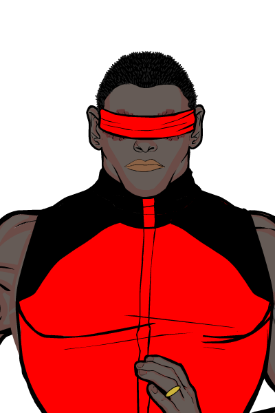
collexMemberHey everyone, I’m back with a new creation. This one is simple, but I would still appreciate feedback. His name is the Blind Protector. He is an ex- US Marines who came back from the battlefield blind after a run-in with some nasty homemade explosive. Determined to find a way to continue to serve his family and his country no matter what, he learned an ancient martial art and can now fight almost anybody hand to hand even without his sight.
What do you think?

 February 15, 2014 at 2:36 am #37848
StulteParticipantCool concept and execution.
February 15, 2014 at 7:48 am #37853
hawk007ParticipantNice character!
-
AuthorPosts
You must be logged in to reply to this topic.


