Home › Forums › The HeroMachine Art Gallery › CKnap’s Character Gallery
- This topic has 159 replies, 30 voices, and was last updated 9 years ago by
CKnap.
-
AuthorPosts
-
March 2, 2014 at 7:12 pm #38473
GuyGenesisParticipantglad you like it, I update his post with a link to the text.
and fair warning I’ve gotten in the habit of masking insignia shapes on random layers to the original body parts to leave a clean background, so he may be a bit difficult to deconstruct. Other than the difficulty caused from double masking: item to insignia back to item, there shouldn’t be too much masking actually
March 2, 2014 at 8:04 pm #38474
CKnapParticipantThats awesome thank you, my original idea came a lot from xmens Rockslide, I loved his look and wanted a mountainous body.
You my friend did that very well. I agree too the open foot looks pretty good.March 2, 2014 at 8:57 pm #38477
GuyGenesisParticipantHad to google him, though yours was closer to his concept than mine appears to be. Masking the body from male>materials is probably what you would find the most useful for the rocky shape, the match to the head you used. As for the bare feet, they seem to give a more brutish feel, and I tend to add a bit of a fantasy flare to most of my creations, hence the sharper edges.
And just to clarify I really liked your character, hence wanting to try my hand at him. When I see a character that catches my eye, not thinking I can do it better, I just like to see what I can do with them in general.
The text is yours to do with as you please, use it, modify it, reference it, whatever, looking forward to what you do with him and future works.
November 2, 2014 at 1:01 pm #114239
CKnapParticipantOk so its been a while since I posted here, things have changed and now im at a loss. I might need a little help on how to do things again. for some reason I cant figure out how to change text size, is anyone able to help?
Attachments:
You must be logged in to view attached files.November 2, 2014 at 1:57 pm #114248
JR19759KeymasterAs far as I’m aware you can’t change the text size. I’ve had a quick look at the tools set and I can’t find anything that looks like that would be its function, sorry. Anyway, good to see ya back man.
November 2, 2014 at 5:58 pm #114255
CKnapParticipantOk, then my next question is how can you add pictures to a post? I know how to upload an attachment but im not sure how to make it part of the post.
November 3, 2014 at 1:13 am #114276
JR19759KeymasterThe best way I’ve found to do that is, once you’ve posted the reply (with the attachment), open the attachment in a new tab, then edit the post and paste the link to the tab into the Insert/ edit image box (the box on the top bar of the reply box that looks like a clip art mountain range) and then re-submit it. I know it’s long winded but it works.
Of course if you are on any other image sharing sites you can just fore-go the attachments and upload straight to the Insert image box.
November 3, 2014 at 7:06 pm #114308
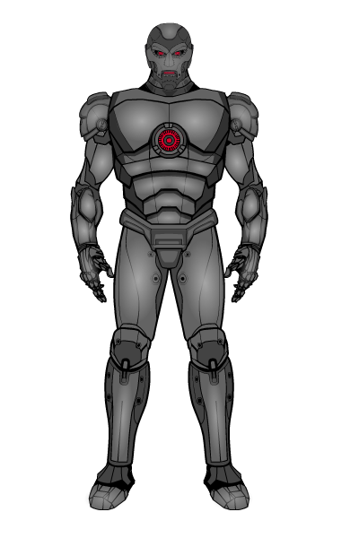
CKnapParticipantOk so now that JR has helped me figure out all these new nifty tricks for the new forum set up I can some what post what I want. Anyways, this accidently ended up in my previous post but here is one of my new characters Technas.
Alien consciousness inside an enhanced robotic body. He has various abilities with his robotic suit and is a genius and is bent on destroying the universe and sees man as insignificant beings.
 November 3, 2014 at 7:44 pm #114311
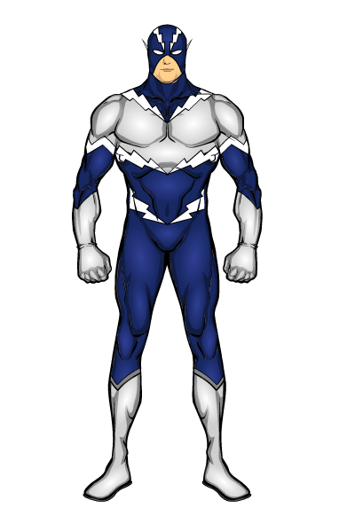
CKnapParticipantHere is the newest hero Iv created. (Iv actually got a few this is just the first iv finished.)
Im not 100% happy with the name but its the best I have been able to come up with.
Here is Turbo

Attachments:
You must be logged in to view attached files.November 15, 2014 at 12:55 pm #115060
KaldathKeymasterI have republished this a second time, let see if it stays open ( I am thinking the editing of posts need to be approved by moderator and thus I need to republish )
November 15, 2014 at 1:24 pm #115071
CKnapParticipantThats bizzare, never had that issue before.
November 16, 2014 at 11:47 am #115151
CKnapParticipantFor a while iv wanted to do a frankenstein, now im almost done but I cant decide on skin tone, dark green or grey, so im gonna post up 2 images and hopefully you wonderful people can help me decide. And if anyone thinks of a different color ill check it out.
Attachments:
You must be logged in to view attached files.November 16, 2014 at 11:50 am #115156
VampyristParticipantJust because I’m a huge fan of the novel, I’d go with grey, though pale would be more accurate to the novel.
November 16, 2014 at 12:15 pm #115161
CKnapParticipantYeah I looked up the description on what he looked like and it said a yellowish skin, but straying away from that, thats where the grey came in, I might change it and see how a lighter grey would look.
The green just gives it something more, but grey looks well more dead.
November 16, 2014 at 1:17 pm #115164
amsParticipantHow about a grey base highlighted with yellow?
-
AuthorPosts
You must be logged in to reply to this topic.


