Home › Forums › The HeroMachine Art Gallery › CKnap’s Character Gallery
- This topic has 159 replies, 30 voices, and was last updated 9 years ago by
CKnap.
-
AuthorPosts
-
January 19, 2015 at 7:55 pm #118979
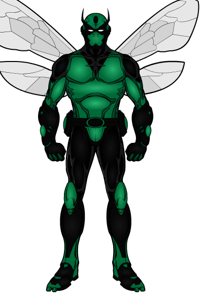
CKnapParticipantHey everyone! Happy new year, I’ve been around creating here and there, I actually asked Archangel if I could use one of his ideas after it was posted on the blog. He gave me the ok to do my take on his Dragonfly character, so all creative work into the character goes to Anarchangel, but here is my take on him.

Attachments:
You must be logged in to view attached files.January 20, 2015 at 5:44 am #118986
AnarchangelParticipantNice. I actually requested that helmet from dblade with the intention of using it on Dragonfly. I eventually went with a different look but I’m glad you put it to good use. 🙂
January 20, 2015 at 8:46 pm #119029
CKnapParticipantMy apologies on the name Anarchangel, haha your right it is easy to miss, I just took a glance and thats what come to my head lol. Thanks you for the comment on the character, that helmet worked perfectly! I put it on and it just stuck.
February 7, 2015 at 12:40 am #119821
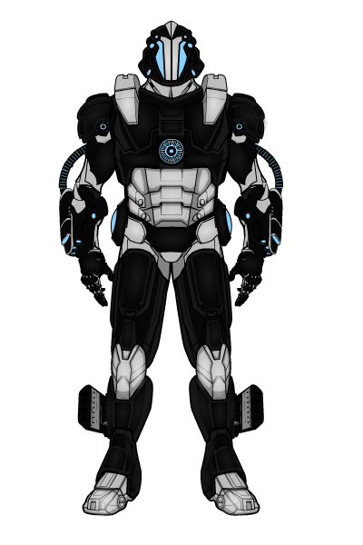
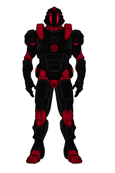
CKnapParticipantHeres one iv been working on for a couple of days, hes a close homage to one of my favorites. Id like your guys thoughts, im not sure on colors I like best, so one is the obvious traditional and one is just a quick change. Let me know. The first one is the finished piece, the last one is just a color change
February 7, 2015 at 4:51 am #119826
jskybaParticipantLooks great!
February 9, 2015 at 5:03 pm #119917
CKnapParticipantFebruary 10, 2015 at 10:05 am #119936
FolklyParticipantGood job!
Personally I like the black and silver robot best, classic – doing black and red might be over-egging it a bit. But it’s a matter of taste I suppose. Very well judged subtle shading on the finished (black and silver) one, makes it really come alive.February 11, 2015 at 9:01 pm #119984
CKnapParticipantFebruary 17, 2015 at 8:59 pm #120147
GuyGenesisParticipantI apologize for posting this in your main thread but I couldnt seem to figure out a private message. Iv been playing around with a character you let me use trying to create a new body from it. If you have the time Id like to request your help/advice. Perhaps even adding it for the community to use. Let me know if your interested and ill share the details.
Sorry it took me so long to respond, haven’t been on in a few days. Of course I don’t care to help you out.
February 19, 2015 at 6:30 pm #120214
CKnapParticipantFebruary 19, 2015 at 8:15 pm #120236
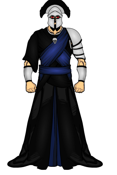
NobodyMemberOblivion looks great. I like the helmet.
February 20, 2015 at 4:38 am #120248
Wolf MasterParticipantOblivion is very cool, i really like how the symbol makes up part of the helmet. And the brooch holding the cape on is cool too.
February 20, 2015 at 7:20 am #120255
VampyristParticipantHe’s cool, the mask is great.
February 20, 2015 at 7:35 pm #120283
CKnapParticipantOblivion looks great. I like the helmet.
Oblivion is very cool, i really like how the symbol makes up part of the helmet. And the brooch holding the cape on is cool too.
He’s cool, the mask is great.
I know, I love how the helmet turned out and the brooch is supposed to be one of those special artifacts (like how everything dr strange uses has a purpose.)
May 2, 2015 at 9:04 pm #123669
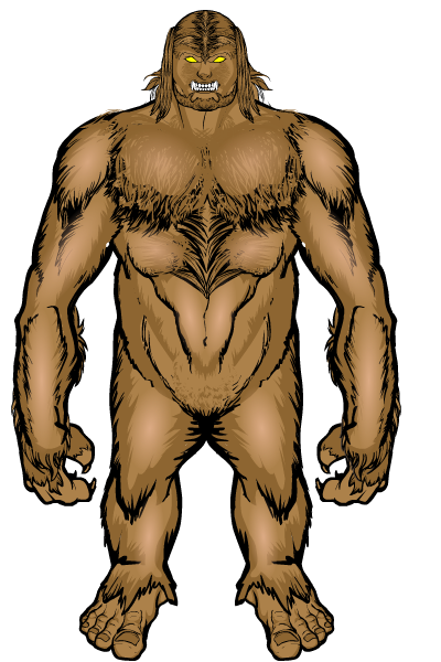
CKnapParticipantI got bored, decided to play around again… And I went and saw the new Avengers and got inspired. The head im not 100% happy with but I can live with it for now, I want to give thanks to GuyGenesis for the help on the body, I did alter the colors and lines a little. Ive wanted a hulking type character for a while and glad I finally have one.
Sasquatch
-
AuthorPosts
You must be logged in to reply to this topic.

