Home › Forums › The HeroMachine Art Gallery › CantDraw Gallery of Bad Art
- This topic has 659 replies, 67 voices, and was last updated 1 year, 4 months ago by
ams.
-
AuthorPosts
-
May 16, 2013 at 7:55 am #24602
HarlekinMemberFor that effect to made liquid metal need to transparence the black and white.
Nice pictures. Nice improvement.
May 16, 2013 at 3:20 pm #24624
CantDrawParticipantThanks Harlekin, I’ll have to experiment with your idea. I’m also thinking of transporting Metal Streak to Sumina-verse via time travel with an interesting story twist.
May 18, 2013 at 9:27 am #24730
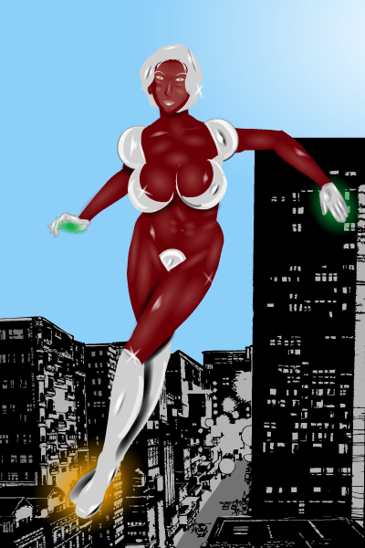
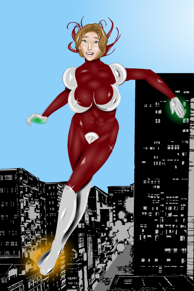
CantDrawParticipantI experimented with Harlekin’s suggestion and I think I like the results. Here is the redesigned Metal Streak both masked and unmasked (I prefer unmasked).


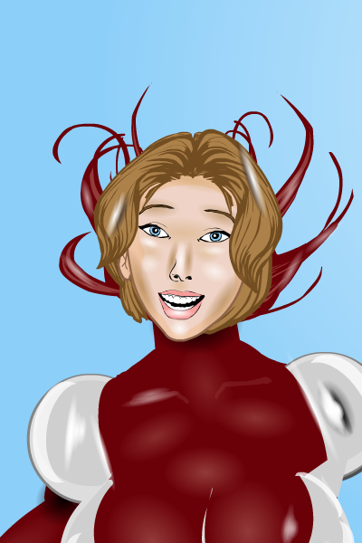
I think this looks a little more like liquid metal and less like vinyl. Also, I included the effect of the mask coming off which I think worked out well. Oh, the liquid metal is actually nanites Dr. Silver invented that can do almost anything she programs them to do, and she figured out how to make the suit fly by using antigravity (don’t ask me to explain, I’m an artist not an scientist
 ).
).On a side note, her suit looks very similar to a recent character. Hmm…I wonder why that could be…
 May 26, 2013 at 10:15 am #25286
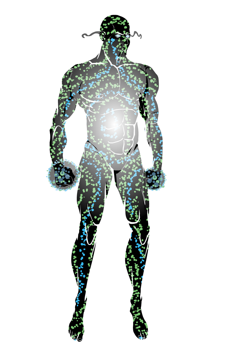
CantDrawParticipantPop Quiz Open Source Atomic Character:

I didn’t have a lot of time, but I tried to use it wisely.
June 3, 2013 at 9:40 am #25713
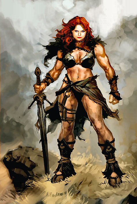
CantDrawParticipantOkay I saw this picture posted a while back:

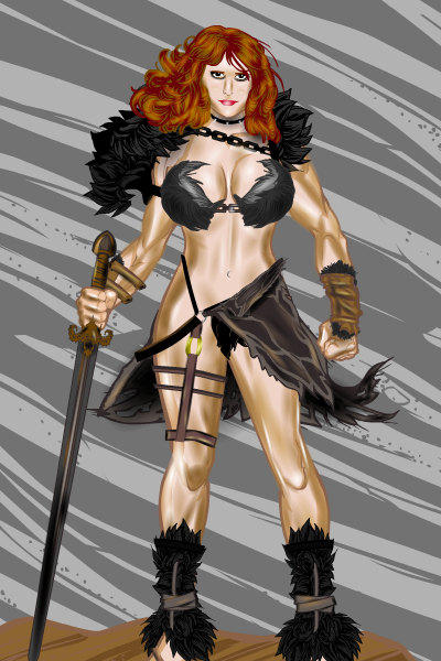
And here’s my interpretation of it:

I haven’t felt real inspired on the contests lately but I couldn’t pass up this picture. Hope you enjoy.
June 3, 2013 at 9:43 am #25714
MoognationParticipantYour shading/lighting is SICK!!! I’m completely humbled here…
June 4, 2013 at 12:23 pm #25768
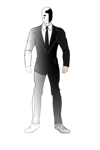
CantDrawParticipantThank you! Here’s my entry for the Emotional Contest (Emoti-Con?):

BIO:
One is a thief that has the power of being unnoticed. His power works best in crowds. Obviously, he represents loneliness.
I thought for a character such as this, minimalism was the preferred route.
June 4, 2013 at 12:41 pm #25769
Alexander of LimboParticipantMinimalism is a great approach. Nice design
June 4, 2013 at 6:07 pm #25787
headlessgeneralMemberYeah, I’d say the minimalism works. Great character.
June 6, 2013 at 2:58 pm #25857
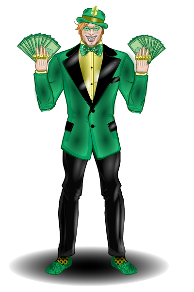
CantDrawParticipantI think I caught the suit bug from Vampyrist. Here’s my 2nd entry for the Emotional Contest:

BIO:
Money Man is an expert thief, gambler, and forger. He also has above average hand-to-hand fighting skills, but prefers for others to do the physical work. When Money Man has to fight, he uses razor-sharp throwing cards disguised as money. He represents Greed.June 6, 2013 at 3:02 pm #25858
TrekkieParticipantCool design, and great shading!
June 8, 2013 at 3:48 pm #25925
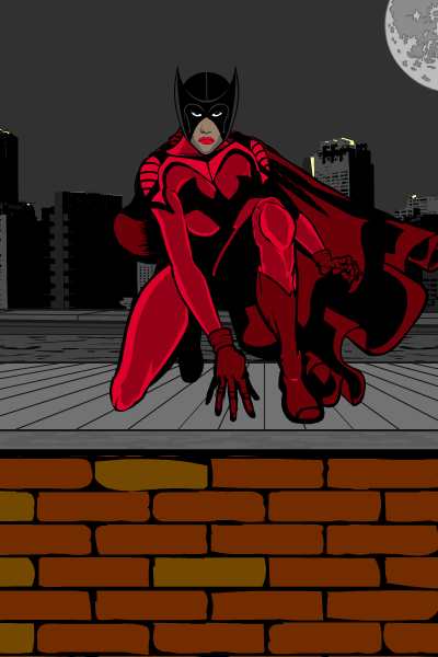
CantDrawParticipantThis is for the Hat Trick Pop Quiz. I didn’t have time to zyp but I plan on getting to it. Although, I like the way it looks without the fancy stuff.

BIO:
Red Bat prowls the night, waiting to strike fear into the criminal heart. She is an expert martial artist with a black belt in several disciplines and deploys various gadgets to aid in her campaign to wipe crime from the city (sound familar?).June 8, 2013 at 3:56 pm #25927
TrekkieParticipantThat pose works really well and I like how simply but effectively the items have been integrated.
June 8, 2013 at 5:23 pm #25930
TorogParticipantAgreed it looks great so far. Zypping will be the icing on the proverbial cake.
June 9, 2013 at 12:27 am #25956
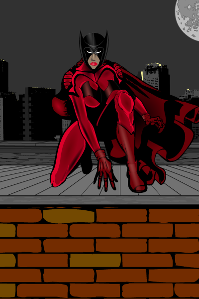
CantDrawParticipantHere’s the finished Red Bat:

I hope it came out good. I did this on my laptop instead of my usual computer, so my screen quality is not as good. Worse case, if it doesn’t look right, I’ll fix it Monday. Admittedly, I didn’t zyp as much as I usually do, but I thought the basic design worked well without too much extra shading.
-
AuthorPosts
You must be logged in to reply to this topic.

