Home › Forums › The HeroMachine Art Gallery › CantDraw Gallery of Bad Art
- This topic has 659 replies, 67 voices, and was last updated 1 year, 4 months ago by
ams.
-
AuthorPosts
-
May 4, 2013 at 11:59 pm #23756
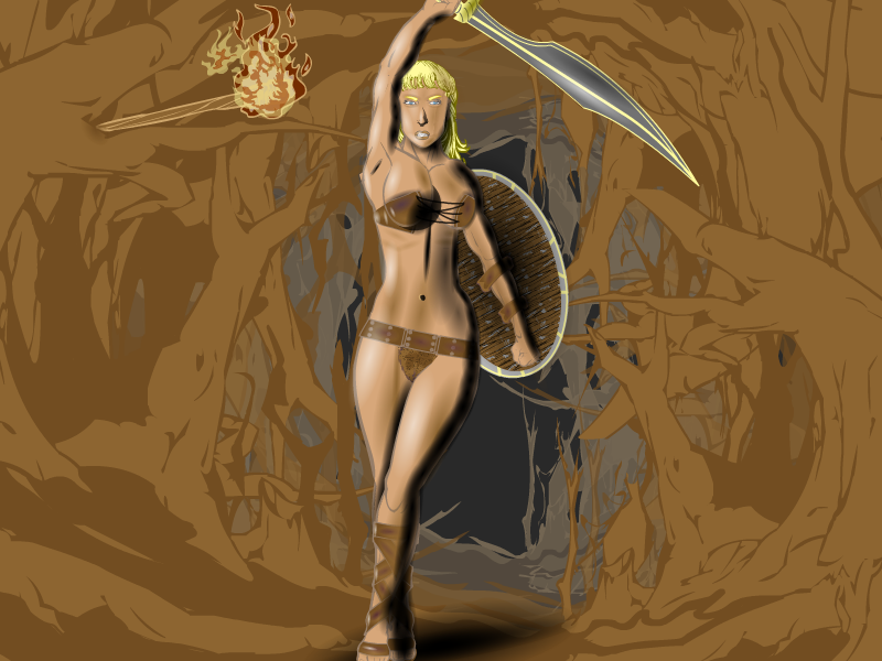
CantDrawParticipantOkay, I thought I’d throw my hat in the ring and create my own universe. Welcome to the Sumina, a world of magic and war. Good vs. evil is nothing new to the Suminans, but technology has arrived. Highly-advanced soldiers from an alternate dimension have invaded the planet and new lines are being drawn. The hero, Nimu, is a barbarian of surpassing strength, and, of course, a magic sword and shield.
 May 5, 2013 at 2:06 am #23757
prswirveParticipantWow that last picture looks new. I like your technique, so unique. Also, i love the redesign of mr. fancy pants! Cheers!
May 5, 2013 at 2:57 am #23764
TrekkieParticipantWow- That shading is amazing!
May 5, 2013 at 3:37 am #23767
JR19759KeymasterIt looks like you did that with charcoals, I’ve never seen an effect like it on HM
May 5, 2013 at 4:07 am #23768
prswirveParticipantYeah i agree charcoal it is..
May 5, 2013 at 2:16 pm #23798
djubyParticipantGorgeous!
May 5, 2013 at 3:20 pm #23802
CantDrawParticipantThank you!. The “charcoal” effect is basically double and triple zypping in full black.
May 7, 2013 at 7:45 am #23922
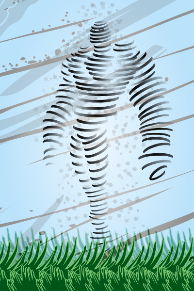
CantDrawParticipantHere’s my first entry for the Greek Gods contest:

BIO:
Strom Head was a thief by trade who specialized in finding rare and exotic items. Upon hearing the tomb of Odysseus had been discovered, he traveled quickly and quietly to Greece. After breaking into the tomb, he successfully nicked several items, including the mythical bag of Aeolus, the god of winds. When Strom opened the satchel, he released the magical winds and was transformed into a wind elemental. Now seeing the error of his ways, he goes by the heroic name of Whirlwind.May 7, 2013 at 8:20 am #23926
AnarchangelParticipantThat is wonderful! I kind of don’t want to enter the contest now because there’s no way any of my characters could beat that.
May 7, 2013 at 8:25 am #23928
prswirveParticipantWow! Doesn’t look like it’s made by HM3 anymore. Superb utilization of items.
May 7, 2013 at 8:59 am #23931
CantDrawParticipantArchangel – please don’t let me stop you. I love your creations! Besides, you never know what people are going to like or what will catch someone’s eye.
prswirve – The cool thing is I only used two items (three, if you count the eyes) to make this charcter: Background-Shapes-Moon and Background-Shapes-Zyp Circle (I don’t what else to call it).
As to his shape, I have to credit Harlequin for the idea of using body parts as a guide (the manga eyes tutorial is really helpful). I used chest, arm, and leg parts to guide where I put the moon shapes. I started with circles instead of moons but is wasn’t curvy enough and the insigina moon has that line down the middle, hence, the background moon.
May 7, 2013 at 9:08 am #23932
amsParticipantStormhead is an awesome, original pic! Very creative. Love it!
May 7, 2013 at 11:14 am #23938
JR19759KeymasterThat. Is. Excellent.
Such a simple yet perfectly executed idea. Loving the ‘pose’ as well.May 7, 2013 at 11:50 am #23942
ScatmanMemberWow!BEAUTIFUL STUFF!Fancy pants is so well colored and designed and Nimu is just wonderfuly posed.As for Stormhead ..very original!Great work man!
May 7, 2013 at 11:57 am #23944
WeilynMemberI’ll chime in with the others. Stormhead looks great!
-
AuthorPosts
You must be logged in to reply to this topic.


