Home › Forums › The HeroMachine Art Gallery › asubtledagger's characters
- This topic has 59 replies, 11 voices, and was last updated 10 years ago by
hawk007.
-
AuthorPosts
-
March 18, 2015 at 3:02 am #121581
grievasParticipantVery nice rework of this character.
Ciao from Italy
March 18, 2015 at 8:50 am #121590
asubtledagger28ParticipantThanks @grievas!
March 19, 2015 at 1:56 am #121628
Wolf MasterParticipantYour recent remakes are great! Shows how much you have progressed.
Keep up the good work!
March 20, 2015 at 5:04 pm #121707
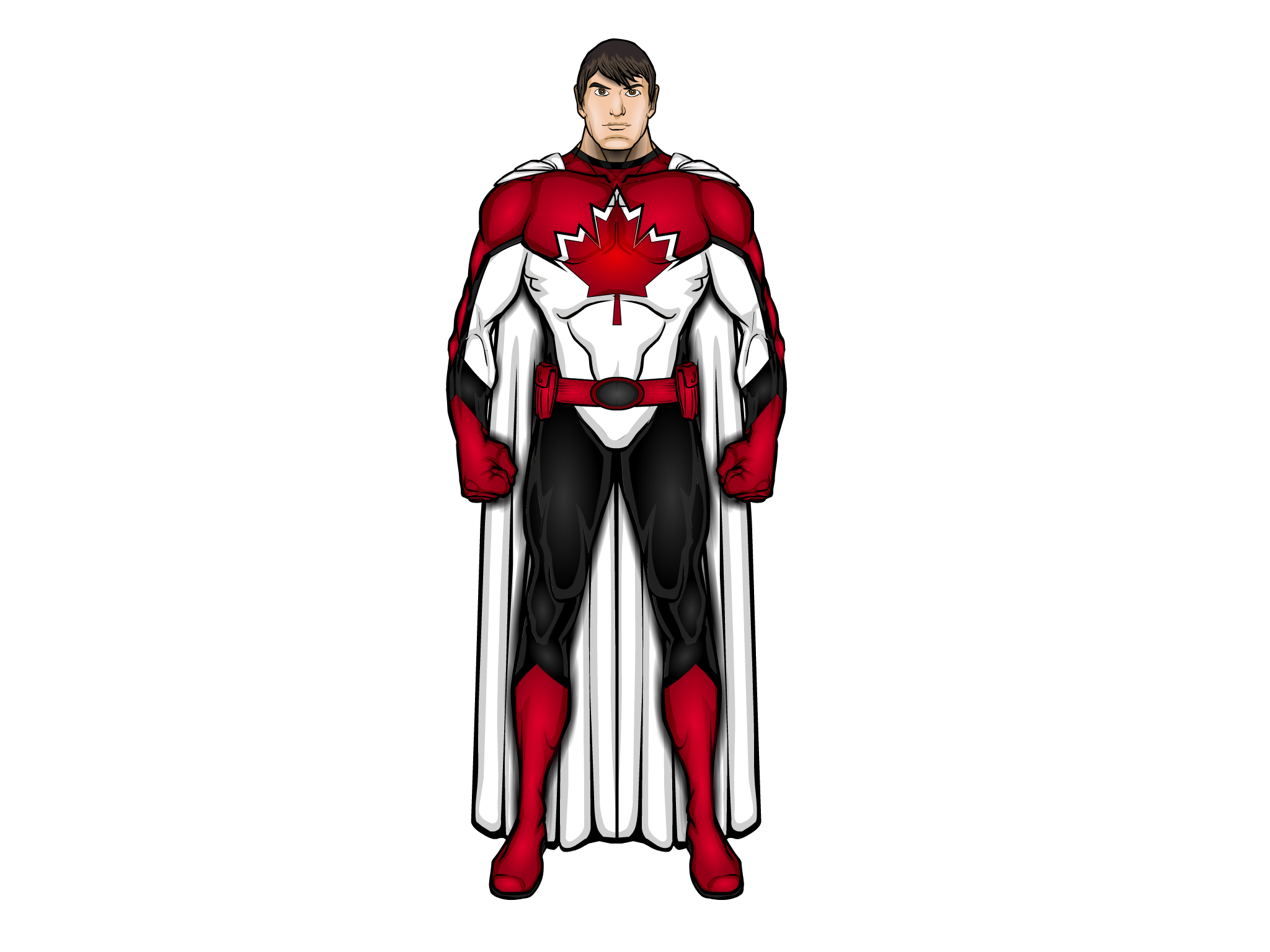
hawk007ParticipantCool characters! With the guy you said you weren’t quite happy with yet (red white and black) could I try making a version of him? Just for fun.
March 20, 2015 at 6:17 pm #121710
asubtledagger28ParticipantThanks @Wolf-Master. I appreciate the compliment. I have learned a lot and been inspired from looking through your gallery and in particular, seeing how you use shadows and highlights.
March 20, 2015 at 6:34 pm #121711
asubtledagger28ParticipantThanks @hawk007! I would be very interested in you making a version of the red white and black character when you have time. I have seen what you can do and am excited to see your take on this character. Off the top of my head my favourite hawk creation was called Dark King I believe. He was really well done.
I’ve never had anyone take a crack at one of my characters so I’m not sure if you need anything or not. I will post the text file to the version without highlights in case you need it.
Thanks again for the offer.
All the best.
Attachments:
You must be logged in to view attached files.March 20, 2015 at 6:44 pm #121714
hawk007ParticipantCool, thanks! Haven’t really tried doing a real character redesign before, so this should be interesting.
March 20, 2015 at 6:59 pm #121717
asubtledagger28ParticipantRight on. No pressure.
March 21, 2015 at 4:55 am #121727
Wolf MasterParticipant@asubtledagger28 Thanks it really means a lot that you say I have inspired you. What is art for if not to inspire.
March 21, 2015 at 10:11 am #121735March 22, 2015 at 10:35 am #121776
Mad JackParticipantHope you don’t mind me barging in unsolicited, but I couldn’t resist. Sorry … 😉
The Canadian Shield à la Mad Jack

Attachments:
You must be logged in to view attached files.March 22, 2015 at 11:15 am #121785
VampyristParticipantI couldn’t resist either, so here is my take on the Canadian Shield.
Attachments:
You must be logged in to view attached files.March 22, 2015 at 5:59 pm #121813
GuyGenesisParticipantOK, who left the multiverse gates open again? Good job all
… Any suggestions for a name would be much appreciated. Naming is not one of my strong points…
Having trouble myself with this one
some suggestions Solaris, Solarian, ProtostarAs far as naming, maybe thinking of who he is and where he originates powers and birth may help
March 22, 2015 at 6:19 pm #121815
asubtledagger28ParticipantWow!!! These are awesome, I love ’em. Thanks everyone for taking the time and for sharing. It is cool to see each of your individual styles come through on these. This really made my day.
@hawk007 I love how strong this guy looks. Looks like he has zero body fat. I’m also particualrly taken aback by the boots and the vibrant/glowing red you used. He looks very futuristic to me. I like the bigger maple leaf on his chest and what you did with the highlighting and shadows on the cape. I haven’t been able to work with capes before to get anything like this. This is really good hawk.
@madjack, by all means, anytime you want to jump in, I’m more than happy to hear from you. I like your design, the chiseled chin and face is great. I like the costuming as well. The black lines and shirt collar ties the uniform in better with the black pants than my original. I also like what you did with the maple leaf adding the white outline at the top and make it glow bright red. I like the change in belt choice as well. Well done sir.
@Vampyrist glad you weighed in as well. I like what you’ve done with this. I like the shield with the maple leaf int he crest and with red as being the dominant colour. I love the modernized costume and the boots. The mask looks way better than the one I was working with as well and I like the addition of the maple leaf on the mask. Good stuff.Thanks again guys, that was a lot of fun and much appreciated! These revisions show me different methods and styles and designs that have me feeling inspired to try to incorporate into my future designs.
All the best.
March 23, 2015 at 3:14 pm #121851
hawk007ParticipantThanks. I tried a sort of new type of shading with this guy. Guess it works.
-
AuthorPosts
You must be logged in to reply to this topic.


