Home › Forums › The HeroMachine Art Gallery › Anarchangel’s Archive
- This topic has 1,637 replies, 90 voices, and was last updated 4 years, 2 months ago by
Vengeance.
-
AuthorPosts
-
September 5, 2013 at 10:30 am #31023
VampyristParticipantMagnetic’s costume is great and for the energy, maybe mask the gradient onto an aura to give it a different shape. It may look better.
September 5, 2013 at 5:10 pm #31039
AnarchangelParticipant@Vampyrist said:
Magnetic’s costume is great and for the energy, maybe mask the gradient onto an aura to give it a different shape. It may look better.
That’s a god idea, Vamp. I’ll have to try that.
September 6, 2013 at 6:01 pm #31111
FRMParticipantsweet costume!
September 7, 2013 at 3:06 am #31149
LegatusParticipantMagnetic is fabulous!
September 7, 2013 at 4:40 am #31153
AnarchangelParticipantThanks guys.
September 7, 2013 at 5:03 am #31156
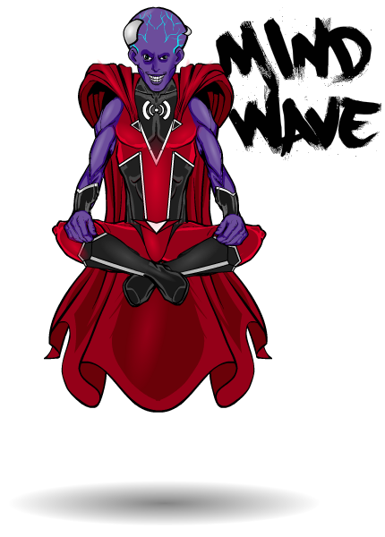
AnarchangelParticipantHere’s a remake of a character from my old archive….or at least it was supposed to be. It wasn’t until after I was finished that I realized I may have accidentally mixed him up with a couple of other old characters to create some new amalgam character.
Maybe he’s screwing with my brain. He does that.
I tried to stay away from the traditional “bad guy colours” here but after trying yellows and blues and greens and even white I realized that red and black just suited him best.
This is the leader of The Children of the Atom, Mind-Wave.
 September 7, 2013 at 10:58 am #31186
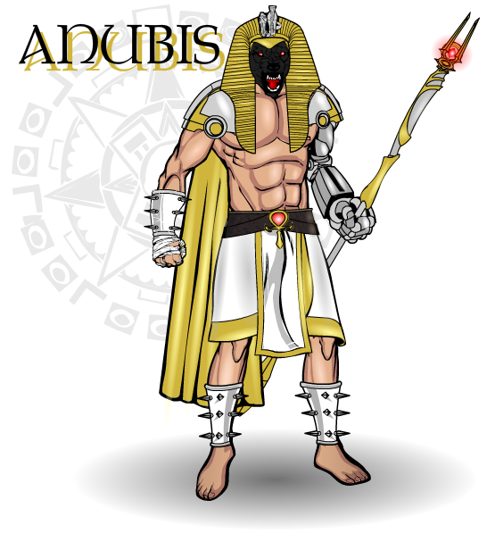
AnarchangelParticipantThis character was mostly an experiment to see if I could combine ancient Egyptian style with modern/future tech into a decent looking character.
This is the super evil Anubis.
 September 7, 2013 at 5:22 pm #31217
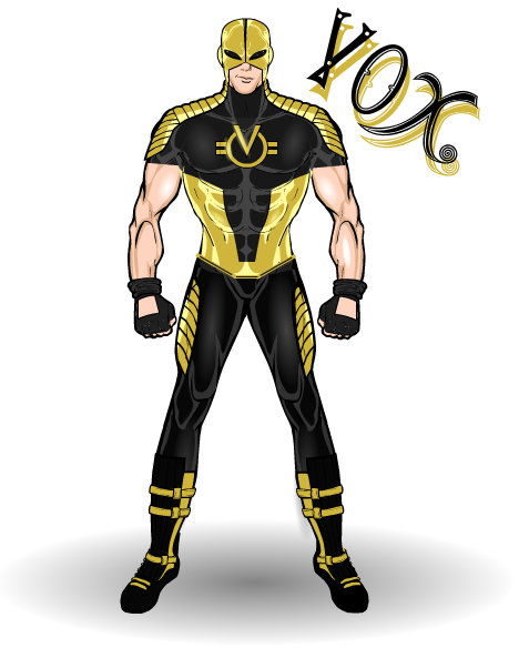
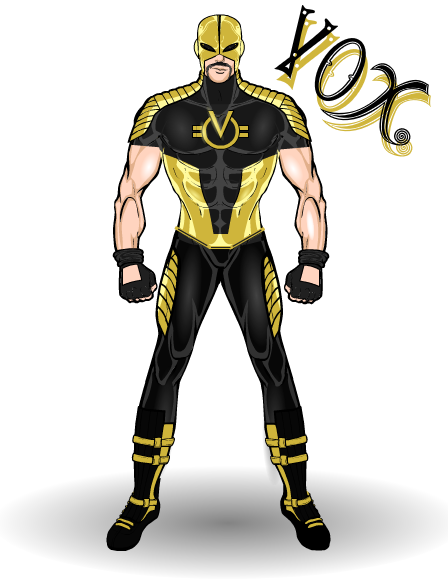
AnarchangelParticipantJust a quick new costume for Vox because I despise the old one.
I also made a version with a handlebar moustache, just for the hell of it. Yes? No?

 September 7, 2013 at 7:40 pm #14365
VampyristParticipantI’d say no, it adds another line that breaks up the nice flesh/black contrast. Nice costume on him either way.
September 8, 2013 at 7:46 am #31244
JR19759KeymasterI’d say no to the ‘stache as well, it makes him look like his day job is working in adult movies from the ’70’s and no-one wants that. Anyway, same comment as last time about how awesome your costume designing skills are, etc. Keep up the good work.
 September 8, 2013 at 9:54 am #31251
AnarchangelParticipantWell the motivation behind the ‘stache was to make him look kinda sleazy (to match his personality) and nothing says sleaze more than a pornstache

I agree with with you both though. The non-stache version wins. Someone fetch a razor.
September 8, 2013 at 11:45 am #31260
hawk007ParticipantThe only word that comes to mind when I think of this is talent. Pure talent.
September 8, 2013 at 6:28 pm #31284
AnarchangelParticipant@hawk007 said:
The only word that comes to mind when I think of this is talent. Pure talent.
Thanks man
 September 8, 2013 at 6:49 pm #31292
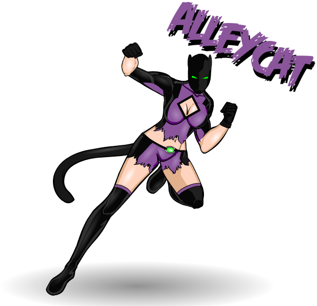
AnarchangelParticipantIf you have a functioning set of eyeballs in your face you’ll no doubt have noticed that my Alleycat character sucked. Hell, you probably noticed that even if you don’t have a functioning set of eyeballs in your face. I can’t quite describe how much I ended up hating that character but it got to the point where I hated just looking at her. So in the end I decided to completely redo her rather than trying to salvage the original look. I guess I was inspired by successful remakes of Salamander and Vox.
For now I like this one. We’ll just have to wait and see if I keep liking her.

“….” – Alleycat.September 8, 2013 at 6:56 pm #31295
DiCicatrizParticipantI like her! Great pose. It’s be hard to get those kind of action poses right without some kind of weird perspective thing or awkward looking joint (for me at least haha), but she looks absolutely seamless! Love the color scheme too.
-
AuthorPosts
You must be logged in to reply to this topic.

