Home › Forums › The HeroMachine Art Gallery › a bit of lime
- This topic has 217 replies, 32 voices, and was last updated 5 years, 1 month ago by
Herr D.
-
AuthorPosts
-
May 20, 2013 at 9:11 pm #24922
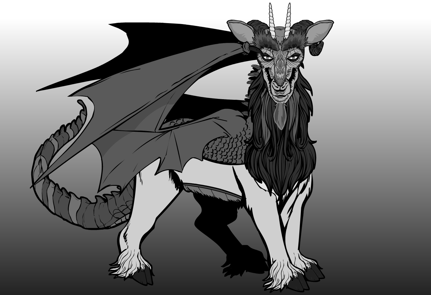
LimeParticipantSome suggest that the quyren is an ancestor to both unicorns and dragons, but others dismiss this claim as heresy.
 May 21, 2013 at 12:52 am #24929
WeilynMemberCool! Very creative combination of items.
June 12, 2013 at 1:33 am #26119
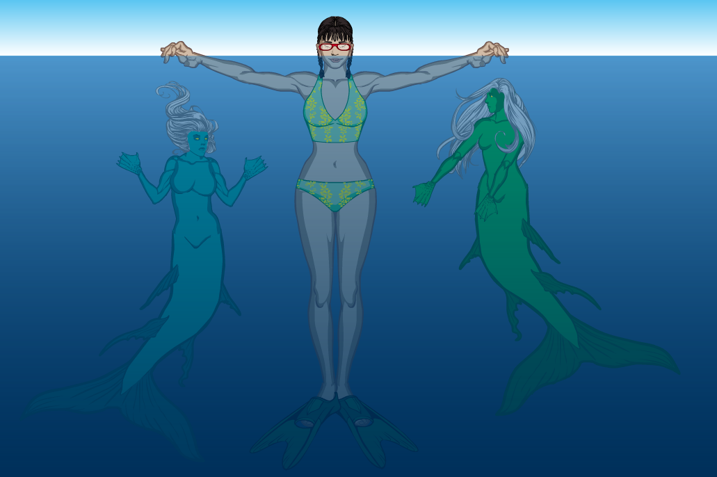
LimeParticipantI suspect this sort of thing is always happening when you’re not looking.
Totally listened to The Little Mermaid soundtrack while making this.
 June 12, 2013 at 3:23 am #26124
TrekkieParticipantI think the Quyren is probably one of my favourite creations of yours- it’s such a great combo of items and it looks fantastic in greyscale.
June 12, 2013 at 3:30 pm #26151
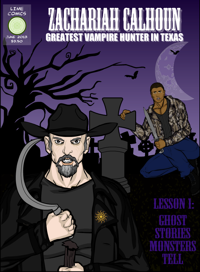
LimeParticipantFor the contest, although I may have to actually write this story now.
 June 17, 2013 at 2:00 pm #26346
ScatmanMemberAwesome!Great cover!
July 27, 2013 at 9:37 am #28540
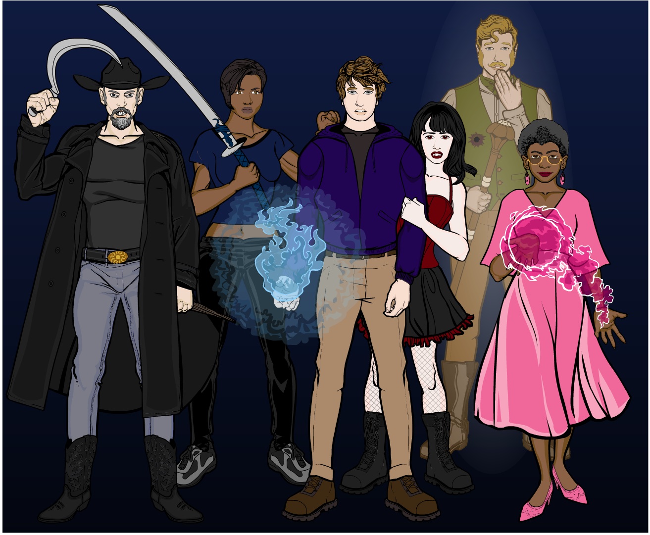
LimeParticipantHere are some pictures I thought I had here already; either I forgot to upload them, or they were from the old forum.


 July 27, 2013 at 10:07 am #28542
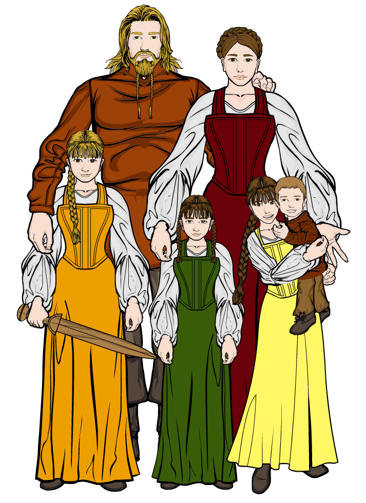
NugParticipantNice gallery! I especially like your family photo! Excellent job!
August 4, 2013 at 1:53 pm #29170
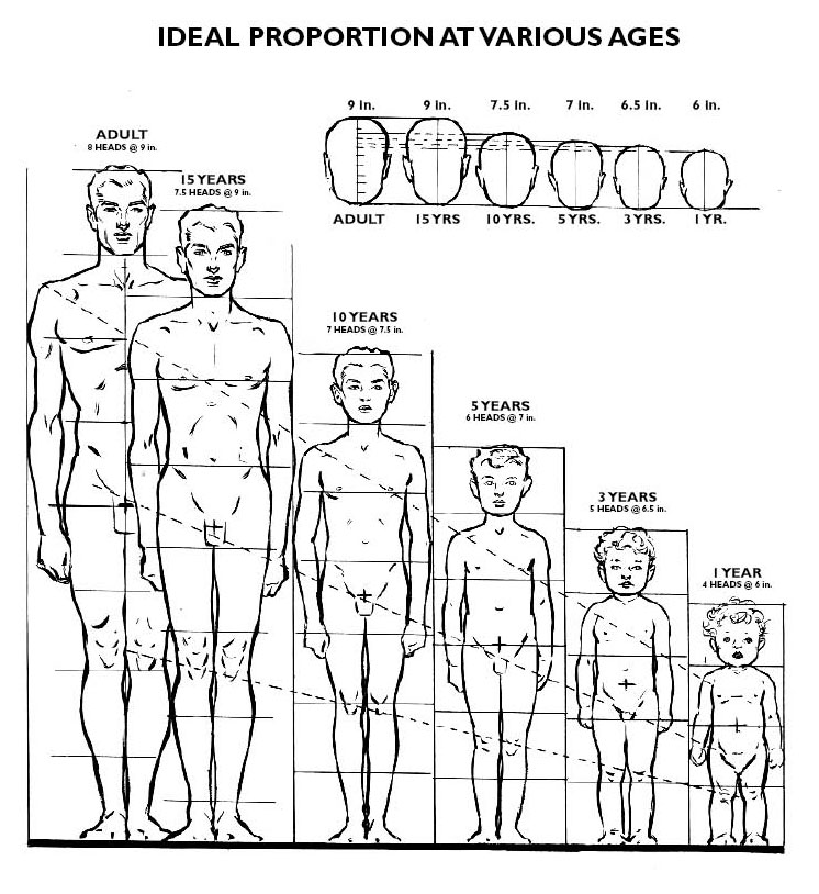
Kaylin88100ParticipantOne thing about that family photo bugs me – according to my chart of adult to child proportions, the kids are roughly 10, 5, 6 and <1, based on height relative to their parents, but based on facial and head-to-body proportions, the younger three look like they should be older than that. What age are they meant to be?
 August 4, 2013 at 2:00 pm #29171
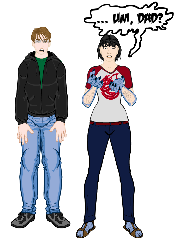
JeimuzuParticipantReally cool stuff in this gallery, I especially like the confusing the locals
 August 4, 2013 at 3:11 pm #29180
LimeParticipant@Kaylin88100 said:
One thing about that family photo bugs me – according to my chart of adult to child proportions, the kids are roughly 10, 5, 6 and <1, based on height relative to their parents, but based on facial and head-to-body proportions, the younger three look like they should be older than that. What age are they meant to be?

Eldest to youngest, 8, 7, 6, and 1 1/2 or so. The eldest girl is going to grow up to be a very tall woman. The other two will be more average height. I never was completely satisfied with the youngest two children’s faces. For the boy I started with the child head on the first page of “Winners” and tried to match the proportions of the features to it, although I think the kid the head was drawn from is several years older.
Is that chart handily available online somewhere?
August 4, 2013 at 4:18 pm #29184
LimeParticipantI would recommend politely declining the invitation.
 August 5, 2013 at 1:25 am #29232
TrekkieParticipantAmazing shadow and silhouette work! And also beautifully done
August 5, 2013 at 1:43 pm #29273
Kaylin88100Participant@Lime said:
@Kaylin88100 said:
One thing about that family photo bugs me – according to my chart of adult to child proportions, the kids are roughly 10, 5, 6 and <1, based on height relative to their parents, but based on facial and head-to-body proportions, the younger three look like they should be older than that. What age are they meant to be?

Eldest to youngest, 8, 7, 6, and 1 1/2 or so. The eldest girl is going to grow up to be a very tall woman. The other two will be more average height. I never was completely satisfied with the youngest two children’s faces. For the boy I started with the child head on the first page of “Winners” and tried to match the proportions of the features to it, although I think the kid the head was drawn from is several years older.
Is that chart handily available online somewhere?
Here it is:

You might also find the other two attachments useful. They’re growth charts for boys and girls, showing averages and 95th percentiles, etc.October 28, 2013 at 11:30 pm #33146
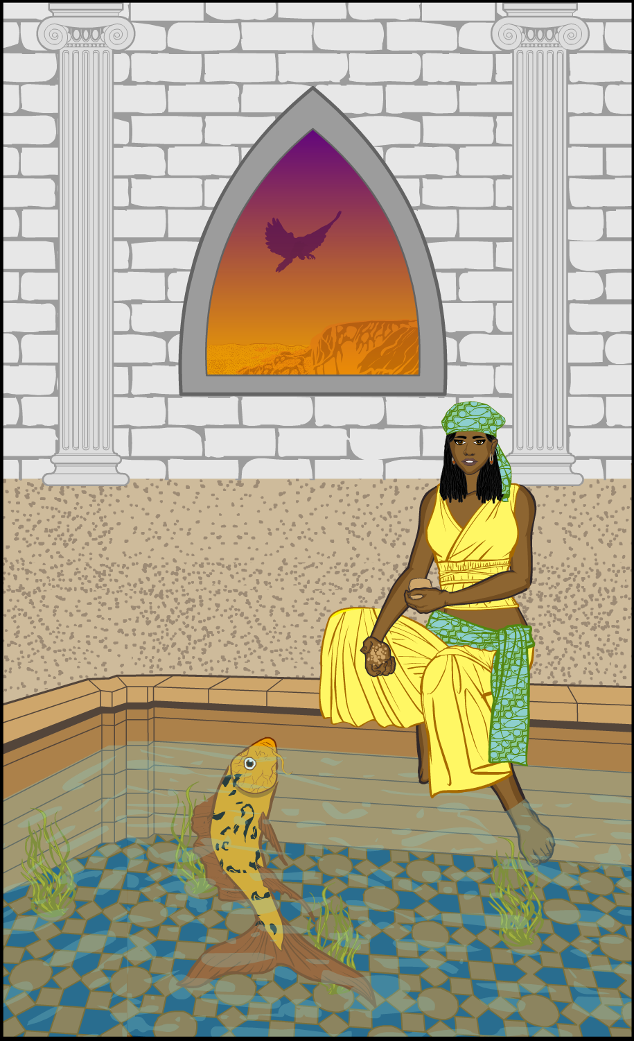
LimeParticipantWow, I’ve been gone a while. It seems to be guest season around here, which has kept me busy. But now I’m gearing up for Nanowrimo, and my plan is to finally write about the Library of Dobesq. To that end, here’s a book-coverish illustration. It features Kasha, who I’ve posted a picture of before. She’s had a new hairstyle since then. The fish she’s feeding is called Grandfather and is alleged to be hundreds of years old and to have powers. Kasha’s not sure she believes that. What’s that in the window? Why, it’s a silhouette against a gradient background. Which seems to have become a habit of mine.

-
AuthorPosts
You must be logged in to reply to this topic.

