Category Archives: Tips & Tricks

Advice and hints on how to create the perfect character illustration.

Creating a Character, Part 1: Thought Processes

Now that I'll be more visible, I think I should do something worthwhile. So I'll be posting an occasional article or something on various subjects, and today's is on character creation in Hero Machine.

Now, just in case anyone wonders how I'm qualified to do that, let me tell you that I have half(ish) an associates degree in graphic design. So there. Continue reading

Better hands

One of the objectives for the HeroMachine Expansion was to provide a way to get the figure's hands in different positions. It always bothered me that even when holding a gun, when you'd expect a trigger finger to be extended, the character still was shown with a fist. I also wanted you to be able to show the hands splayed, as if they were getting ready to throw firebolts or whatnot. To that end, I introduced a skin with no hands at all, so you could affix other items to the end of the forearm without having to worry about covering up the clenched fist that's there by default on the body. It's the last item in the "Skin-Expansion1" set, and it looks like this:

HeroMachine no hands skin

To go along with this skin, the Right/Left Hand Expansion 1 sets also contain items that have hands integrated into them, so they look more natural. You'll find a hand holding a pipe, some cards, a protester's sign, a hand with the index finger in trigger position, and more. I put together an image that uses the "no hands" skin and two of the integrated hand-held items to give you an example of how they might work together:

HeroMachine Hands Expansion

Since the basic pose can't change (too many items depend on its exact positioning), shifting the hands around is a good way to add a bit of life and differentiation to your character. If you find yourself with one of these integrated items in the right hand, but nothing in the left but a stump (or vice versa), you can also choose a glove that will do as a stand in if you prefer not to use the blank one provided in the expansion component set.

Guide for the color blind

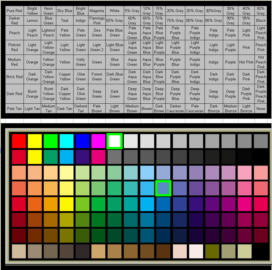
A long time ago, I had a request to make a color guide for the standard color swatches in HeroMachine 2 for someone who was color blind. I just stumbled upon the file on my hard drive, and thought I should re-post it here so it would have a final home in case other color-blind users might find it useful. Click on the image below for the larger, more legible sized version.

HeroMachine Color Chart

Free blank figure templates

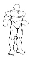
Maybe you want to see the character you've designed in a pose unavailable in the HeroMachine. Maybe you want to try freehanding your own illustration, but you're not very good at drawing the basic figure. To help you out, I've created the following "blank" figure drawings for you to use as a base for your own designs. These are all copyright-free, you're welcome to use them however you like without attribution. Just right-click on the template you want, and choose "Save As ..." or "Save Image As ..." to put it on your hard drive. Once you have it, load it into an image editor like Photoshop or MS Paint and start customizing it. You can also click on each image to load it full-size in its own window to see it without pixelation. Good luck!

Continue reading

Layers without a computer

A while back I posted a quick tour of how you can use layers to improve your digital illustrations. But not everyone has a Wacom pen tablet, Photoshop, and Flash. Or even a computer. So how can you improve your drawings without those things?

You go old school, baby! You need a pad of tracing paper, which is thin and see-through, a pencil, and some regular paper to start off with.

Continue reading

Good group costume design – Linkin Green

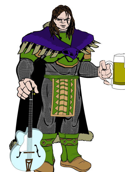
Browsing through the UGO HeroMachine forums, I've seen a number of "group shots", characters all built around a common theme and then assembled together in Photoshop. But I think this trio from "Count Libido" (don't let the name scare you, it's all clean), called "Linkin Green":

Linkin Green Heroes

All of the Count's character images are really well done, even stretching back to 2005 (!) and the earlier HM versions. Note in this Linkin Green group how well the color palettes match. They're obviously three individuals, but just as clearly they're part of a group, and it's done by setting a simple four color palette and sticking with it. A common mistake when making characters is to load every color in the rainbow onto their outfits, but that just looks like a peacock exploded on them. Keep it to a tight group of colors like Count Libido and you'll end up with a much better design.

Stealing from yourself

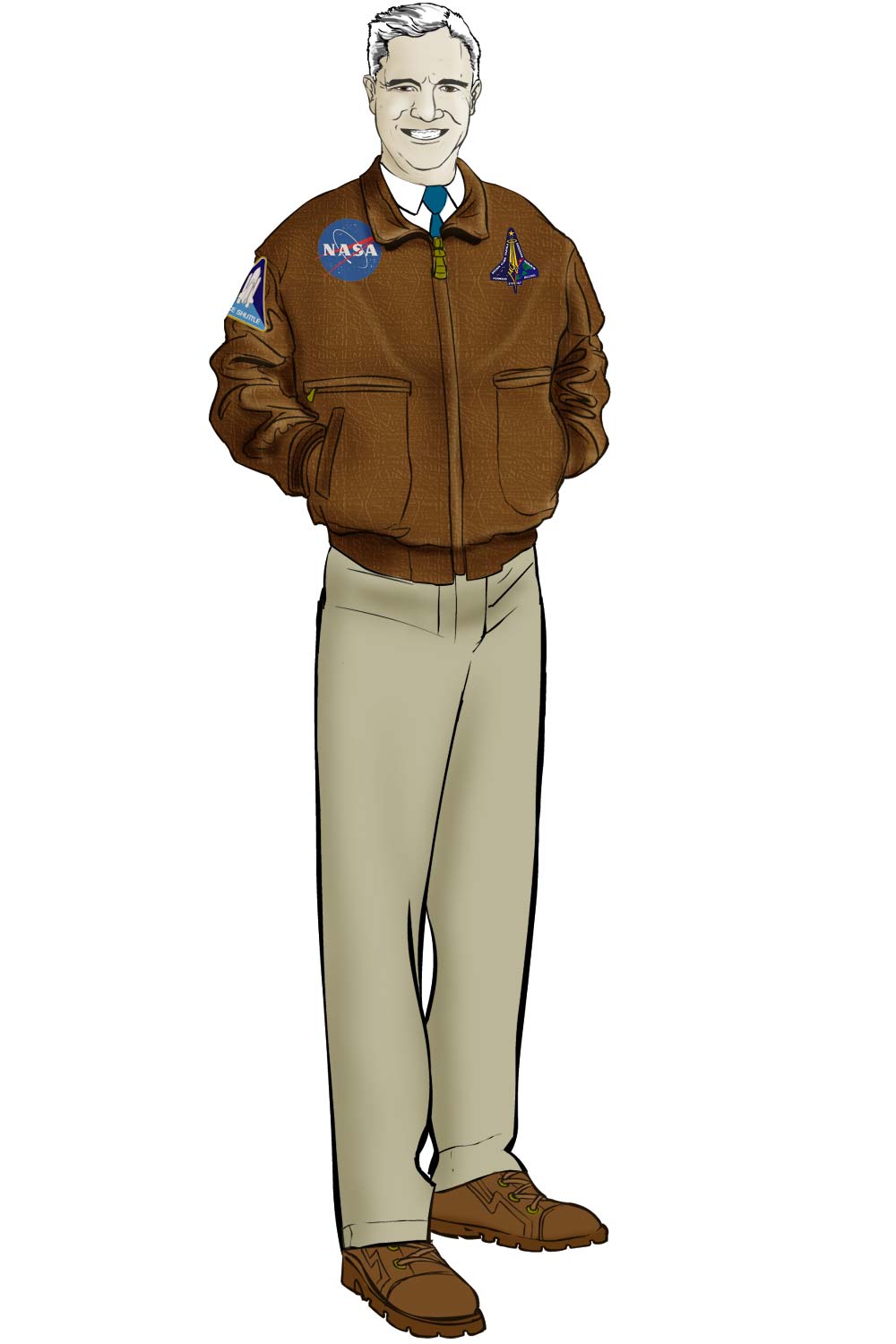
One of the key advantages to using Flash as my illustration platform is that I can easily steal from myself. Take the example of Harry Kruger, NASA bigshot:

Harry Kruger

Harry is a character by Neil Ma from the Uberworld Play By eMail (PBeM) shared universe I'm involved with. Take special note of Harry's face, because I chopped it up and put its pieces into the HeroMachine expansion.

I created the original set of facial features in HM2 by drawing the eyes, noses, mouths, eyebrows, and ears all separately. As a result, they don't always look great put together. So with the Expansion, I took pre-existing faces (either from photo reference or from prior illustrations I'd done, like Harry) and cut up the individual features. That way, when they're put together, you come out with a pleasing whole that fits. As an added bonus, they still look good mixed and matched, too, which is always nice.

This sort of thing is much more widespread than I think most people realize. It's not a bad thing to recycle artwork you've used before, and having your originals available in a digital format (especially a lossless vector format) makes it that much easier. I've even duplicated entire figures as background elements for a different illustration, saving a ton of time and making the final result that much better.

So if you're going to steal, kids, steal from yourself!

(Harry Kruger character © Neil Ma.)

Text Insignia

Did you know you can type in your own letters in a variety of fonts to use as a logo for your HeroMachine character? After picking the body style you want, choose the "Insignia" component, then the "Text" genre of items. By default they all say "ABC", but if you click on the actual item on the character, your cursor turns into a text-selection i-beam. Delete the default ABC and type in whatever you like, from numbers to letters.

On the UGO HeroMachine forums, for example, "monkeykid12" has chosen a text font from the "Expansion1" genre and created "High Five", who probably won't be a guest on an anti-drug "After School Special" any time soon, but who does look pretty neat:

High Five

It helps to choose a non-white color for the Insignia before selecting the font item to make it easier to see. Now get out there and make some heroes!

Cool Character: Spectre

Over on the UGO Forums, "thedoompixel" has a thread showing off some characters he's made. One in particular jumped out at me and I thought you might enjoy seeing what he's done:

Spectre

One of the things I like about this character is the way he's made the "skin" component completely transparent, allowing the clothing items to take the weight of giving the figure form. I also like the clean and simple color palette, with just the eyes in a bold red against black and white. This is a really innovative design, an excellent example of "less is more". You don't have to load your character down with an item from every single component, sometimes (usually!) it's better to rely on a few simple choices to carry the narrative forward.

There are several other characters in that thread that are well worth your time, so head on over and take a gander when you get a chance.

Well done, thedoompixel!

Tutorial: The Power of Layers

You don't have to know how to draw to create characters with the HeroMachine, but there's still nothing like making your very own custom illustrations. So from time to time, I'll be posting suggestions on how you can use your computer to do just that.

Before I start, I wanted to say a brief word about the tools you'll need. At a basic minimum you'll need a computer (duh) and some software to draw in. I use Flash because I like its organic feel, plus the fact that it outputs vector art means I can give my client an image at literally any size they want, from a small web graphic to a giant mural, and it'll always look sharp. I also use a Wacom Graphire 4"x5" pen tablet for the actual drawing. It lets me vary the thickness of the line just like I was inking with a brush, but you can just use your mouse if that's what you have. For software, I'll be using Flash MX throughout this tutorial.

And now, on to our first lesson -- layers!

Continue reading