Category Archives: Things I Like

Pantsless no more!

Imagine my surprise when I checked "Project: Rooftop" today and saw a retrofit of our very own pantsless Unknown Soldier! Head on over and check it out, it's pretty awesome.

Sketch blogs

I wanted to highlight a couple of the "daily sketch" type blogs that inspired me to start my own "Sketch of the Day. Or Every Other Day. Week. Whatever, Quit Hassling Me!" category. Shockingly they're even less consistent about publishing than I am, but it's still so much fun to see a new sketch pop up in my news reader. I find it inspiring. Something about freeing the artist from the production schedule, of having to illustrate a story, makes for a very rewarding process. And sketches instead of full-blown illustrations capture a sense of whimsy and raw imagination it's hard to find in other places.

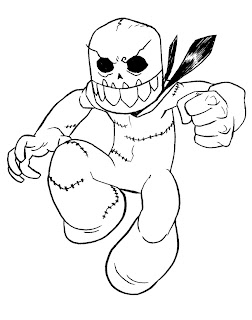
First up is "bletchskog", the daily sketch site of "Hector Plasm" and "Invincible" artist Nate Bellegarde. Here's one example I particularly enjoyed:

It's inked, while most of his sketches are done in pencil, but I think he was able to retain that dynamic and spontaneous feel even so. Which is harder to do with ink than you'd think.

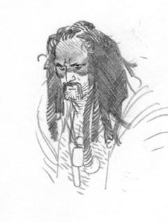
Next is former "Invincible" artist/co-creator Cory Walker's "scatchblag". Again, these are mostly black and white pencil sketches, though Cory goes in more for Supergirl costume designs and tends to have a little more wide-ranging a selection of subject matter than Nate. He also is able to capture more serious, somber moods, as you can see in this one:

Finally, Cliff Chiang's site doesn't do a "Sketch of the Day" thing but he does post a lot of character sketches and such that achieve much the same effect. I particularly enjoy the convention sketches these guys post, those are a lot of fun. I can't imagine how he cranked this out at a convention along with all the other commissions and still had it turn out so spectacularly well:

All three of these sites are emphatically "Things I Like" and I hope you will, too.

Best cosplay outfit ever

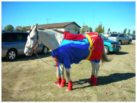
I don't know why I haven't ever seen another Comet the Super-Horse costume at comics conventions, because this rocks:

Can "Streaky the super-cat" be far behind? Possibly not, as the number of "You have the nicest [alternate word for cat] I've seen yet!" jokes from socially awkward attendees would be astronomical.

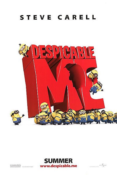
"Despicable Me" review

Short Version: A thoroughly enjoyable, light, animated summer family story that doesn't break any new ground, but does provide an amusing hour and a half of harmless diversion.

Long(er) Version (spoilers ahead!): Continue reading

Loki!

Mr. Hartwell is back with his Sketches of the Week, and this week it's Loki!

More Kirby goodness

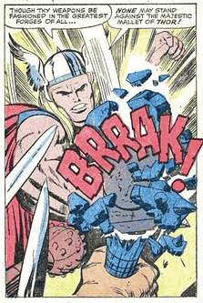
Buddy Rob Barrett of "Kracalactaka" has a great analysis of two pages showing Jack Kirby's fantastic layout skills. Head on over and check them out, it's really good stuff.

On a side note, I'm glad to see Space Ghost's sidekick getting a shout-out all the way back in the Sixties. Well done, King Kirby!

(Image and character ©Marvel Comics, Inc.)

Early Eisner

You certainly don't need me to tell you that Will Eisner is one of the greatest comics artist who ever lived, influencing the shape of the art like few others before or since. From his alternately sad and joyous homages to life in New York City to his legendary "Spirit" character, Eisner had an amazing ability to tell stories visually. He also thought deeply about the foundations of the medium, putting together a language that helped elevate it from slapstick funnies to serious art.

But just like the rest of us, he didn't leap out fully-formed as this magnificent, looming talent -- he had to work at it, think about it, practice it, and evolve over time. When he was just starting out he was but one more fish in a very crowded sea, a raw young talent -- clearly gifted, but not yet the master he would later become. Even then, however, you could see flashes of brilliance in his pacing, story telling, and panel composition. One of the great things about going through the "Police Comics" of the early 1940s is getting to see the birth of "The Spirit" and of Eisner's career as a major comics artist.

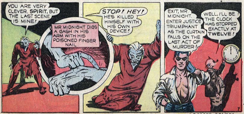
Take a look at this great series of panels that ends the story in 1943's "Police Comics" number 15:

On the one hand, you can see from the virtually non-existent scenery and background elements that Eisner is not yet fully in control of his abilities. As he grew more confident, those aspects of panel design became one of his greatest strengths, but at the beginning he focused much more on the essentials of figure and story. Even at this early stage, you can see how he plays with the panels, particularly in that third scene where Mr. Midnight is draped over the round frame frame while holding himself up against the square one. Having The Spirit break that frame as well increases the sense of dimension here, while not being as disconcerting as other artists would do with their characters speaking directly to the reader or completely trashing the page itself.

I also love how beat up The Spirit is. Eisner brought a street-tough gumshoe level of realism to his characters right from the start -- no sparking invincible blue underpants for this guy! The use of shadow in that last panel is also vintage Eisner, a great foreshadowing (ha!) of how he would later embrace the technique even more, to much greater effect.

Reading and seeing these stories not in isolation, but as part of the whole comics industry of the 1940s, really shows how Eisner both arose from, and yet transcended, the other artists of his age. Flashes of brilliance burst through the struggles of an up and coming talent still unsure of his skills in a way that's just a pure delight.

Rethinking the prequels

I like the way John Seavey of Mighty God King thinks in this essay titled "A Half-Hearted Defense of the 'Star Wars' Prequels":

On the one hand, I’m not crazy enough to say that the “Star Wars” prequels are good. There’s some rough sailing there, for a variety of reasons: Lucas hadn’t directed a film in a long time, his scripts were less polished due to a lack of a strong editor…and the less said about Jar-Jar, the better. But there’s a very strong theme that tends to get lost or misinterpreted, and it’s actually pretty impressively clever–but it requires letting go of one of the big assumptions the classic trilogy gave us. You have to be willing to understand that while the Sith are the villains of the series, the Jedi are the other villains of the series.

That sounds about right to me. I got the feeling throughout the various "Star Wars" properties that the actual people of the realm were all viewed basically as cardboard pawns for the mighty to manipulate, whether Sith or Jedi. Re-watching the original film the other day, I was struck by how distant Obi-Wan was, how emotionally detached. Granted, that was likely equal parts poor direction from Lucas and disinterest from a slumming Alec Guiness, but he still never seemed to care all that much about the beings around him except as they fit into his conception of destiny.

Think about it, what is Obi-Wan's final act? To disappear.

I know, that's not perfectly fair, he did stick around as sort of super-powered Caspar the Friendly Ghost, but the principle is the same -- the Jedi spend all of their training trying to learn how not to have emotions. And that's just as scary in its way as the Sith learning to revel in their darkest ones.

In any event, give MGK a read when you have a minute, I definitely liked this article. And let us know what you think about the issues it raises.

D&D Soda

This should probably go into Saturday's "Things I Like" series, but I couldn't wait -- it's D&D Soda, including such delightful flavors as "Illithid Brain Juice", "Dwarven Draught", and "Eldritch Blast":

Because nothing says "Gaming" like teeth-rotting carbonated beverages with cool labels. I'm in!

King Kirby and the art of the comics panel

You often hear old-timers praise the work of Jack "King" Kirby, arguably the most influential comics artist in history, but harder to find are explanations of why he was so great. Luckily we have Norris Burroughs of the "Jack Kirby Museum" to illuminate our ignorance.

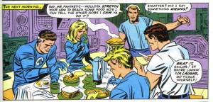
One of Kirby's greatest strengths (although that's a bit like saying "One of the ocean's wettest waves -- the guy did so many things at such a high level it seems odd to pick out just one) was his panel composition, a skill sorely lacking in most comics. Burroughs does a great job explicating one such panel here:

In this panel from Fantastic Four #39, a conversation is taking place around a table.


(Click to embiggen.)

The reader's eye enters the page with the visual cue of the yellow box reading, "the Next morning" and then on to the word balloon emanating from the sailor and finally comes to rest on the sailor himself. However, this is not the only cue to follow, as the structure of the entire composition will also lead us to the sailor. He is the apex of a pyramid that begins with the figure of Mr. Fantastic, travels rightward past Sue Storm to the top of the sailor's head, down his arm to Ben Grimm's shoulder and around left again to Johnny Storm. The oval shape moves the eye around, but the progression of a few moments in time must begin with Mr. Fantastic and end with Ben Grimm's words. This is a clear sequence of time in comic storytelling.

He doesn't post all that often, and the archives are only three pages deep, but he crams a ton of great stuff into those brief posts. Spend a lazy afternoon browsing through his breakdown of Kirby Kinetics and you'll thank me for pointing out this Thing I Like.

(Image from "Fantastic Four" number 39, © Marvel Entertainment Group.)