Category Archives: Things I Like

Character Of The Week- 27th July

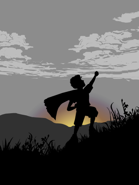
Once again on Character Of The Week, I'm going to feature an image rather than a character (still Character Of The Week sounds better than Image Of The Week). This week we'll look at this image by the brilliant Moognation.

Now, whilst it might be taken almost directly from a series of images that did their rounds on the internet about a year ago, I felt I had to feature it because it's just so awesome. The feeling behind it is tangible, if you haven't ran around with some sort of towel or sheet wrapped around your neck like a cape I think you might be on the wrong site. This picture captures that childhood fantasy perfectly. The pose is right on the money and the proportions are near perfect (which is hard when doing children on heromachine). How Moog did the grass is very inventive, using the bunch of flowers in ItemsRight- Misc, it works very well in silhouette as representing the wild grass on the side of a hill.

The most striking part of this image is the colours. The fact that the majority of the picture is either in greyscale or silhouette makes the yellow, orange and purple of the sunrise stand out even further. And the inclusion of those three colours provides the picture with a feeling of warmth even though the picture is mostly dark and dull greys and black.

Finally, something I wouldn't usually highlight, the title. It sounds somewhat familiar but I can't quite place my finger on what. Either way it fits the picture perfectly, which is hard when titling non-character based pictures, and I can just imagine myself saying that when I used to play superheroes as a kid.

Overall, one of the best silhouettes I've ever seen in heromachine and, Moog, I hope you do more than just the two you've done so far, they are excellent.

Character Of The Week- 20th July

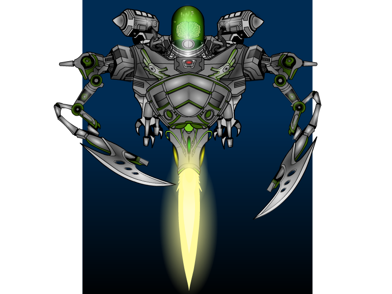
For this week's character of the week we'll take a look at Torog's Brain-Bot-3.0.

The thing that attracted me to this is the attention to detail used when constructing the subject. This is especially prevalent around the centre of the picture, the rocket mechanism made from the glove and shoulder items. The masking here really works, sometimes masking to join two items together can leave a mismatched line along the join, but here there doesn't appear to be one.

Also, the design is very well thought out, it looks like it could conceivably be used in either a comic or a sci-fi movie. The item choices work well together and nothing seems out of place. There is also a menacing quality to the machine, having no face (the essential part of the anatomy for human interaction, without it there is no emotion, something which is inherently unnerving to us) as well as the large, fearsome looking claws, which, coupled with the non-humanoid body structure, suggests something alien and antagonistic.

The final thing I like about this piece is how it is finished. The colour choices for the body  help the menacing aura, being dark and dingy. This is nicely juxtaposed against the bright and brilliant flame from the booster, although this may have been enhanced if there was some sort of reflective glow on the adjacent bodywork. Finally, the shading is very effective, especially on the claws and head. There are still some bits that could have been shaded where they aren't, but there is a very good contrast between light and dark, especially as the dark seems to be more prevalent on the main body whilst the light is more noticeable on the extremities, such as the head, booster and claws.

Character Of The Week- 13th July

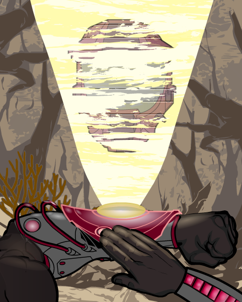
This week, we're going to look at not so much a character, more a scene by the master of Heromachine comic covers; RobM.

Incoming Message

Now, the main thing that attracted me to this piece was the lighting, especially on the wrist projector and the right hand. There are some good hints here on how to get really bold lighting effects, so I asked Rob about how he did them and hopefully he won't mind if I put up here what he said in reply:

"The wrist protector is one item from ItemRight Polearms with one gradient background shape masked to it and another laid on top. The masked gradient background shape has 25% second color and 0% line color. The pink glowing line color on the wrist protector is a result of the 25% darker magenta red gradient combining with the item's 65% gray line color. Then there's a second gradient background shape (the brighter gradient under the yellow disk) at 50% x 20% size laid on top.

The right hand is actually two hands. I masked the bottom portion with the thumb to an insignia so that I could use the darker prime color on the hand's under side. The layer below is a full hand where I used a lighter color for the prime color. Then I laid gradient background shapes over each finger at strategic places with the prime and second colors at 50%. It's tough to do shading on hands because masking works differently for hands than it does for other items."

Whilst these might be the most striking aspects of the picture, it wouldn't be half as good with out some of the finer details, such as the glow on the glove item underneath and to the side of the projection (especially on the wires, which can be very easy to overlook).

Also the projection its self is very well thought out. By a combination of a slightly transparent main focus (the helmet) along with the horizontal line effect and the clouds from the background items (masked to the beam) gives a very good impression of static interferance as usually seen in sci-fi war hologram communications.

Finally we come to the background. The best thing about this is that it doesn't distract attention from the main focus of the piece in the foreground. By using earthy, dull tones and a lighter than black line colour, it contrasts with the clear, bold and precise foreground to give a distinct feeling of depth to the picture and suggest a murky, mysterious and dirty world beyond what we can see.

Very well executed.

Character Of The Week

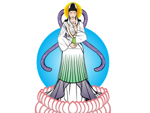
As promised, one of the new weekly blog posts. Now there idea here is not only to give  praise, but to look at good design features and highlight techniques that make the composition work. So without further ado, this week we'll look at Renxin's Kwan Yin.

29th June Renxin-KwanYin


This was entered into this weeks CDC, but I had to disallow it due to it contravening the 'no current religions' rule, however, it is certainly worth looking at more closely.

First off, let's look at the colour. Being a representation of a Buddhist god, the colours are very light and natural, none look out of place or overly dominant. Using only three colours is one of the best techniques for getting a good costume, you can often smoother a good design by using too many colours, no matter how well chosen they are. By using only the green, purple and white, it allows the foreground figure to stand out more against the background. The fading effect used on the colours of the lower dress (HINT: which is done by using the rectangle or circles on the last page of the Background-Shapes page and setting the first colour's alpha setting to 0% and then masking to the desired object) is a really simple but effective technique that can be used in lots of different ways (such as shadow effects or highlighting).

The lotus petals around the feet is a really neat way of using that insignia and by using a lighter outline colour compared to much of the rest of the piece, it differentiates these foreground objects from the main composition in a highly effective way.

The choice of items for making the clothes, whilst not highly innovative, is very effective. The skirts for sleeves is a good example of going to other categories to find what you need.

My favourite part of this piece however, has to be the face. I'm still not quite sure what item was used for the eyes (maybe the manga style nose? Do you think you could clarify for us Renxin, I'd love to know) but it works perfectly. The expression definitely says 'peace', which is the point of a depiction of buddhism. The choice of items for the hair and hairpiece were very well chosen and certainly add to the whole head area without drawing attention away from the face, much like the background 'halo'.

Overall, a wonderfully executed piece that looks very simple, with no masses of shading, because it isn't needed. Shame it wasn't eligible for the contest really.

Doctor Who Review

As this season of Doctor Who has now finished, I thought I might as well run down what I thought of the series and then you guys can have your say. Beware, there may be some slight spoilers, so unless you are River Song, or you don't mind getting slight hints, don't read.

I'd like to start off by saying I'm not a fan of the new format of splitting the series in two. Less episodes means less tension build up over the series. I miss trying to spot the little clues that they used to scatter around to hint at the final episode. And it means we seem to have lost the two parters, which are often the best episodes of the series (Empty Child/ The Doctor Dances, Impossible Planet/ The Satan Pit, Silence In The Library/ Forests Of The Dead, Time Of Angels/ Flesh and Stone; to name but a few). The stories seem to be a bit too condensed this series (i.e. from The Dalek Asylum onwards), but it has been especially noticeable in this half.

However, having said all that, I have quite enjoyed this half of the season. Journey To The Centre Of The Tardis was a very good episode, even if the ending was a bit meh, I loved all of the references to Old Who that they put in there and it was nice to see a bit more of the Tardis interior other than the control room. Hide and The Crimson Horror where probably my favourite episodes, Hide was nicely scary at some points and Diana Rigg was brilliantly nutty in The Crimson Horror. It was good to see them bring back some of the old foes, which was what really excited me about this season, and they didn't let me down. The Ice Warrior episode was as good as should be expected from Mark Gatiss, a man who certainly knows his Who, and I love the retro redesign they've given the Cybermen. I'm also glad they brought back the Great Intelligence as the big bad guy, shame they couldn't have given him some yeti, but evil snowmen and the Whisper Men will have to do. On the subject of the Whisper Men, with all of that stuff at the start of the final episode, the rhyme about them and all that, I was expecting them to be more intimidating, have more substance, but instead a good metaphor for their impact would be when Strax tries to kill one and it just goes straight through it, they were a nothing villain. However, I'm not saying that the final episode was bad in any way, it was an excellent finale for the season in my opinion, I had a veritable Whogasm at the end. It leads on to the 50th anniversary episode very nicely, they explained Clara's role in a way that was very satisfying and didn't give her some massive cosmic meaning like Rose, Donna or Wilf and thankfully it didn't try to answer the big question that they had almost been threatening to answer.

However, this does lead me onto the weak links, the first two episodes of the half. The Bells Of Saint John started out good but as soon as you thought you knew what was going on it jumped to another place and left the whole episode feeling quite empty. However, it was miles better than The Rings Of Akhaten. Now, great old Who reference at the start aside, this was possibly the worst episode since the Absorbalov waddled onto our screens. Unthreatening bad guy overload. The weird masked guys could have worked out quite well as the villain, or even the henchmen to the mummified alarm clock thing, but no, we have to have another sentient sun, lots of meaningless babble and the corniest mass sing-along this side of Disney. This episode could easily have made way for any one of the other episodes to be stretched into a two parter, or it could have just been chucked completely and another episode could have been filmed instead. It's such a shame that the only alien planet episode of this series had to be the worst.

Anyway, that's my opinion, now lets hear yours.
Saturday Morning Cartoons #6 “Dungeons and Dragons “

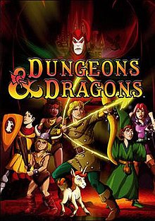
Today's topic is "Dungeons and Dragons", the show originally ran from 1983 through 1985 for three seasons. Hank, the Ranger, Eric, the Cavalier, Diana, the Acrobat, Presto, the Magician, Sheila, the Thief, and Bobby, the Barbarian, along with Uni and the Dungeon Master take on Venger, Shadow Demon, and  Tiamat the Dragon. Let's hear what you have to say.

Dungeons and Dragons DVD boxset art.jpg

Saturday Morning Cartoons #5 “The Super Friends”

The Super Friends, the most awesome cartoon ever. If I missed it when I was a kid, my whole day was shoot. One thing you have to ask is who was better, Wendy, Marvin, and Wonder Dog, or the Wonder Twins and Gleek? The name changed over the years, but it was still a great show. Let's hear what you have to say.

Saturday Morning Cartoons #4 “Jetsons”

Let's talk "Jetsons" this morning. A look into the future, just think about how many things we have today that we only dreamed of having when we watched the Jetsons. A nagging boss, traffic jams, thread mills for dogs, no wait, I don't mean this things. All and all it was a great cartoon. I didn't care all that much for the movie. Let's hear what you have to say about the Jetsons.

Saturday Morning Cartoons #3 “Speed Buggy”

Let's talk Speedy Buggy. I loved this show, it was great. So say it was just a Scooby Doo remake, but I think it held it's own. I remember when I was almost sixteen my cousin had a dune buggy that looked just like Speedy, but it was black. I wanted to buy it from he so bad, it was street legal, but I didn't have a job so I didn't have the money to buy it. I would still love to have one. Let's hear your memories of Speedy. Happy tooning.

Saturday Morning Cartoons #2 “G.I. Joe”

G.I Joe is today's topic at hand. I loved watching it, the characters were great. I have to say I was not to happy with some of the changes they made for the live action movie. I am happy that Road Block will be in the next movie with the Rock playing him. But back to the cartoon. Let's hear what you have to say about G.I. Joe.