Category Archives: Super-Hero Stuff

General ramblings about anything super-hero related, from comics to films.

Hail to the King

Hail to the King

By: Andrew Hines

We finally get a real glimpse into the life of young Arthur Curry, before he became Aquaman. This is a tried and true origin story, they way they used to do it. Like in the "Others" arc, we see a much angrier Arthur. He is also a man just discovering his powers and his legacy. We also meet the classic character, Vulko, his most trusted compatriot.

Geoff Johns has fone a great job penning the origin of Aquaman. Taking cues from the classic version, he has breathed new life into the character. With new trials and tribulations in his path, I believe that we can see much more awesomeness in the next year. I think this version makes Arthur a much more realistic character in the way he deals with his father's death and the realization that he is next in line for the throne of a mythical continent. It would be enough to turn most people's hair white from the shock of it. He handles it about as well as can be expected, albeit with a slightly larger dose of fury and adrenaline. It's good writing for the most part, though with a few fluctuations in pacing.

For the 13th issue in a row Ivan Reis, Joe Prado and Rod Reis have been the art team on one of the breakout hits of the New 52. Reis and Prado's art is consistent the whole way through, just like every other issue of Aquaman in the last year. The colors from Rod Reis, both in back and foreground are very good. They add a nice touch to the action scenes and really bring us into it. There are some great effects throughout the issue where the three work perfectly together.

This earns an "A" for all four of the men who brought this issue to comic stands around the world. It's a fantastic origin. If you enjoy reading Aquaman, this is a great addition to the last year's run.

End of the Sidekick

End of the Sidekick

By: Andrew Hines

We've strayed into a strange new world, where Spidey has a sidekick of his own creation.  It's been a 3-issue arc involving a kid who is arguably the biggest douchebag in comics history.  At the very least, he's on par with Cyclops.  At the least, this arc shows how much Peter values the tenets of power and responsibility. On the other hand, it also shows why he should never, ever, ever have a sidekick. We may see Alpha in later years, if/when his powers return, but for now I'm happy that he's gone.

Dan Slott has done a great job of writing ASM for over a year and a half now. Since Spider-Island, he's shown the wall-crawler's even deeper faith in power and responsibility. The writing on this makes it quite interesting to see how Spidey and Alpha deal with each other and the drastic up-turn that Alpha's power has taken. It's a decent ending that doesn't completely write off Andy Maguire's ties into the super-hero world. As far as the Spider-Man stories have gone in the last year or so, however, this isn't exactly his greatest and it's far from his worst.

Humberto Ramos' art has never been my favorite.  Despite that, the art has a great look to it. Teaming up with Victor Olazaba and Edgar Delgado on inks and colors, has brought out the good in his artwork. The art team hit some high notes on this issue that they didn't really reach on the last two issues. While good, it wasn't enough to push the issue over the top.

The combination of decent writing and good art earned the issue a solid "B". What I can say is that I'll still keep picking up ASM, especially for the next several issues, due to the reappearance of a classic foe.

Origin Of The Runner-Up

Origin Of The Runner-Up 

By: Andrew Hines

Jason Todd has been a cool character to try and understand again. As the second Robin, he was always a bit of a loose cannon. As Red Hood he was like carrying nitro glycerin while doing 80mph on a dirt road. He has loosened up slightly in the last year, as the reluctant leader of this misfit trifecta. He even commented in the first issue that if anything happened to Roy, he'd be "the worst former sidekick ever." Not a lie, really. Anyway, there are a few changes to his origin, but one glaring difference. He meets Batman by a means other than stealing the wheels off of the Batmobile. Despite having more potential for believability, it changes the early nature of his badassery. (If that's not a word, it should be.)

Scott Lobdell has rounded out a full year of writing this title and frankly, most issues has been full-on awesome. The only less-than-stellar issue was #8, which was simply average. This, however, was a very interesting re-telling of the origin. Particularly intriguing was the fact that it covered the entirety of his life. Literally, we see him from the day he was born and even get a glimpse into who his father was. We haven't seen much of his younger life, so thanks for that Mr. Lobdell. It really is a wonderful issue that explains a LOT about why jason is the way he is.

The current art team fits almost in the same vein as the first few issues with Kenneth Rocafort. The look of the comic, still in great hands, has pretty much stayed the same. The pencillers, Ig Guara and Pasqual Ferry and backup story artist, Brett Booth have done a fantastic job. Then there's JP Mayer's inks on the main story and Blond's colors, which are pretty good. There's a certain consistency on the art that no other artist transition has had in a while. Definite props on that. Then there's the cover from Kenneth Rocafort, which just looks great.

Overall, despite the art and good script, I can only give this a "B+". The downside, for me, was the fact that Lobdell changed how he met Batman. It's a letdown.

A Robin Gets His Wings

A Robin Gets His Wings

By: Andrew Hines

Here we see Dick Grayson's journey to becoming the original Boy Wonder. We see him meet Gotham's Dark Knight as they both learn that what separates the two of them and what makes them so similar. After a year of great issues, it's nice to go back and see what made him into Robin and sent him down this path. As with much of the New 52, I was interested to see how much of his past was changed. There have always been minor changes to the origin, and this one is no different. The usual staples are there, though some extra pieces show his differences with Bruce.

Kyle Higgins is still doing well with the writing. From issue 1, we saw the classic Dick, always trying to help simply because he enjoys doing so. In the last year we got some deeper insight into the kind of guy he is in and out of the costume. In this issue, helped out by Tom DeFalco, Higgins does a great job of showing  us the character's, well, character. This issue just helps out that particular cause quite well. They show the transition period between when his parents died and when he took it upon himself to become Robin. That initiative speaks volumes and sets the tone for his life as Nightwing.

After Eddy Barrows stopped working on the interior art on issue 10, we saw Andres Guinaldo for 11 & 12. It's nice to see Barrows back in the game as the penciller for Nightwing. On the first 10 issues he quickly became a favorite of mine, especially since Nightwing is one of my 5 favorite characters of all time. That being said, he really doesn't miss a beat on the artwork here. His work is complemented by the inks of Eber Ferreira. On top of that, Rod Reis' colors both inside and on the cover, are fantastic. There's really nothing wrong with the art here. Now, whether or not you like the suit, is another matter entirely.

The creative team is superb here. Even with the minor tweaks to the origin and the overhaul of the suit, this still gets a solid "A." For the reasons previously mentioned, it's a great issue and one I recommend adding to your list of monthly purchases.

Constructing a Legacy

Constructing a Legacy

By: Andrew Hines

I haven't been much of a Guy Gardner fan in the past, but with the New 52, I've gotten a better look at him and he seems more stable than in years past. Less arrogant and selfish than he was in the old DCU, he started out the year by helping rescue his long-time friend John Stewart escape the Alpha Lanterns. For the last few years, he's been one of the Corps' Honor Guard, which is a huge leap past just being the (sorry) red-headed stepchild of the Guardians.


This issue, penned by Peter J. Tomasi,  gives us a better insight into Gardner. We see the obviously screwed up family life that he led prior to being brought into the Corps and the selflessness that propelled him into being one of the greatest GLs. The dialogue and police lingo that Tomasi uses are pretty much spot-on and don't feel forced, as it typically does on many police dramas on television. The scripting here works very well for Gardner without seeming to try too hard to humanize him. Instead of trying to build on his relationship with Stewart, this issue is just completely about Guy, and that works beautifully.

The artistic team of Fernando Pasarin, Scott Hanna and Gabe Eltaeb has done a splendid job from the get-go on this title. Joined in the last few issue by Marc Deering, GL Corps is full of awesome artwork. While it may not be as instantly recognizable as some other art teams, they've been making a name for themselves this past year. From the smallest shadow to the most in-your-face action panel, this is full of quality artwork.

The team deserves major props for this one. I give it an "A" which is something i never thought I'd do for a title with Guy Gardner as a main character.

Bruce Wayne and the Red Hood Gang

Bruce Wayne and the Red Hood Gang

By: Andrew Hines

So clearly, this is no longer a rule. The 0 issue is pretty good, considering after last week's Detective Comics, there wasn't much left to cover. In this one, we see the original Red Hood before Jason Todd took over the mantle. We see Alfred, of course, Jim Gordon and even a Dark Knight-ish Bat Cave. The only thing is, we never see Wayne Manor, which Gordon makes mention of. It feels very much like the first half of Year One.

Scott Snyder has done a great job for the last year on this title, giving us great stories in Court of Owls, Night of the Owls and now the origin issue. From start to finish it's very much a Batman book. He may be relatively green, but still Batman. Bruce even mentions something that fans have long known, Bruce Wayne is the real facade. I can't wait for the next few months of this title. My only problem is the cliffhanger ending, which left me on the edge of my seat.

Greg Capullo is an amazing artist, simply in the way that he is consistent. There are no bad angles in here. Every motion is captured as if it were stills from the latest, greatest action movie. We never see the Batsuit, but moves are unmistakably Batman. Jonathan Galpion's inks and Fco Plascencia's colors work as the perfect complement to Capullo's pencils. Theses issues are beginning to rival the art of Bruce Timm from Batman: The Animated Series in just how iconic they are. They fit the character wonderfully.

The ending was the only thing keeping this from being top of the class for this week. The creative team gets an "A-."

The Legend of Primus

The Legend of Primus

By: Andrew Hines

Transformers is a huge piece of our childhood. There's really no denying that.   What you may not have now is that they inhabit a vast universe beyond anything the cartoons or movies ever managed to show. I won't pretend to know all about the characters in the world of Transformers, but I can tell you that this issue made me want to seriously get into the story of the Autobots. In this over-sized issue, we get to see someone other than Optimus Prime and the core members of the Autobots. The focus, this time is the crew of the Lost Light, which is in search of the City of Light, home to the fabled Circle of Light.

Writer James Roberts has scripted a wonderful issue. We don't just see a few characters here and there swapping witty banter, but rather, real interaction and classic Transformers references. Just because you don't see Optimus in this issue, doesn't mean you can't feel his presence at times, especially in Rodimus' actions as the commanding officer of the Lost Light. It branches out from their main mission into several smaller stories. It's just good writing in general. It manages to incorporate all of the great dialogue with good pacing.

The main artists, (my buddy) Jimbo Salgado and Emil Cabaltierra did a fantastic job on the pages. The lines on the interior art are fabulous and there's hardly a mis-step in the entire issue. The pencils are clean and the inks are finely tuned. There is a potion of flashback art, which was done by Guido Guidi, that looks very much like an 80s comic book. The colors by Juan Fernadez and Joanna Fuente are smooth and nearly flawless.  In total, I'd say there are very few, if any comics in the last week or two that look as good throughout. It looks as if these pages were exactly what the creators intended them to be.

I give this issue a solid "A". The creative team is awesome and the story is splendid. I really need to get back into reading Transformers if they all look like this and have such writing.

Scarlet Spider: Texas Hero

Scarlet Spider: Texas Hero

By: Andrew Hines

This is an awesome book. There, I said it. I'm a fan of characters like Kaine. The kind of guy who doesn't necessarily want to be a hero, but at the same time feels a drive to do the right thing. He blames Spider-Man for that, finally giving him a conscience. He's been in Austin, Texas for the last 9 months and is beginning to feel at home there. He even has something resembling a life and even friends. He's gotten away from the Kaine of old and is finally on the track to being a tried and true superhero.

Chris Yost has been doing a good job as the writer of this series since issue 1. He's taken Kaine from being just another spider-clone and definite baddie to his own brand of hero. Just when everything seems ten kinds of crazy, our old...err...acquaintance(?) Roxxon comes into the picture. Because what would a trip to Texas be without the presence of an oil company? This is a well-written issue, despite a slightly too clean ending.

The art works, primarily because of the pencils from Khoi Pham. The action shots are great and I don't see any angles that cause weird faces or anything. It fits with the cartoony style of the "Spider-Man Family". The best part, I believe, is the monster of the issue, Mammon. The inking and coloring teams do a good job as well.

I give this issue a solid "B", because of the overly clean ending. It's a better than average issue, but not exactly worthy of a standing ovation.

Superheroes battle to save City of Heroes once again!

(In lieu of our usual "Versus" matchup, today I'm bringing you a guest article about how you can help in a fight to save City of Heroes, the popular super-hero MMORPG. It's the players versus the world! The article is by Jason Brannen.)

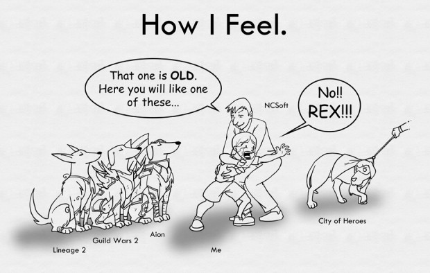
How I Feel

[Illustration by Joe Rossow]

On August 31, NCsoft announced the abrupt closure of their City Of Heroes MMO. NCsoft immediately terminated its entire Paragon Studios staff, ending all development and plans ending services on November 30. The game launched over eight years ago and allows players to create their own customizable hero/villain and battle to save the world/and struggle for unlimited power. It was still profitable and one of the first non-fantasy MMOs on the market.

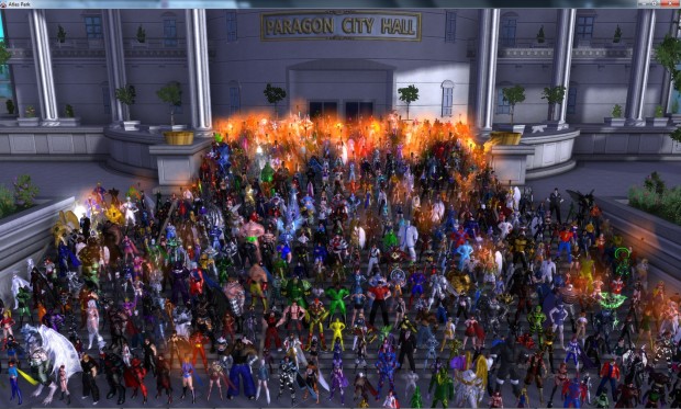
The announcement left the game's community in shock, but within hours, a rallying cry had gone forth. The players behind a group of virtual heroes began battling to save their Paragon City in the real world. Artists, programmers, financiers, legal professionals, and journalist volunteers began long-term planning. #SaveCoH appeared on Twitter. The Save our City of Heroes Facebook group was created. The community published multiple electronic banners, profile pictures, and forum signatures to spread their message. A write-in campaign quickly materialized. A petition organized by Meggan Russell has had more than 15,000 signatures in the first week.

Michael T. Eastham, subscribing for more than eight years, writes to Taek Jin Kim, CEO of NCsoft Corporation, "In the time since I first received an invitation to join the game, I have moved four times, held six different professions, had two friends and two beloved relatives pass away, and restarted and completed college. During hardships, I knew I could turn to those people I had made friends with within City of Heroes, and to the game itself as an escape from the pain and fatigue. I created countless characters, each unique with life of their own, whose problems I could create, and solve, giving me power to tackle my own hardships. City of Heroes has been there for me for a quarter of my natural existence now, and much of my life has been touched by its influence. When I went to college, I chose to go into game design because I held the dream of one day helping to craft the characters and stories I had become attached to within Paragon City.

"Everyone is experiencing the prospect of something we are passionate about being relegated forever to only existing as memories", says Tony Vazquez, administrator of the fan-run Titan Network. "We are Titans, all of us. We've shed blood, we've cried tears, we've never stopped and we're not about to quit now. We've been saving Paragon City for eight and a half years. It's time to do it one more time."

Links:
Save Our City! FAQ: bit.ly/SaveCoHFAQ
Titan Network: http://www.cohtitan.com/
Petition: http://bit.ly/savecoh
Write-In: http://bit.ly/write2ncsoft
Facebook: http://www.facebook.com/SaveOurCityOfHeroes
Twtter: http://www.twitter.com/#Savecoh

Notes:
City of Heroes (CoH) is a massively multiplayer online role-playing game based on the super hero comic book genre, developed by Cryptic Studios, and published by NCsoft.
The game launched in North America on April 27, 2004 and in Europe (by NCsoft Europe) on February 4, 2005.
Twenty-three free major updates for City of Heroes were released since its launch.
On August 31, 2012, NCsoft terminated its entire studio (Paragon Studios), ending all development on CoH and other games with a planned end of services on November 30, 2012.

Jeff's Contact: Jason Brannen storyteller@fuse.net

In the Beginning….

In The Beginning...

By: Andrew Hines

Though I haven't reviewed it in a while, I've enjoyed the last year of Stormwatch. It's a big picture title, which really pulls you in. They're not just there to save America or even the Americas plural. They exist in order to deal with big threats before they become a problem for teams like the Justice League. This issue deals with their entire history. It goes from the time that they were known as the Demon Knights and gives a new reason for the name change. In other words it tells us why they're called Stormwatch. The recurring characters throughout the history have been Adam One and the various Century Babies which seem to just be incarnations of Jenny Quantum.

Peter Milligan has given me plenty of reason to love Stormwatch in the few months. He began writing at #9 and has given us plenty of action. In this issue, however, action takes a backseat and the story takes over. Don't get me wrong, there's plenty of action, it's just not (the comic book version of) "real time." Instead, we get to see some heavy-hitting past incarnations of Jenny Quantum and Adam One doing his best Benjamin Button impersonation. It's a new look at how to write an origin issue for a super team and frankly, it was an interesting one. I'm not typically a fan of "0" issues, so I was pleasantly surprised by this one.

Will Conrad has done a good job here on both pencils and inks. I say good and not great because at several points, both Jenny Quantum and Adam One begin to look like ReBoot characters a little bit. Overall, however it's a good issue, but those moments kind of stuck with me. There was slightly better work in regard to the effects generated by each version of Jenny. Along with that, the colors from Guy Major were a decent fit. The shading was a tad "off" in certain bits which didn't exactly help correct the ReBoot look.

It was a slightly above average issue in terms of art, but the writing was really what saved it. This one get's a "B-". My faith in the creative team's true potential is all that keeps it from getting a C-range grade.