Category Archives: Super-Hero Stuff

General ramblings about anything super-hero related, from comics to films.

Crusader In Training

Crusader in Training

By: Andrew Hines

I'm going to break my own rule and cover an actual Batman issue. I've made due the last few months by not getting  involved with a title directly involving the Caped Crusader. With that being said, this issue gives us something we rarely see in one issue, a glimpse into Bruce Wayne's path to becoming Batman. We all know his origin story, but this is a look at something more special: his training. We've seen a few glimpses from the old DCU and more in-depth in Batman Begins. What we get here is more specialized training with one of his many teachers from across the globe. We also get a new insight into Mr. Alfred Pennyworth in the side story in the back of this issue.

Gregg Hurwitz is another writer I'm not as familiar with. He did surprise me earlier this year with his run on Batman: The Dark Knight. He continues to make a name for himself with this issue, which could have easy seen Bruce bouncing back and forth between various instructors. Thankfully we see a singular instructor somewhere in the Himalayas. As is typical with the Dark Knight, he doesn't find a Mr. Miyagi type of instructor, but rather a cold and disciplined man.

As far as the art on the main story, Tony S. Daniel has done a good job so far. The same can be said for Richard Friend's inks and Tomeu Morey's colors. It's not as dark as the typical Batman issue, but only because that's not exactly who he is yet. The art is consistent from panel to panel. The only real downside is that .... well, there is no downside. It's a good issue from start to finish.

The backup story is just as good, with James Tynion IV as the writer, and Henrik Jonsson as the penciller, Sandu Florea and John Kalisz on inks and colors. We mostly see Alfred waiting for Bruce to return and another character that you need to see for yourself.

Both of these stories have good pacing and some surprising twists. The issue overall deserves an "A-". It's good, but come on, this is Batman we're talking about.

Phantom of the 52

Phantom of the 52

By: Andrew Hines

For as long as I can remember, the Phantom Stranger has been the greatest mystery of the DCU. Who is he? Where does he come from? How does he know so much about the DC(n)U? Is he really as neutral as he claims to be or is he a villain biding his time? These were actual questions from my 10 year old brain the first time I saw him in Adventures of Superman #548, "A Stranger Stalks Metropolis."  Unfortunately this was during the height of the "electric Superman" period where DC was all into the digital age and then some. This issue reminds us of how well Public Domain characters can be utilized for comics.

Co-publisher, Dan Didio has given life to The Phantom Stranger. He begins without even using the character's name though still telling us exactly who we're dealing with through some awesome writing. With time, I can see him being a truly integral part of the DCnU. It's a great intro issue and I hope to see Didio do more in there future. I'll admit, I don't typically follow Didio's work as much as I do other writers', so this is a treat. I think he did a good job with a pretty obscure character, given that he has more creative wiggle room. Of course, being one of the top bosses doesn't hurt.

Brent Anderson's pencils combined with the inks and colors from Scott Hanna and Jeremy Cox, respectively, gave us some decent art to go with a good story. There are good scenes and decent effects. Most notably, the thing that really caught my eye was Anderson's decision to literally draw outside the lines. Several pages show effects that reach beyond the edge of the panels and flow across the page. For a title such as this, it's a great decision. The panel layout works as well, as there are places, such as pages 8, 24 and 25 where the panels, or lack thereof work best for the visual layout.

In all, it's a good issue that deserves a "B". I don't want to set the bar too high on an origin story and make the rest of the run look bad. If you want to know more about the classic character, go to the character's page at http://www.comicvine.com/phantom-stranger/29-3298/.

Comic Book Events: Do We Need Them?

Comic Book Events: Do We need Them?

In the last 10 years there seem to have been very few events worthy of actually being events. Blackest Night is the latest big event to really make a lasting mark on a comic book universe. Furthermore, it's the only one that I believe fans don't hate outright for taking over the comics. I'm not even bothering with Avengers vs X-Men, since it just seems to be filler for Marvel at this point. The House of Ideas is running out of them, clearly. Speaking of which, House of M seems to have been swept under the rug. Only Messiah War, Age of Apocalypse and the full Phoenix Saga have had a truly lasting impact on the Marvel Universe.

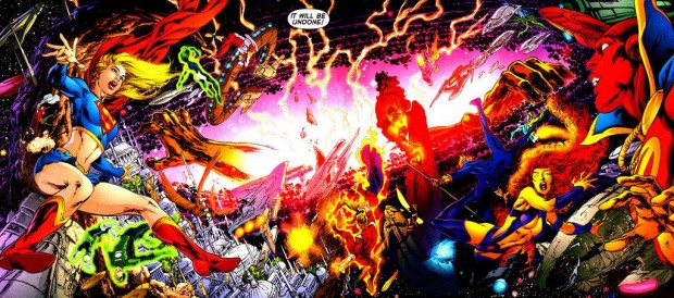
The only time in probably the last 30 years that an event has been so sweeping and ended up completely re-shaping that company's universe as a whole was DC's Crisis on Infinite Earths (1985). The Flash, Barry Allen died during the event and has probably been the only "real" death in comic book history, or at least the longest-lasting. It shaped the other characters relationships as he was the first to die and not come right back from it. (The fact that I'm primarily referencing DC events should come as no surprise.) Of course, he was brought back after 22 years in the events of Final Crisis (2008). Then, the biggest game-changing event in comics became Flashpoint, which the publishers ended up using as a segue into DC's New 52.

In my mind, unless it really does re-shape the universe the characters live in or leads to some larger story that does, we really don't need yearly events in comics. If we have to live through one, make it a Crisis on Infinite Earths or Phoenix Saga. We don't need to see another Civil War and then watch everything go back to normal a few months later.

With that said, what are your thoughts on comic events? Do you have a favorite (in any company) or one that you could live without?


The Third Army Rises

The Third Army Rises

By: Andrew Hines

The last year has had several twists and turns that nobody saw coming, primarily the return of Sinestro into the Green Lantern Corps. Even more surprising was that he was sponsored by the Guardians and replaced Hal Jordan. Yes, you read that correctly.  Okay, so now that's out of the way. In the past year, they've teamed up, fought the Sinestro Corps, fought the Indigo Tribe and gone after Balck Hand, which gets us to where we are now. During this ginormous issue, Hal and Sinestro wake up six feet under. It's a hell of a way to start an issue.  From Here on out I really can't say much more without giving away a HUGE piece spoiler.

So, how 'bout that Geoff Johns guy, huh? He's gone on a few ridiculous streaks with a full year of writing Green Lantern, Aquaman, and Justice League (reviewed earlier this week). This is a great issue in many respects, most notably Johns' introduction of the Third Army, which is not what I expected. It's a giant "WTF?!" moment when you finish the issue. That, in my mind, is fantastic. It's a game changer for the Green Lanterns, an event that will play across all 4 Lantern titles for the next 4 regular issues in the "Rise of the Third Army" story arc.  The dialogue, transitions, pacing and inclusion of canon make this as close as we've gotten to Johns' masterpiece in his 6 years of writing the Green Lantern characters.

Ethan Van Sciver does a great job on his first issue of Green Lantern following Doug Mahnke' departure from the title after issue 12. He ups the ante just in time for some real changes in the title. The pencils he's laid down are a step or two up from Mahnke's work on the title for the last few issues. He's aided by Cam Smith's inks and Brian Miller's colors, which round out a beautiful issue. The detail and colors are amazing on this one.

I give this an "A". The beauty of the images fits the silver tongue keyboard of Mr. Johns. This really is the best comic I've seen in the last few months. If you only pick up one Annual this week, make it Green Lantern Annual #1.


Certain Developments

Certain Developments

By: Andrew Hines

I know what you're probably thinking. "Why is Superman kissing Wonder Woman instead of Lois Lane?!" Well, simmer down a bit and I'll tell you. It all started a year ago, when the DCU got relaunched, ending up with Lois dating some dude named Jonathan and Clark being all alone. Skip ahead 5 years in comic book time and things have been heating up for the Amazon and the Big Blue Boy Scout. In this issue there's a whole big thing with Diana and Steve Trevor finally coming to terms with their relationship or lack thereof. Anyway, that's not really what this issue is about. For the last six issues the team has been battling the villain known as Graves, formerly a famous novelist who chronicled the League's formation and rise to prominence.

Geoff Johns brings his "A" game to the twelfth issue of Justice League. Cleanly wrapping up the last year's worth of story, it works as seamlessly as always. The villain, Graves, doesn't just show us how the heroes act when confronted by "ghosts", but gives us insight into the real tragedies of the characters' lives. We see that Flash is still haunted by the same demons as he was pre-New 52. We all know Batman's deal, but the real mysteries have always been Cyborg and Wonder Woman. Their ghosts, especially for Cyborg, hit a bit closer to home. Their demons are the ones that folks on the team have actually met. There is an interesting moment wherein one of the characters becomes a scapegoat for the team's decline. Johns, as always, keeps it true to the new canon and never glosses over the smallest detail.

Jim Lee's cover(s) as shown and his alternate cover, here: JUSTL_Cv12_var.jpg, show the dual story in this issue. The artwork is great on the inside as well. The men don't suffer as much from the "sucked in abs" as they did in a lot of Lee's previous works. The shadowing  is great, as a result of both Lee's pencils and the inking team with too many names to mention. The coloring is great as well, particularly on the main cover.

With all of that going on, the "0" issue coming out next month and then a whole new arc beginning in October, this has really been a fun book to follow. I give this one an "A+" rating and urge you to pick up the entire year's run, either in single issue format or the first two trades.

Truth of the New Guardians Revealed

Truth of the New Guardians Revealed!!

By: Andrew Hines

Before I get into the writing and artwork, which is good, I feel like I have to give you full year's synopsis. Okay, so a ring from each Corps was stolen and its wearer basically left to die. They all got sent to Kyle Rayner who then looked like a "ring thief" despite having no idea what was going on. An uneasy alliance was formed by Rayner along with Munk, Saint Walker, Fatality (Star Sapphire), Bleez, Glomulus (Orange Lantern construct), Arkillo and eventually the weaponer of Qward. So they get duped by Larfleeze to do his dirty work and whack this Invictus dude who's the sole protector of a giant solar system/space ship. Then Kyle gets recruited by Invictus to kill Larfleeze. That obviously ain't gonna work so Invictus follows them and decides to take on Agent Orange and that brings us to the here and now. Any questions?

Tony Bedard has done a passable job on this one. There's too much expository dialogue and not enough real interaction. It was a very slow beginning and the biggest action sequences took way to long to round out. I'm all for some good old fashioned ring slinging, but come on. It was a decent ending, but at the same time, it was way too clean. The title in general has been far too slow paced.

Tyler Kirkham's art is good and all but at the same time, he often makes the characters' necks far too veiny. With one exception (page 18) I never really got the feeling that Kyle was an artist, which typically shows through his constructs. It looked a lot like Hal's stuff, just beams of light and very run-of-the-mill. Batt's inks on the other hand have been good. Nei Ruffino and Wes Hartman's colors were pretty good and fit what the effects were trying to portray.

I have to give this one a "B-". I want to love it because Kyle is one of my favorite characters, but the writing didn't work out as well as I wanted it to. It was wrapped up a little too neatly. I'm just hoping that better things happen after the 0 issues.

Rogues Get New Management

Rogues Get New Management

By: Andrew Hines

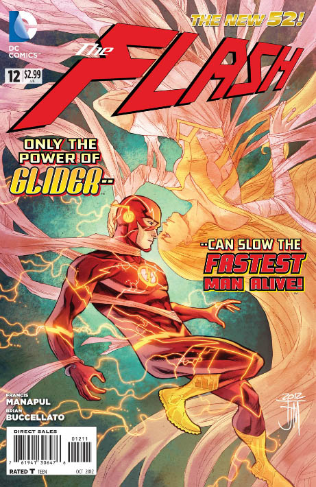
In the last year, the Scarlet Speedster's been hitting a few speed bumps (see what I did there?) From helping to plunge Central City into a full-on blackout, to getting himself, Iris West and several other stuck inside the Speed Force, he's been having a bad year. Add to that everyone in the city thinking he's dead and now being framed for murder, things just aren't going his way. Now, the Rogues are getting back together, albeit with new leadership. For the first time, the new master of the Rogues looks good in a dress. Glider's not only taking control of the Rogues, she's also putting her brother, Captain Cold out to pasture. I've always liked Barry, even though he died two years before I was born. There've been some interesting developments in the last year, but now it's just getting ridiculous. Thankfully this all leads up to Flash Annual #1 which comes out next week, along with Justice League #12, Green Lantern Annual and Superman Annual.

With Francis Manapul and Brian Buccelato rounding out a year of writing Flash, they're either getting tired or has something AMAZING up their sleeves. The pair have done a great job, not only staying true to who Barry is and distancing him from Wally a little bit, but digging deeper into his powers. The dialogue is great and fits each character pretty well. The pacing fits with a two-part story, assuming it ends with Flash Annual #1.

Manapul has done a great job over the last year of updating everyone's looks while keeping with the premise of each character. His style fits the pacing and the artwork in every panel is great. From the front cover to the last page, this is the most consistently awesome artwork in DC. I really can't think of anyone else' artwork I'd rather see in the pages of the Flash month after month. Then there's Buccelato's colors over Manapul's art. For my money, they're on par with the work and consistency of Jim Lee and Geoff Johns. Visually very different, but they do what best fits the characters and script. And to top it off, we get to see it twice in one month with next week's comic.

With this pairing, it's no wonder that there's really no end in sight for this title. They've earned themselves an "A".

Sisterly Reunion

Sisterly Reunion

By: Andrew Hines

Since the beginning of this series, we've seen Jason and Kori break Roy out of a Quraci prison in the middle of nowhere, seen them fight the undead members of the Untitled, and witnessed the unlikelihood of Jason actually helping out Batman in his fight against the Court of Owls. There have certainly been some twists in the stories brought to you by Scott Lobdell. None of them, however, flips the old DCU relationships as we know them on their head quite like this issue. For one, the main focus of this issue, isn't so much the space battle, or Jason's quest for redemption as it is Kori and  her sister's relationship. Add to that the fact that Roy is somehow the hero and you get one giant headache. I mean, seriously Scott, what the hell, man?!

Scott Lobdell continues his now year-long run on this title and delivers a surprising 180 in regard to the Starfire/Blackfire relationship. To write that, and make it not only plausible, but ultimately, believable takes tremendous talent. The pacing is decent, but not his best. The the only truly believable interaction is that between Jason and Isabel, the girl they unwittingly abducted and brought with them on this interstellar journey. The real test will be how the sisters' relationship turns out in October's Red Hood & the Outlaws #13. For that little shake-up, this gets a minor de-merit. Wait...people still do "de-merits", right? Anywho, the point is he gets knocked down to a silver star rather than a gold one. Still, a decent job.

Timothy Green II's artwork is really good and quite similar to that of the previous artist, Kenneth Rocafort. Actually it's more a mix of Rocafort and Ryan Ottley of Invincible fame. Despite the overly complicated nature of the suit designs in the comic, I'm surprised it was done on time. Impracticality aside, the artwork is good, though not exactly up to the par that Rocafort set on the previous 11 issues of the title. Blond's colors are great, still. There really isn't much that's missing or overdone, except that I don't recall Starfire's eyes resembling an anime character, but hey, what do I know? Anyway, we can still see Rocafort's artwork on the cover, along with more of Blond's fantastic coloring, which really translates better when paired with the cover artist.

This is a good title and I'm glad to not see quite as much of Jason as I do of the rest in this one. All things being equal, this earns a "B," putting it right up there with Nightwing this week. Yes, I know it would piss off Jason to be compared to Dick, but then what doesn't annoy that guy?


Downfall of the Republic…of Tomorrow

Downfall of the Republic...of Tomorrow

By: Andrew Hines

Dick Grayson, is easily my favorite of the sidekicks, any sidekick. Okay, scratch that, any former sidekick. He's a great character on his own as well, which makes him all the better. He doesn't rely on the lead character to make him seem useful. In his own way, he's almost a match for Batman. When it gets down to it, they're very close to being the same person. Both lost their parents to violent deaths at an early age, both are trained fighters and detectives and they both help the innocents of Gotham.  The biggest difference is that Dick enjoys being a costumed crime-fighter. Bats does it out of a sense of duty. Nightwing finally puts the pieces of the puzzle together and has a knockdown, drag out fight with Paragon, the leader of the Republic of Tomorrow.

Kyle Higgins continues an awesome run on Nightwing #12. Having never read much of Higgins' work prior to the New 52, I gotta say, the dude knows what he's doing. Turning the former Boy Wonder into a character that I can't wait to read about every month. On top of that, he weaves wonderful yarns that help explain who Dick Grayson has become. He separates Nightwing from legend of the former Boy Wonder and shows how he's become a different man. He's grown up in some respects, but he's never lost his faith in people the way that Bruce, Jason and Damian have. Showing that in every issue is what makes Higgins a name to look for.

This is one more title where the art is a team sport. The pencils have been done by Andres Guinaldo, who I'm not too familiar with. It's really pretty cool, not exactly "A" material, more like a "B+". The action sequences are good, with almost no dead space. A few panels, such as Dick's expression on the last page, are slightly off, but otherwise, it's pretty good work. The inking from Raul Fernandez and Mark Irwin is good, but not over-the-top fantastic. Rod Reis' colors are pretty good, especially when partnered with Eddy Barrows' pencils and inks on the cover. The covers have been the most stand-out part of this series,  aside from Higgins' script.

All things considered, it's a "B". The script, as I said, is good but that alone can't carry the whole weight of the issue. That being said, I still can't wait for the next regular issue of the series in August and the "0" issue next month.

Super-Powered Con Man vs Alien Overlord

Super-Powered Con Man vs Alien Overlord

By: Andrew Hines

Cole Cash has long been a favorite of mine since he was created by Jim Lee (imagine that). Before he got canned with the rest of WildStorm, he was a real badass with a silver tongue and all the ammo he could carry.   He ended up being a rather intriguing character during James Robinson's run on WildC.A.T.s, due to his dealings with boss Jacob Marlowe. As I recall, he was also the only full-blooded human on the team of Kherubim-Daemonite hybrids. It seemed to be like putting Batman, a normal person without powers or special jewelry, in the ranks of the Justice League. So, you know, there's that. The higher-ups at DC have begun integrating the Daemonites into the standard DCnU.


As much as it pains (and surprises) me to say, Rob Liefeld's writing is actually better than his art, which is unfortunately still on the cover. This is actually the issue that brings out my inner geek to the X-TREEEEMMME!!! Sorry, I had to. Anyway, this is actually a decent issue as far as writing goes, but since it's Liefeld it can definitely be better. I want to like it, because it's Grifter, but for some strange reason it falls slightly short. Liefeld apparently couldn't even be bothered to write the dialogue, which was done by Frank Tieri. You can sort of let that one speak for itself.

The art is decent, because it's not whatshisname.  Instead, the pencils were done by Scott Clark and the inks by Dave Beaty and colors were by Andrew Dalhouse. Like I said, the art is decent, not exceptional in anyway. I'd really like for something to stand out here, but it just doesn't. Really, the only good piece of art is the cover, which is done by Liefeld. The colors are about the only really good thing in terms of artwork.

This earns a B-. I like where the story ends and hoe we can see more of it when Liefeld's finished. It's good if you know the characters, but if you're just starting to know anything about Grifter or anyone from WildStorm, then check in later.