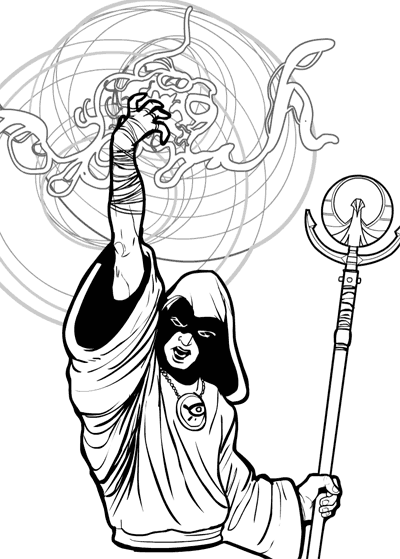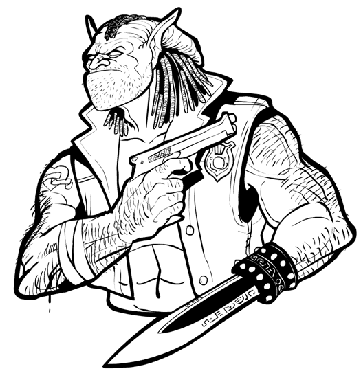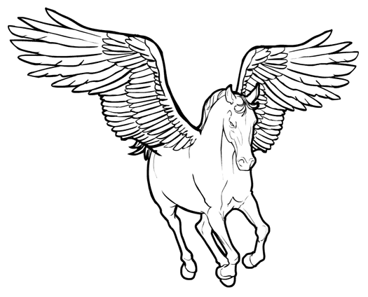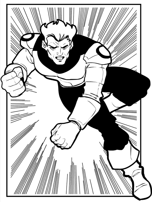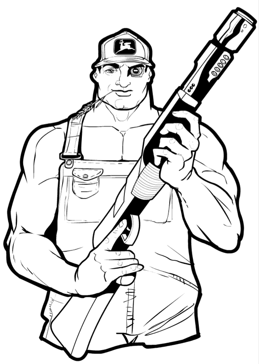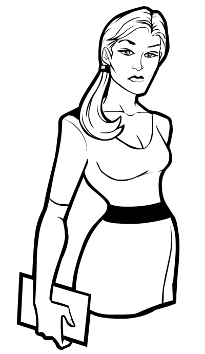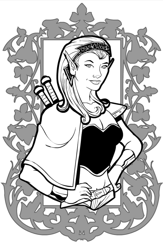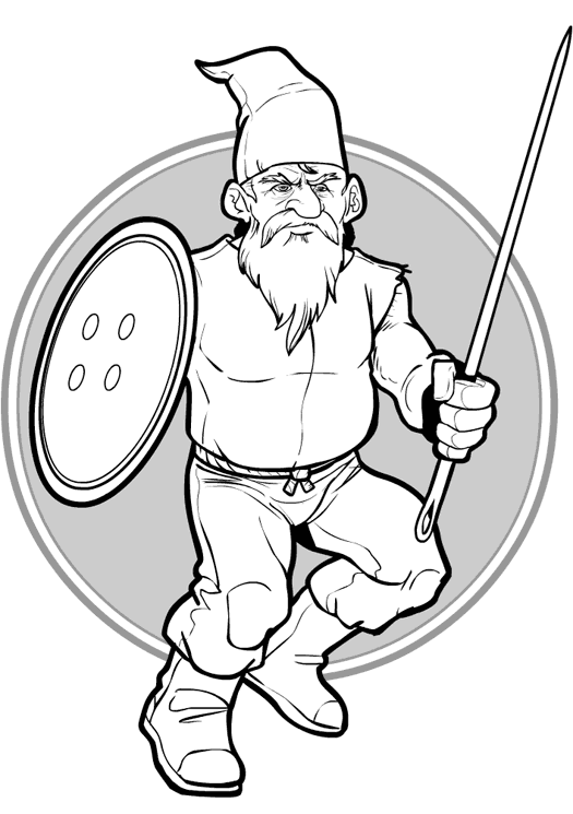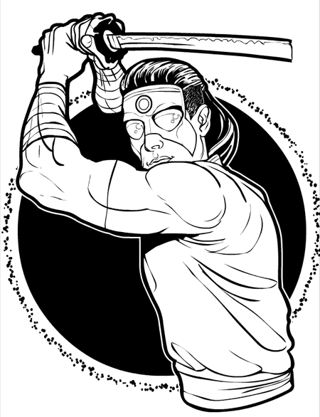
I stumbled across a new website of photo reference for comics artists, so I picked this photo to give it a whirl. For me, this is an example of how photo reference can rob your illustration of life, making them feel too stiff and static. Part of the artistry of drawing super-hero or action comics is knowing what to exaggerate, what parts of the anatomy to enlarge or shrink or bend or twist into arrangements that are hyper-realistic, heightening the drama and impact of the scene. When you're tied too tightly to a photograph, you lose that ability.
The key is to use photo reference as a guide to how some specific bits look ("Oh, so THAT'S how the pinkie lies when holding a sword from that angle") and not tracing it wholesale.

