Category Archives: Previews

Warrior mini insignia sample

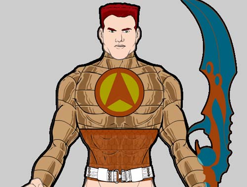
Here's a screen grab showing the way the Insignia slot is really going to make some cool things possible:

insigniasample.jpg

I've chosen the banded shiny metal Top here to serve as the base. I selected a round Insignia, colored the outside orange and the inside light bronze. I checked the "Dupe" box, and added a chevron-shaped insignia, made both color areas orange, flipped it top to bottom, and scaled it narrower to fit inside the previous circle. I then set the outline of the chevron to 0% visibility, so I just had the color areas.

Finally I chose a square Insignia and sized it to fit the width of the character's waist. I chose lighter and darker orange for the two colors, and changed the alpha for the inside color to 60%. I added the scale pattern to make it look like chain mail, and finally Masked it with the Top item, so you only see the Captain America-ish stomach band.

Pretty neat, ain't it?!

Warrior mini patterns

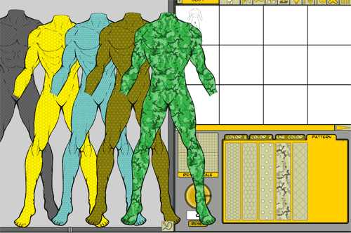
I spent the day today programming in the "patterns" for use in the upcoming Warrior Mini. Here's a screen shot of the ones I have so far:

patternssample.png

If that's hard to see, they are fishnet/diagonals; hexagons; scales; rivets; and camouflage. The camo in particular is pretty neat. All of the patterns are semi-transparent lines & shades of gray, so the color you pick for the item in question comes through and tints the line. That way you can have green jungle camo pants, or sandy desert camo pants, or snow white and gray camo pants, etc. One drawback to that is, you can't directly change the color of the pattern, it relies on the color underneath it. So you can't, for example, make the actual rivets a different color from the shirt they're put on.

Another drawback is that you can either have the item serving as a mask or hosting a pattern, but not both. So for example, if you wanted the lightning bolts to be masked by the body (so you could get the off-shoulder look I had in a previous sample), you couldn't do that AND have a pattern on the body too. Well, you probably could if you had two bodies, one regular with the pattern on it, and another turned to be invisible serving as the mask for the lightning bolts. I assume Kaldath et. al. will be plumbing the depths of these sorts of things and showing me things I didn't think were possible 🙂

Anyway, I hope it's a good feature that will make the applet all that much more useful and fun.

By all means, please feel free to suggest other patterns you'd like to see, I've got room for at least two more, and I can resize the buttons to fit in as many as seem worthwhile.

Sample Warrior Mini character

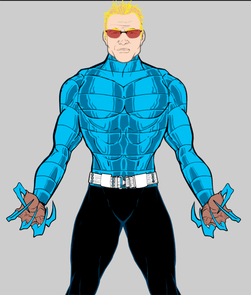
Nothing fancy, but I put the faces in tonight and wanted to see how they came out. The hair got done this morning, and that Top was completed last night. Pretty fun to play with. Hope you're having a fun Halloween dressing yourself up for real tonight!

samplechar1.png

Mini tops

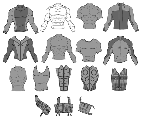
I've been working on the first batch of "Tops" for the Warrior Mini. Let me know what you think, other ones you want to see, etc. etc. Note that "camo" will be one of the "patterns" you can apply to anything. That won't be totally satisfactory, as you won't be able to color the camo pattern itself, but hopefully it'll work out. If not I'll add some variations of these that have integrated camo with color areas.

tops-sample1.png

Multiple Mini headgears

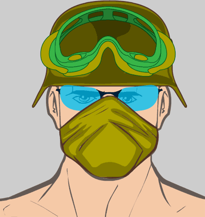
I wanted to show briefly the kind of thing you'll be able to do with multiple items in the same slot in the upcoming Warrior Mini (and eventually HM3):

multiple-headgears.png

What you see are four separate Headgear items stacked and moved on top of each other. The tank-goggles on the helmet are separate from the WWII helmet are separate from the cool modern shades are separate from the mouth mask. I think this is going to make some really awesome effects possible. I was up late last night thinking of all the possibilities once you bring various Insignia into the mix, too -- imagine building your own custom logo from basic shapes layered and sized, with pre-drawn icons to go with them. Or you could take a simple triangle logo shape and mask it to the helmet, to get a chevron effect on the headgear.

The more items I add to this thing in more slots the more excited I get to really explore the possibilities.

Mini headgear preview

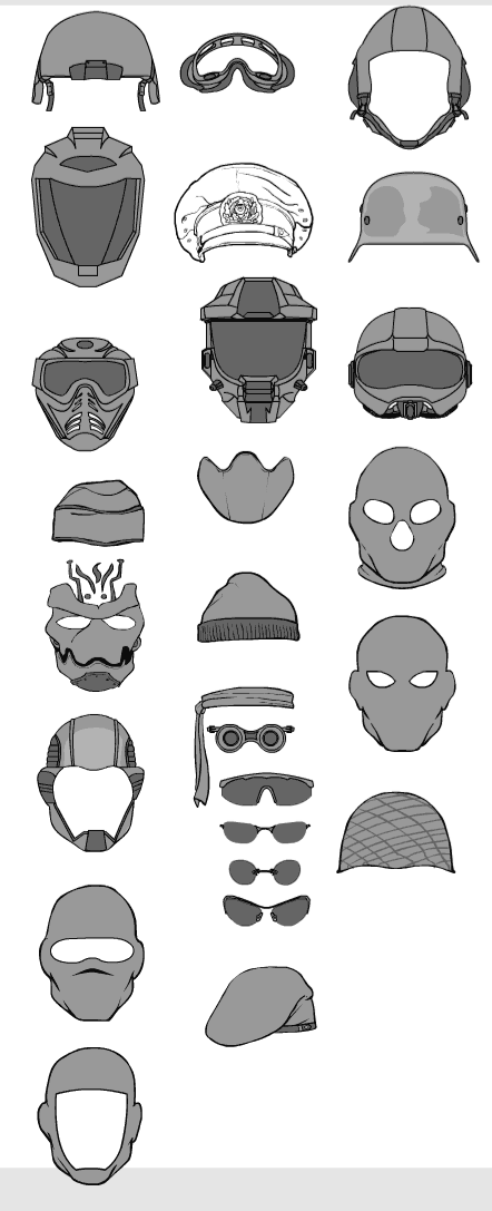
Today I finished putting all of the hand-held items in (23 if you're keeping track at home), along with a couple of new hands (a front view of a clenched fist for holding staffs and such and one other one I can't recall). Once that was done I moved on to Headgear. I'm doing these by drawing them all in one big file before converting them into program items, which makes it easier to produce previews of the items. Like this:

headgear-preview1.png

Let me know what you like, what you don't, and what's missing. One thing I'm looking forward to doing is combining these, so you could have the SWAT type mask with an army helmet on top, and cool sunglasses to finish it off. Should be fun.

Mini screen grab

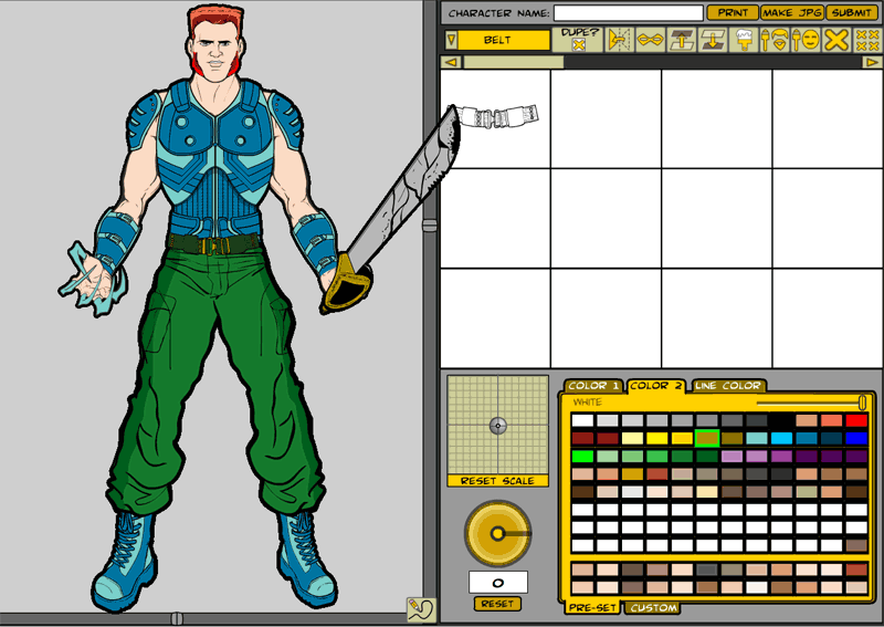
I took a moment during the coding and drawing and football watching (and fantasy losing) today to take a screen shot of the new HM Warrior Mini:

In the character design area, you can see one of the new sets of hands. I've also relayered the pants so they cover the boot tops, as someone pointed out in comments that the last version of this didn't look right. I've added a new feature, launched with the little pencil icon at the bottom right corner of the character window, that outlines the figure and all the items in the image with black. I think it helps the illustration look more cohesive and really "pops".

The control buttons in order are:

  1. Dupe: By default this is turned off, and the program works just like HM2.x -- click on a "RightHand" item, for instance, and the old one gets removed, replaced with the new. Check the box instead and you can add as many of each sort of item as you like. So in the example, the previous hand remains and is joined by a second, third, fourth, etc.
  2. Mirror: Flips the current item left-to-right and right-to-left, like you were looking at it in a mirror.
  3. Mask: Clicking this button changes the cursor into a domino mask (get it?!). Clicking on any item in the character build window will set it as the current item's mask. So for instance, if you have the LeftItem "Colt 45" set as active, click the Mask button, and then click on the LeftHand, the hand will mask out the handle of the gun where the fingers overlap. This will also let you do things like mask out the insignia with the body, so only the part of an extra-large insignia that coincides with the figure will show, like the lightning bolts in a previous post.
  4. Layer Up: Pretty self-explanatory.
  5. Layer Down: Ditto.
  6. Paint: Click this button and the cursor changes into a paintbrush. Click on any item in the character design window to apply the color selections of the current item. So let's say you paint the chest piece darker and lighter blue, as I did in the sample. I liked it and wanted to carry that color scheme to the other clothing elements, so I clicked Paint, then clicked on each glove, each boot, and the shoulder pads to quickly make them all match.
  7. Color All Hair: Applies the current item's color scheme to all Hair and FacialHair items at once.
  8. Color All Skin: Applies the current item's color scheme to all Head, Body, RightHand, and LeftHand items at once.
  9. Clear: The cursor turns into an "x" and clicking on any item in the character design window will remove it from the figure.
  10. Clear All: Removes all items and colors from the design window.

Lots of items and a few new features yet to come, but this is the progress to date.

The joys of bugs

I've been going crazy all morning, trying to figure out why two of the hands I drew don't properly mask out the items you put in them. Basically what masking means is, I can define an area in one item (the hands) that blocks out part of another item (like guns), so it looks like the hand is actually gripping the gun instead of just being layered on top of it.

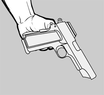
That's a bit confusing, so I'll show you what I mean. Here are the two items unmasked:

handgun-unmasked.png

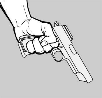
And here they are masked:

handgun-masked.png

You can see the difference -- in the second one, even though the gun is the same illustration as the gun in the first one, the handle gets blocked out by the fingers curling around. This is great because it lets me draw the entire hand-held item (i.e. the gun grip) and still use it in any kind of hand.

But this morning there were two hands that just refused to mask properly. No matter what I did, the proper parts of the gun type items didn't get blocked, and I couldn't figure out why. I tried recreating the mask object, I tried redrawing it, I tried renaming things, I tried deleting and starting over, I tried comparing the non-working ones to the working ones, and nothing made any damn sense at all.

I assume I am not the only programming type person to run into roadblocks like this, where nothing works and you don't know why. I am probably more prone to it than most because I am, frankly, a hack when it comes to Flash (meaning I didn't go through any formal training, I'm entirely self-taught). I keep running into holes in my education, and I never know if it's something wrong with me or the program, or both.

This time, it turned out to be the program, and in an incredibly stupid and irritating way.

It turns out when you're making a mask in Flash, which way you draw the lines matters. If you draw the mask shape clockwise, it all works fine. If you draw it counter-clockwise, though, it won't work.

How freaking jacked-up is that?! I can't imagine the Pope telling Michaelangelo "I like the parts of the Sistene Chapel ceiling you did with the brush strokes going left, but not the strokes going right. Change them all to match."

I mean, I know in Physics there are left-handed and right-handed particles, but this is nuts.

Luckily a Google search turned up a page that held the solution in the comments, for which I am profoundly thankful. This ruined my whole morning and part of last night; it's a really stupid bug, and I hate it, but at least now I know how to work around it. I never would've guessed the solution in a million years, though -- thank goodness for Google!
Warrior mini, hands

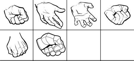
Here's a first look at the hands I drew today for the HM Warrior Mini:

hands-preview.png

If you have any positions you think would work better, or if there are different sorts of hands you'd like, let me know in comments.

Melee weapons

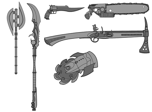
Some of these are combination melee and ranged weapons, but mostly they're for hand-to-hand stuff. Hope you like 'em.

meleeweapons1.png