Category Archives: Previews

Holy Horrific Backplanes, Batman!

I've now added a "Backplanes" slot to the HeroMachine Horror Mini Beta, available here. It includes the holstered shotgun, bat wings, man-bat wings, mechanical wings, extra arm, and a few other items from previous versions.

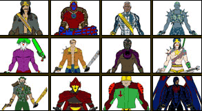
Warrior gallery

gallery.png

UGO has put up a gallery featuring some of the contest entries they've received so far. I don't know how they choose which ones go up, nor do I have access to the library of all entries, so I don't have any particular insight to offer on why yours isn't up there. I just thought they were neat and that you might like to get a look at some of the competition.

This is in reference to the Modern Warrior Contest being put on by UGO where the best character design gets to star in a new online video game, in case you missed it.

Horror Edition Beta

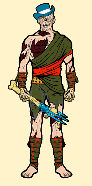
I've just put up the HeroMachine "Horror Edition" beta up, which you can find here. Let me know what you think of it, features you'd like to see, things that aren't working, etc. Here's a sample character I made up while checking things out, sort of a "Zombie out on the town" sort of thing.

zombie.png

I took a lot of the recommendations people made in the last post about things like big chunks of missing skin (which you can see in the sample above), eye sockets missing eyeballs, separate skull pieces in the Head slot, and much more. It's already over the 1MB mark, so I don't know how much more I can comfortably add to it, but by all means holler if there's something you really wanted but don't see.

Horror mini update

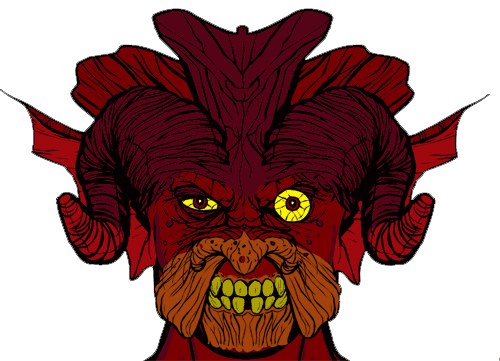
I've got all 52 Head items in and the 12 hand-held items, so I took a moment to whip up a scary-looking guy in the upcoming Horror Mini.

devilguy2.png

That's an assemblage of something like eight different "Head" elements, some (like the eyes, horns, and ears) duplicated and flipped. I like the effect of having one huge eyeball hidden behind the ball-less socket of an eye item, while the other giant eyeball has been moved in front of it to look like it's bulging out. Good times.

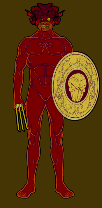
Here he is from a distance:

devilguy1.png

He's kinda nekkid on account of I don't have the clothing items in yet, but you get the idea. I like the effect of the two different interior colors combined with the red line color, all outlined in black with the "outline" feature.

The deadline on this is extremely tight, so I don't know if you'll have a chance to play with it in beta before it launches, but I hope you will for at least a day or two.

Warrior update

I'm not able to post it, but I have taken your suggestions to heart and made a change to the Warrior Mini code base (which will also work for the Horror Mini and HM3). The "Dupe" setting is now slot-specific instead of being global. In other words, you can have "Body" and "LeftHand" set to Dupe, "LeftItem" and "Belt" set to No Dupe, and those settings will stay as you switch around to the different slots.

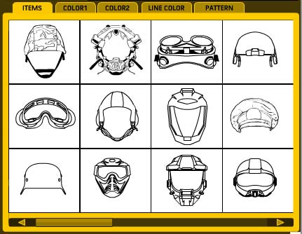
I also updated the code for the Preview section, so the previous button actually goes back one screen instead of going to the Next screen. I've got a slider button in there too that changes size and position based on the number of screens in that slot's Previews so you have a better idea of which set of items you're considering:

previewsupdate.jpg

Not sure if those updates will make it to the launch version, though I certainly hope they do. I kind of missed the "final code deadline", but if we're lucky UGO will slip them in anyway.

The horror, the horror!

"So Jeff," I hear you asking out there in Internetland, "just what the heck are you doing with your time, since clearly you are not bringing teh funnah on such a regular basis the last two weeks and the Warrior Mini is pretty much done?" To which I reply, "Why am I hearing voices in my head again, did I not take my lithium?"

Seriously, joking about mental illness is not funny, I regret that last sentence and refer you to my many other substantive, caring, mature posts dealing with such weighty matters as cabbages, thinly veiled penis jokes, and vaguely homoerotic spandex fetishes, not to mention the thousands of words I have penned regarding the pressing scatological issues of our time.

To answer your impertinent and personal questions, however, the fact is that I have been spending night and day for the last two weeks drawing skulls, bones, horns, pulsating skinless muscles, spike-clad leather pants, and much more, all in service to a new client-sponsored top secret HeroMachine Mini I like to call ... "Mini Horror!"

Hmm, that doesn't spawn the sort of bone-chilling dread I'd hoped. I instead have flashes of Mini-Me in latex cracking a whip at me, which results in giggles. Not at al the effect I was going for. I think instead I'll settle on "HeroMachine Horror Edition" instead, at least it sounds somewhat professional.

I'll post some sample images below the fold, and if you have any particularly gruesome or morbidly fantastic items you've always wanted to see in a HeroMachine version, speak now or forever hold your severed head. Or whatever.

Continue reading

Warrior Mini Beta 2

I've put up a second version of the beta, with a major layout changes and 11 new Body parts for a bit of pose-customization. Let me know your thoughts in the comments to this post; I'm headed out of town in a bit but will be back on Sunday."> another iteration of the Warrior Mini. The two big changes are, first, a new layout to accomodate a 300x250 ad. I fought this, but it's a client demand and there's not much I can do about it. I tried to put the ad at the lower right, so the workflow wouldn't be as disturbed, but was rebuffed. C'est la vie.

The second is the addition of eleven new Body items, including arms, legs, feet, chest muscles, etc. so you can hopefully repose the figure a bit. It's kind of clunky, but it definitely expands the range of possibilities significantly. Let me know what you think. I hate dumping this on you and then leaving town for a day, but at least if you hate it you still have the old one to tinker with 🙂

The warrior cometh …

I'm finally releasing the early Beta of the HeroMachine Warrior Mini for you all to play around with. You can find the page here; I hope you'll let me know what you think of it, preferably in the comments to this post, but the site's Contact Us form and my email are also fine.

It's going to be buggy, so don't be shy about letting me know what you find broken or what you'd like to see work better. Let me know if something is confusing, or doesn't work how you'd expect it to, or if something strikes you as counter-intuitive, or pretty much anything else you think about it.

Hope you all like it!

A Tale of Two Legs

Time passes so quickly that it hardly seems to pass at all until, every once in a while, you see or hear or do something that brings you up short and makes you take stock, realizing with something of a shock that you are not, in fact, the same person you were ten years, or five years, or even three months ago. These tire strips on the road of life can be good, horrible, or anywhere in between, but they all have the same stopping power to break the chain of continuity from moment to moment to moment that ties us in our current mental state as if it were the only one that ever could, or ever has, existed.

All of which is a long and flowery way around of saying "Holy crap, I was drawing some real shit two years ago, and I'm much better now. Has it been that freaking long?!"

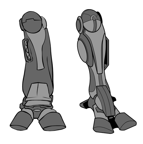
Specific case in point, these two "Boots", one from the Expansion Pack and the other one I just finished for the Warrior Mini:

twolegs.png

Jiminy Christmas, that one on the left looks like it got partially melted in a laser firefight. I mean, come on, let's be honest -- it's crap. And yet at the time I thought it was good. Which makes me wonder, is the one on the right actually crap and I am kidding myself into thinking it's good?

Luckily deadlines exist so we creative types can't keep plunging knives into our own hearts, never actually completing anything. I hate to think how often I have sent out work that was just "good enough, it needs to be finished". On the one hand, I hate that I sent out something I knew wasn't as good as it could have been. On the other hand, it got done.

I have to say, though, I've learned a lot over the last two or so years of doing character illustrations for the Caption Contest and, I think, finally getting a good handle on how to draw with the digital pen. My work's getting much, much tighter and more solid looking, which I am so happy about.

Anyway, back to work, I am still cranking to get the Mini ready for beta tomorrow. And this time, when it comes to actually launching it, it will be the best I can possibly make it. Which will make me happy until the next time my life is brought to a screeching halt by looking at the boot on the right and thinking "That sucks!"

Warrior Mini sample character

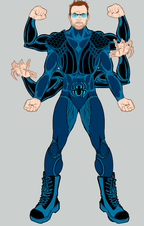
In the last two days I've made a ton of progress on adding more items to the upcoming Warrior Mini, including the Backplane, FacialHair, Shoulders, and Legwear slots. Here's a quick character I whipped up just to try out some of the new Backplane items:

samplechar2.png

Things to note:

  • The Backplane slot has a muscle-posed arm with no hand on it, which seems weird at first glance. I added it to the stage four times, flipping and rotating it, to get the extra limbs on this guy. I matched their color to the basic uniform to make it all look the same using the new Paintbrush tool. I added extra hands in the same way, rotating and moving them to fit on the ends of the arms. Doing it this way instead of how it is in the HM2 Expansion Pack lets you fit different hands on the arms for cooler effects. And, the hands themselves still have masks built into them, so you can stick extra weapons in them and they fit.
  • The belt buckle is actually an Insignia, scaled down and moved lower.
  • The robotic/mech Legwear item is Capri-pant length, ending at the calf. They weren't quite long enough, and skin showed over the top of the Boots. So I just scaled the boots up until they matched, which you couldn't do in previous HeroMachine versions.
  • The vest Top turned out neat, using a light blue as the Line Color so the interior black showed through.
  • The stubble beard's color area was overlapping the line of the chin, making it look blobby and weird. So I Masked the stubble with the Head, and the lines now overwrite the color area of the stubble. That'll make it possible for the stubble to fit on any of the Heads, no matter the shape of the jaw or chin.
  • I was careful with the sunglasses (and the Headgear that has a glass front) to make the glass parts only affected by transparency. So in this case, you get the lenses see-through, but not the (admittedly very small) frames. This is important on helmets, because you might want to see through the colored glass but not the similarly-colored bits of the head cover part.
  • I am having way more fun building this than ought to be legal.

Hope you like it! I am cranking along on this; I hope to have a testable version up this weekend, so be sure to check back for any announcement.