Category Archives: Previews

HM3: Cape fronts

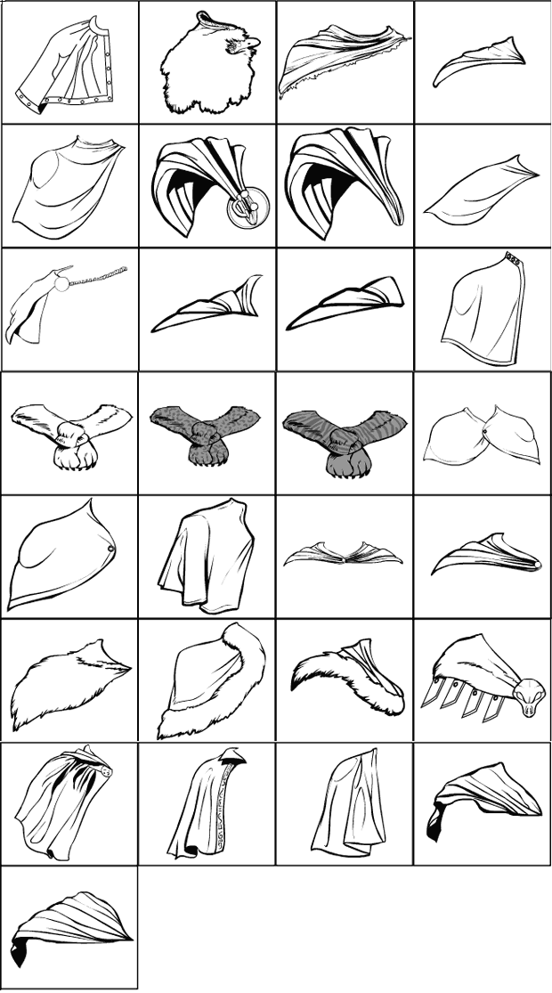
I am still plowing through HM2 sets that need to be converted to HeroMachine 3. I've just posted the new version of the old "Coats-CapeFronts" set, which can now be found in "ShoulderRight-Capes". Here they are:
Holler in the comments if you either see something wrong, or if there are specific items you'd like to see added. Requests with links to an image of what you want are the most helpful, but please make it specific -- if I want to do a Google Image Search for "Capes" or "Cloaks" so I can get twelve dozen pictures I will do so. Limit yourself to no more than three requests, otherwise I'm going to mentally mark it as "spam" and move on.

That sounds harsh. I don't mean it that way, it's just that sometimes too much is worse than nothing at all. So only request things you really want, I think I have a pretty solid set already and am not looking for general reference, just specific items likely to be of interest to lots of different people to flesh it out.

Nature Insignia update

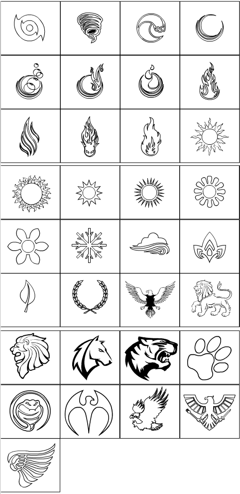
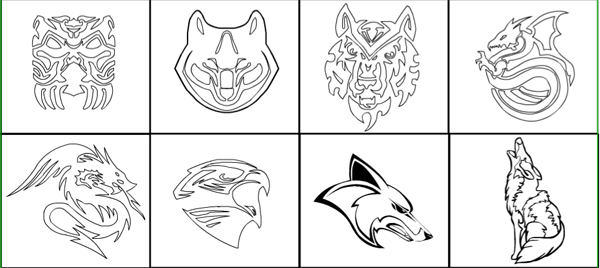
With help from the nice commenters on the last post, I've added the following items to Insignia-Nature for HeroMachine 3. Thanks guys!

HM3: It's only natural

I'm happy to announce that the "Insignia-Nature" set of items for HeroMachine 3 is now live. In addition to almost three pages of nature-themed items from the Insignia-Standard set you've already seen, I've added another three pages of all-new entries as well:

Hope you like 'em! If you think I missed some items that ought to be there, or if you see a glitch of some sort, by all means let me know in the comments.

Lots of new HM3 items

With profound thanks to Mark Shute, I'm happy to announce that his ItemRight-Rifles set is now live in HeroMachine 3 and ready for outfitting your various dinosaur marines. Woot! More to come in this set, but we didn't want to limit you unduly with the contest this week. Please do not make requests for Rifles yet, Mark wants a separate thread for that so he can keep track of it, once he's all done with the ones he's already got plans for.

Also, I've been working on prizes for past contests and have uploaded several, including the following:

Continue reading

Mechs

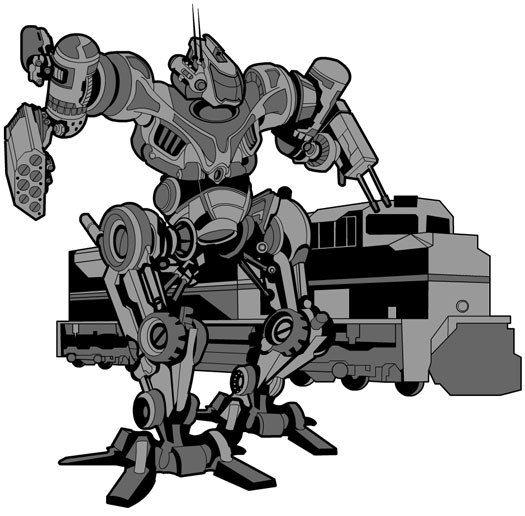
As I mentioned last week, today (a couple of days late) I am starting work on a special HeroMachine Edition dealing with Mechs for an upcoming product that must remain confidential until release. Since I know almost nothing about mechs, I thought I would turn to you and ask for what you would want in such a version to help you build the ultimate big robot vehicle fighting machine.

I'm going to be using some of the items I build for the last, similar attempt that got canceled and which you can find in HeroMachine 3 now -- the robot heads and arms and legs and such. But I need a lot more. If you have any ideas, I'd love to hear them in the comments.

I will probably be using a 3/4 view figure like in the old one, so the mechs will be facing off to one side. That makes placement in HM3 a bit awkward since that's a head-on view but such is life.

I've also been doing some thinking about what slots should be available, and so far this is what I have:

  1. Background
  2. Weapon
  3. Driver
  4. Torso
  5. Head
  6. Hips
  7. Right Shoulder
  8. Left Shoulder
  9. Right Arm
  10. Left Arm
  11. Right Leg
  12. Left Leg
  13. Miscellaneous

I was tempted to put something like Insignia in, but these guys don't usually have chest emblems, do they?

Anything you can tell me that you think I should know about building good mechs would be much appreciated.

HM3: More Miscellaneous items

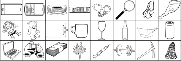
I've just posted 30 new items into the "ItemRight-Miscellaneous" set, bringing the total to 84. Here's a quick peek at most of them:

Not shown are a spray paint can, a Bible, a nasty-looking grimoire, a blank furled flag, a blank open flag, and a round bomb with fuse.

Hope you like 'em! If there's something egregious you see wrong or missing, let me know.

Two fairly large non-HM3 projects have come up with UGO, so it may be two weeks or so before I work on new items. I have someone else working on them in the meantime, though, and if he wants I may post a thread for requests.

HM3: Miscellaneous

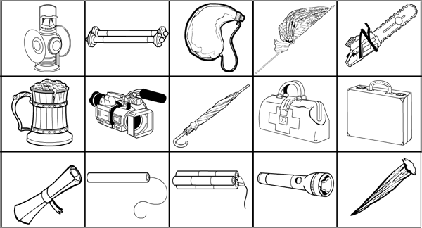
I've just updated the HeroMachine 3 Alpha with the first set of ItemRight-Miscellaneous items, comprising all (I think) of the Expansion and default HM2.5 Miscellaneous items. Most of them have been redrawn, a few are ports from existing sets (cigarette, cigar, yield sign, etc.), but all are now available for your character creation enjoyment. Here are a few of the new options:

Now that I have converted all of the existing items, I'll start working on your suggestions in that last thread. Thanks for those by the way, there are some really good ones! The set currently has 54 items in it, and I'd anticipate adding another 30 or so. I'll start working on those this afternoon.

Let me know any problems you find with these and I'll get on 'em. I know there are some patterning issues where the pattern fills odd spaces, but I haven't been able to fix it yet.

HM3: New UI ideas

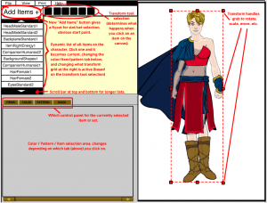
I've been working for the last couple of weeks on rethinking the layout and user interface for HeroMachine 3. Here's a first pass at translating these thoughts into a design (click for a larger version):

newui

Some of these ideas are from Mark Shute's excellent usability study from a few months back, while some are new on my part. The main problems the current rough layout pose to my mind are:

  • No clear starting point. You're just supposed to know that you start by clicking on the slot selection drop-down, in the middle of the far-right side of the app. In Western writing, obviously, you go from the left to the right, top to bottom, so this placement is way off where you would expect something important to go. To address this, I've consolidated both the slot and set drop-down boxes into a "Add New Item" button in the top left portion of the screen. Clicking on this would bring up first the slot-selection menu (Head, Headgear, Body, ItemRight, etc), then the set-selection menu (Standard, Blades, etc.). Once you've chosen a set, you get the grid of black and white items at the bottom so you can pick a specific item.
  • Difficulty knowing which item you're currently working on, and knowing what all is on your character. Just below the "Add New Item" button is a scrolling list of all the items currently on the canvas that make up your character. Clicking on any one of these items will make that item current, bringing up its colors and transformations and other item-specific information. Ideally you'd be able to relayer items by dragging them up and down this list. Viewing the character in this list fashion should make it very easy to know exactly what you are dealing with at any given time. This was Mark's suggestion and I think it's brilliant.
  • Not obvious that you can click on items in the canvas area directly to select them. I noticed this particularly when sitting down with younger kids to design characters, and when talking with the UGO staff on the very first iteration of this technology (I think it was the Zombie mini, actually). I happened to mention I was clicking on an item and they were all like "You can do that?" I've addressed this by placing any tool that can directly affect the character, from basic selection to scaling and rotating and moving, to the bar just to the right of the "Add New Item" button. Depending on which of these is currently selected, making an item current (or adding a new one to the canvas) will result in a selection box appearing around it. This will immediately reinforce which item is current. If the Rotate tool is active, grabbing any one of the eight selection handles will allow you to rotate the item. If scaling is active, dragging a handle will scale it. And so on.
  • Too many buttons. Having all those buttons in the current layout between the canvas area and the ad was a bit confusing. There are an awful lot of them, some of which are for universal controls (like printing or help), while others were item-specific (coloring hair and skin). At Mark's suggestion, separating these functions out into more specific areas should help ease confusion. For instance, making just one "Color" tab instead of three, and moving the color-centered controls (like the paint brush and the Color All Skin/Hair) there would make more sense.

There's a lot more "under the hood work" to be addressed as well, naturally, but before I start coding I want to make sure I have the layout and user interface nailed, or as close as I can get, anyway.

I'm eager to hear your thoughts on all this, please let me know what you think, if this promises to be better or worse, obvious pitfalls you see, etc. Thanks!

HM3: Framed, I tells ya!

I added the frame from that "elf lady" sketch of the day to the Background-Shapes set in HeroMachine 3. So ha, I DO do something, some days!

I also hid tomorrow's SOD in the Companions-Standard set somewhere, but if you don't want a spoiler don't go hunting.

HM3: Monstrous addition

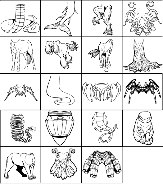
I've just added a "BodyMonster" set to the HeroMachine 3 Alpha. These are actually just replacements for the legs, as you can see:

monsters

Holler if there's something you had hoped for but don't see. This does include the set of updated Monster bits from HM2, with the centaur(s), tree trunk, spider, faun, etc. I also included some requests from the Aliens thread with the ghost bottom, twister bottom, etc. I also cheated a bit and stole some elements from Insignia and Companions to make more half-human, half-animal hybrids possible beyond just centaurs.

Hope you like 'em.