Category Archives: Previews

FaceMaker update with video!

I now officially have an unsavory love for my new Macintosh, as I discovered in the process of trying to create the following screencast of the early beta FaceMaker applet. When I tried to do this on my PC, it took a good day or so of downloading and reading and tinkering, and I never did end up with a decent movie. With the Mac, it took about half an hour, start to finish.

The end result is this clip, showing how the FaceMaker is coming along:

Continue reading

The Facemaker cometh

I'm about 70% done rewriting the HeroMachine code from the ground up for the series of "Minis" I've talked about before. These are intended to be rapid-development applications like the Rock Star Edition or the Real Life Edition, which won't have the sheer volume of items in the full 2.5 but instead will focus on more of a "niche" type of area. I needed to have actual items to test the code on, so I had to choose one of the "Mini" varieties we've discussed to get started with. I settled on the Face Maker, because it seemed like it would benefit the most from the new features I wanted to include like line coloring, scaling, moving, etc. Keep in mind, the whole idea here is that once I get the code base finished, filling new versions with new and different items should be a breeze. I'm hoping to put out at least one a month when ready, maybe two if I can really get it down to a science.

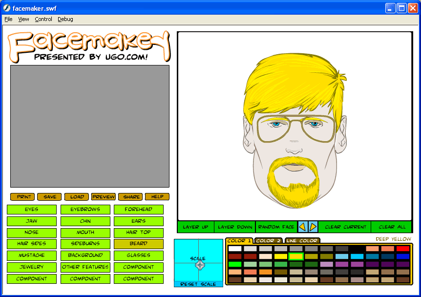
Anyway, even though I only have two items in each slot so far, I think it's showing promise. Here's a screen capture of what I've done to date. I should be finished up with the basic code early next week, at which point I'll begin really pumping out the items. Note that the colors and the look of the interface is just a shell, to be "prettied up" once everything's working.

Facemaker screen grab
(Click for a larger version.)

The big-ticket functionality items still to address is the layering, the printing, and the saving/loading stuff. All of that's pretty close to the current code so I don't think they'll be very hard to do. I was most worried about the scaling and moving the items around, and that's worked out pretty well.

Note that the beard and the mustache are actually two separate layers. I was able to shove them together to make it look like an all-in-one Van Dyke kind of thing. That's one of the early, and surprising, benefits to movable item slots -- it's very easy to tweak things around to make new combinations that would not have been possible otherwise.

I've also been very surprised at how much of a difference being able to change the line color makes. I always thought that was kind of a cheesy request, but once again the user community knows far better than I do.

Once all the buttons have at least minimal functionality, I'll probably post a very early beta for you all to play with and critique.

Mini colors

I'm continuing to work on the basic functionality and code for the series of HeroMachine Minis we'd like to do. One of the neat features -- not Earth-shattering or anything, just a fun little addition -- I've installed is a color guide:

Color palette

When you mouse over a color, the line of text at the upper right tells you what that color is named. It "sticks" as well, always showing you what the currently selected color is. This should be helpful for color-blind folks using the program, but I think it'll still be a nice little addition for everyone who's wondered "What the heck color is that, anyway?"

Most of the names are from Photoshop, so don't blame me if they seem silly!

On the coding side, the applet is turning out to be much easier to program and much tighter. It will hopefully be much easier to "skin" and change, allowing for faster updates and additions down the line. That's the hope, anyway. I've learned a lot about writing code in the past five years that I can implement in the new version to make it all work faster, better, and more easily. The next big challenge is the scaling control.

HeroMachine Mini Layout

If you've ever wished you could influence the design of an actual Internet application, now's your chance! I am designing the next generation of HeroMachine Mini-applets and I want to hear from you about what you do and don't want them to be like. The goal is to create one basic frame that can be used for any of these smaller applets by changing just a few pieces of data (and of course drawing all new items).

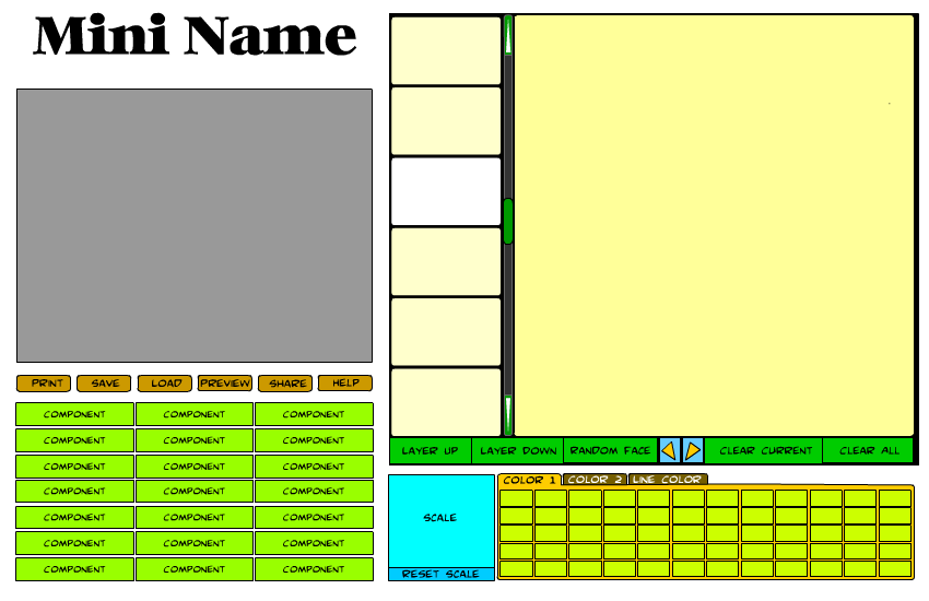
Here's the latest version of the wireframe (a basic layout without any design elements applied) I am considering for future "HeroMachine Minis" like a Face Maker, Alien Creature Creator, or what have you:

The gray area would be for a 325x250 ad. Below that are general function buttons that affect the overall applet. The only "new" one is the "preview" button, which will remove everything except the current creation, shown full-screen. I might even include some zooming type of feature on that screen. Below that in light green are the various item category buttons (for instance "Headgear", "Undershirt", and so on).

The right side of the applet is for actually creating your image. The row of six small rectangles is for item previews, like you have in HeroMachine 2.5, so you can see a set of items before having to pick one. The currently selected item would be highlighted in white. You can scroll up or down an entire set of six items by clicking either below or above the green scroll button, or more than one set by dragging the scroll button itself. The green arrows at the top and bottom of the scroll bar allow you to scroll the preview boxes up or down one box at a time. Clicking on a preview box will select that item and put it on the dark yellow canvas area, applying the currently selected colors to it.

Below the preview boxes and the canvas area is a row of buttons that let you affect the current item or the entire image. Items can be moved up or down in layers, like in the current HeroMachine 2.5 application. You can clear the current item, clear all items, or clear just the currently selected item. The blue and yellow arrow buttons let you select the next or previous item in the set, acting like the left and right arrows that were previously integrated into the component selection boxes.

Below that row of buttons is the scaling control. This will let you stretch the currently selected item sidways or up and down. You can move the current item around on the canvas by clicking and dragging it.

Finally, to the right of the scaling control is the color selection area. The number of color boxes here is flexible. You can potentially set two different color areas as well as the line color. Selecting a color area tab will set that as the active region.

That pretty much covers it. I'd be delighted to hear any suggestions or concerns you might have about this proposed interface -- features to include that aren't there, features currently there you think would be useless, overall layout, anything goes.

Face Maker

With the HeroMachine 2.5 Expansion nearing completion, I am starting to think about the next big project I should work on. After a bit of back and forth, the one that has me most excited is the idea of a Face Maker, a HeroMachine-powered applet that would focus on the face and head. One site that does something similar is "Ultimate Flash Face", to give you an idea of what I am talking about here. I've got a rough draft wire frame model and some other thoughts after the jump.

Continue reading

Multiple Components, trenchcoat and suit

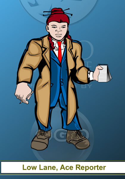
I had a request in the last thread to show if it's possible with the new components to have a suit and trench coat combination, so here you go:

Low Lane, Ace Reporter

Multiple items in multiple components

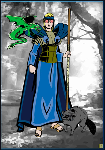
I just finished duplicating some of the more common components into other slots, and created this preview character showing three different Coat items (one in Coats, one in Overshirt, and one in Undershirt) and two Companions (one in the Back slot and one in Tail). Should be fun!

Preview

What next?

One of the reasons I wanted to start this blog was so that all of you out there would have the chance to be involved in an ongoing development project by providing insight and input throughout. Over the last few months there hasn't been a lot of opportunity for that, as the Expansion was in the "grind the items out to the additional templates" mode.

But now that the 2.5 expansion is finally getting to the wrapping-up stage, it's time to start discussing what you would like to see next out of the HeroMachine team. I've been talking with the UGO team, and here are the ideas we've put forth as big projects. I'd like to know what you all think about them, or if there are other things you'd like to see us work on.

Continue reading

Expansion Guns

In the next couple of weeks I'll be releasing some additional Expansion items, including a nice set of firearms by the invaluable Mark Shute. Since people seem to like guns and other assorted firearms, I thought I'd provide a preview of what they look like (click the image for a much larger version):

Expansion Firearms Preview

One of the things Mark does much better than I is creating drawings of mechanical items with clean, crisp lines that convey a sense of solidity. My Flash drawings tend to look like they were drawn with a brush, while Mark's are more like those rendered with a good set of technical pens. It works much better for these kinds of things, and I have to admit I learn something every time I work with his stuff.

This next expansion to the expansion is going to add several hundred items to the set, thanks to Mark, including some really nice shirts and belts, among many others. You can see the full set of items he's submitted here.

New brick metal skin

The "robot" skin probably takes longer to draw than any other single item in the program, but I think the one for the male Brick has turned out the best of all:

Continue reading