Category Archives: Previews

Mini figure

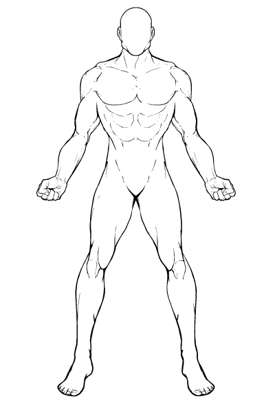
I spent a big chunk of the weekend working on the template for the upcoming HM Mini, and wanted to get your thoughts on it:

figuretemplate2.png

At this point I'm thinking the entire head will be one slot, consisting of the outline of the skull, the jawline, and the chin. Hair, facial hair, and the face would be separate slots as well inside the head slot. This means that when you scale (resize) or move the head, the face and beard will transform right along with it.

The hands also will probably be their own separate slot. That hasn't gotten a lot of traction in HM2.5, but I think partly that's because it was an add-on rather than being a core part of the program from the beginning. I really think having the ability to change out the way they're posed will help make the figures more distinctive.

Flash now lets you dynamically declare one movie clip (which is what the "slots" are) as a mask for another. So what I'll probably do is have one slot for "Hand-held items" with a drop-down box for you to choose another slot to mask it out with or not. That way if there's a cool sword you like, for instance, you could either drag it over the belt to make it look sheathed behind a sash, or you could drag it over to a hand and mask it so it looks like it's being held, or you could drag it over to the back and mask it out with the body so it looks like it's in a back sheath.

Modern Warrior applet

I've just gotten word that the "theme" of the next HeroMachine Mini I talked about earlier will be "Modern Commando". That means lots of camo gear, lots of weapons, lots of cool gun belts, and other ultra-modern gear for all your urban assault needs.

The next HeroMachine applet

A new project for a major UGO client has come up, and while I can't talk about it in any detail, it's going to come along with a contest that's absolutely going to knock your socks off. Seriously, what you stand to win is so cool that I wish I weren't building the applet so I could enter.

This is going to end up as the most HeroMachine 3-like applet yet. I'll be testing almost all of the core ideas that will go into the full version, the only exception being the ability to rotate the underlying body parts. I have to rewrite the base code again, because I want to make it possible for you to add ten different shirt layers if you want, for maximum flexibility. More technical detail after the jump.

Continue reading

Skateboard HM Mini

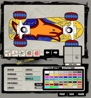
The first "HeroMachine Mini" based on the "FaceMaker" code is now up for your entertainment purposes! skateboarder.jpgThe Tony Hawk Tricked Out Skate Deck lets you build your own skateboard HeroMachine-style, with all the features of the new version available. You can scale items, move them around with your mouse, set your own custom colors, and more. I think it turned out nicely and is pretty fun to play around with, even if you're not much of a skateboarder. Let me know what you think if you check it out!

Comic Book Improv

Would you be interested in a web comic whose heroes, major plot points, villains, settings, and more were controlled in part by you and your votes? My wife's pretty amazing, and she had that idea some months ago and now I want to know what you think about it.

Basically people could design a character look in HeroMachine and submit it. From those entries I'd pick the top ten or whatever for everyone to vote on. Whichever look got the most votes would be chosen as the "star" of the web comic, and we'd then have a contest for what he or she (or it, I suppose) would be named, powers, background, etc. Once all that was voted on, we'd have submissions and votes for the general topic of the first issue, for villains, supporting characters, etc.

Once it was set up, the idea would be that pretty much everything in it would be decided by voters, introducing a random quality that (obviously, given the rest of this blog!) tickles my fancy. I'd actually write and draw it, of course, but the elements would be from reader submissions. Sort of "Comic Book Improv".

If we get bored with the first character, more could be introduced. We might even have a "shared world" sort of thing going on, where all the characters would operate in the same setting but would have separate careers and adventures for the most part.

I see it as being along the lines of "Invincible", if any of you read that, where a new mind-blowingly-cool character is introduced seemingly in every other panel, sometimes never to be heard from again. I see it coming out every week once it gets going, each installment incorporating whatever was voted on before.

Anyway, it's been kicking around in my head since my wife suggested it, but now I'm starting to get a bit more serious about it and wanted to throw the doors open to discussion of the basic idea. Is it something you'd be interested in participating in as a voter or reader? Or does it seem pointless? Well, I mean, of course it seems pointless, we're talking about comics, not ending world hunger, but you know, given that.

FaceMaker update now with Previews!

I've uploaded the latest beta version of the FaceMaker applet to http://www.heromachine.com/ugo/facemaker5.htm if you want to give it a whirl. It now includes thumbnail previews of each item to make it clearer what your choices are. If you get the chance, let me know what you think, positive or negative. This is pretty much done in terms of functionality, once it gets a facelift from the UGO design team it'll be good to go, so get your feedback in now if there's anything in particular you're looking for that it doesn't offer.

FaceMaker updated again

As just one example of how you can directly impact a real piece of software, I have updated the FaceMaker beta with a suggestion from YahooGroups member Peter Boughton. He pointed me to a grid of good skin tone colors and suggested I create a feature where you can apply the current item's color to anything with skin. I cranked it out this morning and it's now up at http://www.heromachine.com/ugo/facemaker5.htm.

All of the HeroMachine-based apps have improved by orders of magnitude thanks to people like Peter, willing to take the time to share their points of view and making great suggestions. Many thanks to him and to the hundreds of people over the years who have directly contributed to these applets.

I look forward to even more and better suggestions going forward, so if the thought of helping to contribute to a real piece of software appeals to you, get in there and start thinking!

FaceMaker new beta

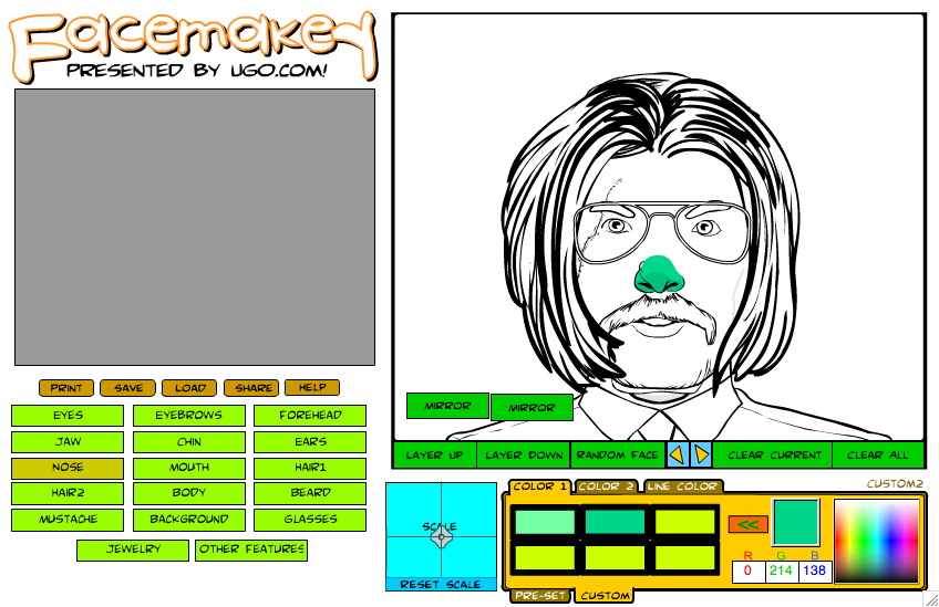
I have made a lot of big changes to the FaceMaker beta applet and am curious to get your reaction to it. The latest update looks like this:

facemaker5.jpg

You can find this new version here, and the previous one for comparison's sake here. Changes in this update include:

  1. Moved the character canvas area with colors and buttons to the left side of the screen, and the ad over to the right. Since most people expect the most important part of the page to be at the upper left, I think this works a bit better.
  2. Massive update of items -- every item slot now has what I think to be a reasonably solid, complete set of options from which to choose.
  3. Changed the item slot selection boxes from being separated out and visible at all times to being in a collapsible selection box like in HeroMachine 2. I probably need to add a little arrow in that box to make it obvious what it's for. Basically though you just click on the item slot name and a pop-up appears with all the other options.
  4. Made the action buttons icons instead of text-based.
  5. Added "gender" buttons, which basically just skip the beard and mustache if you're randomizing the face.
  6. Created space for preview boxes which I am reluctantly going to have to add by hand. Sigh. They'll go on the bottom right, below where the "Share" and "Save" buttons currently sit.
  7. Fixed the bug where the scaling button would keep moving even after you moused out of the box.
  8. The scaling button now moves to the appropriate spot on the grid to reflect how the currently selected item is set when changing slots.
  9. You no longer get "blank" items for essential slots like Forehead, Jaw, Nose, etc. Before you'd get some really bizarre looking results with Random Face, with the background showing through and such. You can still make those slots blank manually if you like, of course.

I'm very curious as to how you think the new layout and collapsing the item selection boxes into a pop-out menu works versus the previous method of keeping them out at all times.

Feel free to leave your suggestions, observations, complaints, and/or compliments in the comments below. Or if you're shy, you can email them to me directly either via afdstudios@gmail.com or through this blog's "contact us" page.

Thanks in advance for any thoughts you'd like to share regarding the program thus far!

FaceMaker Preview

For those of you willing to roll the dice on a very early beta program, I'd love to hear what you think of the first pass at the FaceMaker applet I've been working on. Only about half of the item slots have content, but the feature set is complete and I think there's enough "there" there to get a sense of how it's all going to operate. If you get a chance in the next few days, please head over to the temporary home for the beta and give it a twirl:

http://www.heromachine.com/ugo/facemaker4.htm

If your Internet connection is a bit on the slow side, be advised that the applet is about 540KB.

I'm going to be slammed until Monday or Tuesday working on a custom HM-style designer for UGO (last minute deal, huge rush, etc.) so I won't be tinkering with FaceMaker at all, making this the perfect time to gather feedback. Some things to look out for:

* Did the "Save" (i.e. Save as a JPG) feature work for you?
* Does the scaling feature work properly and act as you'd expect?
* Does being able to drag the features around help put together the right image?
* Do you like the ability to save your custom colors while you're working?
* What kind of content is missing that you would want to be there in the final version (either whole new item slot categories or items within a category)?
* Any other thoughts you have about the applet overall, or about specific features, or anything in between.

Let me know what you think, any changes you think should be made to make it better, whether you think it's worthwhile or not, how the interface works for you, concerns or reservations you have, or even (goodness forbid!) things you like about it.

Thanks in advance for any input you want to make!

FaceMaker custom colors

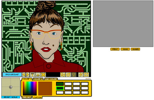
I am happy to announce that just a few minutes ago, I finally figured out how to let you save your own color swatches in the upcoming HeroMachine Minis! As in the current HeroMachine 2.5, you can pick a custom color by scrolling around a color grid, or by typing in the RGB values manually, but for the first time you can now save that custom color onto your own swatch so you can easily use it on other items. Here's a screen capture showing the six customizable color swatches in use:

You can choose to work on either of two color areas like in regular HeroMachine applets, or you can change the line color (which is both all-new and extremely useful). And at any time, no matter which color area you're working on, you can switch to either the pre-set 60 color swatches or you can toggle over to make your own custom ones. Ultimately I'll probably add more than six custom color swatches, but I'm not sure yet of the exact number. I also am having a bit of a problem with the color grid not matching up exactly with what you're mousing over. I didn't actually write that part of the code, it's adapted from free source at FlashKit.com, so fixing it is a bit of a challenge.

Also, although I haven't yet put the buttons in their proper place, you can see a couple of neat (if not terribly useful) features that let you mirror the face horizontally (i.e. flip it left to right) or vertically (i.e. flip it top to bottom). Not exactly killer, must-have stuff, I admit, but fun. I am going to try and see if I can get it working on individual items instead of the entire picture area, which probably would be of more use.

Finally, I am trying to figure out an easy way to do item previews, like in the full HeroMachine 2.5, so you can see a set of thumbnails for a given item slot without having to manually scroll around them. I've seen complaints about the Her-O-Matic application in that regard, so I'm going to try and solve it here. In HM2.5 that's all done by hand, with me copying and pasting the item line art into pre-made buttons, lining them all up, making new screens when needed, and that sort of thing. But that takes a lot of time and isn't very efficient. And without getting technical, if you try to move or resize an item, it ends up resizing all the previews too. Which sucks.

So if I can figure out how to a) make the previews generate themselves automatically in a way that b) doesn't ruin the ability to scale and move the items themselves, I'll do so.

And if I can do that, I'm more than halfway to the full feature set I want on HeroMachine 3. I'd still have to figure out how to rotate groups of items (all the parts of the arm, the whole torso, etc.), and how to load up separate sets of items not included in the base application, but most of the really hard stuff will have been done.

Anyway, if you see anything in the screen capture that prompts a question, by all means fire away in the comments. The program is really starting to come together and I'm super excited to put it out there. I know I've promised previews a couple of times in the past, so I won't do so now (I keep adding more features that delay things, but on the other hand they make it much cooler!). But I am indeed working away on it!