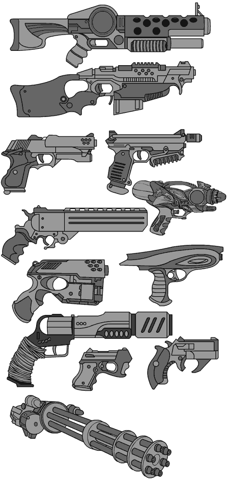
"Hey, nice guns!" she said admiringly.
"Thanks!" I replied, flexing my biceps.
"No, idiot, the guns you spent all day drawing."
So since she didn't really want to look at my guns, I now inflict them on you. Flex flex.
Sponsored Links (which Premium Members will never see):
"Hey, nice guns!" she said admiringly.
"Thanks!" I replied, flexing my biceps.
"No, idiot, the guns you spent all day drawing."
So since she didn't really want to look at my guns, I now inflict them on you. Flex flex.

Comments Off on Guns guns and more guns
Posted in Previews
I've been working on the HM Modren Warrior Mini all day, and have the first five hand-held items ready to roll. Here's a sneak preview:
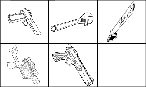
I'm running into some difficulties with masking -- the shoulder stock on the bottom left gun, for instance, looks weird when masked by the hand. Not sure how to fix that yet, or if I can given the way it's all built. But it's a neat looking gun, you have to give me that!
Also, if you look closely you can see I stole the top three items from Caption Contest prizes. Can you tell which?
Comments Off on Warrior Mini guns preview
Posted in Previews
My Portuguese is a bit rusty but thanks to Google Translator, I'm pretty sure the guys who do Her-O-Matic have a new version in the works, previewed here:
And here's another preview of the app:
What do you all think? It's got some really cool features, most of which (I think) are going to be do-able in the HM Warrior Mini, and then in HM3. Particularly the heads and hands and legs and such being swappable. The only big think I can see they have that I don't is the texturizing, but I have a pretty good idea how to do that. Is that something you'd want?
On the other hand, I don't see that in their version you can scale, rotate, or move objects, and I think you're going to find with the Mini that they are key features, which are going to make for some very powerful options.
They also don't have item previews, little versions of each one that you can scroll through. How important is that to you?
Anyway, they're doing a nice job, and I was curious what you thought about it. If there's anything you see that you want HM3 to have, let me know in the comments.
Comments Off on HeroMachine competitor
Posted in Previews, Suggestions & Ideas
I have heard the lamentations of the women (and the commenters) and have revised the one "Top" item I had for the HM Warrior Mini:
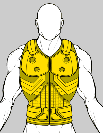
Is this one better?
Comments Off on Revised mutant turtle armor
Posted in Previews
I only have one of each item type drawn, but using most of them gave me the following image from the early HeroMachine Warrior Mini:
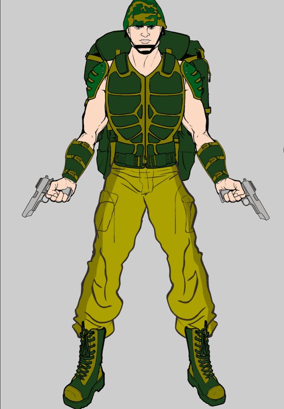
Not super exciting yet, but a promising start. If you have any items you'd like to see included, now's the time -- guns, helmets, combat jackets, you name it. Post a link to an image in the comments and I'll go have a look.
I have to say, at this stage of the FaceMaker development, the thing that most surprised me was what a big change the ability to change the line color.
In the Warrior Mini, the biggest two surprises are how much being able to move and scale items is, along with the utility of masking. Pretty neat, I can't wait to get it to a usable point so you all can tinker with it.
Comments Off on Warrior Mini first figure
Posted in Previews
I had planned to start drawing items for the Warrior Mini first thing this morning, but I got caught up in building the "masking" part of the applet.
And I'm glad I did, because it rocks.
Here's a screen grab of a very simple masking effect. I added two lightning bolt insignias, colored the same and rotated to face each other at an angle. I masked one with the Body to get a Lightning Lad effect. I had to duplicate the Body to serve as a mask for the second lightning bolt insignia, but it came out really neat:
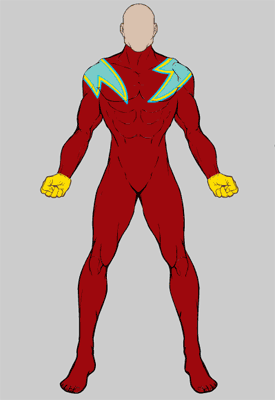
This feature is a little bit complicated, but I think it's going to be totally awesome. You can make all new uniform effects by, for example, choosing an insignia shape like a chevron or circle or square, and masking it with the body shape. That gives you a form-fitting uniform element like (for instance) a big half-circle colored shape on the top half of the figure.
Hopefully by the end of the week I'll have enough items, and the code in good enough shape, for you all to play with. I am very excited by the way this is turning out! This is another one of the key HM3 features that I've been sweating, and now that I know how to do it, it should be (relatively speaking) a piece of cake to implement for that version.
Comments Off on Warrior Mini mask update
Posted in Previews
So I have all these new color swatches to fill in the Warrior Mini, but I don't know what to fill them with. If you have any suggestions, whether it be single colors you'd like or a web site with a palette you'd want to see replicated, please let me know. The current set of colors is below the fold if you're into hexadecimals.
Comments Off on What colors?
Posted in Previews
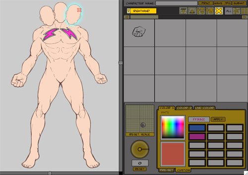
I've been hard at work all week getting the new HM Mini (Modern Warrior) coded, and it's going really well. It's funny, I get the same glow from figuring out how to make something work in Flash as I do when I write a really good post, or complete a particularly nice illustration. I guess the creative buzz is the same no matter what gives rise to it.
Anyway, here's a screen grab of the program so far, with explanation to follow:
Comments Off on Warrior update
Posted in News & Updates, Previews
Which do you like better, the first proposed new HM-mini body template, or this one:
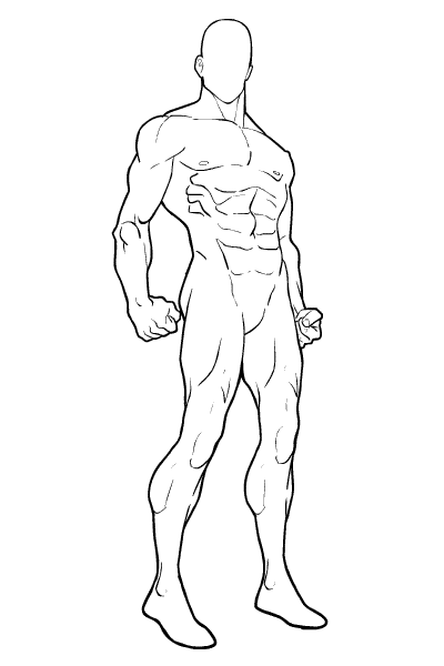
This one has more "attitude", I think. The first is workable, but it looks more like an avatar screen in a game or something, I suspect this one might make for better actual character images. The angle's from just below waist-level, which might be different enough to cause some problems.
I don't know, what do you all think?
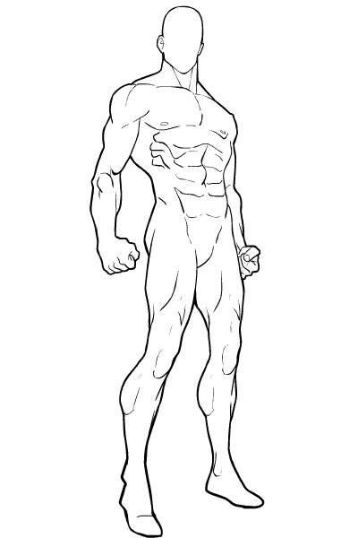
UPDATE: With thanks to commenter TheNate and John, here's an updated version with the right foot pointed in a more solid direction, and the right hand no longer stapled to the buttocks.
Comments Off on Combat mini figure 2
Posted in Previews
Here's a screen grab of the interface I am proposing for the upcoming "Modern Warrior" style HeroMachine Mini:
More explanation after the jump.
Comments Off on Mini wireframe
Posted in News & Updates, Previews