Category Archives: OnomontoPOWia

Galactic vampires go GLOMP?

We all realize that onomontoPOWia is an inexact art at best. Who knows, after all, what sound interdimensional demons from Hell really make when they vomit spells into the Devil's face? Not you, me, or Jackson Guice, that's for sure. You just try to pay attention to other, hopefully similar sounds, translate them into words, and give it your best shot.

Having said that, I'm pretty sure that when a furry gay bondage galactic vampire bites through a cosmic-ray-altered muscle-bound, orange-rock-skinned Thing, it doesn't go "GLOMP":

marvel-4-galacticvampires.jpg

Surely there'd be some sort of K type sound of a crunchy exterior giving way to the soft, gooshy Thing-goo inside, no? But maybe GLOMP is how it sounds when the Thing gets a hickey, I don't know, and the thought that maybe Jim Starlin does know frankly disturbs me.

Just to be on the safe side, I think I'll do my best to avoid both space-going galactic vampires and rock-skinned stud muffins, even if they do have gorgeous baby-blue eyes.

A super-power I'd frankly rather not have. Or smell.

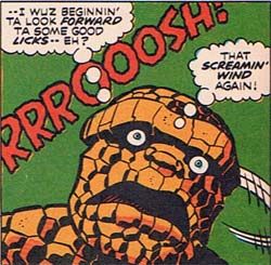
So ... many ... juvenile jokes ... from this panel:

marvel-4-screamingwind.jpg

I'm all froze up -- do I go for the (doubtlessly rocky and gritty) oral pleasure innuendo of the first thought balloon? The implicit fart joke of the second? The look of shock and horror on Ben Grimm's face at his apparently complete lack of control over his own bodily functions? Or the fact that when you've been turned into an ambulatory pile of orange rocks by cosmic rays, your gaseous emissions go "Rrrrooosh!", which frankly I did not know, despite a college-level geology course?

The mind boggles.

But in honor of OnomontoPOWia Friday, I will go with the last joke. Plus, it's educational. I just wish we had a complete compilation of all the sounds your various heroes make when passing gas, each with its own evocative name like Ben's given us here with his "Screamin' Wind". I bet Superman's could blow down a building if he's not careful ("Smellier than a foetid swamp! More noxious than a landfill!" "Look, up in the sky! It's a cloud! It's nuclear fallout! No, it's ... OH MY GOD!!!). Iron Man doubtlessly has some sort of self-contained air filtration unit; if not, talk about repulsor beams! I bet the Scarlet Witch's arrive with a bewildering array of hex-powered unfortunate consequences ("Wanda, my Perrier seems to have transmogrified into biodiesel again, could you please lay off the garlic?"). And they don't call Thor "The God of Thunder" for nothing, I'm telling you.

And yes, I just spent a whole paragraph speculating on the flatulence of super-powered individuals, marking an all-new nadir for this blog. Wahoo!

The sound of stupid

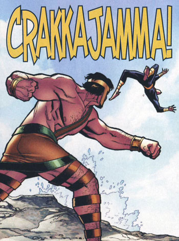
With thanks to Chris Sims over at "Chris's Invincible Super-Blog", I submit this image as evidence that the hyper-silliness of the modern super-hero comic has finally come to the world of onomontoPOWia:

hercajamma.jpg

I'm sorry, but I have to disagree with Chris -- that's not cool, it's just stupid. It's the "Every panel a poster" approach of Walt Simonson's epic all-full-panel Thor vs. the Midgard Serpent issue only waaaaaayyy too self-aware, to the point that (for me at least) my immersion in the created world crashes to a halt with me thinking "Craka-whaaaaaa--?!".

Or maybe I'm just dressed as a grumpy old man for Halloween, shaking my fist at all these whippersnappers and shouting "Get off my comics lawn", I dunno. But it's an abomination, I tells ya!

Plus, I find it profoundly troubling that if the camera angle were just a little lower, we'd totally have a super-hero Hercules "upskirt" shot here. And that's just wrong.

The sound of exploding fairies

From the pages of "Elfquest" comes this profoundly disturbing image of a fairy splooging herself into a troll's face, in what I think I can safely say is the first example I have ever seen in a mainstream comic of a reverse facial:

elfquest-30-spoot.jpg

As artists, we're often asked to come up with odd sound effect visuals, but I am pretty sure this one takes the cake. The next panel, where the troll has to wipe the sticky white goo off his face (I am not making this up) is almost as good, but doesn't qualify as onomontoPOWia because there's no actual sound effect. Still, in the interest of completeness for the historical record, here it is:

elfquest-30-spoot2.jpg

Hats off to the Pinis for breaking the prudery barrier with this bold gender reversal.

(image ©1988 WaRP Graphics., Elfquest, Vol. 2, No. 30.)

It was the ocean, I was ALONE …

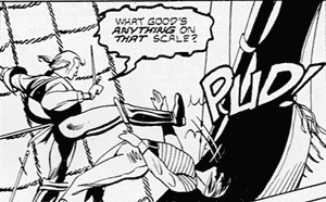
The combination of pirates, the hurtling-into-the-sea second guy, and the gigantic pole in the background combined with the use of the onomontoPOWia "PUD!" in this panel:

phantom-5-pud.png

contractually require me to make the following joke:

"Now that's what I call pounding the pud!"

Thus proving my high school motto: "You're only young once, but you can be immature for the rest of your life."

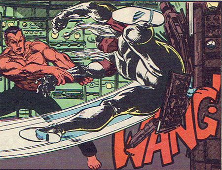
WANG!

I think this is one of the more unfortunate juxtapositions of onomontoPOWia with a crotch-shot of a large, muscle-bound S&M-themed character I have ever seen:

namor-12-wang.jpg

Yes, "Master Man" (that's his actual super id, I kid you not), we're all veeeery impressed, now close your legs and get busy with the fight. Yeesh.

A commenter in another post brought up a good point (in regards to the Jackson Guice vomiting illustration in Dr. Strange), that the letterer usually adds sound effects, not the artist. Is that still true? I look at this panel and I can't imagine Byrne not having drawn that WANG! right into the panel, it's such a key part of the design. Had he not meant it to go there he'd not have left so much space in the lower left corner.

So I appeal to you, the better-informed comics audience, in today's books does the penciler draw in the big sound effects, or is that left up to the letterer?

By the Vomiting Varmints of Vogotth!

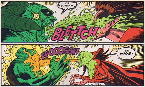
Only in Dr. Strange -- and maybe a Pinky and the Brain comic -- would you find the stunning spectacle of two demons from Hell casting spells on each other through the massive power of projectile vomiting:

drstrange-8-blettch.jpg

From time to time we are called, as illustrators, to create a moving visual image for some generally unpleasant things. But I think this takes the cake, because not only is it visually arresting, but it's also a wonderful assault on our hearing as well. Jackson Guice manages to incorporate two great onomontoPOWias into the duel of the horking hounds of hell and they really help bring the entire spectacle to life. I like to imagine Mr. Guice at his drawing table, thinking through all the many questions these panels raise.

  • What is the sound of a demon retching?
  • Would it sound different coming from a different demon?
  • Does a viscous stream of regurgitation make a noise when it impacts wetly?
  • Why didn't I become a fireman like my mother wanted?

Such are the conundrums that plague our souls as creative types, dear readers. Luckily they also pay the bills. I just don't want to know what kind of real-world research Mr. Guice had to go through to determine that Mephisto's effluvium would sound like "FFOOOSSH" while Satannish's would be "BLETTCH" -- "Honey, pass me some more ipecac, I need the dog to throw up some more so I can compare it to the cat."

(Image from "Dr. Strange, Sorcerer Supreme", Vol. 1, No. 8, ©1989 Marvel Entertainment Group, Inc. Roy Thomas & Dann Thomas, writers; Jackson Guice, pencil art; Jose Marzan Jr., ink art; Janice Chiang, lettering; Max Scheele, colors.)

Rob Liefeld even SOUNDS bad

Yesterday's OnomontoPOWia entry will take place today due to my being sucked into some sort of time vortex. I hate it when that happens.

I've done a pretty thorough job of plumbing the depths of the suckitude of Rob Liefeld's "The New Mutants" number 94, but when considering the scope of this man's craptacularness you can't limit yourself to sight just because he's a visual artist. Oh no. Talent this awesomely bad can, through the magic of comics, extend itself into sound as well, I assume so that blind people can be offended by him too.

OK, that was pretty harsh, I withdraw that last comment even though it pains me to use the words "Liefeld" and "draw" in the same sentence.

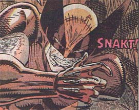
Anyway, here's a panel from that issue, with Wolverine retracting his claws so he can beat on Cable with his bare hands. I admit that changing the normal "Snikt" of the claws popping with "Snakt" for them pulling back in is pretty clever, but as usual Liefeld manages to take a good idea and make it worse through sloppiness.

newmutants-94-snakt.jpg

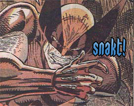
The lettering is uneven at top and bottom, the letter spacing is off, and the color looks like whatever comes out of Stretch Armstrong. I took the liberty of editing out the onomontoPOWia and replacing it with something more modern; granted, Liefeld didn't have the benefit of computer-assisted lettering, but basic draftsmanship should have enabled him to do a more creditable job than he did.

newmutants-94-snakt-jeff.jpg

I also took the liberty of changing the color from a warm pinkish to a cool blue. Partly this is to reinforce the idea that the claws are metal, and partly it's to set the sound apart from the muddy background of warm browns and oranges.

Rob Liefeld, now offending two of your five senses. And that's assuming "taste" only has to do with the flavor of your food and not matters of cultural appeal.

(All images and characters from “The New Mutants”, Vol. 1, No. 94, ©1990 Marvel Entertainment Group, Inc. Louise Simonson, writer. Rob Liefeld, penciller. Hilary Barta, inker. Joe Rosen, letterer. Brad Cancata, colorist.)

Loud enough to spin your limbs

Rob Liefeld does everything bigger and badder, from muscles to jaws to crazy-high projecting mask bits to sound effects. For instance, you can tell that this SPLOOSH onomontoPOWia is so loud it changed both Cable's and Wolverine's left feet into right feet!

newmutants-94-twofeet.jpg

That's some louditude, boys and girls.

Furthermore, I hope you'll note that in classic Liefeld fashion he has rejected the tired, patriarchal color norms, replacing the expected blue of the tons of water falling on these two (from a big water tower in a warehouse, because we all know how important it is to keep your crates well moistened) with a sickly green. The only thing better than fresh water that quenches your thirst is puke green algae water that slaps your feet on backwards!

CRASH!

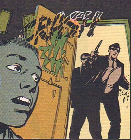
I think this is a lovely bit of onomontoPOWia, from the pages of the freshly-mocked "Haywire":

haywire-1-crash.jpg

This just goes to show that you don't need crazy coloring and Photoshopped filters to get a great effect. This scene is part of a flashback the main character is having, and the choices the art team made are really spot-on. The way the black CRASH blends in with the muted palette is perfect, and the breaking-glass jagged lines echoing the door smashing in is great. The sound fits with the room as it would appear in the witness' memory twenty years later -- somewhat muddy (perhaps why he chose that color scheme for his armor?), all blended together, and somber.

I spend more than my share of time making fun of things here, but mostly that's because the medium has such rich possibilities I hate to see them not taken advantage of. This panel shows, in my opinion, some of the power of comics to convey a mood and set a scene. Very well done.

(Image from "Haywire", Vol. 1, No. 1, ©1988, DC Comics, Inc. Michael Fleisher, writer; Vince Gerrano, penciller; Kyle Baker, inker; John Costanza, letterer; Bill Wray, colorist.)