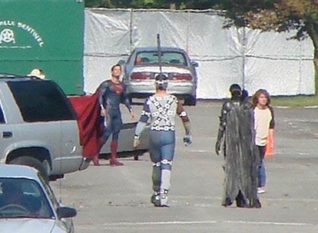
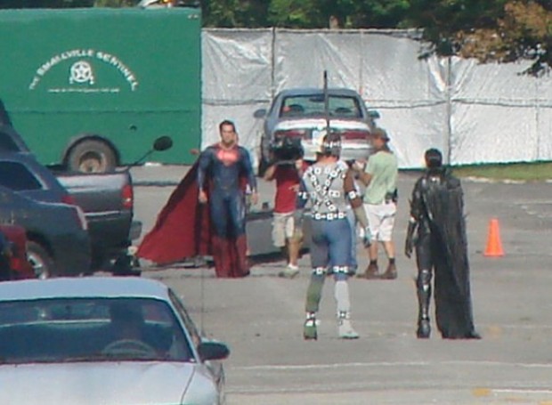
Several new photos have been sneaked out of the new Superman "Man of Steel" set, this time featuring full frontal Superman:
I say it every time, but it's hard to judge a motion picture super hero costume from stills, or even fan videos. You have to see it in motion, with full effects treatment, in the context of a story to know if it "works" or not. Having said that, I am very dubious about the choices made here, specifically about removing the red trunks.
I know the arguments against them, made most prominently by Dan DiDio, Co-Publisher of DC Comics, that modern audiences simply cannot accept the sight of an actual man running around in his underwear. If that's your position, that's fine -- I don't necessarily agree, but I can understand it.
However, just removing the trunks without paying attention to the impact that has on the overall design is, in my opinion, a serious mistake. And lazy. That visual band of red with the yellow belt serves to separate the uniform into a shirt and pants. Simply removing them, as it appears has been done in the movie costume, means you end up with a grown man running around in a onesie instead of his underwear. I'm not sure that's necessarily an upgrade.
You need either some kind of a visual break there like a belt (that's not the same color as the top and pants!), or you need to design the tunic and pants in such a way that they're clearly separate elements. You can do it with piping, or seams (the modern equivalent of the Nineties pouches), or you can make them subtly different colors (i.e. different blue tones), but you need something to make it clear that we're not looking at a one-piece leotard. Because outside of the Bolshoi or an NHL game, men in one-piece leotards look ridiculous.
Friend of HeroMachine John Hartwell had another excellent point as well arising (if you will) from these shots:
It's like a naked blue buff man in a cape. Are the Village People in town?
And I'm sorry - but the tight "onesie" look (well said) only draws attention to his groinal area when the light catches it the wrong way, as you can see in the shot where he's facing the camera. There's this expanse of blue, then, hell-oooo! It's a super-crotch! It's just...disturbing.
Now, I don't necessarily have anything against seeing the outline of a guy's junk. Goodness knows, I have junk myself and I'm happy for it. But in terms of costume design, if you don't have anything else going on in that region then the junkage becomes the focus, rather than the costume.
Fundamentally, that's my problem with this. It's not that the trunks are gone, it's that the trunks were removed and seemingly no thought was given to how that impacts the overall design.
I poked around online and found some suggested "no trunks" alternatives that I thought solved the problem in a much better way, and which in my opinion would look better "live" than what I see in the stills above. Thoughts?
Continue reading →
 Three middle-aged nerds (including yours truly!) review all of the MCU movies in chronological order. Short, funny, and full of good vibes, check it out and let us know what you think!
Nerdmudgeon.com


