Category Archives: I Hate Rob Liefeld’s Art

Reason #8: The writing makes it even worse.

We already know Liefeld's art is lame, but when attached to his writing or humor, it gets even lamer. "But Jeff," you might say, "that's like saying something is more infinite than infinity or more immovable than the immovable." And you would have a point, O Anonymous Internet Philosopher Who Sounds An Awful Lot Like The Voices In My Head, but this is no ordinary art we're talking about. This crap's transcendent.

Witness the following one-panel, "Far Side"-style "humor" panels Liefeld produced in 2001. Be warned:

Not For The Weak.

Continue reading

Reason #7: He breaks women

Goodness knows I don't have any room to talk on this subject since I can't draw women to save my life, but no one ever said you have to be able to "do" in order to "criticize". With that out of the way, let me say that reason number seven I hate Rob Liefeld's art is that he can't draw women to save my life, either.

We all know by now that he can't draw feet. So when it comes to drawing women's feet, well, it's like a perfect storm of suckage:

Continue reading

Reason #6: None of his figures are related

Most of the time, when you're drawing a comic you want to master page layout as I've discussed before but also to master the position of the characters within a panel as well. In other words, you want to make sure two people standing in a room really look like they're both standing in the same room at the same time.

But if you're Rob Liefeld, you just draw each figure as if it were in a stand-along pinup and say to hell with making them relate, as you can see here:

Continue reading

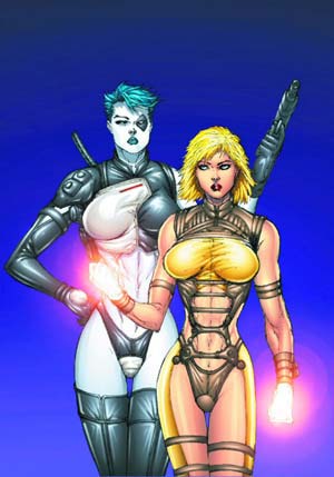
I bet SUPERMAN never had to wear crotchless pants

I almost can't put into words how awful both of these outfits are:

xf30-horribe-woman-small

As far as I know, the purpose of a brassiere is to lend support to a woman's breasts. So they don't flop around, banging painfully. Not, you understand, to squeeze them from top and bottom so they spurt out aggressively with absolutely no support at all. That would be like an anti-bra. An Arb, if you will. But if you're going to go out in public wearing an arb, the last thing you want to do is to spread gauzy yellow snot all over your breasts, which is all I can assume that stuff is, since no fabric ever known to humanity -- thankfully -- has ever behaved like that, clinging to the skin like a Playtex glove on the breasts, while hanging limply between them.

But given the treatment the rest of her body has to endure from this hideous getup, maybe her boobs are lucky.

How in the name of Odin's Spear is that leather harness thingie supposed to operate? Surely it would just hang there, unless she uses some sort of spirit gum to adhere it to her body. And are the two outside, bottom ends of it actually bolted to her hip as it appears? If not, what are those things doing there?

And then the piece-de-resistance, the final cherry on the sundae, if I can use that saying with regards to such a delicate area. The final little touch that pushes this sartorial assault up from simple chubby-panted fanboi lust to full on psychosis:

The crotchless leather vee-cut panties.

Sheer crotchless leather vee-cut panties.

Which are, sad to say, a vast improvement over the sheer leather vee-cut panties with attached "teeny weenie rubber weenie" model her teammate is sporting.

You wonder why I hate Rob Liefeld's art? Look no further than this abomination of feminine super-wear, my friends, and realize that he made this sort of thing the rule in super-hero comics for almost ten years, thus making it impossible for me to open one without my brain exploding. Which would be very unfortunate as it would doubtlessly soil my crotchless leather vee-cut underoos, and we can't have that, can we?

(Image © Rob Liefeld.)

Reason #5: He can't handle the truth

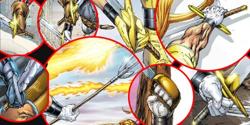
When I say Rob Liefeld can't handle the truth, I mean the truth is that he can't handle anything with a handle. Like swords:

badswordholding-composite

Study those for a bit and see if you can tell the fundamental mistake he's making. Pay particular attention to the one at the top right of the image and try to imagine how in the hell anyone could actually use a sword "held" like that, with the hilt perpendicular to the hand instead of parallel.

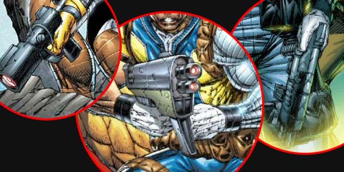
Once you're ready -- feel free to put on sunglasses or something, facing directly into this sort of thing can lead to blindness -- take a look at how he treats hand-held guns (and there are even more guns than swords in any Liefeld comic):

badgunholding-composite

Why are there no fingers curling around the handle of the guns on the left and on the right? What the hell is his left arm grasping in the center image? Again, there's a pattern here. See if you can spot it.

Give up? The explanation is pretty straight-forward, particularly if you remember that Rob Liefeld is a lazy artist:

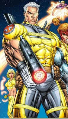
He draws the figures first, with their hands however he knows to draw them, and then adds the items in the hands later. As if they were an afterthought. Which they are, because while shooting guns is kewl, hands holding guns are not. Think I'm crazy? Take a look at this beauty:

xf1-badgunholding

First of all, where the hell is that thing pointing? If it's like every other gun ever manufactured in the history of projectile-throwing, the handle ought to be on the opposite side of the sights, otherwise aiming it would be a cast-iron bitch. But in this case that would mean he's going to be pulling the trigger with his penis, which I think even Rob Liefeld understands is probably less than optimal battlefield strategy.

But he didn't draw the gun until after he was done drawing the figure, you see, and by then he was bored with the whole thing and couldn't be bothered with actually drawing his weapon parallel to the arm holding it. That's why you've got the penis-fired orientation and the fact that he's holding it as if it were pointing towards the bottom right side of the panel, and yet the barrel is practically facing the viewer.

Still don't believe me? Consider this, then:

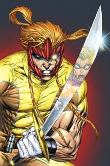
xf2-badswordholding

I defy you to explain that weapon in that hand in that position any other way. Liefeld only knows how to draw hands in three or four different positions. And figuring out how to jam a weapon in those positions takes too much time, so he just crams them in however they'll fit, twisting them however he needs till it looks right enough to get out the door.

Here's what happened with that particular cover, I guaran-damn-tee you. He drew the figure first, thinking "It'll be awesome to see Cannonball reflected in the sword!" But then when he was done with the fun part -- the figure -- he realized that if he put the sword actually in its hands, the thick part of the blade would be off-panel, and you couldn't see the reflection. So instead of just redrawing the hands, he skewed the sword blade thirty degrees and called it kewl.

Because he's lazy.

And he doesn't know how to draw things in hands.

And that is reason number six why I hate Rob Liefeld's art.

Reason #4: His layout sucks

Setting matters, and in comics you establish and maintain setting in every panel, on every page. Rob Lifeld, being lazy when it comes to his art, of course can't be bothered with a) figuring out where the action takes place, much less b) either drawing or remembering it as he goes along. As a case in point, I bring you page 3 from "Youngblood" number 2:
Continue reading

Reason #3: He's unhinged.

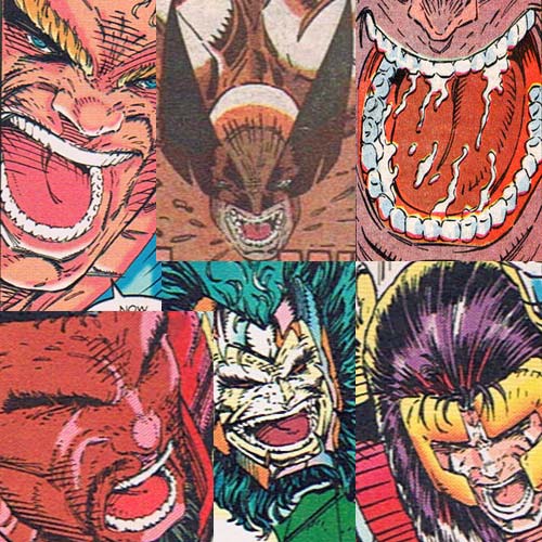
I bet when you join one of Rob Liefeld's super-teams they hand you a commemorative pair of ear plugs, because everyone in every Rob Liefeld comic is always screaming:

lotsateeth

And no one ever just, you know, shouts, they all have to pull their lips back in a rictus-like full-throated bellow, with their lower jaw horizontal and parallel to their upper jaw, mouths hanging open in full unhinged reptile-swallowing-a-water-buffalo mode and crammed full of more teeth than you could fit into a Great White.

Seriously, take a look at the top row on either end, and count the number of teeth showing between just the upper canines (the pointy ones). Go ahead, I'll wait. Bring a calculator if you've got one, you'll need it.

Pretty amazing, isn't it? Careful probing of your own, non-super pie hole should indicate that you've got four teeth between the canines, but apparently the super-power mutation in Imageland is linked to one that adds ten or twenty additional chompers.

Plus the tongues -- Great Googly Moogly, the tongues. They're the size of a regular person's head, all flat and spongy and gross. And don't even get me started on The Blob's spittle-streams up there at the top right, that's just disgusting. For my money the only thing that ought to be unhinged in a good super-hero comic is me, not the characters' jaws. But that's probably why I'm not a gazillionaire like him.

(All images from either "New Mutants", Vol. 1, No. 94, ©1990 Marvel Entertainment Group, Inc. or "Youngblood" #2, © Rob Liefeld, 1992.)

Reason #2: He's lazy

I've been called out before for saying Rob Liefeld's early Nineties Image work was lazy. To belie such baseless and scurrilous refutations, I present just one piece of evidence out of the dozens I could have chosen from the Liefeld written/created/pencilled/inked "Youngblood" number 2:

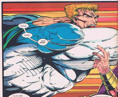
youngbloods-2-headshrink

That's "Brama" (get it? like the bull? genius!) throwing a punch at Prophet so big it spans two entire pages. A punch so big it has transformed the background into a Star Wars hyperdrive-like expanse of horizontal lines. A punch so big it has apparently severed Brama's own head, simultaneously squashing it flat and propelling it forward a good foot.

Seriously, look at his head. Notice how flat the top is -- usually you've got about as much space above the eyeline as you do below it. And look where it's positioned on the neck in relation to the torso. It ought to be back about two inches and about an inch higher, if this were an actual human figure being represented.

One explanation might be the aforementioned self-decapitation due to force-of-blow. But I think we all know that's BS.

Another explanation might be that Rob Liefeld is a genius who is dynamically reinterpreting human anatomy to reinforce the awesome action being portrayed. But I think we all know that's BS too.

The simple answer is, Rob Liefeld ran out of room to fit the figure into the panel. He roughed out where the torso and arm and punch were, and didn't notice that he hadn't left enough space to squeeze the head in at the top.

So rather than resketch the layout, he just decided to squash that sucker in there wherever and however it fit, anatomy be damned.

And that, my friends, is just flat out-and-out lazy.

(Note: I'm renaming this category "Reasons I Hate Rob Liefeld's Art", with Reason #1 being "He doesn't understand human feet face different directions". These reasons are not in order of how much they make me hate his art, they're just kind of random. And I didn't name it "I hate Rob Liefeld" because I don't even know him; he might be a swell guy. I just hate his art.)

(Image and characters © Rob Liefeld, 1992, from "Youngblood" #2.)

A new day dawns, with two left feet.

I ran out of observations about onomontoPOWia, so I bid that topic a fond farewell (at least as our staple on Fridays) and instead introduce you to:

Liefeld Follies Friday.

Yes, my friends, I have decided that I should not be the only one subjected to the eye-gouging agony arising from forced reading of Nineties-era Image comic books. So now you have to suffer too, because that's how America works, you commie bastards.

And because I want to get things off on the right foot -- or the left one, I don't care really, as long as there are two of them on the same body -- I treat you to this wonderful assortment of feet from the Rob Liefeld created, Rob Liefeld written, Rob Liefeld pencilled, Rob Liefeld inked, and Baboo the Blind Monkey non-edited/non-art-directed comic, "Rob Liefeld's Youngblood" Number 2:
Continue reading

Rob Liefeld can even humiliate a GOD

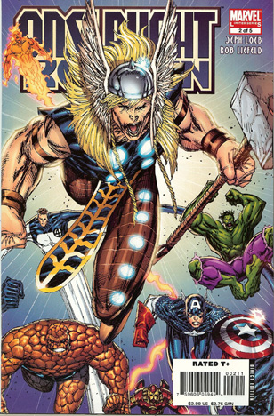
You might think that mortal man cannot hope to tangle with a deity and come away the victor, but you are wrong, for you have reckoned without the awesome power of Rob Liefeld's suckage:

onslaught-reborn-2-2006-thor.jpg

Here's how I imagine the conversation going in Rob Liefeld's brain as he was working on this redesign:

La la la, I am sooooooo rich, I cannot even count all my dough, ha ha! Man, these legs sure are long. And boring. I'll add some muscle-y types of things in there, that ought to be fun. Hmm, nope, still bored. Still more leg to go, jeez, how long are these suckers, anyway?! Boredom sapping my will ... got to ... break up ... monotony ... I've got it, metal bands! Made out of leather! And some glowy things, ooooooo pretty!*

Seriously, if I didn't know better I'd have said you couldn't really screw up Thor. Norse guy, silver helmet with wings, big ol' gnarly hammer aaaaaaaand scene. But no, Rob Liefeld's suckage cannot be so easily thwarted. He courageously decided to keep the silliest element of the whole original design -- the circles on the blue onesie he wears -- and extend it all the way down his legs! Which will be made out of metallic leather bands! Which will (whew!) hide his feet! Man, this is easy. Now that he's extended the bad stuff, he takes it to the next level by getting rid of the cool stuff. Neat-o cape, gone. Big ol' knee pad boot thingies, gone.

Of course then it looked too plain, so he took a step that only Rob Liefeld could take. He added ... well, let's see, how to describe this on a family blog ... he added an object in the groinal area that is, ahem, "ribbed for her pleasure."

Folks, I challenge you to name me another multi-million-dollar artist who would dare to go there. No, I won't wait, because you ain't gonna find one, only Rob Liefeld could pull off the greatest Bad Costume Redesign in history by putting one of those onto a god.

Finally, to cap it all off, you have the other trademark Rob Liefeld touches. The crazy, corona-like hair with extraneous braids flopping about. The senseless, needless lines running all over everything. The obnoxiously large and completely impractical mile-high headgear (apparently doorways in Asgard are really tall). The pinched parrot-beak mouth, gaping open in a wordless yell. The background consisting of nothing but lines and a color gradient. The hands that aren't really holding whatever it is they're supposed to be holding.

Seriously, look at Mjolnir; it's coming out of his hand at an angle to the upper right of the page, while the hand holding it is angled to the upper left. Unless Thor's developed a new grip that involves the weapon sitting cock-eyed in the hand while the handle juts out between the middle and ring fingers, that's just wrong.

The only thing missing here is some spittle and a band of pouches to really finish this sucker off in true Liefeldian fashion. Although given the pose, it's possible the newest Asgardian belt-wear is festooned with the suckers but, like whether or not the new Rob Liefeld Thor has feet, we may never know for sure.

*Not an actual transcript.
(Image and characters ©Marvel Entertainment Group, Inc.)