Difficult decision this week. There's been at least 3, maybe 4 pictures that could have been featured this week, but I'm going to go with this one by Nug because it gives me a bit more to talk about.
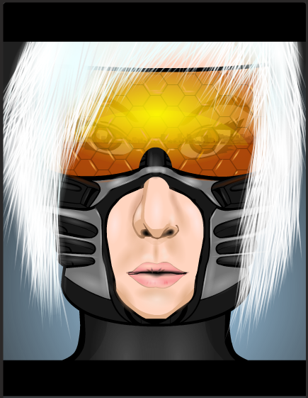
Lets kick off with the best bit shall we. As I'm sure everyone has noticed, the colour on the visor here is truly stunning. The warmth and the depth is gorgeous, it really adds to the sunrise reflection effect that is being portrayed here. It also doesn't drown out the rest of the reflection, nor the face beneath the visor, which is good, making the image seem more realistic. I also like the fact that Nug put small highlighting shines in some of the hexagons on the visor. It's a little detail that just adds that little bit of polish to the image and just takes it that little bit further.
Nug said on his thread that he wasn't to happy with the hair on this picture. I personally can't see the problem. The slight glow that he has added makes the hair seem more natural than it would if it were just left unshaded. That combined with the fact that you can actually see the individual hairs for the most part gives a natural looking hair style with an un-natural edge, a very pleasant and eye-pleasing juxtaposition.
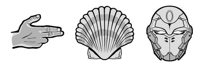
However, we now come to something I haven't done in a while, what's wrong with the picture. Nug is right, this picture isn't perfect, it could be improved. And for me, it's the jaw line. The metal part of the helmet is made from a cyber-torso, which is fine and the item works well for its purpose, but I don't like how Nug just left the bottom edge as it was. It gives the character an oddly shaped square jaw and it looks odd when you look at the characters chin. If he had masked the torso item to the same female head he had used for the chin, Nug may have been on to a real winner here. But just that one bit makes it fall short of perfection. But only just.

