Category Archives: HeroMachine 3

Character Of The Week: RobM- Sublimation Silver

This weeks COTW was a hard one to decide. There were a few that at different points of the week I was planning to write this post about. In the end I had to go back and go through them all and basically see which one I would have the most to say about. And this wonderful piece of surrealism came out on top.
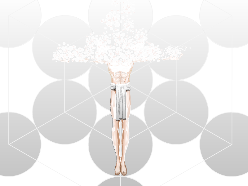
Now, obviously the most striking thing about this piece, is the fact that his head and shoulders have been reduced to bubbles. If you just look at the lowest bubbles, you can see where Rob has masked the hands and arms to the energy. Plus the fact that some of the bubbles are skin coloured, you really do get the impression that this person is actually dissolving.

And then, once again, Rob is being sneaky and testing me on my skills in try to explain how he does these effects. I am of course talking about the white shine he has created on the chest and legs. And I'm kinda at a loss. I at least figured out that the abs come from the really muscular Male-Alternate body and the glow effect on them is the shading circle set to colour 1 as the skin colour and colour 2 as white, but I actually have no idea how he did the chest. Rob, once again I must ask you to explain your methods.

Now, I have literally now just spotted one thing that needs to be changed on this piece before I could truly say its perfect. The feet. They aren't the same colour as the rest of the skin. It's not that noticeable when you first look, what with everything else going on in this picture, but now that I've noticed it, it's really nagging me. But otherwise, I would have to say that this picture is sublime (if you'll excuse the pun).

HM3: More Stuff From The Thrift Shop

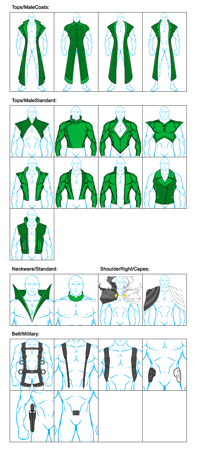
As promised, here a few more new items for the 'machine. Enjoy! (That's an order!) 😉

12_10_2014
They are online now, but you might have to clear your cache to see them ...

Character Building With JR19759

Hey guys, sorry this is late. As I explained in the last post, I just haven't had much time this week. At least I got it done. As requested, this week I'm tackling anime style faces and hair, along with Japanese honourifics and the custom colours. I apologise for the horrible loud sound right at the beginning, I got carried away and clapped during the intro, completely forgetting I wasn't on camera.

Also, if you want a step-by-step guide for how to do anime style faces amongst other stuff, you can find one here- http://www.heromachine.com/forums/topic/manga-style-tutorial/

HM3: It’s cold outside, you should cover your head.

So, after a longer hiatus I finally managed to put a few new items in the 'machine. More to follow soon ...

12_07_2014

Hope you like them! 😉

Character Of The Week: Candruth- Alien Woman Portrait

It's funny, I always try to feature different people for CotW, just so I'm not repeating myself. However, I'm spectacularly bad at it, as I'm sure those of you who remember the original run will know. But it seems there is one person who I just can't stop featuring, as this will be their 3rd or 4th time getting CotW.

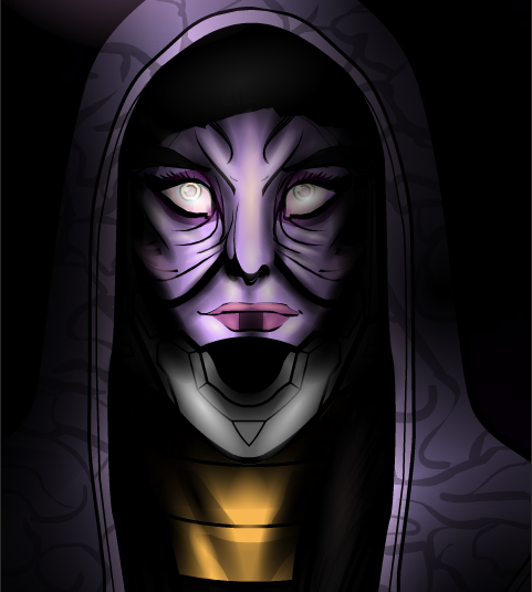
Ok, I will say straight off, this isn't as good as the last of Candruths works we featured on CotW, but that one was a masterpiece. But I have to feature it, simply for the same exact reason I always feature Candruths art, the flipping' attention to detail on the shading and highlighting. If I could just draw your attention to the wrinkles around the nose and the mouth. Look at that lighting, really properly look. You have the base purple skin colour, then you have a slightly lighter violet colour, then that cream colour for highlights. Add the black shadow shading and then you have another purple to accentuate the contrast in colour (though this could be a mixture of the lighter purple and the black, but it looks to me like another colour). Most people just have base colour, highlight colour, shade colour, done. But obviously not Candruth. And then you have those eyes. Not only are they superbly creepy, but they also seem to have at least 5 different colours in there for shading and highlighting (green, cream, pink, very light purple, white and a darker purple) added onto the base colours. Honestly, Candruth does more shading on her characters eyes than I do on my whole characters. And that's saying something. And just when I think I can stop going on about the shading, I see the neck. And the shadows on the hood, making it melt seamlessly into the background. God, so good.

Oh, and does anyone else think Star Wars when they see this picture, or is it just me?

Character Building With JR19759

As I say in the video, I will probably be going back to the costume and having a mess around with it, because I'm not entirely happy with it and the video would be an hour long if I recorded until I was happy with it. If I have any interesting ideas that I think could make good content for a video, I'll include them at the start of next weeks video. Also, remember to say which you'd like me to do a tutorial of next week, anime style face and hair or normal face and hair.

Character Of The Week: AMS- The Ankh

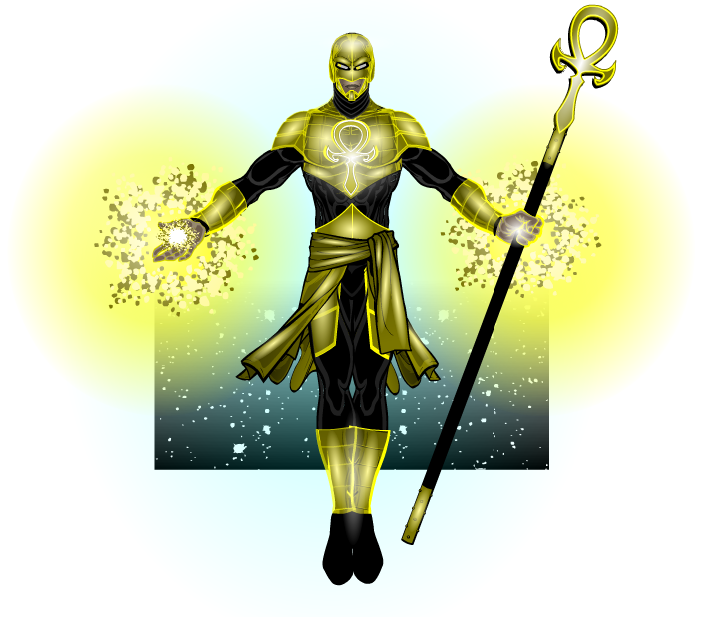
Ok, I'll admit I was a tad mean with this weeks CDC curveball, but it's not fun to be predictable. But the fact that he couldn't enter it into the contest didn't stop AMS from carrying on his redesigns of his character The Ankh, whom he entered into the HM1 contest and then recreated for the HM2.5 Contest.

So, it's an AMS picture, y'all know what to expect. Fantastically simple costumes that still manage to knock your socks off (see the top, which is a nice combination of two tops and some shoulder items, masked so they all fit together like they were a single item), peerless shading (do I need to give examples here?), posing and expression (look how fierce the expression is) and that finishing touch that just takes his work that extra little way (in this case the background, which appears to be a combination of three different background techniques. The first being the stars, which are masked to a background square. Then you have a gradient circle, which is also masked to a background square, to give the black corners. Then finally, over the top of the previous two elements, there is the gradient square, which is set to Colour 2 as White and Colour 1 is set to 0% alpha, then flipped upside down, so it looks like the background is fading into the white base. Well, that's how I'd do it anyway). So yeah, your standard AMS work. That is to say, it's freakin' sublime.

The Big Question ♯28

This week we'll keep it short and sweet with the Big Question. Like the previous 2, this one is going to be heromachine related.

So, question is, what Blog series, past or present, is/ was your favourite? Personally I'd have to go with the Power User Profiles. It's nice to learn more about the people who use this site and, as we have a Hall of Fame for pictures but not one for users, it's nice to reward those who contribute to the community.

So, over to you guys. What's your favourite blog series that we've had on the Heromachine Blog?

Character Building with JR19759

As promised, part 1 of the new mini series of videos here on the Blog on Tuesdays, starting this week with posing. I did focus mainly on one pose, but I threw in a few other bits as well, and the principles I go over whilst making this pose can be applied elsewhere as well.

Hope y'all find it helpful. Oh, and sorry for my voice, the fan on my Mac was going crazy during the recording, so I had to filter and EQ the buzz out afterwards and it makes my voice sound a bit weird. Hopefully it won't happen next week.

Remember to leave suggestions for costume ideas for next weeks video. If there are any things you've seen someone do on Heromachine that you'd like me to go over, feel free to say and I'll see what I can do (it might be an idea to leave a link to the HM picture you reference if you do so).

Character Of The Week: DiCicatriz- Crag

Now there's a very particular reason I chose this weeks COTW and I want to see if anyone realises before they get to the end of the post. So, everyone, please take a look at this.

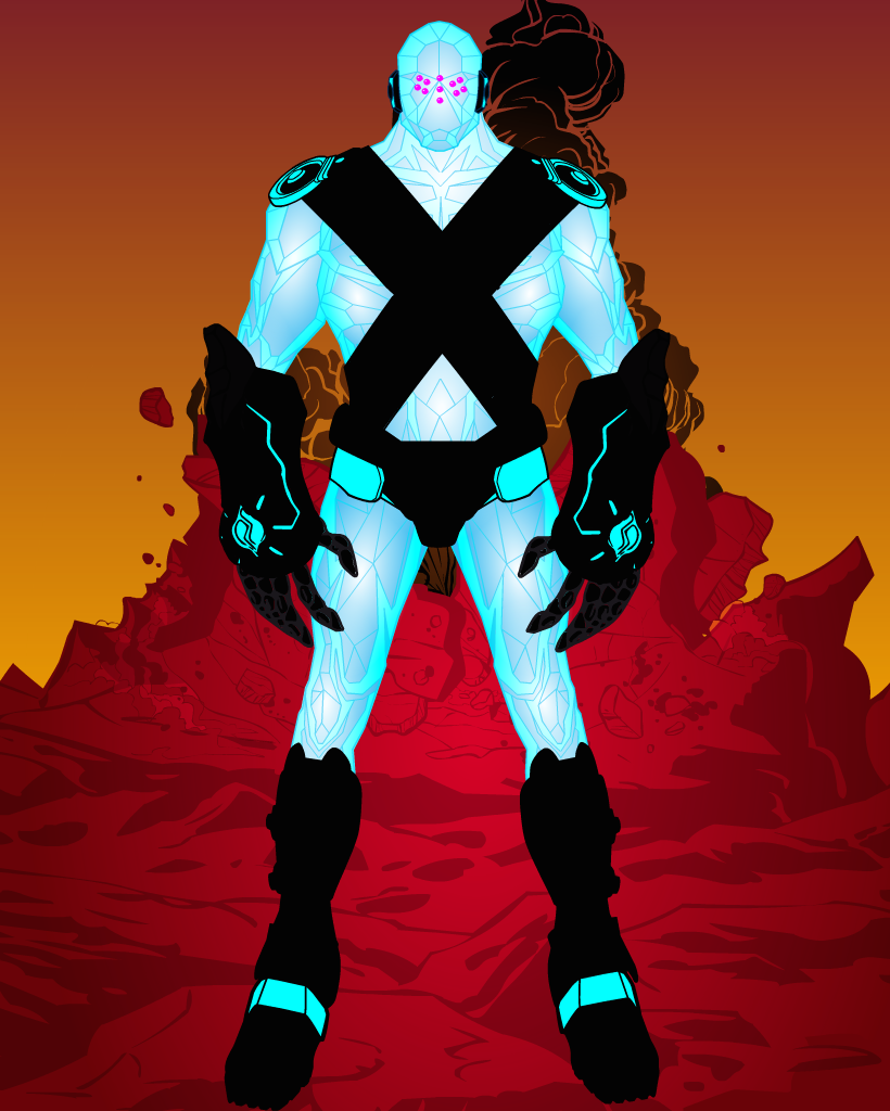
Ok, well for a start it's DiCicatriz, so that means the shading is awesome. You can just feel the cold emanating from him, with those icy blues and the stark white highlights. But that's not the reason.

Then we have the contrast of the picture. The cold blues and whites of the foreground character stand out brilliantly against the warm reds oranges and browns of the background. Still not the reason though.

Then we have the costume. Admittedly I would have preferred it if the pure black didn't make up most of the colour for the costume, it does mean much of the detail is lost, but it works against the very light body colours. I do like the fact that DiCi has used some of the lesser seen items, the disk shoulder pads (not sure what they're called) and the giant clawed gauntlets. It makes the piece stand out more. But again, that's not the reason.

The reason I chose to feature this picture, is because of his face. He's Regice 😉 . Ok not really, but he looks quite like him. Seems like someone else is as hyped as I am for the new Pokemon games 😉  .