Category Archives: HeroMachine 3

HM3: What I’ve been up to

For the last week and a half or so I've been trying to figure out one key feature that presents as two different ones. To wit, I've been trying to load saved characters from the server instead of just from the ones you choose to save locally to your hard drive.

The key factor here is that these server-based character templates are in XML. Which is basically text.

Which in essence means this feature also would allow you to import and export characters as text, just like you could in HeroMachine 2.

I've made a lot of progress so far. I can successfully import saved XML files from the server and translate them into actual live characters in the program. I can also export any currently loaded character as an XML text list which you can copy to your clipboard, paste in a text file or email, and send to friends or whatnot.

The last piece of the puzzle programming-wise is to figure out how to let you paste the XML text into the program directly.

The other piece is figuring out where to put all these new choices. Right now I have introduced tabs to the File Load/Save screen, named "Your Characters", "Templates", and "Text". The Text one is what I haven't really coded yet. But basically it'll turn the traditional file list into a big empty text box which if you're in Save mode will be filled with the text representing whatever character you've got loaded up at the moment. And if you're in Load mode, it would be empty, waiting for you to paste some text into it.

Anyway, it's been slow going, with lots of false starts slowing things down, and even more niggling little details that have to be worked out along the way ("Where does this menu go", "What kinds of warnings do they get", "Why can't I convert a string to a &$%@#% date", etc.), but I am getting closer to having it ready for test.

I know it's been a while since the last update, so I just wanted to keep you all informed about what's been going on behind the scenes here.

Fire Recipe by Me, Myself, and I

In response to Jeff’s (not so subtle ☺) suggestion that we could use a Recipe for making realistic fire with HeroMachine I have put this together.

There are a few things I consider when producing fire imagery;

  • It contrasts greatly with whatever is around it;
  • It is never completely symmetrical but it is often balanced;
  • Because it is a light source, the color and intensity of close by objects will often be affected;
  • It is always transparent but in varying degrees;
  • It varies in color and can include greens, blues, reds, oranges, yellows and even whites;
  • Fire also engulfs objects.

The major challenge with making a recipe for fire is that it does not have a static form. Therefore this recipe will be kept very general with few specifics.

Step #1 – Background
I referred to contrast previously and a really dark background can make a bright subject really pop off the page. I just used a dark background rectangle and filled the entire screen with it.

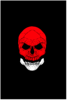
Step #2 – Burning Object
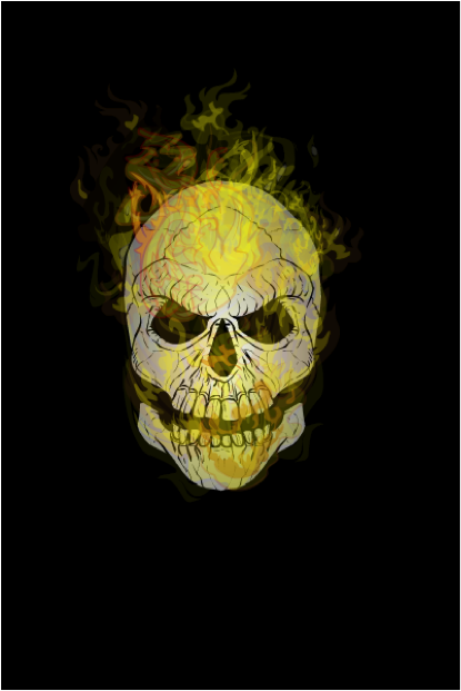
What fire is complete without something to burn eh? (Yes I did just include “eh” at the end of my sentence. I’m Canadian so I figure I’m allowed☺). This time I chose a skull because it’s dark and sinister.

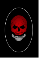
Step #3 – Shading
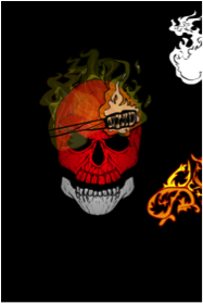
Certainly not necessary but I often like my objects to have some shading. I selected the last item in the Backgrounds > Shapes section and gave the Primary color an Alpha of 0%. The Secondary color has an Alpha of 75% and is black. Sized like the image here and centered over the skull makes the edges of the skull darker while the center remains lighter. This should give the skull some depth. The Line Color is left as white to illustrate here but will be subsequently changed to an Alpha of 0%.

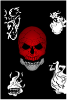
Step #4 – Flame Elements
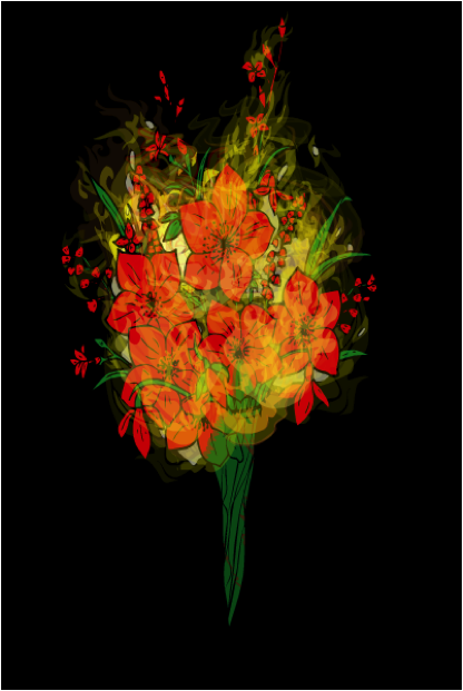
I like to use a few different objects to make flames. I do this so that the same shapes do not appear readily. As the image progresses I will add literally dozens of layers of just the flames and the will begin to overlap. There are a few elements available that work easily for flames and here are a few examples before I start to color and layer them.

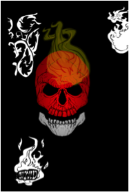
Step #5 – Adding the Fire
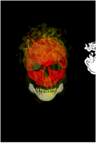
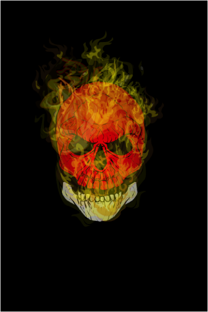
I will layer numerous layers of each of the flame objects. As mentioned previously, flames are not symmetrical so each object will be changed in size, shape and rotation to reduce the same shapes showing up repeatedly. Furthermore, the level of transparency changes as well so the Alpha levels will be changed for each object as well. The torch and glove may seem like unlikely additions but the flames on the torch are really good if the Line Color and the Primary Color Alpha 0 ratings. Some of these objects will be in front of the burning object and some will be behind. The torches in particular are placed behind the object so that the lines aren’t so obtrusive. The glove works quite well for small wisps of flame if the Primary Color and Line Color are made to have Alpha values of 0.

Step #6 – Review
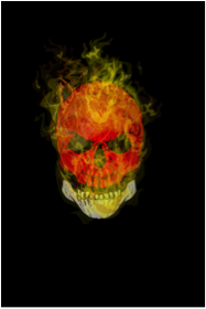
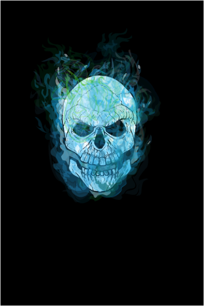
Because the fire covers the burning objects the underlying items often look different than anticipated. I usually find it is good to review the burning object to make sure the coloring and clarity is still what was desired. Feel free to experiment with other objects or coloring to decide what meets your desired objective. In the end it is the methodology or strategy and experimentation that is important and produces results; not any one detail.

Step #7 - Alternatives


Size matters

Many thanks to Hammerknight for putting together the following handy guide to the physical size your character image translates to when using the Export option.

Click on any one to see at a larger size.

HM3 Update (A.23)

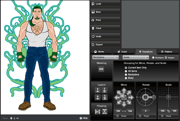
I just uploaded a minor update to the HeroMachine 3 Alpha. First, I've introduced a "Current Layer" indicator in the Layering box (Transform tab) showing which layer the current item is on. It should update automatically as you raise or lower the current item's layer.

Second, I've added a "minimize" button to the "view" toolbar just below the character creation canvas:

It's a little hard to see, which I may tweak down the line, but clicking it hides the view toolbar, leaving just the button. So now you can have the entire left side of the screen for character viewing.

I want to thank Worf for pointing out this problem -- the toolbar was hiding the very bottom of the illustration, so if you wanted to do a screen capture you'd lose that bottom portion. Hopefully this will resolve that issue.

HM3 Scroller

Just wanted to give you a heads-up that a minor tweak to the HeroMachine 3 Alpha has been uploaded (version A.22) that improves the performance of the scroll bars in the Load/Save window. You can now hold the arrows down and the list will scroll on its own, or you can drag the little handle in the middle for more rapid manual scrolling.

I thought I'd fixed the "sort by date" bug on that screen too, but it turns out it's still broken. Feh.

HM3 minor tweaks

I just wanted to give you a quick heads-up regarding three minor tweaks I uploaded to the HM3 Alpha this morning:

  1. The manual entry box for resizing items used to be limited to 200%, but now goes all the way up to 999%. That should allow for some interesting effects.
  2. The label formerly known as "Scale" has been renamed to "Size", on the recommendation of UI specialist Mark Shute. I agree with him that this is a much more universally understood way of saying what the tool does.
  3. While you could previously click on the three "current color" swatches to change color areas just as if you'd clicked on one of the buttons over to the side, you can now also click directly on the numbers themselves to do the same thing. Before this tweak, the numbers were not clickable, creating a non-functional blank spot right in the middle of the swatch.
  4. It doesn't get much more minor than this, but I added "%" indicators to the manual entry boxes for the Size tool.

One question for you all, is it obvious that you can manually change the settings in the Transform area?

HM3 Color Swapping now live

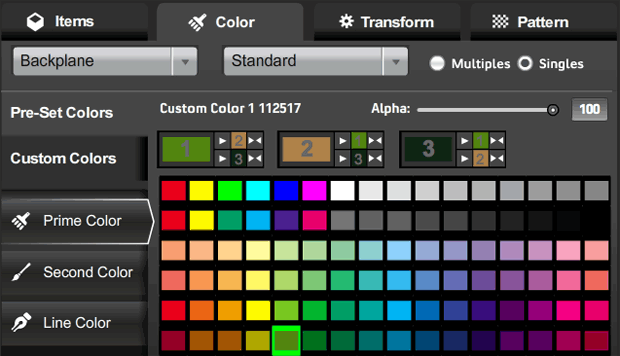
I've just updated the HeroMachine 3 Alpha with the long-requested Color Swapping feature! Here's how it looks:

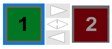
I'm dubious I've nailed the best possible arrangement here, but this is at least functional. That new row below the color name and alpha slider shows all three color areas, appropriately numbered in the big color swatch.

Each of the three blocks has three parts to it: The big current color swatch for that color area; smaller color swatches for each of the other two color areas (again, appropriately numbered); and buttons for either copying the main color (one arrow) or swapping the main color and one of the other colors (two arrows).

Look at the first main box, labeled with a big "1" in the light green swatch:

  • If you were to click the the top button having only one arrow, that light green would get copied to color 2, currently a tannish-brown.
  • If you were to click the bottom button having only one arrow, the light green would get copied to color 3 (line color), currently a very dark green.
  • If you were to click the top double-headed arrow, color 1 and color 2 would swap, so color 1 would become tannish-brown and color 2 would become light green.
  • If you were to click the bottom double-headed arrow, color 1 and color 3 (line color) would swap, so color 1 would become very dark green and color 3 would become light green.

It looks confusing, but I think once you've used it for a minute or two it'll make sense. Note that clicking any of these new buttons does not change which color is currently active, as indicated in the buttons to the left with the white outline around them ("Prime Color" in the screen capture).

One question I have for you obviously is, does this work? But I also would like to know if you think it makes sense or is too confusing. Should I add numbers so the selection tabs read "Prime Color (1)", "Second Color (2)", and "Line Color (3)" or something?

Just as a reminder, here's the color swap box in HeroMachine 2:

With three colors, I couldn't do this exact layout, but the basics are the same -- big color swatch, one-headed arrow for copying color from one to the other, and a double-headed arrow for swapping them.

Thanks in advance for your feedback and patience as we all continue working together to improve the program!

HM3 new UI now Live!

I've just updated the main HeroMachine 3 Alpha version with the latest User Interface. Holler if you have any problems with it! This should not affect your saved characters in any way.

HM3 New Layout Test

If you're feeling particularly brave, you might check out the new layout I've been coding for HeroMachine 3. It's based on the excellent work of Mark Shute, who did a wonderful usability test for me a while back, and Jim Marcus of LiquidCrack.com who actually designed the whole thing (which I posted about in September). BIG thanks to both of those guys!

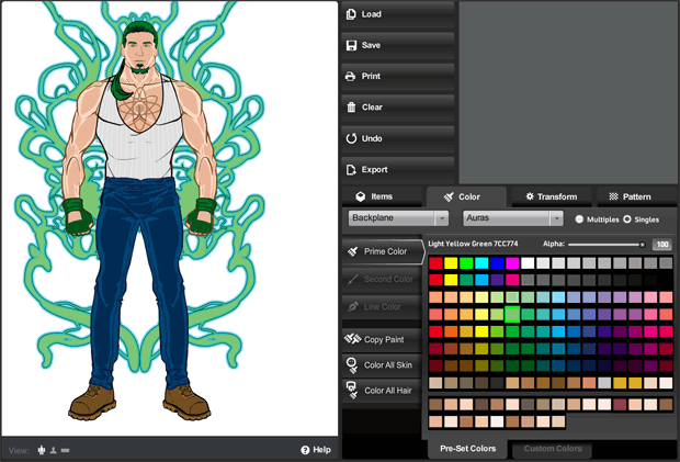
Here are a couple of screen grabs for those of you who can't or don't want to visit the live preview directly:


As you can see, it's a lot slicker and more modern. The old gold and brown color scheme and layout were always intended as nothing more than placeholders for whatever design we ultimately settled on. And it's certainly possible that at the end of the day, UGO will have their in-house design team do something different altogether.

In addition to the look-and-feel update, I've also moved some buttons around in an effort to group like-functions together more clearly and to make the initial user interface cleaner and less confusing. To that end I've moved the "Color All Skin/Hair" buttons to the new unified Color tab. I moved the "Flip" and "Mask" buttons to the Transform tab. I removed the "outline" feature since no one ever seems to use it, and it didn't really work like I'd hoped.

I also added a few new features. For instance, you can now flip items vertically in addition to flipping them horizontally. Not sure how useful that'll be, but it's fun! I removed the "arrow action" buttons that were intended to be what you'd click to make the manual entries for alpha, location, rotation, and scale take effect, but which were rarely understood or used. Instead, you now just enter your value and either tab out of the box, or click on some other part of the screen, or hit ENTER, and whatever you typed in there will be implemented.

I also updated some of the more irritating text box limitations. For instance you can now manually enter a location figure up to 1000 if you want (note that this would put the item completely off-screen). And you can now enter negative numbers in the Rotate box.

Please give it a look-see and let me know what you think, any major bugs you find that weren't there before, good and bad on the layout or control locations or really anything else you can think of. Thanks in advance for your feedback!

HM3: Undo tweak

I just updated the HeroMachine 3 alpha to A.20, which adds a cap of 20 actions to the number of undo levels. If that's not enough, let me know -- it's easy enough to change.

If you have more than 20 saved characters, I'd strongly encourage you to make a backup of your hmcharacters.sol file before you do too much today. This shouldn't impact the save file at all, but ... yeah, it makes me nervous, too. Better safe than sorry.

Hopefully this will stop the irritating Flash pop-up asking how much file space you want. Although, if you see that, just right-click on the HeroMachine app, choose "Settings" from the flyout, click the little folder icon, then set the file size to the next level up. 1MB usually works. You can check the "Don't bother me again" box if you want as well.

But like I said, hopefully this will stop it from being an issue at all.