Or are they walking legs? Either way, here’s a quick screen grab of the legs I just added to the “BodyMaleStandard” set:
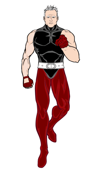
Or are they walking legs? Either way, here’s a quick screen grab of the legs I just added to the “BodyMaleStandard” set:

Posted in HeroMachine 3
I spent the weekend ironing out a persistent and irritating bug that was preventing me from making item set selection easier. To reward myself for my virtuous persistence, today I am drawing. Specifically, I am following up on Kaldath’s suggestion that I draw as many arm positions as possible in the “Body” sets to increase the flexibility of the character’s position. To wit:
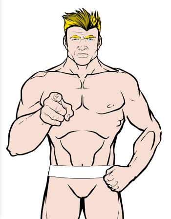
The body in the image is made up of seven different items — torso, left & right upper arms, left & right forearms, and left & right legs. They’ve been layered, sized, and moved to create the given effect, along with one of the new RightHand items.
As you can see there are a few gaps in the lineart — the figure’s left elbow doesn’t quite match up, and the left wrist is a bit choppy, but I don’t think that’s avoidable given how freely all these items can rotate and the need to account for one being layered on top of another. Luckily the “outline” feature hides a myriad of these sorts of sins.
Next I think I’ll be working on more and alternate leg positions as well.
The drawback to all of this, of course, is that not all of the gloves are going to fit on that foreshortened forearm. And if I draw legs in the classic “flying guy” sort of pose (as I plan to), not all the pants or boots will fit either. But given that you can color the various body segments individually, it ought to be possible to make a pretty convincing body suit in any of these configurations regardless.
Posted in HeroMachine 3
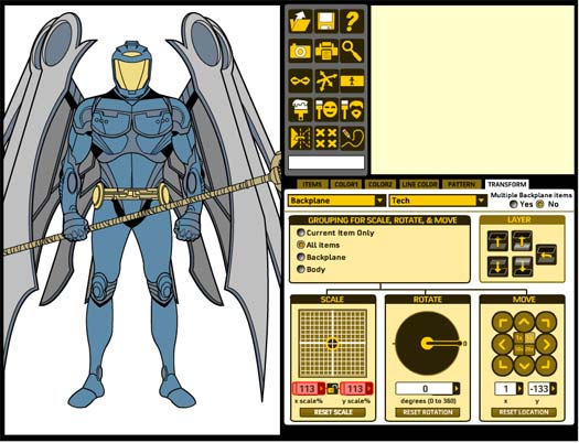
I am happy to announce that I’ve gotten the “widescreen” or “character preview” mode working in HeroMachine 3! Here’s a screen capture of a character in progress in the regular viewing mode:
And here is the same character with “widescreen” mode activated:
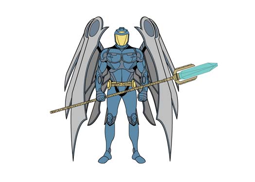
Thanks to everyone who kept reminding me about this feature, it’s actually pretty neat now that I see it in action.
Posted in HeroMachine 3
I wanted to quickly highlight the “portrait view” feature of HM3. I thought it might be handy to be able to get a closer-up view of the head and shoulders of the character, like you’d see on most RPG sheets. So here’s a quickie I threw together just to illustrate what that looks like:
At another suggestion from Kaldath, I have separate arm items turned so you can see the inside of the arm instead of the outside. This is to resolve the problem where some of the new hand positions just wouldn’t be anatomically possible with the arm in the default pose.
Anyway, there you have it. I’ll also still work on a “fullscreen” type of mode where all the controls get removed and you just have the character filling the whole area, so you can see those bits that might be chopped off by the edge of the screen.
Posted in HeroMachine 3
I only have about a third of the slots filled with any sort of items at all, and the functionality is a bit hit-or-miss with lots of bugs and undesired behaviors, but … already this thing is pretty cool. I love the part in developing one of these applications where I’ve got enough features implemented and enough items ready that I can actually build something. So here he is, the very first character image generated by the early HeroMachine 3 software:
Posted in HeroMachine 3
Onions have layers and make you cry, which is exactly what HM3 has been all about the last few days. I’ve been working on getting the layering stuff all worked out, which has been more challenging than I anticipated. Unlike the Minis, in HM3 all items are in the same “bucket”. All of the “Headgear” items were in the Headgear bucket, so if you wanted to move a particular Headgear item on top of, say, a Mask, while leaving all the other Headgear items below it, well, too bad. You can’t do it.
But in HM3 all the items and the layers they are on stay in the same bucket, so you can put any item on any layer you like. Which is good. But by default, I want it all to layer as you’d expect, with hair on top of the head and belts on top of pants and footwear on top of the feet they’re supposed to go on, etc. My goal is, for anyone who wants to just use it with the basic defaults in place, it’ll function just like HM2.x, more or less. I thought that would be easy to pull off, but it wasn’t.
I finally got the layering stuff working today, though, and to show you the fruits of my labor, here’s the latest screen shot:
Notice that I also am about to get “grouping” working, so you can move, scale, and rotate nested items together. In other words, you can move the Hair with the Headgear and the FacialHair and the Mask and the Head all at once, or make them all the same size at once, etc. Pretty neat. It doesn’t actually work yet but it will. I swear it!
Anyway, let me know if you see anything hinky or if you think of something it’d be cool to have.
Oh yeah! I forgot I also got a primitive “Zoom” feature working so you can get up close on the head for more of a classic “portrait” sort of look. I need to make it more fully-featured, but the basic idea is there.
Posted in HeroMachine 3
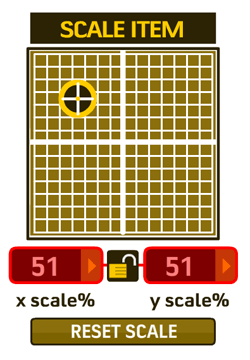
With thanks to Fabien for reminding me, I’ve added a “proportional scale” toggle to HM3 so that you can make an item bigger or smaller without distorting it. Here’s a screen shot of the new feature turned on:
Posted in HeroMachine 3
I spent the weekend filling out the “Transform” tab in HeroMachine 3, finally arriving at the following layout of controls:
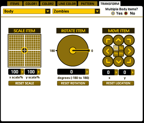
The main addition to the rotate and scale controls is that you can now manually enter values for scaling an item. These text fields also automatically update while you’re scaling the character so you can see what the values are.
The new kid on the block is the “Move item” set of controls. As you can imagine, clicking the various direction arrow moves the current item in that direction. In the middle of the controls are four “multiplier” buttons, so you can move it either 1, 5, 10, or 20 pixels at a time. Of course you can still manually click and drag items around as you like, with the current coordinates automatically displaying while you do so in the appropriate boxes. “Reset Location” will move the item back to the default starting position for everything in that slot.
Still to come on this tab are: grouping controls, so you can (for instance) move/rotate/scale everything in the Body slot all at once; a “reset all” type of button that will reset scale, rotation, and position for the current item with just one click; layering controls; outline options (so you can outline individual items in either black or white — figuring out how to do that for the full set of colors is a headache I don’t need); flipping; some sort of “apply all transformations to …” button, kind of like the paintbrush in the minis, so you can click on items to apply the current item’s scale, position, and rotation. And whatever else y’all think of.
I’ve gotten a lot accomplished this week. Within the next few days I ought to have enough done to start drawing. The first thing I’ll do when that time comes, probably, is to convert all the Zombie and Modern Warrior items over. Luckily that turns out to be pretty easy. Before that can happen, though, I need to nail down the little mini toolbar that gets added to the preview box, currently that’s just for show. And I also have to get the preview item tab working properly. I’d say with those completed, I’ll have the minimum functionality needed to make drawing worthwhile. The rest of the feature set can get added as I go along.
Let me know if you see something that looks like it won’t be good, or if you think of something I ought to add but haven’t thought of yet.
Posted in HeroMachine 3
I spent all day (literally) fulfilling Eric’s request in the comments to my last HM3 update, and am happy to say that the basics of manual RBG and alpha color entry are in for HM3. The screen grab here doesn’t have the Alpha channel implemented yet, but it’s coming:
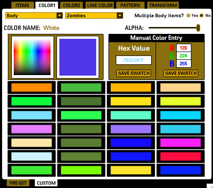
All of the 28 color boxes on this page are custom ones, filled by moi. I can put more boxes in there if you want, though even 28 seemed kind of like overkill. Anyway, from this panel you can mouse over the color gradient until you get the color you want and click, saving it to the custom color swatches (and also filling in the hex and RGB fields with that color’s values in case you need a starting point).
You can also manually enter a hex value if you prefer that and save that color swatch.
Or, you can enter Red, Green, and Blue colors in the text boxes and save that color.
Meanwhile you can adjust the alpha (transparency) of any particular color area on the figure as well, so you can get those cool see-through skeleton skins and such. There’ll be a text box like the RBG ones next to the Alpha slider for that purpose.
I love this — you guys make a request, it sounds like a good idea that I can hypothetically figure out, and bam, it goes in the program. That’s the kind of live, interactive development you can only get with the web.
So thank Eric if this sounds like something you’ll get use out of! And if you won’t, you can just ignore it — you’re under no obligation to use any of the new advanced color functions at all if you don’t want.
And now, the weekend, woot!
Posted in HeroMachine 3
I’ve spent the last two days trying to get the various tabs working in HeroMachine 3, and it’s been more aggravating than I thought it would be. The structure is a little bit different, and chasing down all the changes in hundreds of lines of code can be quite taxing. But I think I have the basics working in terms of loading up sets of items. As a bonus, I can even color things! I only have one set of Zombie heads and one set of Zombie body parts active at the moment (I don’t want to do too much until I know exactly how it needs to be set up to work) but here’s a taste of things so far:
As you can see, a lot of functionality has been condensed into the larger tab structure. The ability to choose your current slot type and the set of items for that slot will remain present at all times, so no matter what you’re doing you can change your targeted item. In the minis, the Rotate and Scale functions were always present to the left of the ad, but for HM3 they’re being moved to the new “Transform” tab. I’ll probably also have a set of “Move” controls there too, so if (as someone mentioned earlier) you have trouble dragging the actual item where you want it to go, you can use arrows to move them remotely, as it were.
I tell you, what’s really struck me this week as I’ve been bearing down and really grinding out the code is just how fricking complicated this thing is. After you code something and it’s all working, you kind of forget about it completely. It just is. But then when you have to go back and tweak and expand it, you realize how the gradual accumulation of complexity can turn bits that were very simple looked at one-at-a-time insanely difficult in aggregate.
Anyway, work is proceeding. I had optimistically thought at one point earlier this week that by Monday I’d be drawing items full time but that’s starting to look like a fever-dream.
Posted in HeroMachine 3