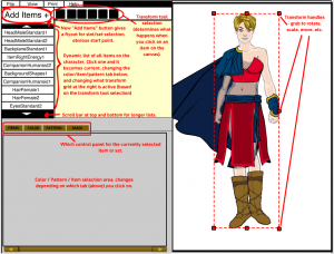
I've been working for the last couple of weeks on rethinking the layout and user interface for HeroMachine 3. Here's a first pass at translating these thoughts into a design (click for a larger version):
Some of these ideas are from Mark Shute's excellent usability study from a few months back, while some are new on my part. The main problems the current rough layout pose to my mind are:
- No clear starting point. You're just supposed to know that you start by clicking on the slot selection drop-down, in the middle of the far-right side of the app. In Western writing, obviously, you go from the left to the right, top to bottom, so this placement is way off where you would expect something important to go. To address this, I've consolidated both the slot and set drop-down boxes into a "Add New Item" button in the top left portion of the screen. Clicking on this would bring up first the slot-selection menu (Head, Headgear, Body, ItemRight, etc), then the set-selection menu (Standard, Blades, etc.). Once you've chosen a set, you get the grid of black and white items at the bottom so you can pick a specific item.
- Difficulty knowing which item you're currently working on, and knowing what all is on your character. Just below the "Add New Item" button is a scrolling list of all the items currently on the canvas that make up your character. Clicking on any one of these items will make that item current, bringing up its colors and transformations and other item-specific information. Ideally you'd be able to relayer items by dragging them up and down this list. Viewing the character in this list fashion should make it very easy to know exactly what you are dealing with at any given time. This was Mark's suggestion and I think it's brilliant.
- Not obvious that you can click on items in the canvas area directly to select them. I noticed this particularly when sitting down with younger kids to design characters, and when talking with the UGO staff on the very first iteration of this technology (I think it was the Zombie mini, actually). I happened to mention I was clicking on an item and they were all like "You can do that?" I've addressed this by placing any tool that can directly affect the character, from basic selection to scaling and rotating and moving, to the bar just to the right of the "Add New Item" button. Depending on which of these is currently selected, making an item current (or adding a new one to the canvas) will result in a selection box appearing around it. This will immediately reinforce which item is current. If the Rotate tool is active, grabbing any one of the eight selection handles will allow you to rotate the item. If scaling is active, dragging a handle will scale it. And so on.
- Too many buttons. Having all those buttons in the current layout between the canvas area and the ad was a bit confusing. There are an awful lot of them, some of which are for universal controls (like printing or help), while others were item-specific (coloring hair and skin). At Mark's suggestion, separating these functions out into more specific areas should help ease confusion. For instance, making just one "Color" tab instead of three, and moving the color-centered controls (like the paint brush and the Color All Skin/Hair) there would make more sense.
There's a lot more "under the hood work" to be addressed as well, naturally, but before I start coding I want to make sure I have the layout and user interface nailed, or as close as I can get, anyway.
I'm eager to hear your thoughts on all this, please let me know what you think, if this promises to be better or worse, obvious pitfalls you see, etc. Thanks!

