Category Archives: Cool Characters

Neat characters submitted by HeroMachine fans.

Goblin Wars

When last we saw our hapless hero, his Spider Sense was doing a lot more than just tingling. He was captured by the third iteration of the Hobgoblin and taken to the Kingpin and given the once over with brass knuckles. Then there's the fact that he was guarded by the Hand, which is excessive since they didn't think he was Spider-Man. I mean, sure, he's been outed as "Spider-Man's tech guy" but that's different. So far, he's managed to survive possibly the largest set of super-villain waves he's seen in quite a while. His boss even came to his rescue in the last issue, which brings us to the here and now.

Dan Slott and Christos Gage have been doing an exceptional job writing what is probably Marvel's premier title. Slott already has nearly 2 years worth of experience writing the original Spidey book, and the assistance from Gage has certainly not hurt the book. The dialogue they've put in here is just classic wall crawler. The pacing is good and there are a few references to characters we haven't seen in a while. The full plot of the last few issues comes to a beautiful close here. There's definitely some great things coming from the look of it. There's no shortage of awesome to this script.

The art is still really good in this one. Giuseppe Camuncoli has brought his "A game" to the end of the story arc. There's certainly plenty of action, things going boom and just plain great  things to illustrate. Dan Green and Dell's inks have helped cement the artwork thus far. The inks and Antonio Fabela's colors have given some extra dimension and nice shading to Camuncoli's colors. The colors, especially the somewhat muted bits on Spider-man's costume are pretty good. I lust like the art in this one all around. Every bit is wonderful and consistent, which really makes a difference.

The issue earns a 5, because  there's nothing missing and above all, there are some added bonuses that really make it work as a story arc finale. If you're a Spider-Man fan, this issue is simply spectacular. I hear the next few will be as well, so this is certainly one to read.

Amazing Spider-Man #697

Marvel

Writers: Dan Slott & Christos Gage

Pencils: Giuseppe Camuncoli

Inks: Dan Green and Dell

Colors: Antonio Fabela

Holy Déjà Vu, Batman!!

Holy Déjà Vu, Batman!!

By: Andrew Hines

This has been one of the most amazing titles I've ever come across in almost 20 years of reading comics. I honestly don't think there's been another title I've loved so much in so many ways. For the last year and change, I've been on the edge of my seat reading this title and I dare say that doesn't look to be changing any time soon. It feels like watching a horror movie as you spend the night as a "guest" at Arkham. The only predictable thing is that you know you can be sickened, giddy, mortified and appalled at any moment and even experience two of these emotions at the same time. Honestly, I can never really wait for the next issue.

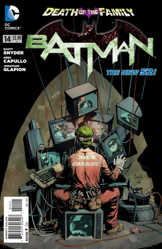
Scott Snyder has done something absolutely astonishing in this series. He's made us feel afraid for Batman again. I don't think I've actually feared for Batman's safety since the Knightfall story arc from 1993 that spanned 6 long months of publication. Snyder has also dug deeper into Joker's insane mind and given us all new levels of creepy wickedness. Let's get to the meat of the writing now. The issue picks up essentially where the last leaves off and the pacing leaves nothing to be desired except the next month's issue. The dialogue is also amazing, especially in the interaction between Bruce and Dick. It's possibly the most psychological issue of Batman since the start of the new 52. Every time I hear the names "Batman" and "Scott Snyder," I think I know how Pavlov's dog must have felt.

The pencils from Greg Capullo are as good as the script. He hasn't yet illustrated a bad issue of the current Batman run. The wonderful thing is that it has a feel similar to the 90's animated Batman cartoon, but slightly darker and grittier. Jonathan Glapion's inks are pretty awesome and help with the darker feel of the issue. he manages to fill half of the page with the deep shadows that Gotham is known for. Then there are the glimpses of brightness that are brought out in FCO Plascencia's colors. All of this together makes for a hell of an issue. The Joker's new look, above all else has had me quite intrigued. He seems to dress more to his mindset, thinking that he's actually fixing a problem. From the first page to the last, the art team here is pretty awesome.

I have to give this issue a 5/5 for sheer excellence. The way that the writer and artists work together on this book is rarely seen in such quality. I doubt there's anything they could have done differently that would have made it better. If you're a fan of batman or any of the Batman Family, this arc is one that you really shouldn't miss.

Writer: Scott Snyder -- Pencils: Greg Capullo -- Inks: Jonathan Glapion -- Colors: FCO Plascencia

Charlie’s Fundamentals

Charlie's Fundamentals

By: Andrew Hines

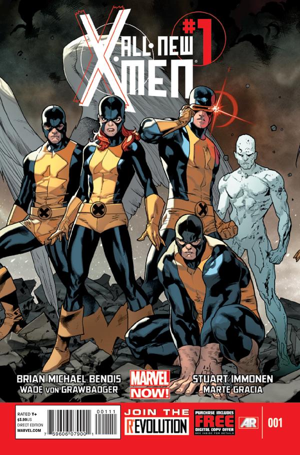
Its hard not to be a fan of the X-Men, as the group (in it's many guises) has been saturated in the media for almost 50 years. I love the original team, though they've had some interesting additions over the years. That's not even considering the giant SNAFU that is the Summers-Grey(Pryor) family tree that stretches through different realities and alternate futures. The original five are the prime example of what the X-Men stand for and Charles Xavier's vision for what his former colleague called Homo superior. The kids that became a family are as iconic as their fearless leader's visor.

Brian Michael Bendis has done a great job with the first issue. We get the full story here as to what is going on. We even see a different side of the current Iceman at the start of the issue. The dialogue and pacing are pretty good, especially the pacing. It's interesting to see how different the characters are from their younger selves. I'm not just talking about the looks of the characters, but also their personalities and how they're handling the Avengers vs X-Men fallout and the loss of Professor Xavier. Bendis has managed to set an amazing tone in this issue, which I'm really hoping will continue long after he's gone.

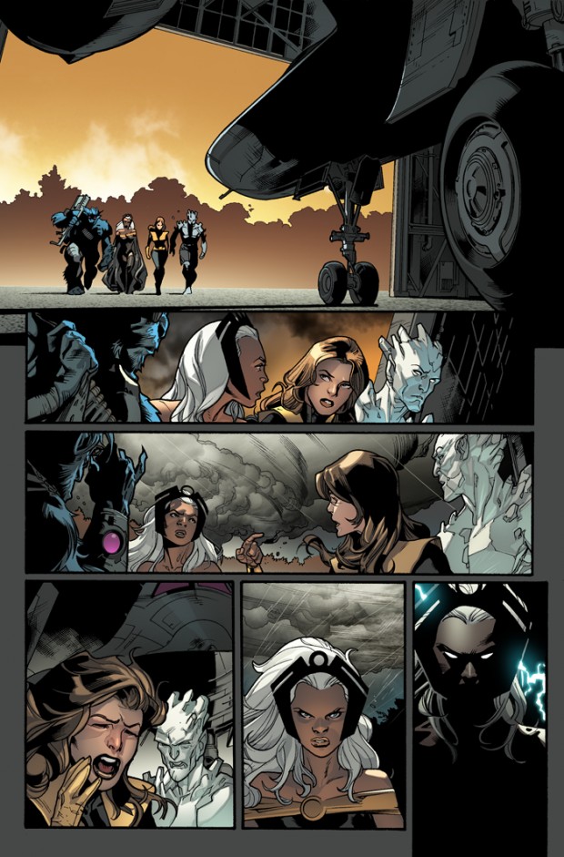
The art by Stuart Immonen and Wade Von Grawbadger is pretty damned good. This stuff is fantastic and blends the two worlds together pretty well. The original team looks better than ever and the current characters look pretty badass. The colors by Marte Garcia are great too, especially the last panel in the image at right. It brings in an almost horror movie effect and really matches the tone of what a lot of readers are thinking and feeling after AvX. The entire issue is filled with page like this that are more emotionally charged. The art team is fantastic in every way. You just don't see this kind of quality artwork anymore. It's a beautiful and refreshing change from the cartoony vibe that we've been getting from a few of the X books in the last year, not including the AvX tie-ins.

I give this issue an "A" partly because it doesn't start with the Back to the Future moment. It presents a story, rather than giving us an instant shock and relying on sensationalism. It gives us a reason to read the entire issue, which I implore you to do.

Enter the Multitude / Death of Krypton

Enter the Multitude / Death of Krypton

By: Andrew Hines

There's not much DC hasn't done in it's nearly 75-year history, except maybe for what you'll see in this issue. With two parts of equal importance in this issue, with the first being these Weeping Angel-like beings, collectively called the Multitude. The second is a cameo by a renowned astronomer and astrophysicist. We may not all be fans of the Last Son of Krypton, but there's been no denying that the new direction has been...interesting. Not inherently good or bad, but definitely different. This is one of the few New 52 titles I've been interested in from square one.

Grant Morrison may not have been at his best in the last year but this is a nice turn around on that. The dialogue is good and the pacing is better than it has been for several issues. The same can be said of Superman as a character. Morrison has been going out of his way to explain exactly what's going on with the abrupt power shift that occurred between issues 7, 8 and 10. Now that he seems to finally be beyond that, he actually written a good story that stands on its own.

The pencils by Rags Morales are pretty damned good. I'm not always a fan, but these pages have made me one. Then there's Mark Probst's inks, which are pretty good. This page at right (sorry for the Maxim label at the top) should be a great example of that and Brad Anderson's colors. Really, this is the best example of the artwork in this issue. It all comes together quite well. Those colors are astounding, to say the least. Given that the main story takes place on Mars, I'm pretty sure that the reds in the background are fitting.

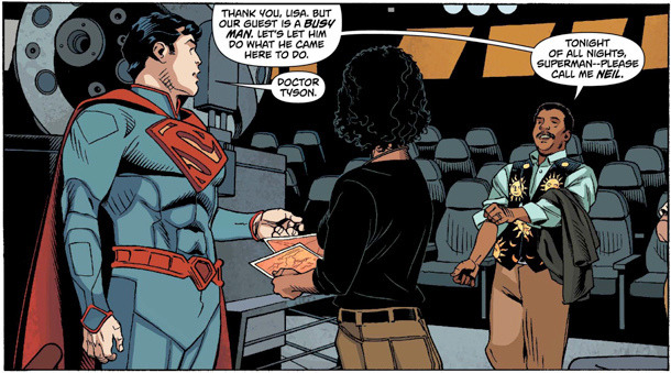
Sholly Fisch is the writer for the backup story in this issue. The story is actually really cool and gives us a look at the hero's perspective on his home(s). The dialogue and exposition are good, as is the sciencey stuff in here. It's an awesome backup story and maybe should have been it's own issue.

The pencils from Chris Sprouse and inks from Karl Story are good. It seems like a mix of the old Superman cartoons from the 90s and an astronomy-themed episode of Bill Nye. The colors from Jordie Bellaire are pretty good too. They are part of what helps give it the cartoon feel, that I love.

The issue is actually great, both parts of it. I give it an "A". There's something awesome in both parts of the issue. There's great art and good writing. What else do you need?

Attack of the Dead Presidents

Attack of the Dead Presidents

By: Andrew Hines

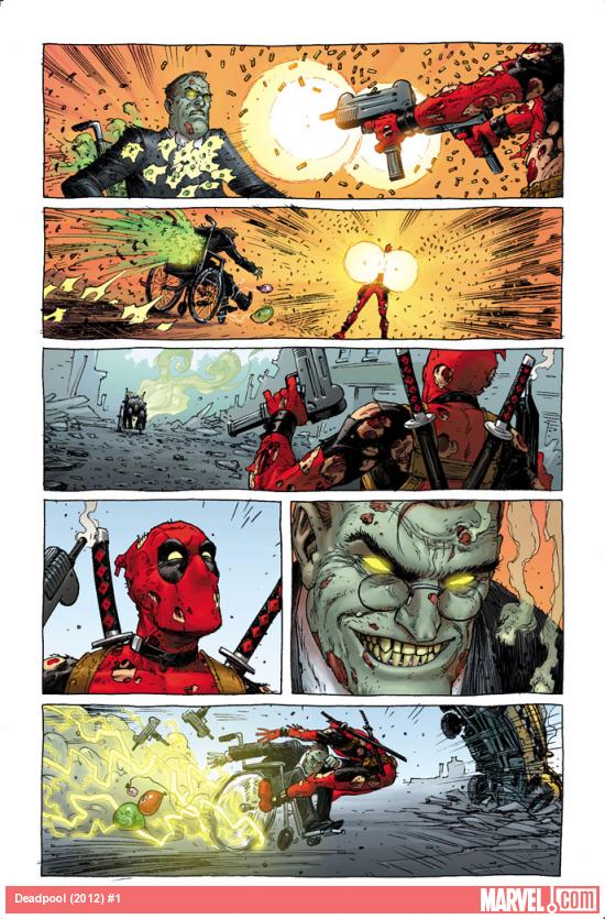
Who doesn't love Deadpool? I mean, aside from Wolverine, Thor, the X-Men and basically anyone who's ever met him? This is a pretty cool dude we're dealing with here. And no, I'm not just saying that because he's got a gun to my head. (Help me. He's got a gun to my head!) The baddest Merc With a Mouth just got a restart to his own series. Basically, he's about to be more popular than ever and there's not much we can do about it. From the looks of the cover, there may not even be much monsterzilla can do about it. (We can't say the "G" word for legal reasons...probably). Is it just me, or does this version look more like Reptar from Rugrats?

The writing by comedians Brian Posehn and Gerry Duggan is hilarious and very fitting for Mr. Wilson aka Deadpool. The pacing is good and we'll surely see a few familiar faces from the (American) history books in this series, starting with this issue. It's a good start to a really cool and funny story arc that could last a while. Then there's the team-ups which according to those he's teaming with aren't team-ups at all. The dialogue is fantastic and i know I throw that word around, but it's really just witty, stupid, childish fun. At the end of the day, that's what Deadpool is. He's a kid with a bunch of weapons a smart mouth and a bad case of road rash.

Here's some off the awesome (cartoony) artwork from Tony Moore. Yes, I said "artwork", as in pencils and inks. Pretty cool, if you ask me, which I guess you did since you're reading this. Anywho, the colors from Val Staples (who is apparently a dude, sort of like Val Kilmer was in Top Gun) are just epic. They make everything pop, even Mr. Polio, or is that Former presider Polio? (He died in the 40s. It's not too soon.) Also, sorry for lack of word balloons on the page. It was all I could find at short notice. The art works for a Deadpool story, I think. As does the ghostly FDR in the photo. That's President Franklin Delano Roosevelt to our non-US friends. It's an uncultured thing, you wouldn't want to understand.

This gets an "A" grade from me. I love the humor and teen the cartoony artwork. Given what we see in these pages, I think we'll be in for a treat in the months to come. That's if our comedy writers keep the same pace and quality of laughs. Please, go out and buy this before Wade runs you through with a katana, or Bea Arthur as he calls her.

Trial By Fire

Trial By Fire

By: Andrew Hines

The Rise of the Third Army marches on in issue 14 of Green Lantern, still written by Geoff Johns. Here we see a few interesting moments dealing with the team dynamic, Baz's preconceived notions of the Justice League (close to those of the other human Corps members) and his demeanor in general. In GL #0 and #13, we saw what Baz had gone through to get to this point and now we see what the Justice League will do to get Hal Jordan back and even a little of what they think of Gardner. You'll be surprised by this issue.

Geoff Johns has given me reason to like Baz. Like most readers being introduced to a new member of a team they've come to love, I was hesitant to say the least. The writing on this one, both in regard to Baz and the League and even the spots with the Guardians is pretty good. I thoroughly enjoyed it. He reacted pretty much the way any normal person would if they were thrown headfirst into a meeting with Superman, Batman and the rest. The jumps back and forth between that group and the Guardians made the book seem, for lack of a better word "complete." It really is a great intro to Baz as the newest GL of Earth.

I haven't always been the biggest fan of Doug Mahnke's pencils, but here I can finally say he did his job well. From start to finish, I think the illustrations are great. That's mostly because they're entirely consistent. The inking team (still have no clue why it's a team effort) of Christian Alamy, Mark Irwin, Keith Champagne and Tom Nguyen are good as well. Then there's the colors from Alex Sinclair and Tony Avina which are wonderful. All the little glowing parts are especially awesome and there's more than a few of those parts in a GL book. The page at right is probably the best rendered of Baz in the entire issue. The art in general is amazing here. The look of Wonder Woman on the cover could be better but then you've got images in the interior like the one at right. The "holy crap" look by itself is just priceless and leads me to believe that me may have just hit a deer (if you know what I mean).

Yeah, this is a great issue and I enjoyed it far more than I ever thought I would. It gets an "A" grade. Go out and buy this is you're a Green Lantern fan, or even for the anti-Guy Gardner jab.

The Next Chapter

The Next Chapter

By: Andrew Hines

I was hesitant to pick this up because I love Iron Man so much. I didn't want there to be any huge changes, especially to the suit. The thing is, that once I started reading it, it was really fun. I actually really like the new suit. It's a mix of Iron Man and War Machine armors, which is awesome. They're really making Tony more like he was during the Extremis story, very aware of what his armor could be used for, rather than making him the arrogant douche, though somehow lovable douche we've seen in the movies. This is a switch that needed to happen lot sooner. When I first heard about the Marvel NOW! titles, I didn't have a whole lot of faith in them, but that may change in the next month, starting with this title.

The writer we have here is no stranger to the Marvel Universe. Kieron Gillen is a wonderful writer and while he doesn't shine quite as brightly as he did on last year's Uncanny X-Men, he's still starting off pretty well. He gives us a new look and fairly classic insight into the mind of Tony Stark. The greatest part of the writing is that we see all of the reasons we love and hate Tony Stark and the reasons that the Marvel Universe can't live with or without Iron Man. As many things as he's made to aide the world, he's got an equal number that may destroy it. Gillen reminds us of that from the start. He pulls no punches, though he may have started swinging a bit before the bell.

Artist Greg Land has contributed to the pencils on this first issue. There are a lot of great moments, but one of the first pages, with Pepper Potts in the club, just doesn't feel right. It's mostly the facial expressions and Pepper in a dress. Then there's the inks from Jay Leisten that work well. The inks are good, though the issue doesn't require a lot of it, unless you count the black parts of the armor. The colors from Guru Efx are just fabulous. I mean, look at the metal forming the suit like that. That's just freakin' awesome. Really, the only bad thing about the art is the weird facial expressions I mentioned earlier.

This is a surprisingly good issue, considering. I give it a "B+". The writing is great and most of the art is awesome. Having whole pages that look off, however takes a bit away from the grading of the whole issue. I recommend it if you're not too weirded out by the change in armor.

Earning the Mantle

Earning the Mantle

By: Andrew Hines

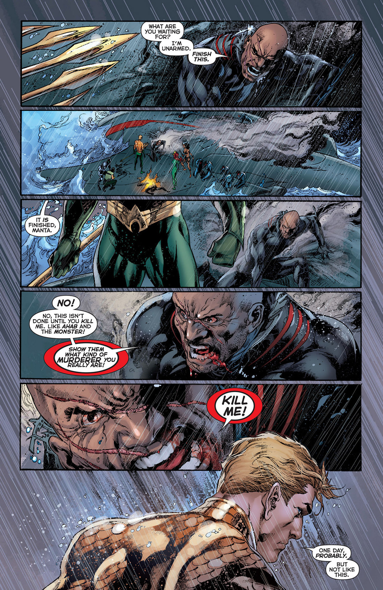
Holy salted anchovies, there's been a lot of stuff going on for Arthur and company. This has been a much darker, more aggressive book than most in the New 52. It's not as dark as others like I, Vampire or Swamp Thing, but it's a hell of a change for Aquaman. This is a wrap up of the Others story arc. Bringing together Arthur's original team, this has been a wonderful run. We see Arthur finally confronting Black Manta and getting to the root of his anger. Before I start sounding like Dr. Phil, after that comment, I want to get into the actual review.

Geoff Johns has continued to do the unthinkable by making Aquaman a true badass and a hero of his own accord. The first part I should tackle was the pacing, which was perfect. Usually we see it go close to what the story should be or it'll sort of ebb and flow. Here, however, the story hits every marker right on time. The dialogue is great, without having too much or too little. The character interaction, especially between Aquaman and Black Manta is awesome. Everyone seems to play their parts perfectly and no expository stone is left unturned. Thankfully he didn't use a bulldozer to do the turning, though. The story is a fantastic conclusion to The Others storyline.

The usual art team is intact for this issue, with Ivan Reis on pencils, Joe Prado taking care of inks and Rod Reis doing the coloring here. The art is spectacular. It may seem like I'm being overly optimistic, but this team makes my definition of fine art. You can see it on the cover just as well as on the interior pages, such as the one at right. How many other art teams can capture the emotion and inherent danger of the storm raging on this page? The effects, such as the rain hitting Arthur's back and shoulders, are brilliant. It feels like a still from an action movie. The only way it could be more picturesque is if it were illustrated by Alex Ross. I really can't say much more about this, except that the colors are as fantastic as the line work.

This deserves an "A+". I have trouble finding anything wrong with this and looked through this with a fine-toothed comb. It's Aquaman. I wanted to find something that didn't work, but there was nothing. The ending was great and really made it seem more like a movie. I can't wait for the trade so I can read/watch the story in its entirety. Go out and buy the whole series if you haven't started on this.

More Power!!

More Power!!

By: Andrew Hines

If you've read Superman: Earth One already, you'll understand when I say that this is a worthy follow up to that first volume. Not only did it give us an updated origin for the Man of Steel, but we got to see what some of his other job options were. In this we get to see Superman and Clark both develop as people. There are some moral choices he'll make that may leave you stunned. There's a classic villain in there that many should instantly recognize. Even the question Superman vs the bedroom is tackled. That alone gives one of the greatest lines in all of recent comics.

That brings us to the writer of this fine piece of graphic novel goodness, J. Michael Straczynski. The starting point of this issue is quite clever and the way that Clark is depicted is interesting. The way that he depicts Clark in his younger years is probably the best way the character's been handled in the last few years. The character interaction overall is good, with everything being sort of tied together. The best part is that you don't really get that feeling until the very end of the book. It's not entirely "true" to the characters as Jimmy acts slightly more confident than he's typically written. Lois and Perry, however are probably written better than  they have been in the last ten years if not longer.

The pencils from Shane Davis are awesome, and make up a fantastic base for Sandra Hope's inks. Even uncolored, this would be wonderful art. Barbara Ciardo's colors work well and actually give us really cool lighting effects. Than can be seen in the electricity that Parasite is daring from the room and the lighting on Superman's face, arms and torso. Davis' design for Parasite is a great treat by itself. Especially in his powered-up state, he really looks like the classic villain. I'm just happy that they did away with the white stripes on his costume, which I never really understood anyway. I can't really say enough about the art in here, but I don't want to seem redundant. Suffice it to say that the art is as good if not slightly better than  Volume 1.

The graphic novel gets an "A", partly because it gives us samples of what would be both Clark and Lois' writing styles. That was always what helped make some of my favorite Superman stories. Really the fact that everything comes about as being sort of tied together or at least contrasted with an other piece of the story is fantastic. This, above almost anything else in DC, I urge you to go buy. If you don't have Volume 1, get that first and then buy this.

Avenging the Broodling

Avenging the Broodling

By: Andrew Hines

Apparently Wolverine's popularity is tied to his healing factor somehow.   He's been running a school for the last 19 issues. It's been his place to finally put his decades (more like a century) of knowledge and experience to good use. There've been some developments and I'm not even talking about Kitty being "pregnant". Well, I guess I am now. I mean before that, there was the Hellfire Club ('s children) attacking the school. Then we found out that a Krakoa was the school grounds, Angel came back all amnesiac and finally normal-looking-ish and Broo was shot in the head last issue. Any questions?

Jason Aaron has been doing a bang-up job of writing this series. This one, however was a little clunkier than the rest have been. It's mostly because he doesn't follow one simple storyline in this issue. The issue is broken up into three overlapping parts, with Kitty taking a more administrative role by interviewing prospective instructors, Beast doing his medical stuff and Logan doing "what he does best". The dialogue is good and fitting of every character, which seems to be something Aaron does rather well. The pacing is good and the ending gives us all just what we need. It's a good continuation of the events from the previous issue and a great lead into what could be one of the best arcs of this title.

The art from Nick Bradshaw, shown at right without any text, is actually as good as any of the previous issues. The way he depicts everyone is actually pretty cool, especially Beast and Iceman. I have a hard time not liking his art in general. Then there's the inks from Walden Wong, which are good and allow the colors to really pop. That brings us to colorist, Laura 'DePuy' Martin. Really, the colors she brings really bring out the effects. Even something as simple as the solution that Bro's lying in is wonderfully colored. It's little touches like that that really bring a page to life. The art here is damned good.

With that, I have to give this another "A-". There doesn't seem to be anything really missing from the issue. Even the very end is amazing. Oh, and did I mention that there's a classic X-Men member joining the teaching staff? That's kind of important. For that surprise and the great writing and artwork, you should really pick this up.