Category Archives: Cool Characters

Neat characters submitted by HeroMachine fans.

Character Of The Week: Mudslide by Anarchangel

Ah, the lesser spotted COTW post, some what of an endangered species, mostly due to the fact I want it to be special when I do post it, so it's not weekly anymore. But anyway, just because the forums are down doesn't mean we're not getting awesome artwork to feature. For example, Anarchangel posted this to his deviantart page earlier.

Ok it hasn't got as much of a "Wow!" factor as the last few COTW's but I felt this deserved to be featured because its very inventive. You don't see many mud/ slime creatures in Heromachine form, mostly because they're very difficult to do, but AA managed to pull it off in a very impressive way, just by using the elasticated arm as a base and working from that. And I think we can agree that the final product works very well.

One final thing, would you guys like me to make this post weekly again once the forums are back up and running (whenever that may be). I have said why I'd like to keep it a occasional post, but if you guys want it weekly again I will oblige. There's plenty of great heromachine work out there deserving to be featured for me to make it weekly again.

Character Of The Week: The Forsaken by Valyndril

So, two days ago, this new guy starts a thread on the forums, begins filling it up with work that literally causes peoples minds to be blown. I mean, some of the effects he's doing with heromachine I've only ever seen done in photoshop and the like. Then, today he posts this;

Do I really need to give any further explanation as to why I'm doing a Character Of The Week post for this? Just go and check out the rest of his work here: http://www.heromachine.com/forum/the-heromachine-art-gallery/valyndrils-heroes/#p42381. He hasn't uploaded much yet, but what he has uploaded is spectacular.


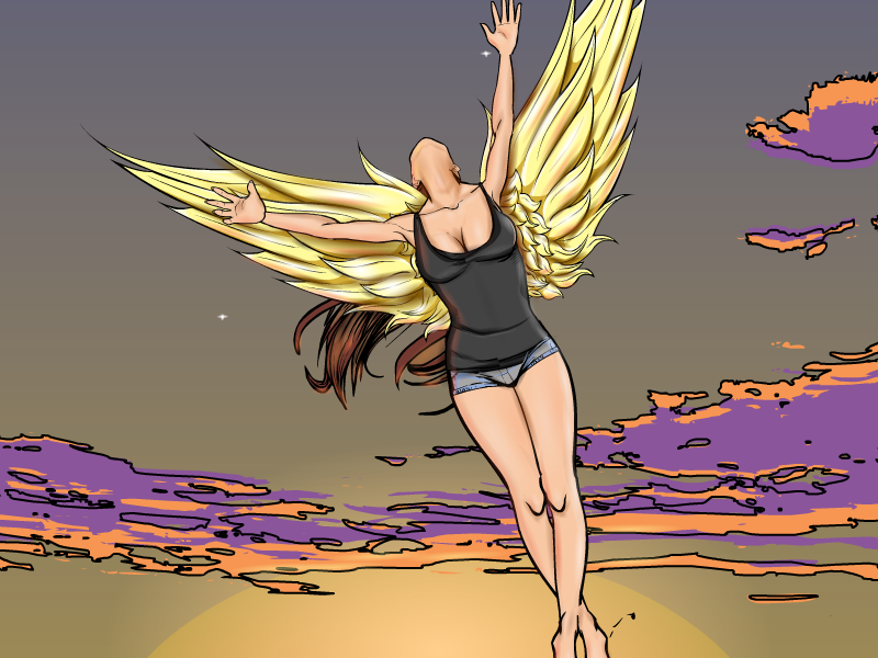
Character Of The Week: Candruth- Summer Flight

I know I don't do Character Of The Week as a regular blog post anymore but I thought I might as well bring it back as a one off because I feel that this picture is in need of being singled out for sheer awesomeness.

Now, Cadruth has been doing a lot of truly amazing stuff recently (if you haven't checked out the forum thread Candruth's Characters :3 you've really been missing out), but I think this one takes the biscuit, if not the entire cookie jar. And if I had to single out one reason and one reason alone (which is quite hard actually), it would be the shading.  The use of colour here to accentuate and add depth is truly superb, especially on the wings and on the neck. And whilst we're on the neck, I have to applaud Candruth's posing here. It is fairly difficult to do a raised head in Heromachine, mostly because the join between the chin and the neck is quite hard to get right, but it is pulled of brilliantly here and the use of shading just add to this. I also have to make mention of the colour usage here. We'll start of with the colour usage in the shading, because I haven't gone on about the shading enough yet, but it's nice to see shadowing without using black (especially as someone who uses that technique exclusively) it adds much more vibrancy to the picture and allows the highlighting to make the subject shine. Then we have the contrast between foreground and background. Whilst I do think there could have been more done to the background (maybe loosing the outlines around and adding some shading to the clouds, as they look quite flat currently, also maybe a few more stars would make it more visually pleasing) but the overall sunrise/ sunset (I think it's more likely meant to be sunrise going by the colours) effect is very nice and it contrasts well against the main foreground colours, the light creamy gold of the wings against the slate grey is especially effective. Overall a very impressive composition.

Creators Club Poster 2014

Ok guys, I've finished putting together this years Creators Club poster. First, I'd like to thank all the creators who entered, seeing all your work was really awesome. Sorry, a few people didn't send me the text files for their entries so they didn't end up on the poster (I struggled to fit everyone on as it is).

You might want to open it in a new tab to see it in more detail. Funny thing is, the poster was much bigger than it ended up whilst I was creating it, something must have got compressed during the export, so sorry about that.

If anyone else wants to do next years poster, I'm ok with that, but otherwise I'll try to come up with an interesting theme for this time next year.

Jackrabbit Cover Design: Costumes

I've done a couple of covers for Friend of HeroMachine and author Ian Thomas Healy. The next book up in his "Just Cause" series is a more humorous super-hero story titled "Jackrabbit". We thought it might be fun to include you all in the cover design process, so over the next couple of weeks I'll be making posts here about how it's going.

Continue reading

Strut Your Stuff!

From time to time I like to make a place for you all to show off your best stuff. So in the comments, paste a link to your favorite HeroMachine drawing, or maybe one that you feel like hasn't gotten enough attention, or just something you have done that you think is awesome. It doesn't have to have been for a contest or anything, it can be any HM illustration you're particularly proud of for any reason.

Then we can all ooh and ahh over each other's work and feel good about ourselves!

Just one selection per person, please. I look forward to seeing your stuff!

Succubus by Therianthrope

I'm sorry, I know it's Jeff's thing, doing a random character of the day, but I just came across this in the forums and it needs to be given this sort of fanfare.

You can check out the rest of Therianthrope's gallery here: http://www.heromachine.com/forum/the-heromachine-art-gallery/therianthropes-characters/

Character Of The Week: 21st September

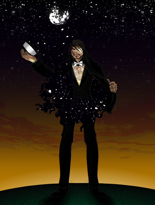
Earlier this week, Delirious Al posted three pieces that I think might just be the best stuff this incredibly talented creator has ever done. I could have featured any of them in this blog, and in fact I changed my mind on which one to cover several times, but I eventually settled on this one because it just seems to have wonder spilling out of it (literally).

9: 21 DeliriousAL_MidnightMagician


I'm struggling to know where to start. The glowing effect on the symbols/ tattoos across what of the characters body you can see is just stunning, the simplicity of having the white glow behind the yellow font in order to enhance the font and make it stand out in such a way that it seems realistic is brilliant. Then we have the characters expression and his pose, which are just the right mixture of malevolence, mystery and charisma to make him an enticing centrepiece to a piece with so many different eye catches.

But really, the reason this piece won out over the other two is the background. And to discuss that we must start with the costume, because the two are basically inseparable. For once I find myself unable to recognise what item was used to create the effect of the stars spilling out of the coat, but the effect is magnificent. It does look like a condensed gas escaping from a container. The fact that the rest of the costume is also black adds to the effect, because it is hard to tell where the character ends and the background begins. And then there's the sunrise, which just adds another layer of warmth and I might just have run out of superlatives for which I apologise, but I think you get the idea.

Character Of The Week- 31st August

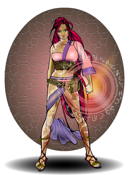
Now, up until this morning I had a completely different picture in mind for this weeks COTW, however, when I saw this piece by prswirve when I did my rounds this morning, I felt compelled to change.

8:31 prswirve_elantra


Now the first thing that caught my eye here was the patterns that cover her body. I love how they are light on one side and dark on the other, very unusual and effective, especially when the alpha setting on both colours is lowered to allow the shading from the items behind to show through.

The next thing I looked at was the face. She has a great look of focus, with the pursed lips and staring eyes, which is accentuated by the 'ready' pose. The shading here is great too, it brings out the facial features wonderfully and doesn't overpower the pattern that carries over onto the face from the body.

Which brings me nicely onto my second favourite thing about this character, the costume.  I love the custom made top, which teams Far Eastern historic with modern style very nicely, shows of the skin pattern on the shoulder and manages to make pink, purple and brown work together. Of course not everything works brilliantly, the right shoe is a bit off and the cape by the leg could have worked better if a different cape had been used, but those are the only gripes.

However, the best bit of this picture for me is the energy effect prs has created. The warmth of the pinks, oranges and golds used is incredible, it looks like a sunrise and contrasts brilliantly against the dusty dull brown of the background at that point. Brilliantly done.

Character Of The Week- 17th August

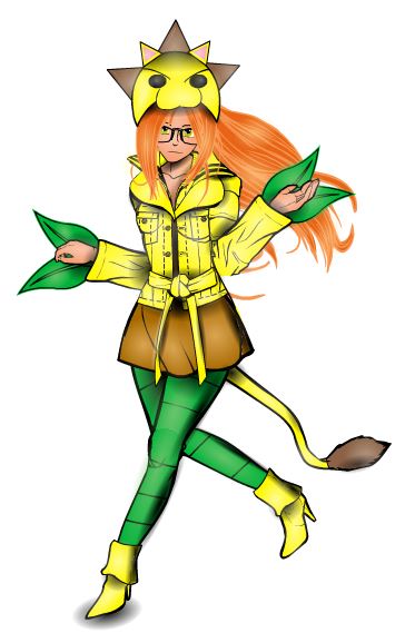
When looking for a subject to cover in character of the week I always try to find something different, someone who I haven't covered before or even recently. However, this week it seems I have been unable to do so, due to the fact Jeimuzu exists and is doing stuff like this on a constant basis.

8: 17 Jeimuzu-Dandelion


There are lots of things that caught my eye about this creation in particular, starting with the costume, which is kooky to say the least. I love the hat and the leaves coming out of the sleeves, which both tie in with the characters name; Dandelion. She certainly has a unique style, much like her creator.

The colours used enhance the character brilliantly, only needing three (major) colours for the costume and two for the body/ hair. The costume colours were well chosen to tie in with the name and costume, with the main focus being on the yellow, which alongside the green of the leaves and leggings and the orange of her hair, gives the character a very vibrant feel.

The face was the next thing to catch my eye. Very nicely understated and quite pretty, she looks like the kind of girl you could expect to see dressed in that fashion at some sort of anime convention. She doesn't look aggressive or overtly sexual (which seem to be the two main categories for super heroines), she looks relaxed, which would certainly be unnerving and strange for anyone facing her.

Finally the pose, which has a very nice movement to it. The fact that she is not really running, but more skipping towards her next adventure adds to the quirkiness of the design. Again, it gives the impression of relaxation around the character, that she's not really worried about having to do all the super heroics, which I think is a nice way to look at it.