Category Archives: Character of the Week

Character Of The Week: Candruth- Alien Woman Portrait

It's funny, I always try to feature different people for CotW, just so I'm not repeating myself. However, I'm spectacularly bad at it, as I'm sure those of you who remember the original run will know. But it seems there is one person who I just can't stop featuring, as this will be their 3rd or 4th time getting CotW.
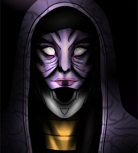
Ok, I will say straight off, this isn't as good as the last of Candruths works we featured on CotW, but that one was a masterpiece. But I have to feature it, simply for the same exact reason I always feature Candruths art, the flipping' attention to detail on the shading and highlighting. If I could just draw your attention to the wrinkles around the nose and the mouth. Look at that lighting, really properly look. You have the base purple skin colour, then you have a slightly lighter violet colour, then that cream colour for highlights. Add the black shadow shading and then you have another purple to accentuate the contrast in colour (though this could be a mixture of the lighter purple and the black, but it looks to me like another colour). Most people just have base colour, highlight colour, shade colour, done. But obviously not Candruth. And then you have those eyes. Not only are they superbly creepy, but they also seem to have at least 5 different colours in there for shading and highlighting (green, cream, pink, very light purple, white and a darker purple) added onto the base colours. Honestly, Candruth does more shading on her characters eyes than I do on my whole characters. And that's saying something. And just when I think I can stop going on about the shading, I see the neck. And the shadows on the hood, making it melt seamlessly into the background. God, so good.

Oh, and does anyone else think Star Wars when they see this picture, or is it just me?

Character Of The Week: AMS- The Ankh

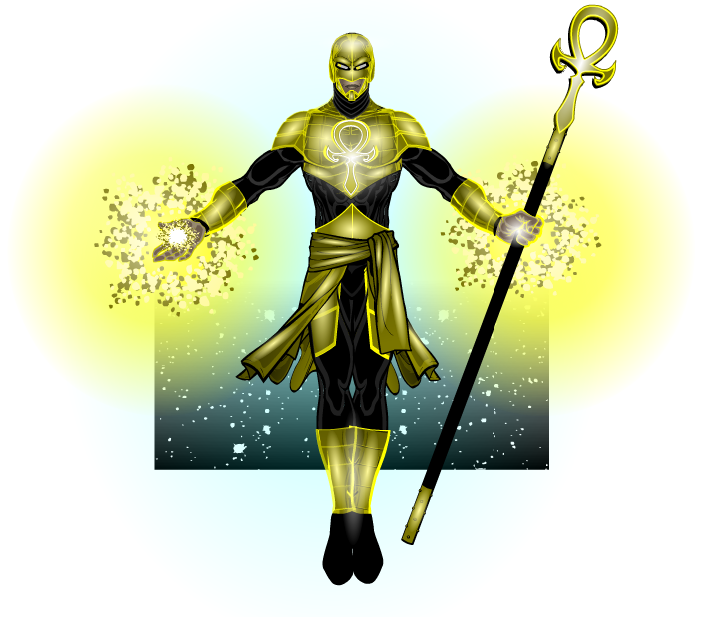
Ok, I'll admit I was a tad mean with this weeks CDC curveball, but it's not fun to be predictable. But the fact that he couldn't enter it into the contest didn't stop AMS from carrying on his redesigns of his character The Ankh, whom he entered into the HM1 contest and then recreated for the HM2.5 Contest.

So, it's an AMS picture, y'all know what to expect. Fantastically simple costumes that still manage to knock your socks off (see the top, which is a nice combination of two tops and some shoulder items, masked so they all fit together like they were a single item), peerless shading (do I need to give examples here?), posing and expression (look how fierce the expression is) and that finishing touch that just takes his work that extra little way (in this case the background, which appears to be a combination of three different background techniques. The first being the stars, which are masked to a background square. Then you have a gradient circle, which is also masked to a background square, to give the black corners. Then finally, over the top of the previous two elements, there is the gradient square, which is set to Colour 2 as White and Colour 1 is set to 0% alpha, then flipped upside down, so it looks like the background is fading into the white base. Well, that's how I'd do it anyway). So yeah, your standard AMS work. That is to say, it's freakin' sublime.

Character Of The Week: DiCicatriz- Crag

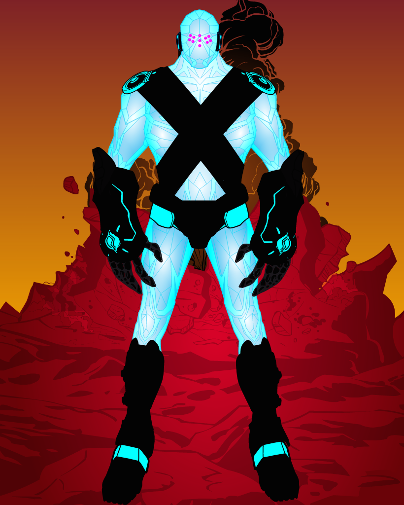
Now there's a very particular reason I chose this weeks COTW and I want to see if anyone realises before they get to the end of the post. So, everyone, please take a look at this.

Ok, well for a start it's DiCicatriz, so that means the shading is awesome. You can just feel the cold emanating from him, with those icy blues and the stark white highlights. But that's not the reason.

Then we have the contrast of the picture. The cold blues and whites of the foreground character stand out brilliantly against the warm reds oranges and browns of the background. Still not the reason though.

Then we have the costume. Admittedly I would have preferred it if the pure black didn't make up most of the colour for the costume, it does mean much of the detail is lost, but it works against the very light body colours. I do like the fact that DiCi has used some of the lesser seen items, the disk shoulder pads (not sure what they're called) and the giant clawed gauntlets. It makes the piece stand out more. But again, that's not the reason.

The reason I chose to feature this picture, is because of his face. He's Regice 😉 . Ok not really, but he looks quite like him. Seems like someone else is as hyped as I am for the new Pokemon games 😉  .

Character Of The Week: Nug- Cyber Mask

Difficult decision this week. There's been at least 3, maybe 4 pictures that could have been featured this week, but I'm going to go with this one by Nug because it gives me a bit more to talk about.

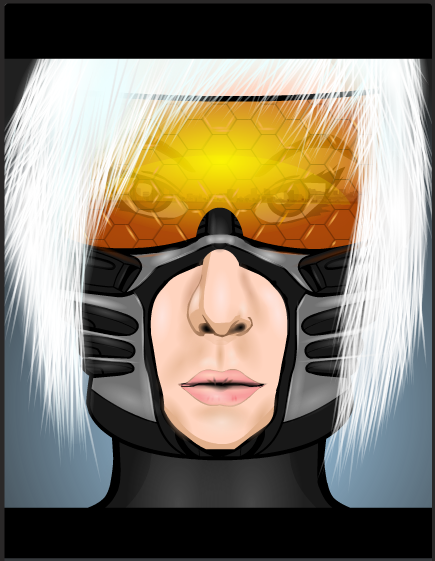
Lets kick off with the best bit shall we. As I'm sure everyone has noticed, the colour on the visor here is truly stunning. The warmth and the depth is gorgeous, it really adds to the sunrise reflection effect that is being portrayed here. It also doesn't drown out the rest of the reflection, nor the face beneath the visor, which is good, making the image seem more realistic. I also like the fact that Nug put small highlighting shines in some of the hexagons on the visor. It's a little detail that just adds that little bit of polish to the image and just takes it that little bit further.

Nug said on his thread that he wasn't to happy with the hair on this picture. I personally can't see the problem. The slight glow that he has added makes the hair seem more natural than it would if it were just left unshaded. That combined with the fact that you can actually see the individual hairs for the most part gives a natural looking hair style with an un-natural edge, a very pleasant and eye-pleasing juxtaposition.

However, we now come to something I haven't done in a while, what's wrong with the picture. Nug is right, this picture isn't perfect, it could be improved. And for me, it's the jaw line. The metal part of the helmet is made from a cyber-torso, which is fine and the item works well for its purpose, but I don't like how Nug just left the bottom edge as it was. It gives the character an oddly shaped square jaw and it looks odd when you look at the characters chin. If he had masked the torso item to the same female head he had used for the chin, Nug may have been on to a real winner here. But just that one bit makes it fall short of perfection. But only just.

Character Of The Week: RobM- Monument Builders Of Sirius

Ok, I've gone and broken my own rules again, because this picture was actually posted last week. But I already had written last weeks COTW post when this was uploaded and when I went back and looked at it again I thought to myself "I should probably feature this one next week". So I'm going to.

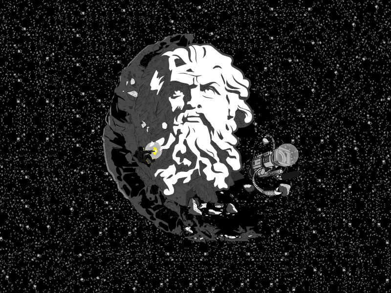
It's not  often that we get a picture where I actually have to go into Heromachine to try and figure out how it was made and then, an hour later, I come out none the wiser. Rob if you could enlighten us as to how you managed to blend the grey portion of the face so seamlessly with the rock face, as well as how you managed to get the grey sections patterned without the white bits being patterned also, because I couldn't get it to work when I tried to do the same, I'd be very grateful. It's such a great effect  and it really annoys me that I can't explain it….

Hang on. I just zoomed in on Preview and had a look at the face more closely. Are those background-floors? You sneaky bugger. Those are the wood/ stone texture uneven floors turned sideways! *facepalms* How did I miss that? Time to whip out the COTW slogan of "simple but effective" once again.

Anyway, my favourite part of this image  isn't actually the planetoid face, it's the character carving it. Rob was the person who, if not created, at least made known the technique of backlighting with his CDC33 winning entry Moonsrise. And he's used the effect to great… effect (?) again here. The effect is, once again, stupidly simple, you create and pose a character and then make the colour full black, so the character is a silhouette. Then you make duplicates of the items/ body parts that you want to be backlit, and make the copies slightly bigger than the originals, place them behind the original body parts so that they are slightly showing, and change the colour so it is the colour you want (in this case yellow, but white is more striking). The effect can be quite stunning when done well, as Rob shows us here.

Character Of The Week: Zyp- Katana

I will apologise for the excessive amount of hyperbole and fanspazzing in this weeks post, however, if you look at the title of this post, look at the name, who it is that is being featured, I'm sure you'll understand.

Yes, that's right, after an extended absence, "the man after whom the technique of shading on heromachine is named after" has returned. Zyp is back. And he immediately makes everyone else look amateurish. Apparently this was meant to be an entry for the Going Japanese contest, but he missed the deadline, zypping probably. All I can say is, if this had been an entry, it probably would have been a much closer contest.

Anyway, onto the actual justification bit. And, although the picture its self should provide justification enough, I feel compelled to talk at length about it (so what else is new?). We'll kick of with the character. The pose just screams badass, she looks at the ready to slice and dice with that katana and the expression on the face would suggest that she couldn't care less who said katana slices and dices. It's such a wonderfully aggressive expression. It basically sets the scene for the picture, gives it the depth needed for the rest of the image to tell a story.

Next we have the composition of the picture, by which I mean the background elements, the angle of the focus and the colours. I love the fact that this picture is on a slant. It means that the focus of the picture is not centred, which draws your eyes around the image more than having a straight central focus would.  Your eyes are drawn from their default centred position to the right so you see the face, then you are drawn around the picture in a clockwise motion, down the body, around the floor and up the sword until you reach the sky, then back to the face. It's so easy to take in the entire picture just by following the elements that make it up. This is helped by the wonderful use of soft and warm colours. The pinks and yellows of the sky set of the greens and greys of the middle focus perfectly, and the two contrasting colour schemes are combined on the main focus, the character, in such a way that they don't clash or contrast but work together, making all three layers of the image fit together so naturally. I must also mention the fact that Zyp has changed the line colour of some items where he is including the reflection of the sunset on the character. I know I say this a lot on these posts, but it's such a simple idea that works so well. Attention to detail and a bit of extra creativity can turn a picture from a great one to a masterpiece.

And finally, the obvious thing that one has to talk about when critiquing a work by Zyp. Really what do you want me to say. He's Zyp, you expect me to trash talk his shading? Look at that freakin' sword. The subtleness of the colour differentiation on the clothes. The block shadows on the arms. That sky. And of course the aforementioned sunset reflections. *shakes head* What am I meant to say.

"We are not worthy" *throws self to floor Waynes World style*

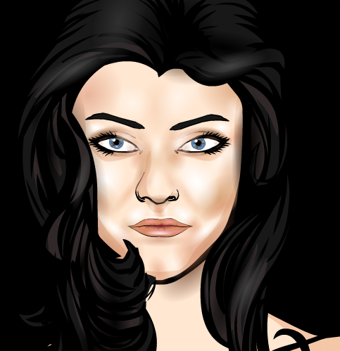
Character Of The Week: Candruth- Portrait of a Blue Eyed Woman

I fear I would be neglecting my duty if I didn't showcase this picture for this weeks COTW, even though it was originally posted last friday, just before the last COTW went up. But, technically, I pre-schedule these posts the day before, so I couldn't have featured it last week, so I can feature it this week. So for those of you who missed it, here's Candruth's latest piece of Art.

Anyone remember that amazing portrait SeanDavidRoss did for the faces contest a couple of years back? It's in the Hall of Fame, so if you don't, go find it. This piece reminds me of that, and that is very high praise indeed. There's not very much to the picture apart from the shading/ lighting, so that's what draws your eyes. And it just looks gorgeous. Ok there are some messy bits, some of the shading does spill over into the eyes, but the lighting looks so natural and realistic that it doesn't seem to matter so much. The attention to detail is stunning. It took me a few minutes to realise "hey hang on, there's something going on with those eyes, I don't remember seeing eyes with pupils like that in heromachine before". And I was right. Canruth has actually done minute dots of colour and shade in the pupils, which just adds that much more depth to the look of the piece. Even those little fleshy bits in the corner of the eye that no-one knows what they're called (in before someone says it in the comments) look like they've been shaded. And there's the extra bottom lashes. And the shading around the cheek bones. I'd hate to think how long this whole thing took, or how many layers the final piece came to. Well done Candruth.

Character Of The Week: Linea24- Lilac Rose’s Mishap

If you really need me to explain why I've chosen this weeks featuree (is that a word? It is now) as Character Of The week, I'd suggest you get your eyes checked, and possibly return them to the manufacturer, because they're obviously faulty.

See what I mean? Linea says it's all just insignias, but I think it's more likely witchcraft. If I didn't know she'd used heromachine I wouldn't believe it was heromachine. Linea has a talent for making cats and this is a fine example. The pose might look simple, but I can't even imagine the patience required to get it to work and look so seamless. Of course, there are still some bits that could do with some attention; the paws in this case, they could do with some features, such as definition between the toes so they don't just look like blobs, but overall it's incredible. Then we have the background. The glow effect works really well as a contrast against the black, grey and dull browns of the rest of the background. I also like the fact that the glow is reflected, not only off of the rest of the background, but off of the character its self. It shows that the character is actually interacting with the surroundings, which shows real thought on the part of Linea.

Stunning work.

Character Of The Week: Stulte- Spirit 11

I'm kinda bending my own rules here this week, because I said that I wouldn't be featuring any entries for the Character Design Contests. However, considering that this one was entered for a contest during the Forum down time and Stulte has only just got round to posting it, plus it's only one of six parts that made up his entry, I think I can get away with it. Anyway.

Ok so, I can't really talk about much here, because this is so simple, but it looks so good. This is a perfect example of what you can do with just two items and some colour blending, because all it is is some wings and a tail. I love the warm vibrancy that the golds and oranges bring to the piece and the fact that the line colour is lighter than any of the filler colours exaggerates that, making them look deeper and even more inviting. And the fact that the centre is covers by a glow masking where all the items meet adds a sheen to it, makes it look neat and professional, as if all the parts where made to make up the whole rather than the whole made to fit the parts. So yeah, good job on this one dude.

Character Of The Week: Therianthrope- Giovanni

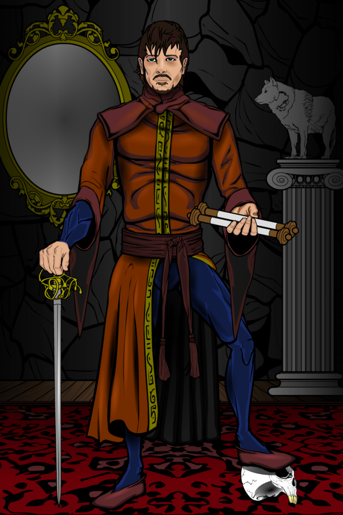
This weeks COTW I had to feature not only because of the fact it's a great image, but for all of the symbolism included and the thought that went into it.

Ok, we'll kick off with the usual stuff. The shading is excellent. There is a chance that when you do shading with near full alpha settings, you can end up with shading that looks messy and horrible, which is why I tend to prefer using at most 75% alpha on the shading circle, but Therianthrope has a knack of actually making it work. The shading on the face is a very good example of this, as well as a good example of adding depth without using the standard black. The face looks incredibly realistic and the expression just draws you in. However, while we're on the shading, I do think he missed a trick by not putting a shadow underfoot of the character and the skull beneath the left foot, it makes the character look slightly divorced from the background at the point they meet.

My favourite part of the image is not the shading though, it's actually the left hand. It's so stupidly simple, but I haven't actually seen those two hands used together in that way before. It's impossible to mask to the palm up hand that is used as the back part of the hand here, or at least impossible to mask in a way that looks good, so using the grasping fingers makes sense. But I haven't seen it before. Maybe it's just no-one has had need to use those items in that way, but I had to make mention of it because it just works so well and I will be borrowing that idea at some point in the future.

Finally we get on to all of the symbolism and for that I'm going to let Therianthrope speak for himself. As he posted on his forum thread:

"The rapier standing for his clans strength – wielded with finesse, the scroll standing for his learned status, the mirror in the back indicating his wealth, the statue of the wolf indicating he is Cainite, and the skull under his left foot is for his clans mastery over death (they’re necromancers)."

I love all of the thought that was put into all of the little details and inclusions in here. Everything has a place and a meaning, nothing is out of place or needlessly included. It just works.