Category Archives: Character of the Week

Character Of The Week- 17th August

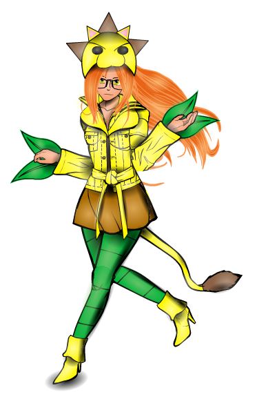
When looking for a subject to cover in character of the week I always try to find something different, someone who I haven't covered before or even recently. However, this week it seems I have been unable to do so, due to the fact Jeimuzu exists and is doing stuff like this on a constant basis.

8: 17 Jeimuzu-Dandelion


There are lots of things that caught my eye about this creation in particular, starting with the costume, which is kooky to say the least. I love the hat and the leaves coming out of the sleeves, which both tie in with the characters name; Dandelion. She certainly has a unique style, much like her creator.

The colours used enhance the character brilliantly, only needing three (major) colours for the costume and two for the body/ hair. The costume colours were well chosen to tie in with the name and costume, with the main focus being on the yellow, which alongside the green of the leaves and leggings and the orange of her hair, gives the character a very vibrant feel.

The face was the next thing to catch my eye. Very nicely understated and quite pretty, she looks like the kind of girl you could expect to see dressed in that fashion at some sort of anime convention. She doesn't look aggressive or overtly sexual (which seem to be the two main categories for super heroines), she looks relaxed, which would certainly be unnerving and strange for anyone facing her.

Finally the pose, which has a very nice movement to it. The fact that she is not really running, but more skipping towards her next adventure adds to the quirkiness of the design. Again, it gives the impression of relaxation around the character, that she's not really worried about having to do all the super heroics, which I think is a nice way to look at it.

Character Of The Week- 10th August

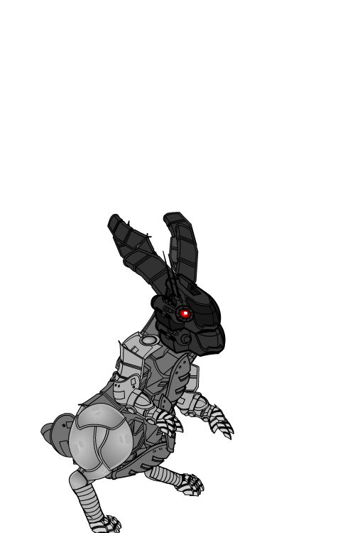
This week, I'm going keep it short and talk about the latest in Trekkie's robot companions series, the Robot Rabbit.

8: 10 trekkie-RobotRabbit


Now, the main point of looking at this image is that there aren't any really fancy tricks going on, no shading (which Trekkie can do very well), no background, just item placement. See how many different items you can spot. Making items fit in places they aren't made for can be hard enough sometimes, but fitting them around a companion must take a while, especially as it's so well done. It doesn't need any other decoration to look interesting (although it'd probably be spectacular shaded).

Character Of The Week- 3rd August

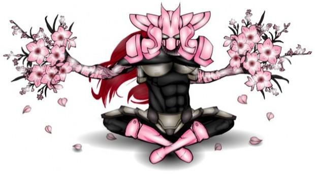
Finally, for the first time since the second Character of the Week, we're going to look at a character. And what a character it is. Sakura Master by Jeimuzu

8: 3 Jeimuzu- SakuraMaster


Now, Jeimuzu has been causing quite a stir on the forums since his first post two weeks ago, and I could have put any of the characters he posted this week up for COTW, but I felt drawn towards this one.

We'll start of with the headgear, which looks like it belongs on a space villain from an anime kids show (and I do not mean that in a bad way, I grew up on 'em). I've no idea how he'd move his head left or right, but it looks badass, even in pink. Plus it's a good use of an item in a way it wasn't designed for, in this case shoulder pads for headgear, which always wins big points. I can see a samurai influence in the helmet design, which I'm sure isn't just because of the Japanese connotations of the character name.

If we now move on to the pose, the lotus position is a must do if you are doing an oriental character, but the fact the character has his arms outstretched, with a dark glare fixed on the viewer suggests to me that he's only a nano-second from some serious pain dealing.

Colour wise, there's nothing bad to note. It's hard to carry pink off well, especially on a male character, but it works here. I also like the shading, although the alpha on the neck- cape could come down a bit to the level of the torso shading (which works really well). The problem with choosing the lightest colours of the pallet and then doing highlighting with white is that the white can often over power the main colour leaving the picture looking swamped, but thankfully this hasn't happened here. Jeimuzu has found a happy medium, especially on the boots and flowers.

The last bit to talk about here is the attention to detail. And here I have to highlight the arms, or specifically the join between the arms and the flowers. It looks very natural and there are no lining up problems as far as I can see. And I also like the use of the leaf insignias as falling petals, something that is very associated with Japanese culture (usually seen in pictures of Geishas), another great touch in subliminally telling the viewer of the characters culture.


Character Of The Week- 27th July

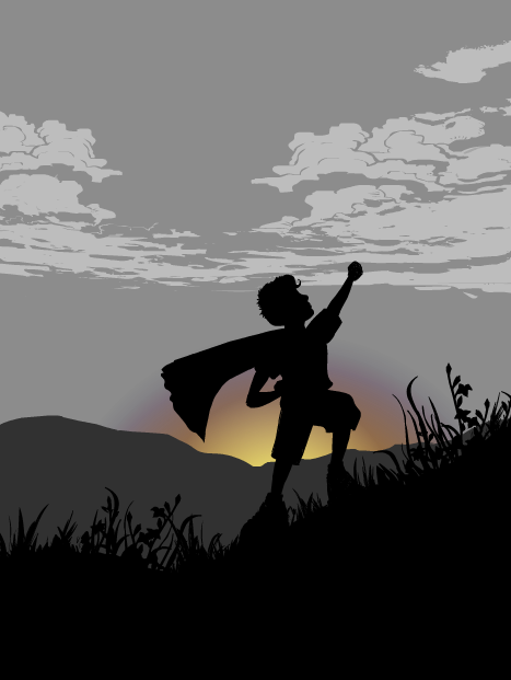
Once again on Character Of The Week, I'm going to feature an image rather than a character (still Character Of The Week sounds better than Image Of The Week). This week we'll look at this image by the brilliant Moognation.

Now, whilst it might be taken almost directly from a series of images that did their rounds on the internet about a year ago, I felt I had to feature it because it's just so awesome. The feeling behind it is tangible, if you haven't ran around with some sort of towel or sheet wrapped around your neck like a cape I think you might be on the wrong site. This picture captures that childhood fantasy perfectly. The pose is right on the money and the proportions are near perfect (which is hard when doing children on heromachine). How Moog did the grass is very inventive, using the bunch of flowers in ItemsRight- Misc, it works very well in silhouette as representing the wild grass on the side of a hill.

The most striking part of this image is the colours. The fact that the majority of the picture is either in greyscale or silhouette makes the yellow, orange and purple of the sunrise stand out even further. And the inclusion of those three colours provides the picture with a feeling of warmth even though the picture is mostly dark and dull greys and black.

Finally, something I wouldn't usually highlight, the title. It sounds somewhat familiar but I can't quite place my finger on what. Either way it fits the picture perfectly, which is hard when titling non-character based pictures, and I can just imagine myself saying that when I used to play superheroes as a kid.

Overall, one of the best silhouettes I've ever seen in heromachine and, Moog, I hope you do more than just the two you've done so far, they are excellent.

Character Of The Week- 20th July

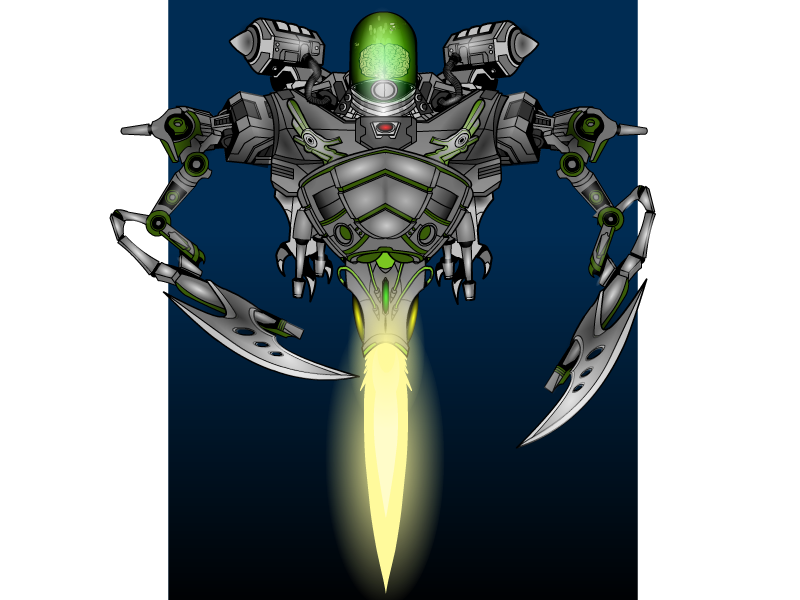
For this week's character of the week we'll take a look at Torog's Brain-Bot-3.0.

The thing that attracted me to this is the attention to detail used when constructing the subject. This is especially prevalent around the centre of the picture, the rocket mechanism made from the glove and shoulder items. The masking here really works, sometimes masking to join two items together can leave a mismatched line along the join, but here there doesn't appear to be one.

Also, the design is very well thought out, it looks like it could conceivably be used in either a comic or a sci-fi movie. The item choices work well together and nothing seems out of place. There is also a menacing quality to the machine, having no face (the essential part of the anatomy for human interaction, without it there is no emotion, something which is inherently unnerving to us) as well as the large, fearsome looking claws, which, coupled with the non-humanoid body structure, suggests something alien and antagonistic.

The final thing I like about this piece is how it is finished. The colour choices for the body  help the menacing aura, being dark and dingy. This is nicely juxtaposed against the bright and brilliant flame from the booster, although this may have been enhanced if there was some sort of reflective glow on the adjacent bodywork. Finally, the shading is very effective, especially on the claws and head. There are still some bits that could have been shaded where they aren't, but there is a very good contrast between light and dark, especially as the dark seems to be more prevalent on the main body whilst the light is more noticeable on the extremities, such as the head, booster and claws.

Character Of The Week- 13th July

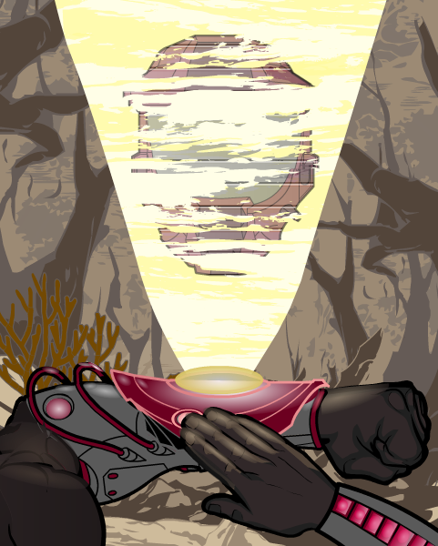
This week, we're going to look at not so much a character, more a scene by the master of Heromachine comic covers; RobM.

Incoming Message

Now, the main thing that attracted me to this piece was the lighting, especially on the wrist projector and the right hand. There are some good hints here on how to get really bold lighting effects, so I asked Rob about how he did them and hopefully he won't mind if I put up here what he said in reply:

"The wrist protector is one item from ItemRight Polearms with one gradient background shape masked to it and another laid on top. The masked gradient background shape has 25% second color and 0% line color. The pink glowing line color on the wrist protector is a result of the 25% darker magenta red gradient combining with the item's 65% gray line color. Then there's a second gradient background shape (the brighter gradient under the yellow disk) at 50% x 20% size laid on top.

The right hand is actually two hands. I masked the bottom portion with the thumb to an insignia so that I could use the darker prime color on the hand's under side. The layer below is a full hand where I used a lighter color for the prime color. Then I laid gradient background shapes over each finger at strategic places with the prime and second colors at 50%. It's tough to do shading on hands because masking works differently for hands than it does for other items."

Whilst these might be the most striking aspects of the picture, it wouldn't be half as good with out some of the finer details, such as the glow on the glove item underneath and to the side of the projection (especially on the wires, which can be very easy to overlook).

Also the projection its self is very well thought out. By a combination of a slightly transparent main focus (the helmet) along with the horizontal line effect and the clouds from the background items (masked to the beam) gives a very good impression of static interferance as usually seen in sci-fi war hologram communications.

Finally we come to the background. The best thing about this is that it doesn't distract attention from the main focus of the piece in the foreground. By using earthy, dull tones and a lighter than black line colour, it contrasts with the clear, bold and precise foreground to give a distinct feeling of depth to the picture and suggest a murky, mysterious and dirty world beyond what we can see.

Very well executed.

Character Of The Week- 6th July

So, for this weeks COTW we're going to look at one of the most creative and unique creators still active on the machine, Harlekin (/Harlequin/ Tarkarra/ Tarkabarka). Here's the piece in question.

Now, of course there are many things to talk about here, so we'll focus on a few things.

First off, the perspective. Harlekin is very good at doing weird perspectives, birds eye view is one he's very good at. A very good way of doing unusual perspective/ position parts of limbs (such as thighs and biceps) is to use female-heads and then resize them, as you can see with the biceps here. This can also be used for foreshortened arms and crossed legged thighs.

The bike is very well made, out of numerous different items, a good example of thinking outside the box when using items. In the construction here I can see items from headgear, items-right, body-mech and insignias. I'm not sure about how the front wheel and handlebars line up, but still, it's not that noticeable, and it still works.

The main thing, apart from his posing skill, that is interesting about how Harlekin does characters is how he does faces. The manga/ anime style is very hard to do on heromachine with conventional items. The way this is done is by using insignias to create every aspect of the face (which he shows how to do in this series of tutorials http://www.heromachine.com/forum/tips-tricks-how-tos-and-guides/lick-and-tricks-with-harlequin/).

I'm sure we'll cover Harlekin again, because there are other aspects of his art that aren't best demonstrated in this piece that I'd like to talk about, such as his shading and clothing design, but for now I'll just end with that.

Character Of The Week

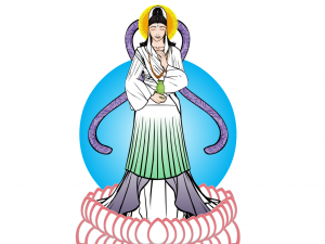
As promised, one of the new weekly blog posts. Now there idea here is not only to give  praise, but to look at good design features and highlight techniques that make the composition work. So without further ado, this week we'll look at Renxin's Kwan Yin.

29th June Renxin-KwanYin


This was entered into this weeks CDC, but I had to disallow it due to it contravening the 'no current religions' rule, however, it is certainly worth looking at more closely.

First off, let's look at the colour. Being a representation of a Buddhist god, the colours are very light and natural, none look out of place or overly dominant. Using only three colours is one of the best techniques for getting a good costume, you can often smoother a good design by using too many colours, no matter how well chosen they are. By using only the green, purple and white, it allows the foreground figure to stand out more against the background. The fading effect used on the colours of the lower dress (HINT: which is done by using the rectangle or circles on the last page of the Background-Shapes page and setting the first colour's alpha setting to 0% and then masking to the desired object) is a really simple but effective technique that can be used in lots of different ways (such as shadow effects or highlighting).

The lotus petals around the feet is a really neat way of using that insignia and by using a lighter outline colour compared to much of the rest of the piece, it differentiates these foreground objects from the main composition in a highly effective way.

The choice of items for making the clothes, whilst not highly innovative, is very effective. The skirts for sleeves is a good example of going to other categories to find what you need.

My favourite part of this piece however, has to be the face. I'm still not quite sure what item was used for the eyes (maybe the manga style nose? Do you think you could clarify for us Renxin, I'd love to know) but it works perfectly. The expression definitely says 'peace', which is the point of a depiction of buddhism. The choice of items for the hair and hairpiece were very well chosen and certainly add to the whole head area without drawing attention away from the face, much like the background 'halo'.

Overall, a wonderfully executed piece that looks very simple, with no masses of shading, because it isn't needed. Shame it wasn't eligible for the contest really.