Google Sponsored Content
The Nerdmudgeon Podcast
 Three middle-aged nerds (including yours truly!) review all of the MCU movies in chronological order. Short, funny, and full of good vibes, check it out and let us know what you think!
Nerdmudgeon.com
Three middle-aged nerds (including yours truly!) review all of the MCU movies in chronological order. Short, funny, and full of good vibes, check it out and let us know what you think!
Nerdmudgeon.com-
Recent Blog Posts
- HeroMachine 2 is back! December 12, 2023
- The Death of the CDCs February 18, 2023
- Character Design Challenge #– 540 – Home Sweet Home February 13, 2023
- CDC #539 – Alter Egos ( Hosted by Cody Merrill) February 5, 2023
- CDC #538 – Fantastic creatures..! (hosted by Scott Weyers) January 29, 2023
Archives
Categories
Useful Links
The Secret Lair
Category Archives: Challenge Favorites
Character Design Contest ♯33 Poll
[polldaddy poll="7281265"]
Comments Off on Character Design Contest ♯33 Poll
Posted in Challenge Favorites
Character Design Contest ♯32 Winner
The winner of last weeks CDC poll was this fabulous piece Love is always win Part 2 by the excellent Harlekin. Congrats Harlekin and well done to everyone who entered.

Comments Off on Character Design Contest ♯32 Winner
Posted in Challenge Favorites
Character Design Contest ♯32 Poll
[polldaddy poll="7265224"]
Comments Off on Character Design Contest ♯32 Poll
Posted in Challenge Favorites
Character Design Contest ♯31 Winner
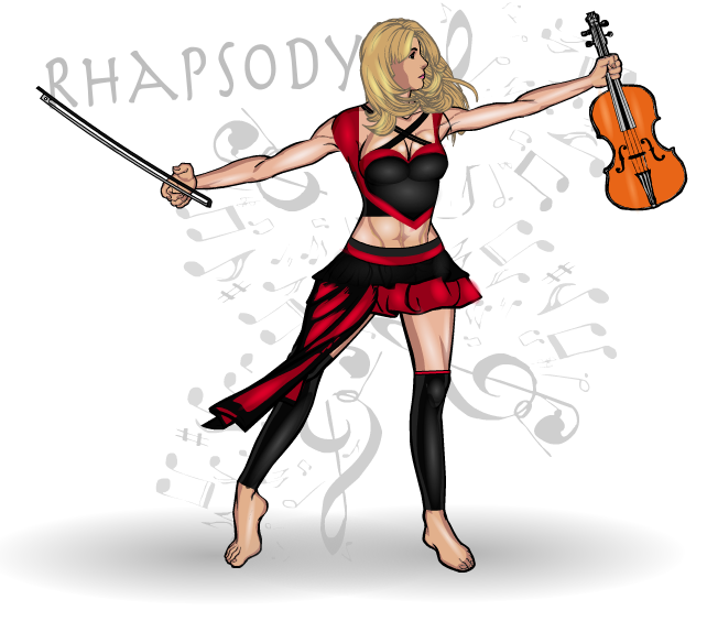
The results of this weeks poll were close guys, only one vote in it. But, of course, it doesn't matter in the end how close it was because, as they say in Highlander- There can be only one! And this week that one is Anarchangel for Rhapsody.

Comments Off on Character Design Contest ♯31 Winner
Posted in Challenge Favorites
Character Design Contest ♯31 Poll
[polldaddy poll="7249091"]
Comments Off on Character Design Contest ♯31 Poll
Posted in Challenge Favorites
Character Design Contest ♯30
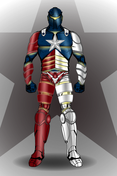
The winner of this weeks poll (getting nearly 50% of the vote I might add) is Can't Draw for his Texan superhero Lone Star

Comments Off on Character Design Contest ♯30
Posted in Challenge Favorites
Character Design Contest ♯30 Poll
[polldaddy poll="7232094"]
Comments Off on Character Design Contest ♯30 Poll
Posted in Challenge Favorites
Character Design Contest ♯29- Winner
Run away winner of this week's CDC was Scatman for Catequil. Excellent work from everyone, especially (but not exclusively) our five finalists.

Comments Off on Character Design Contest ♯29- Winner
Posted in Challenge Favorites
Character Design Contest ♯28 Winner
Congrats to Delirious Al for winning the last Character Design Contest. I thought it would be closer than it was, I must admit.
Comments Off on Character Design Contest ♯28 Winner
Posted in Challenge Favorites
Character Of The Week
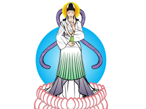
As promised, one of the new weekly blog posts. Now there idea here is not only to give praise, but to look at good design features and highlight techniques that make the composition work. So without further ado, this week we'll look at Renxin's Kwan Yin.
This was entered into this weeks CDC, but I had to disallow it due to it contravening the 'no current religions' rule, however, it is certainly worth looking at more closely.
First off, let's look at the colour. Being a representation of a Buddhist god, the colours are very light and natural, none look out of place or overly dominant. Using only three colours is one of the best techniques for getting a good costume, you can often smoother a good design by using too many colours, no matter how well chosen they are. By using only the green, purple and white, it allows the foreground figure to stand out more against the background. The fading effect used on the colours of the lower dress (HINT: which is done by using the rectangle or circles on the last page of the Background-Shapes page and setting the first colour's alpha setting to 0% and then masking to the desired object) is a really simple but effective technique that can be used in lots of different ways (such as shadow effects or highlighting).
The lotus petals around the feet is a really neat way of using that insignia and by using a lighter outline colour compared to much of the rest of the piece, it differentiates these foreground objects from the main composition in a highly effective way.
The choice of items for making the clothes, whilst not highly innovative, is very effective. The skirts for sleeves is a good example of going to other categories to find what you need.
My favourite part of this piece however, has to be the face. I'm still not quite sure what item was used for the eyes (maybe the manga style nose? Do you think you could clarify for us Renxin, I'd love to know) but it works perfectly. The expression definitely says 'peace', which is the point of a depiction of buddhism. The choice of items for the hair and hairpiece were very well chosen and certainly add to the whole head area without drawing attention away from the face, much like the background 'halo'.
Overall, a wonderfully executed piece that looks very simple, with no masses of shading, because it isn't needed. Shame it wasn't eligible for the contest really.
Comments Off on Character Of The Week
Posted in Challenge Favorites, Character of the Week, Cool Characters, HeroMachine 3, Things I Like


