Category Archives: Bad Super Costumes

That's gonna sting

No character in comics history has had as many distinctive costumes as Wasp from The Avengers. The fashion-forward Janet Van Dyne likes to look good when she walks (or flies) out the door, so you're as likely to see her in the latest haute couture creation from Milan as a powered suit of shrinking armor via Tony Stark. In fact, you can see all of them at this amazing site, comprising page after page of her clothing choices.

But one character design in particular jumps out as just awful. Apparently she was brought back from the dead somehow (comics, everyone!), only as a result she got transformed into ... well, this:

Continue reading

Hulkenstein

Completing our review of the Worst Avenger Designs in honor of the film, we turn at last to the Hulk. Since his entire outfit consistes of miraculously non-bursting purple pants, doing a true fashion review presents a major challenge. So instead, I'm going to pick what I consider the worst overall character design in his history.

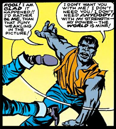
That turns out to be, surprisingly (for me, anyway), his very first incarnation as presented by Jack Kirby, the infamous Gray Hulk:

I'm not sure why both Iron Man and the Hulk were originally gray. Maybe Stan and Jack went through a color-blind phase there for a while? Regardless, besides the obvious non-green color scheme, the body design here is way on the Frankenstein side of the scale. Subtlety was never this creative team's strong suit, mind you, but I think this take goes way too far in beating the viewer over the head with the analogy.

This Hulk sports the body of a fairly typical person, albeit a somewhat muscular one. Not yet present is the gigantic scale, the massively broad chest, even the squared-off, ragged hair. This is just a beefy gray dude. Adding to the ordinariness is a decidedly Jekyll and Hyde aspect with the clear speech and the selfishness. This concept is not the unconstrained rage elemental the Hulk would very rapidly become.

I'm glad that transformation happened, as this is definitely one case where the original vision was inferior to what would follow. Thus, I'll take this as my example of the Worst Hulk Design.

Plus, Original Gray Hulk wasn't even as scary as this version of a more recent Hulk:

'Nuff said.

Of fire nipples and Cyclothongs

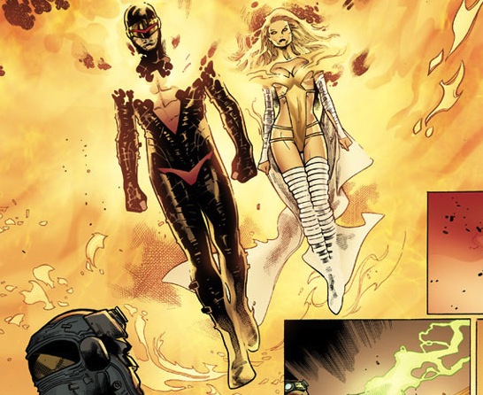
If you're standing next to Emma Frost and you're the one people point at while shouting "That's a horrible costume!", then you, my friend, have achieved truly epic levels of sartorial psychopathy:

It's bad enough that Cyclops is wearing a red thong here (or "banana hammock" if you want to be technical about it), set against a black backdrop so it really pops. What's worse is that it's the same shape as his Cyclopean eye slit, making you think maybe they're both staring at you and waiting to blast you with a beam of some sort. Yuck.

His metal or leather or whatever the chic super-hero fabrique du jour is has a deep, plunging neckline cut into it in the shape of a phoenix, presumably because he's been taken over by the Phoenix Force. Or the NBA's Phoenix Suns, which would be much worse. Either way, it's good that the cutout exists because his nipples are on fire. That's gotta smart, but if you're not willing to take the pain then you're not really committed to your fashion choice.

So congratulations, Cyclops, you've managed to wear an outfit so bad I can't even mention Emma Frost, a sentence I'm pretty sure no one anywhere ever thought they would be able to write.

(From "Avengers vs. X-Men" 6, ©2012 Marvel Comics.)

Black Widow or Bat Widow?

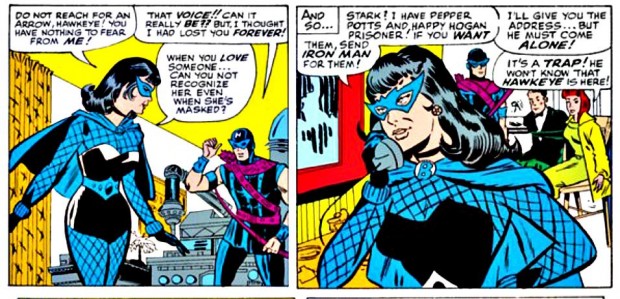
Did you know that the ultra-mod black leather sheath with matching bullet-bracelets was not the first costume worn by Natasha Romanoff, aka "Black Widow" of The Avengers? That honor belongs to this sporty number, ripped directly from the pages of Bruce Wayne's fantasy sketch journal:

That's a lot of fishnet and bat mask for someone named after a spider. And a lot of blue for someone named Black. I particularly love the big bold "B" neck clasp for the half-cape, which I believe is the grade she's hoping to receive for her fashion design project. Sadly, that's not even close.

On the plus side, nothing went to waste even though they ditched this outfit in favor of the much more functional and fashionable sheath, as a young Dinah Lance found it in a dumpster and promptly donned it to become the next Black Canary. So all's well that ends well!

Iron Man EXTREME

Continuing our examination of the worst fashion moments in the history of the Avengers in honor of the movie release, we turn our attention this week to Iron Man.

Possibly the super hero with the largest and most varied wardrobe in all of comics, Tony Stark as Iron Man changes costumes seemingly with each new dawn. From the original gray turtle to the classic gold and red to armor specially made for the Arctic to the deep sea, I would wager most of the profit from Stark Industries goes to suit storage fees. So many variations exist that multiple fans have been driven to build databases just to keep track of them all.

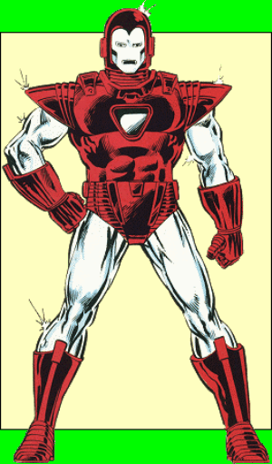
The Silver Centurion armor from his West Coast Avengers days was always my least favorite:

I thought it looked so much clunkier and chunkier than the sleek red and gold model, from the oversized helmet to the massive underwear to the pasty white color (it never came across as "silver" to me, just white). I hated it.

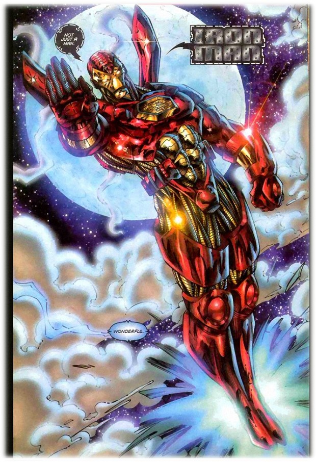
But while looking into the Cap costume I featured last week, I came across an EXTREME version of Iron Man that to my shock is even worse. MUCH worse:

This was from the Jim Lee and Rob Liefeld "Heroes Reborn" project in 1996, also known as "When Marvel went insane in their pursuit of money and whored out their most popular characters to the people that ruined comics". (Fun fact, Liefeld's company was actually named "Extreme Studios". You can't make this stuff up!)

Apparently Jim Lee was in charge of the Iron Man redesign, and I think you can see why so many of us Old Farts crapped ourselves when it was announced he was going to bring this same level of vision to the Justice League.

Let's start with the basic question, "Why does Iron Man need smoke stacks coming out of his back? Is he Steampunk Iron Man and I missed the memo?" Let's ignore the fact that those things are the worst idea in aeronautics since the Hindenburg met static electricity and would get ripped off at the velocities Shellhead is capable of reaching.

No, let's stick with saying they just look flat-out ridiculous, a completely unnecessary and aesthetically unpleasant add-on that does nothing for the design except make you want to spit it out like an accidental bite of gristle when you thought you were eating steak.

I think the chest piece sums up "The Jim Lee approach to costume design", which is to take a clean and simple element and add unnecessary lines to it. We went from the original simple circle, eventually to a triangle, and now to a hexagon. Complexity is good! I hope to eventually see the Jim Lee Dodecahedron Armor. And if six sides aren't enough lines for you, never fear, because we can jam a whole frigging circuit board into that thing! More lines, stat!

On a side note, I have to admire Lee for being willing to introduce "Flower Power" to Iron Man's boot jets. Nothing says confidence in martial ability like flying around on a pretty blue lily.

Another great Jim Lee hallmark is the introduction of the armored belt pouches. I have been trying to figure out what the heck Iron Man would keep in there that's important enough to tote along but not important enough to build directly into the armor like everything else. Passport? WD-40? Condoms?

Judging by the Iron Banana Hammock, I'd bet it's the latter. Seriously, that thing looks like it walked right off a European beach and into my face. Tony, my man, if you're going to advertise the merchandise, don't undersell yourself!

Finally, I can't help but wonder how he even walks around in that armor with the massive thigh shields. He'd have to waddle like a Sumo wrestler. Why armor only the middle of your thighs? Is that middle third somehow super vulnerable while the upper and lower parts are naturally resistant? It makes no sense.

In short, I'm going to have to declare that my vote for "Worst Iron Man Costume Ever" goes to this Jim Lee Steampunk European Beach Iron Banana Hammock Hexagon Uni-Beam With Unnecessary Fiddly Bits And Belt Pouches version over the West Coast Avengers design. Any time you're in a contest with both "West Coast Avengers" and "Worst Costume" in the title and you lose, you're into some pretty epic territory.

It's a blaze of something, that's for sure

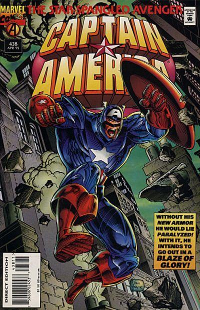
Continuing our "Worst Moments in the History of Avenger Costumes" in honor of the movie, we arrive at that beloved icon of national pride, Captain America, at that unfortunate moment in history that he had some disease whose symptoms included massively impaired fashion sense and having his nose eaten off:

I'm glad the armor lets Cap move, so hopefully he can haul his star-spangled butt to the nearest Gap. And I think if I had to choose between dying and being seen in this costume, I'd have a hard time choosing.

My favorite part of this design has to be the fact that they armored the floppy boot tops. That's like having a metal cape where they build in the folds -- it just makes no sense.

I would like to see him stab-kick someone with the pointy metal tips on those suckers though. He needs something EXTREME to go with the bionic unhinged jaw-scream he's sporting.

Thor, God of the G-String

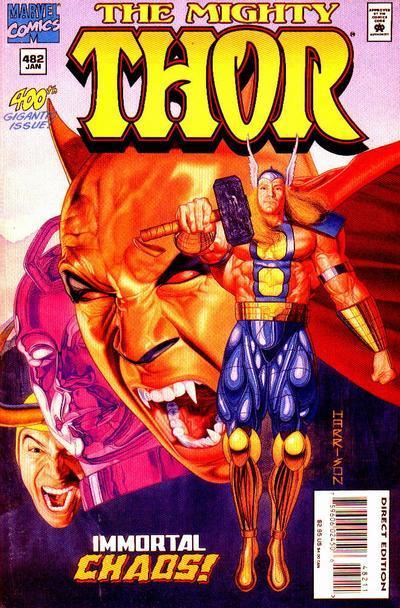
Keeping with Dan's suggestion that we take a look at the worst-dressed moments in this history of the Avengers in the movie, I bring you Thor, God of the G-String!

First, let this serve as a warning to all you budding artists out there that you should never base your drawings on your action figures.

Second, if you can tear your eyes away from that Ken-like monstrosity of a crotch and the giant balloon legs, think about how this outfit works. A normal plunging neckline (for instance, like Luke Cage's) covers all but the middle of your chest because presumably you want lots of protection from the elements and enemy bullets while still letting the chicks gaze with wonder at your pecs.

To that, Thor says "Nay nay"! Because apparently Thor heard about these things called "G-Strings" and wanted to try them out, only to be thwarted by his articulated nether regions. So he went all atomic wedgie and yanked that sucker over his head.

It's like a negative-space shirt, covering what ought to be open and opening what ought to be covered. I bet that's what the giant floating heads behind him are screaming so violently about. "THOR! I CAN SEE YOUR NIPPLES! AND WHY IS YOUR CROTCH THAT? SERIOUSLY BROTHER, YOU SHOULD SEE SOMEONE. LIKE, NOW. AND WHERE IS MY BODY?! I CAN'T STOP SCREAMING, YAAAAAAH!"

Hawkeye

Frequent contributor Dan suggested that we take a look over the next few weeks at some of the worst moments in Avengers fashion history in honor of the blockbuster movie release. I thought it was a great idea, and where better to begin than the Purple Poltroon, leader of the Worst Dressed Team In Forever (aka the West Coast Avengers), Clint Barton, the one and only Hawkeye!

Continue reading

A Fate Worse than Death

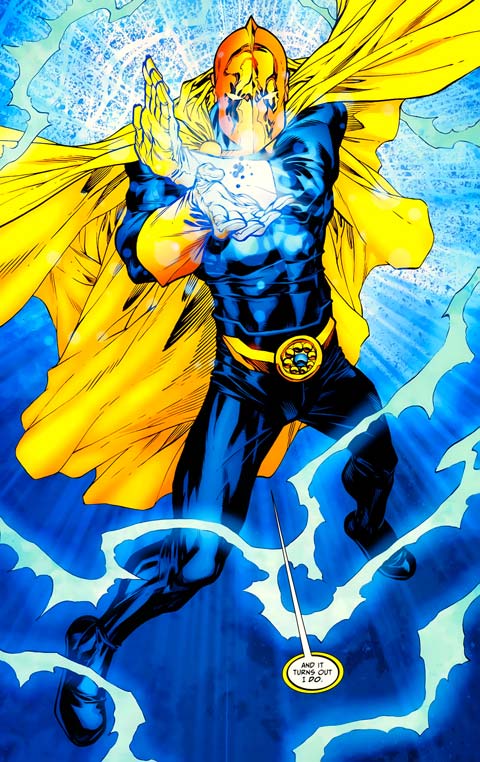
Our latest excrescence from the flatulent bowels of the 1990s comes courtesy of mega-publisher DC Comics, featuring a redesign of the immortal warrior for Order, Doctor Fate. He normally looks like this:

But in their infinite wisdom, DC made him look like this instead:

Continue reading

I was Disco Indian when Disco Indian wasn't cool

Crazy cross-genre combinations are the norm in today's comics world, with zombie super-heroes and dinosaur nazis and "what if super villains ran the world" sorts of high concepts. High being the operative word.

Have you ever wondered, however, why no one has ever done a Native American Cowboy Disco Rebel book before? I know I have! Well thanks to ReaderKate, we learn the answer: Because it's already been done before! Ladies and gentlemen, meet the sartorially challenged genre-busting fashion spectacle that is ... HAWK, Son of Tomahawk!

Continue reading