Category Archives: Bad Super Costumes

Bad costume headgear, Paul McCartney and Wings edition

Let he who is without useless bits of head frippery cast the first bad costuming stones. Or something.

flashblackcanary.JPG

Black Canary is exactly right, as potentially off-putting as high heels are for a super-powered get-up, silly dangly bits coming off your head are even worse. With that in mind, let us take a brief tour of bad headgear costuming decisions throughout the comics world.

captain-america-wings.jpg

I would argue that Cap's helmet wings are the best-known and most-useless costume elements in comic book history. They serve no purpose at all and frankly, they look silly. No animal in the real world has wings coming out of its head, so I can't imagine that this is some sort of symbolism. Perhaps they're present to flap in the wind as Cap rides his motorcycle, because the other heroes were making fun of the tassels on his handlebar handles.
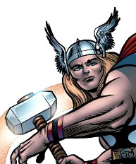
thor-420-small.jpg

The next step up from the pathetically small and silly looking temple wings of Flash and Captain America is Thor's Norse helmet. The wings are still a bit strange, but at least they're made out of metal and might, say, deflect a sword-stroke or something. Thor just barely tiptoes over the line from bizarre to kind of cool, but mostly that's because he'll hit you with a hammer and call lightning down on your house if you make fun of him.

hawkman_3.jpg

Hawkman, however, does headgear wings right. If you're going to slap disembodied animal parts onto your noggin, then they by God ought to be large and in charge. Sure, they block your peripheral vision and make it hard to go through doors, but you're armed with a mace, baby, just bash that sucker down!

Unfortunately, as is often the case some people just take a good thing too far. Stryfe saw the metal wings on Hawkman and Thor and just had to have some, only bigger and sleekly abstract:

stryfe1.jpg

I think we can all agree that too much is just as bad as not enough, a claim often heard in bars at closing time but rarely so well illustrated as this.

Given the potential pitfalls and well-known disasters that come from putting wings on heads, the moral of the story is clear: Wings ought to stay on the feet of ocean-dwellers where they belong.

namore-foot-wings.jpg

Why did a flaming starfish eat his face?

I've commented before on the odd habit of putting superheroes in costumes that make it look like they're getting eaten, but I have to confess I never thought someone would design a mask that appears to be a starfish humping a guy's face. It's possible, of course, that the haberdasher simply sewed Sunfire's top lip to his headgear, but I think I'm gonna stick with the man-eating echinoderm. Judge for yourself:

sunfire.jpg

Note that in none of these images can you see Sunfire's upper lip. In fact, the only way to account for the way this looks is to assume that Rob Liefeld doesn't know anatomy from anemone jokemeister Wolverine got a little crazy with the superglue. Regardless, here's how I like to reimagine the dialog in these panels. "Hey guys, I think this starfish bit off my nose! No, really I am freaking telling you my nose is gone!! Hey you over there, is that my nose on those lines under your feet, assuming that's your foot I mean? Ah to heck with it, there's no space in this mask for my nose anyway, just let it go."

I included the bottom left image because I couldn't figure out how all the various pieces of this sea-borne abomination actually would fit together. But after seeing it from behind, I realized that Liefeld doesn't know either, so I stopped worry and learned to love the suck.

I really wanted to grant the benefit of the doubt here and assume that Liefeld was just having an off day when he designed and/or drew this. But the entire issue is rife with the same kind of massive head-wingery. Don't any of these people ever have to go through a frigging door?

wolvie-headgear.jpg

You can't see it in this image, but Wolverine also has amazingly long pointy bits coming off of his boots. Apparently he doesn't go sideways through doors either.

stryfe.jpg

Stryfe, being a big-time villain leader of a whole group, naturally has more resources than your lowly X-Factor type of teen mutant, so he's able to not just have tall sharp prongs coming off the top of his helmet, but the bottoms as well. Plus some extraneous antenna spikes on his shoulders and arms, just for good measure. I bet most of his criminal takings go right back to the carpentry guild, constantly repairing door frames he smashes on his way through. Sadly, all of his power and resources were not enough to save him from having his lip eaten by his mask as well.

warlock.jpg

Warlock makes up for the fact that he doesn't wear clothes by naturally extending his cybernetic head shafts to impossible lengths. Because even though you can draw them long normally, sometimes you need even more!

dragoness.jpg

Dragoness is the only one in the clear on this, because she already has to make sure she has room overhead for her wings.

cannonball.jpg

At least Cannonball's aviator goggles hang down. Of course, given the fact that his whole schtick is flying at incredibly high speeds, how practical is that, really? "Don't worry, I'll save you -- urrrk, gaaaack!" and Cannonball dies, strangled by his own intemperate headwear, a fate we wouldn't wish on anyone besides the guy that drew all of this on days when we're feeling cranky.

(All images from the same single issue -- yes, all of that packed into just one comic book! "The New Mutants", Vol. 1, No. 94, ©1990 Marvel Entertainment Group, Inc. Louise Simonson, writer; Rob Liefeld, penciller; Hilary Barta, inker; Joe Rosen, letterer; Brad Vancata, colorist.)

Random Panel: Words fail me

rememberthisleatherthong.jpg

(hat tip to Ye Olde Buncheness)

Bad Costumes: Spymaster

Spymaster is a Marvel villain who's had several incarnations, with the first one being the most unfortunate, costume-wise:

spymaster.png

Let's say you want to be a master of industrial espionage, someone whose mission it is to infiltrate the most secure locations in the world undetected, and you're trying to decide on your costume's color scheme. You first settle on lots of blackish-blue, which makes sense as you'll be skulking in a fair number of shadows. But let's see, what accent color should we choose? Something subtle, something that says "Don't look over here, nothing to see!", something that's ... yellow! Bright, cheery, neon yellow! You know, like canaries use to stand out from the riot of colors in a jungle when they're trying to attract a mate.

So now you're in your very inconspicuous black and electric yellow, and it's time to accessorize. But you're not sure what to pack, because hey, multiple targets and challenging security systems and whatnot, right? In which case you pack your handy-dandy "Electric Plug With a Handle". That way, no matter what appliances you might encounter during your nocturnal espionage, you can plug them right in. There's nothing worse than midnight corporate skullduggery interrupted by a Mr. Coffee that's got no juice.

Now you're almost set, but before you can start your super villainous career you really need a logo, something that makes you stand out, because if there's one thing a spy desperately craves it's to be instantly recognizable to anyone who somehow penetrates the sun-like glare of your color scheme.

Of course you must keep in mind that you're a high-tech spy, not some mundane little third-world CIA hack. So naturally you choose a kitchen knife for the primary element of the logo, as nothing says "Silicon Valley" like an apple corer. Then, to set it off, you put it over a world-shaped blob with lines all over it, to signify that while you're aware there are such things as longitudes and latitudes, you're not actually in on where all those continents and stuff are. Better just to make it all "ocean" and let someone else figure out the details. I mean, that's why they make spy secretaries, right?

Simple weapons for simple villains

When it comes to bad super costumes, you can't limit yourself to just the actual uniform. Weapons count too, which is why I adore "Psychoman" so much:

drstrange-32-psychoman.jpg

Granted, he doesn't look all that bright, so maybe simpler really is better in this case. It certainly cuts down on the size of the decision tree he needs to consider during battle. "Hmm, I'm about to get smacked in the face by The Hulk. Perhaps he needs a generous dose of HATE! No, wait, that would be counter-productive. A healthy bout of self-doubt as to whether his massive green thews can truly smash my orange shiny head? I'm already afraid so that's out. Decisions, decisions..."

You can tell how confident his secret creator is about Psychoman's cognitive acumen by the dialog. "Unknown to him, I secretly guided a renegade scientist's efforts to unlock the enigma of fear." That's some enigma there, very difficult to unlock. Now I'm no scientist but I'm going to go out on a limb here and guess you'd press that gigantic button marked "fear" to unlock that particular enigma. I'm surprised they were brave enough to put three buttons on the giant box instead of just one marked "PRESS HERE DUMMY!"

Speaking of which, I love the size of the buttons. There's nothing worse in the middle of a super battle than to accidentally press the wrong button and enrage the crowd you're trying to disperse fearfully. Plus, the way he's holding it, so tenderly, it makes me wonder if there's not a "Technophile" button on the back of the thing set permanently to "on". Because you should love your gadgets but don't, you know, love your gadgets.

(Image from “Dr. Strange, Sorcerer Supreme”, Vol. 1, No. 32, ©1991 Marvel Entertainment Group, Inc.)

Gay Batman or Vampire Liberace? We report, you decide!

I'm not sure what exact number it is, but somewhere on the "Big List of How To Make a Bad Super Costume" is "Make the whole thing pink and purple." For any questions regarding this vital tip, I point you to either Hawkeye or Dr. Strange's brother, the vampire:

drstrange-16-a-gaybatman.jpg

Now, in his defense, this guy was being mind-controlled by an immortal voodoo queen at the time. But still, even mind-controlled voodoo vampires have pride, or ought to. Besides the ghastliness of the color scheme, you have to wonder why a vampire -- who, let's not forget, can actually turn into a real bat! -- would need to dress up as a bat when in human form. Because if he wanted to look like a bat, wouldn't he just, you know, turn into a frigging bat?! The giant fake ears, the giant fake wing/cape, it's all unnecessary. It makes you wonder if, in his bat form, he wears a tiny little tuxedo and Count Dracula cape. "Look at me!" he would squeak, "I'm a human!"

Maybe the outfit is supposed to stun his victims, who would be torn between horror at the creeping undead about to consume them and convulsive laughter at the pink and purple big-eared Mardi Gras costume it was wearing.

Because nothing says "Macho Universe Destroying God" like a beer gut

As I mentioned in the Mashup credits, here’s a free tip for any of you comics industry bigwigs out there. If your project requires a scripter and a plotter, two pencillers, and three inkers, it’s going to suck. Witness “Trinity”, an unholy multi-space-going-comic-characters crossover featuring L.E.G.I.O.N., the Green Lantern Corps, and the Darkstars, with all of the cringe-inducing anticipation of crap you, the savvy reader, would expect.

What really caught my attention about this Space-Borne Spectacle of Suck, however, was the beer-belly-baring badness of Tzodar the Destroyer:

bad-trinity2.jpg

Here you can see just how large Tzodar's gut is by virtue of the unnamed hero getting unfortunately sucked into his belly button. Luckily, when you're a god you get to have the best fashion designers in the universe put together your outfits, which is why his armor has a convenient cut-out so his love handles can flop around in all their glory while he's busy destroying creation. "Oh no," I can hear you saying, "that's just an armor plate, not his stomach!" To which I can only reply, why do you hate America?

But that's not all this paragon of fashion has brought to the table my friends, oh no! Why stop at a Madonna-inspired midriff-baring ensemble when you can add a long, flowing pony tail and ridiculous cloud/stopwatch/what the hell is that?! logo to the mix!

bad-trinity1.jpg

Because nothing says "I'm a butch macho god" like a long greasy pony-tail and your ginormous bloated stomach hanging out of your shirt. At least that's what I've been assuming in my weekly jaunts to the local grocery store which, now that I mention it, might explain the strange looks and continued police presence I find there. A police presence which, frankly, would have been better off escorting those responsible for "Trinity" and Tzodar's outfit off to jail before they could have published this comic.

(Images from “Trinity”, No. 2, ©1993 DC Comics.)

Fiasco, thy name is "Spider-Mobile"

I usually try to keep my "Bad Super Costume" posts about actual humanoids, but when something is so awesomely bad that even the guy who owns it calls it a fiasco, I cannot resist. Ladies and gentlemen, I present ... the Spider-Mobile!

spiderman-2-a-spidermobilefiasco.jpg

Besides looking silly, which, let's be honest, isn't saying much considering it's going to be driven by a guy dressed up like a blue and red spider, let's run down the many ways this idea sucks:

  1. It's a dune-buggy. In Manhattan. Last time I checked, all the dunes there were paved over in, like, 1634.
  2. It's a dune-buggy. In Manhattan. Last time I checked, all the roads there are already clogged with vehicles, making a car the last thing someone would use to get someplace in a hurry. Spider-Taxi, now, that has promise ...
  3. It was built by Johnny Storm who, frankly, is number four on the list of Fantastic Four members you'd trust with a wrench.
  4. One of Spidey's nicknames is "The Wallcrawler". You can't climb walls while you're riding in a car, and "Driver of Car That Climbs Walls" isn't nearly as punchy.

Seriously, I get that Marvel wanted to move some product in the toy stores, and they were insanely jealous of the Batmobile. But come on. Putting Spidey in a vehicle robs him of everything that makes him cool. He can't climb walls or spin webs or dodge and weave or in any other way act like a spider. Yes, the vehicle can do some of those things, but the vehicle isn't Spider-Man. Technology and doo-dads are part of Batman's persona, but not Spider-Man. Giving him a car is almost as bad an idea as taking away Superman's powers and making him lightning-based instead, although no one would be stupid enough to do something so obviously foolish! Oh, wait ...

To their credit, the writers at the time understood, I think, how silly the whole idea was. A company sponsored the build and wanted to pay Spider-Man to drive it, which he reluctantly agreed to eventually out of desperation and a desire to, you know, be able to afford pizza. It turned out poorly and he eventually dumped it in the river. Where a villain recovered it and reprogrammed it for evil.

Which couldn't have been that hard because, come on, the Spider-Mobile was pretty evil by the mere fact of its existence in the first place.

Captain Rectitude

The third rule of creating a super-powered character (only slightly less important than "Don't tug on Superman's cape" and "Never start a land war in Asia") is, "Never put anything in their name that sounds like 'rectum'."

Which brings us to She-Hulk villain "Captain Rectitude":

she-hulk-21-captainrectitude.jpg

If you're going to violate that third rule anyway, however, at least don't put him in giant purple thigh-boots that should never be seen anywhere outside of a pirate deck. And you certainly shouldn't put a big double-testicle-shaped heart logo on his chest that fires pearly white beams of anti-smut rage. And you definitely, definitely shouldn't make his abilities based on re-channeling his every sexual impulse into Puritanical anti-porn powers.

Yes, that's right, "Captain Rectitude", with the name that starts out with the same root as "rectum", is entirely powered by repressed sexual energy.

Somewhere, Freud is rolling over in his grave and smiling.

(Image and character from "She -Hulk", Vol. 2, No. 21, ©1990, Marvel Entertainment Group.)

Super Bimbos vs. Giant Intergalactic Space Sperm

If the concept of a "Shane and Sia The Barbi Twins 16-Month Swimsuit Comic Art Calendar" doesn't strike you as a terrible idea, then perhaps the installment for "March, 1996" will change your mind:

barbis-1-sperm.jpg

I feel this qualifies as a "Bad super costume" because a) it's a "comic art" calendar, b) the artist, Peter Hsu, worked in the comics industry (granted, on "The Barbi Twins Adventures", but still), and c) they are being attacked by a Giant Intergalactic Space Sperm, which could only happen in either a comic book or a bad John Holmes movie.

Also, one of the twins (I can't tell if it's Shane or Sia, as if that really matters) is making a "Spider-Man Webslinging" hand, which clearly is a comic book reference. I don't specifically recall Spidey facing off against a Giant Intergalactic Space Sperm, but he did fight Galactus once or twice. I leave the rest to your imagination.

Having established that this image is a bona fide target for comic book investigation, I have to ask the following questions:

  1. If you feel confident your day will involve flying out of the atmosphere to battle Giant Intergalactic Space Sperm, why would you wear a bikini?
  2. Nine inch spike heels: fashion accessory of potential weapon?
  3. What the heck is that in the lower twin's hair? A mind-amplifying tiara (right, like there's a mind to amplify!)? Insanely oversized bunchie? Levering device to dig out the atomic wedgie that bikini bottom is giving her?
  4. What in the name of all that's holy is that bottom twin doing with her left hand there, and how will pulling something out from between her sister's leg help defend Earth against marauding Giant Intergalactic Space Sperm?

OK, I lied, I don't really want to know the answer to that last question.