Category Archives: Bad Super Costumes

Multi-level badness

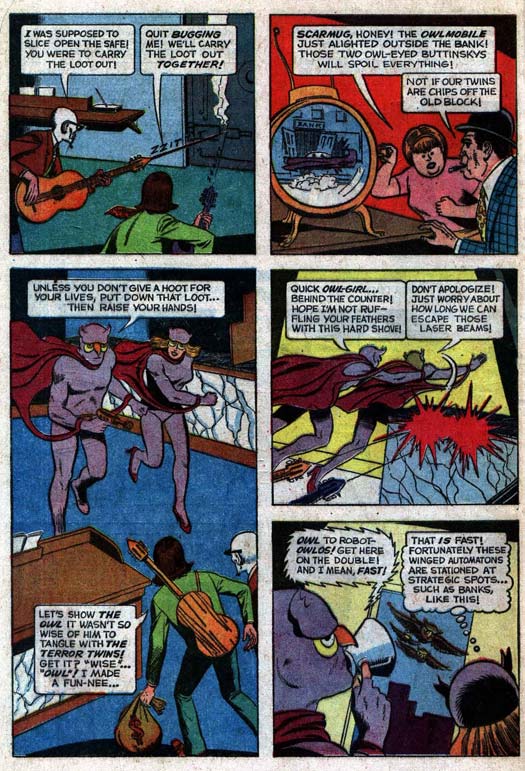
Some characters constrain themselves to just a bad costume, while others have bad costumes, bad sidekicks, bad gear, or bad dialog. But you rarely come across someone who pegs the meter on all of those levels at once, like Gold Key Comics' "The Owl":

The list of good purple costumes is pathetically short, and the insightful (i.e. "not blind") reader will guess that "The Owl" does not appear on it. A plain body suit may be enough to get you in the Blue Man Group but you've got to bring something better to the super hero game if you want to be taken seriously. The mask and the silly head tufts with yellow bags under the eyes don't help, making him look like nothing so much as a dyspeptic burlesque queen slowly wasting away in a "Former Starlet" nursing home, or maybe a failed Penguin henchman.

But what clenches this entire ensemble for the "Bad Costume Hall of Fame" is the wine-colored cape which is bizarrely attached to his wrists via the broken-off ass-ends of a tetherball. I cannot for the life of me imagine what good that possibly does. Did "The Owl" have a problem with his cape escaping at some point in the past, possibly in an effort to flee the scene of the fashion disaster in progress, thus necessitating some sort of leash?

As uninspired as he is on his own, though, "The Owl" gets outdone in the unfortunate costume competition by his girlfriend, the shockingly named "Owl Girl". There's nothing like red high heels to really set off a purple body suit. Maybe she was anticipating the great observation from "Good Morning Viet Nam" when the Robin Williams character advises the army change to a similar color scheme: "It's war, let's clash!"

So, bad costume -- check. Bad side-kick -- check. "But Jeff," I hear you say, "what else is bad about The Owl?!" Well I'm glad you asked, imaginary internet person, because if you carefully read the comics page you'll see that the bad pun to panel ratio is approaching one. I was trying to imagine what is worse than a character named after an owl, dressed in purple, standing next to another owl-themed purple-clad woman in red heels, who runs around spouting "jokes" that would embarrass Golden Age Robin, when I realized the answer was right in front of me -- if the "jokes" were puns that rhymed! That combination of badness is almost enough to rip the fabric of space-time.

Almost.

The only thing missing for the perfect combination of lameness, for that singularity of suck, would be if you combined all those things into one page and then finished it off with an incredibly silly set of gadgets like an Owl Mobile or, I don't know, maybe "Robot Owlos".

Wait, what's that ripping sound ... ?

(Many thanks to reader Kate, who once again has come up with a winner of a loser.)

Because names can suck too

"Bad" comes in many guises, my friends, and while I have done my part to expose badness as it relates to super hero costumes, and super hero comics artists, and comic book sound effects, I feel another vital area of the genre has gone uncritiqued for far too long-- names.

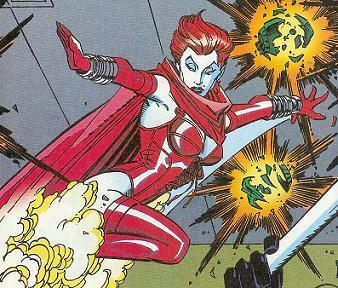
Thanks to reader PCFDGrey, I remedy that oversight now by presenting you with this young lady:

crimsoncurse

Her name? The -- and I kid you not -- "Crimson Curse". A woman, named "Crimson Curse". Someone who is female, a gender known to have a certain problem that is frequently called a curse, and which frequently causes them to frequently curse, and I am not going to get into color because even Superman is smart enough to ask no questions when Lois is bloaty.

Thus: Worst. Name. Ever.

I can tell you that I, for one, would not want to face this lady even if I were the Avengers. And if they know what's good for them, neither would the Avengers! Just run, far and fast.

The only thing that could make her even more offensive is if she only has her powers one week out of every month. That would be truly epic.

Brick Bat? Seriously?

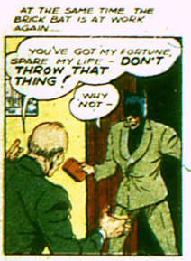
Yes, "Brick Bat" from 1942's "Police Comics" sports a very bad costume consisting of a cheap Batman cowl and a poorly-fitting suit:

police-comics-5-1942-brickbat

But sometimes, the overall lame character concept can super-charge even a weak outfit, catapulting both into the upper echelons of badness.

Start with the name. What do a brick and a bat have in common besides alliteration? And in combination they tell you nothing, beyond suggesting something along the lines of "bric-a-brac", which sort of fits because, let's be honest, this guy is a random assemblage of only loosely related concepts.

Of course, bats fly and so do bricks, if they're thrown. Which is what this guy does -- he throws bricks. Seriously. Granted, usually the bricks are filled with some sort of deadly gas, which is both more sinister and more befuddling because what the hell is gas doing stuffed into a brick?

Setting aside that utter inanity, however, you're left with the fact that his whole power is throwing bricks. And not like with super strength or inhuman accuracy or anything. Nope, he's just a guy in a bad suit and knock-off mask throwing dried clay. What does the bat cowl have to do with that? I have no idea. Maybe he's just vaguely embarrassed by the whole business and hopes to hide his identity to avoid the ensuing mockery.

You'd hope he could come up with something clever like a Brickarang or a Brickmobile, but no. I hope at least he calls his house "The Brick Cave", even though it's just a house, but given his overall M.O. I seriously doubt he's that creative.

The proportionate boobs of a skeleton!

Action figure company executives struggle daily with the distressing fact that girls comprise 50% of the toy-buying public, but 100% of action figures are made for boys. How then is one to sell toys to that female market?

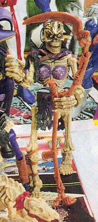
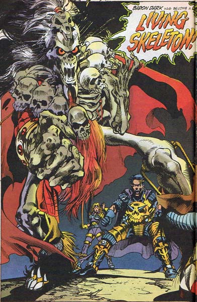
Well, if you worked for the Landmark Entertainment Group of the early Nineties, you introduced a female member of the Living Skeleton's Skeleton Legion for the Skeleton Warriors* (did we mention skeletons?!) for the chicks, with -- and you might want to hold on to your metaphorical hat here -- boobs for the boys. On a skeleton!

shriek1

Because, you know, boobs mean girls when you're a boy. OK, or a grown up male as well, let's be honest. Also, just in case those gender stereotypes haven't sunk into their young brains yet, it's important to name the only female something shrewish, like "Shriek" because those girls just won't shut their yappers, amirightguys!?

The actual toy is even more hideous:

shriek2

I am not sure what the absolute number is of babies needing to be suckled by the undead, but I bet the over-under is somewhere around zero. Still even if you have no flesh at all on your body, it's important to make sure you still have boobies, because otherwise how will you attract the amorous attention of all those male skeletons who ... well, who don't have any actual flesh either, so that's a little moot. Still, you know, boobies!

As you can see, my generation had no choice but to use up all the natural resources of the earth and leave you, our poor children, with horrific financial and environmental messes to clean up, because our toys destroyed our minds.

* I am not making this up. The main bad guy is Baron Dark, the Living Skeleton, and his minions are the Skeleton Legion, all of whom fall under the general brand of the Skeleton Warriors line. I'm telling you, money must have been falling out of the sky for people to get paid to come up with this stuff.

Overkill

Ladies and gentlemen, courtesy of the 1994-era Landmark Entertainment Group, I would like to show you what happens when you let a committee of marketing weasels design a super-powered character:

livingskeleton

I like to imagine the meeting going something like this ...

Marketing Weasel Boss (MWB): We need a head villain to go with this whole Skeleton Warriors toy line.
Marketing Weasel 1 (MW1): Well, "skeleton" is right there in the name, I say we do something with that.
MW2: Great idea!
MW3: I definitely think we should play up the whole bones angle, you know, do away with all the skin and flesh and just do bones!
MWB: I think that's what a skeleton is, Bob.
MW1: Hey, you know what skeletons have instead of heads? SKULLS!
MW2: Eeeeww!
MW2: That is so true!
MW3: Wow, yeah, that would totally fit on the body of bones! And you know what, since this guy is the head of the bad guys, and his head is a skull, we could really drive home the branding message by repeating that motif ...
MWB: You mean ... ?
MW1: That's right, skulls everywhere! Even kids can't miss that. Like maybe he has this big skull necklace.
MW3: And a skull on his shoulder pads!
MW2: Lots of skulls on his should pads!
MWB: Hey, I know, let's make his shoulder pads entirely out of skulls!
(General alarums and excursions and applauses and whatnot, huzzah!)
MW2: I like the way you think, Boss!
MW1: I don't know if we really nailed it yet, though, I feel like there is still some low-hanging fruit.
MW3, sotto voice: Not on a skeleton there ain't ...
MW2: Well ... If having the head of the skeletons have a skull for a head is good ...
MW3: And if repeating skulls everywhere is better ...
MW1: Then ... we could ... yes! Put a skull on his skull!
(General alarums and excursions and applauses and whatnot, huzzah!)
MWB: Brilliant! Have some dweeb in Art draw it up and send it to manufacturing, we're geniuses, gentlemen!

I certainly think that scenario is plausible, at least.

Lightstar is VERY excited to meet you

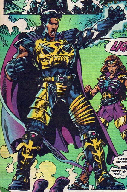
For those of you lucky enough to have missed out on 1990's-era super-hero propaganda, I can now sum up the entire experience with this following image from a free comic book promoting an exciting Saturday morning cartoon* and toy tie-in on CBS featuring a super-powered children's super-hero character with gigantic metal spikes for nipples that stick out of a skull's eye sockets:

skeleton-warriors-landmark-entertainment-group-1994-lightstar

And people wonder what's wrong with my generation.

(Image and character ©1994, Landmark Entertainment Group.)

*Back In The Day we only got cartoons for about four hours on Saturday mornings, so suck it, children of today!

I’m the Whizz!

If your super power involves running away, there are two things you want to avoid when it comes to setting your your heroic identity.

First, you want to avoid choosing yellow as your primary color, because (news flash!) in our culture, yellow is the color of cowards. You rarely want to combine running-away powers with cowardice.

And second, on the off chance some dim-witted criminal misses the whole "I'm bladder-voidingly afraid" vibe, you probably don't want to name yourself anything even vaguely reminiscent of, in fact, pissing yourself.

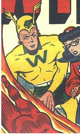
And yet, I give you "The Whizzer":

whizzer1

Super-heroes use costumes to send a message about themselves, whether that message is "I'm a bright icon of hope" for Superman or "I'm about to kick you in the face and you won't even see it coming" in Batman. It ought to go without saying -- and apparently, tragically, it most definitely went without saying where The Whizzer could hear it -- that you don't want to send a message that says "Please don't hurt me or I'll pee on both of us." I would bet you'd have a hard time inspiring fear in anyone besides the men's room attendant with that kind of look.

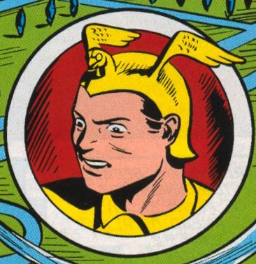
But let's say somehow you have attracted a Rogues' Gallery of epically clueless proportions, who have, against all odds, completely missed the fact that you're depicting yourself as a galactic-level coward. In that unlikeliest of events, the very last thing you would want to do, the absolute worst way you could possibly reinforce the unfortunate stereotype of your moniker, would be to mount a chicken on your helmet. And yet:

whizzerhelmet

Oh sure, he'll claim that's an eagle, but I think the preponderance of evidence would clearly show it's a chicken. Because I've met eagles, my friends, and I can assure you, not one of them would be caught dead hanging out with the King of Wee. Even future guests of KFC have more pride than that.

(Many thanks to reader Kate for once again pointing out an awesomely bad Golden Age costume!)

Character redesigns

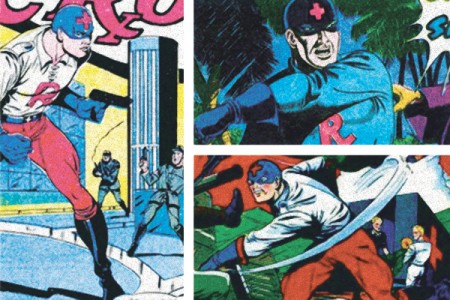
The gang at Project: Rooftop have a cool new feature where they redesign an old public-domain character along modern lines, kind of like we've done a time or two with character contests here at HeroMachine.com. Their first pass is with "The Red Cross":

redcrossoriginals-450x300

However, they've overlooked his greatest enemy -- the hypervigilant copyright attorneys employed by The International Red Cross. They're almost as vicious as Girl Scout lawyers!

I always like the thoughtful super-hero fashion design stuff at Project: Rooftop, and this looks like another great feature.

Count Crapula

Having a bad costume foisted on you is demeaning enough, but a far sadder spectacle is a bad costume the recipient actually likes:

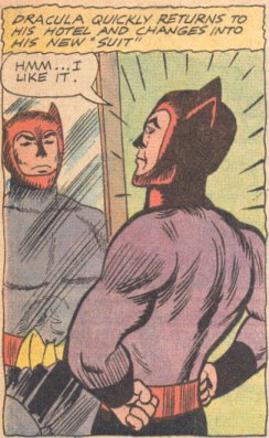
dracula-mirror

This revamp (get it, re-"vamp"?! I just slay myself!) is from the Golden Age of comics, when an intrepid publisher tried to cash in on the whole super-hero fad by combining spandex and Dracula. It must be frustrating to have all the supernatural power of the night and still no fashion sense, but he's really pulled it off here. From the Daredevil like horns and spandex mask to the gigantic bat buckle holding up his underwear, you'd think at least he'd be granted the mercy of not being able to see his own reflection in a mirror like a real vampire, but no. Even that is forbidden him, and he is forced to endure his own sartorial horror for all eternity.

Now that's a curse you can believe in.

Update: As several commenters pointed out, this is actually from a Dell comic in the 1960's. That's important because they had to make him non-scary due to the pernicious Comics Code. Remember kids, censorship leads to bad art, that's key.

Twisted

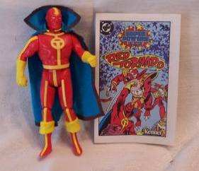
The hardest thing about art is knowing when to stop. The second hardest thing about art is trying to do fashion design with industrial grade road painting rigs. The people behind Red Tornado, sadly, learned neither lesson:

redtornado
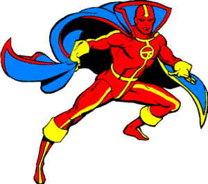
tornado2

Someone should've stopped earlier with the stripes in honor of Maxim One, because he looks like roadkill via Maxim Two.

The question that has puzzled Super Hero Fashion Philosophers for years has been whether the red on Red Tornado is "flesh" or clothing, because if it's flesh, suddenly the garish yellow stripes are not decorative, but utilitarian, in that they are actually clothing. And not just any clothing, but the only clothing standing between us and a serious case of Naked Robot.

Which in turn makes you realize, queasily, that he's got the worst case of one-strap-thongism this side of a Lady GaGa concert. Seriously, I don't want to know where that groin strap goes. Just ... no.

Given that unsettling concept, we'll opt to believe that in fact the red isn't skin, but some sort of cloth-like covering. Yes, I know, he's basically just a giant toaster oven and thus human norms of sexuality and clothing don't apply, but even toasters should be afforded a little dignity.

That only gives relief from a moral outrage standpoint, however, not from fashion outrage, because the stripes just don't make sense. Not only are there too many of them, but why do the pants stripes go under his briefs? It's a very awkward break. And integrating the chest insignia with the central stripe just adds to the confusion, tying it down instead of making it stand out like a good insignia should.

The whole effect of the striping is to make what should be a character who's all about chaotic twisting and dynamism instead look static and tied down (literally). Lines of consistent thickness and uniform direction serve to stabilize him when that's the exact opposite of what a tornado should be.

OK, let's leave off the stripes for now ... Wait, of course I am kidding. How could I talk about stripes and not deal with that ridiculous arrow on his head? Seriously, look at that thing. It's ludicrous. What is it pointing at? His nose? Are we to assume that his tortured twisting is going to fling off an astounding stream of Red Snot? I have no idea what that thing is supposed to denote, graphically. It's just a big yellow distraction.

Oh, and why do the leg stripes continue through his boots, making the cuffs look like they're just sewn on without being, you know, actual boot tops? I hate that.

Moving on, I also hate his cape. It's way too big for a guy who functions in high winds. Believe me, at my wedding we did an outdoor dance, and my wife's veil (which was nowhere near as voluminous as that gigantic blue number Tornado sports) almost beat me to death. Of course, for some unknown Comic Book Physics reason, only his bottom half rotates, which whatever, but still, the cape goes all the way down. Wouldn't that grab him by the throat and choke him to death? Ha ha, he's an android, he doesn't need air, sucker! Unfortunately.

The black stripe on the cape mirrors the same thickness as the out of control, and yet too-controlled, yellow stripes of the costume, again destroying anything dynamic that might have arisen from the design. Plus it's black. Why black, when there are no other black elements to the costume? Because the rest of the cape is blue, which also doesn't appear anywhere else!

See, thinking about it makes you dizzy, just like you would be in a real tornado! And that is pure, beautiful genius.

Stay twisty, my friends.

(All art and the Red Tornado character are © DC Comics, Inc.)