I recently stumbled across this fascinating pair of panels from the early run of Iron Man:
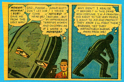
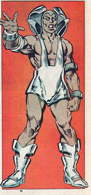
I've always like the gray Iron Man armor. I think it's cool, modern, and intimidating. But I like the red and gold armor even better -- it's all those things and it looks stone-cold awesome. Costume redesigns are tricky, it can be hard to retain the original integrity of the character while making the whole outfit look better.
What I love about these panels is that you have the character himself offering an excellent rationale for a redesign besides just "we need more sales". His armor works and looks good, but he identifies a key problem -- you have to not only intimidate your enemies, you have to make the people you're supposedly serving feel good about you, too. Otherwise they might call Thor instead when they reach for the phone to call in the latest bad guy rampaging through downtown.
The outfit's bulky, Frankenstein-like appearance is a drag on his public relations, so he decides to make a shift. I love that -- generally characters don't give their outfits more than a moment's consideration, if that, and changes are foisted on them from the strip's writers and artists without necessarily making much in-character sense.
I think this is a great example of a bad-ass costume still being bad for the character (paging black-costume Spider-Man!), leading to a redesign that works both in-character and as a sales driver. In fact, I'd argue that no other character in comics has costume changes integrated into the very (ahem) fabric of the character as well as Iron Man does. Part of it, clearly, is that his costume is his super-power, but there are plenty of other armored avengers out there who are stuck with one look. Not so Iron Man -- he's got a closet full of armor that would put Imelda Marcos' shoe collection to shame. And it works!
So bravo to the Marvel team for taking a bad-ass design and shelving it in favor of one equally cool, but even more effective. Well done, old-school sirs!
(Image and character © Marvel Comics.)

