Author Archives: JR19759

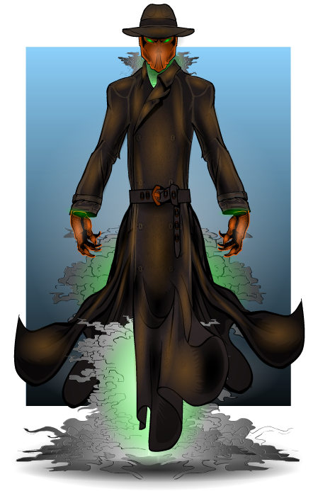
Character Of The Week: AMS- Sir Destiny

You know, I swear I did this last week. AMS did a thing, it's awesome, COTW.

But anyway, have to point out the excellent use of colour (orange and brown with green, giving off a very creepy vibe), the superb shading especially on the mask, which just exudes menace, and the masking used to blend the bottom of the coat to the cape used to create the blown effect. Brilliant work.

Gallery- Planet AMS 

Character Design Challenge ♯153- Buildings

So, for this weeks challenge, I want you guys to go all architectural and design the best building you can using heromachine. When I say building, I mean any freestanding structure supported by foundations, so you can do a house, a roman villa, a skyscraper, a castle, a bridge, a factory, a university, anything like that. Now obviously, there are already some buildings in heromachine as items (mostly in the backgrounds section). Don't use them. You can use backgrounds- cityscapes for backgrounds obviously, but don't build you building by adding on to an already designed building that's an item, that's not going to get you anywhere.

As per usual, no limits on the number of entries and the contest will close at midnight Saturday (blog time). Please read the contest rules before entering, have fun and good luck.

Rules for posts, contests, and challenges that I am hosting: Original characters only, no copyrighted characters, no characters based on copyrighted characters, no characters based on RPG’s or other games. The characters must be your own design and not based on any character that might be copyrighted in any way. I have the right to delete any post that I believe crosses this line without warnings. Only post characters that you have either created for this contest specifically or you know for certain have never been entered to a contest before. If you aren’t certain, don’t enter it, because I’m not going to go back through all of the contests and check.

Character Design Challenge ♯152 (Going Greyscale) Winner

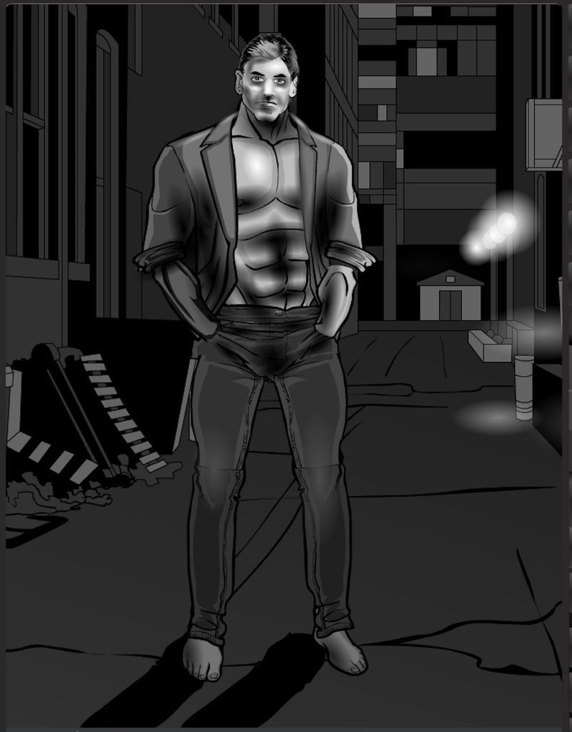
Honourable Mentions: Cliff- Greyscale Model & Superfly30- Frontier Sunset

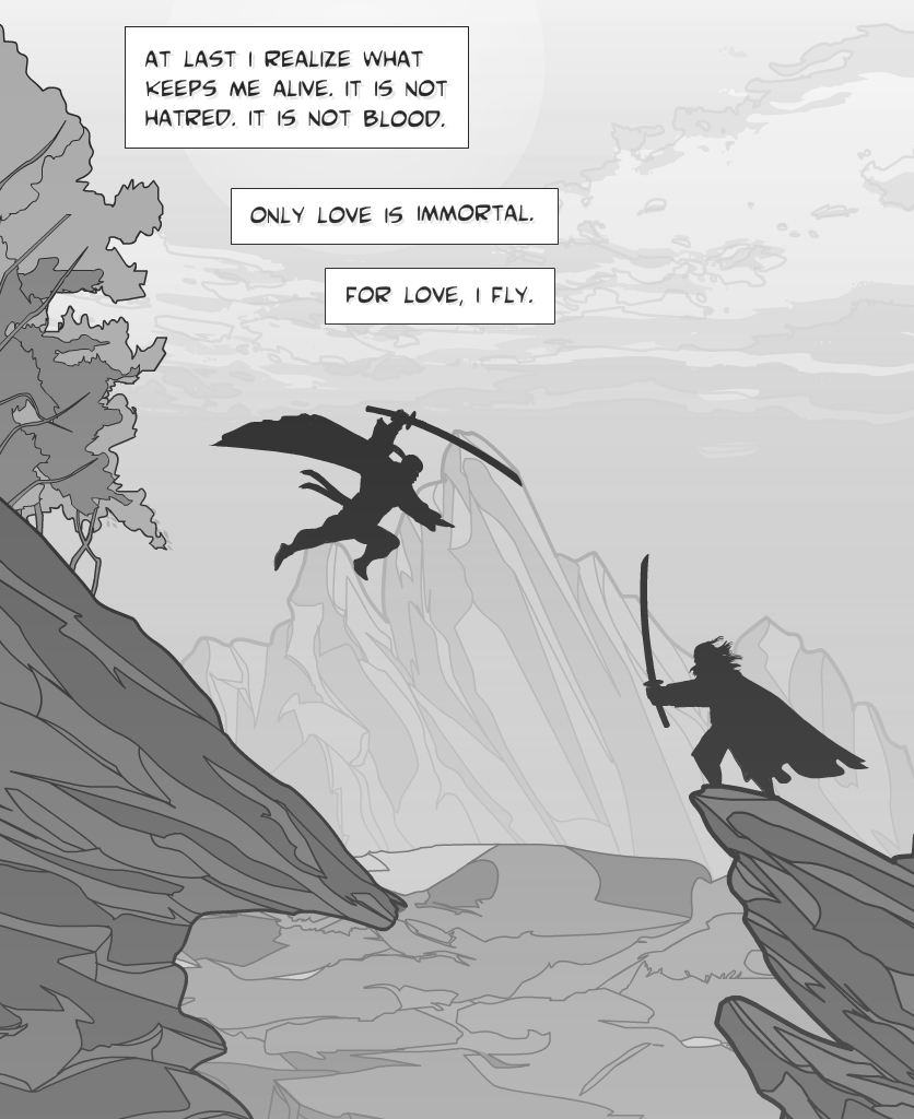
Winner: Tango- Fly For Love

152 Tango- Fly For Love

Creators Club Reminder

Hey guys, JR here.

Just a quick post to remind you guys that you only have 2 weeks to get your entries finished and sent in for this years Creators Club Poster. All the submission requirements can be found here, so if you want to get on the poster, get to it. It would suck to be left out because you didn't finish in time.

And with that.

JR out.

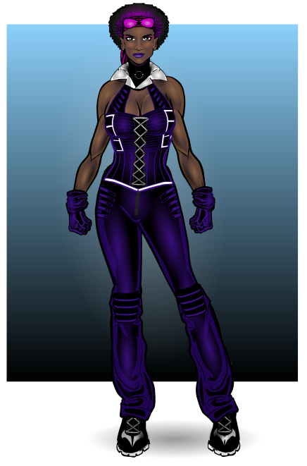
Character Of The Week: AMS- Ms. Roxy Rivet

A new year, and yet some things never change. AMS being incapable of doing anything that could be described with words other than "sublime" or "jaw-dropping" is a good example of this. This week he has posted three brilliant pieces in his gallery, but I have to give the nod to this on because, in my opinion, it is one of the best he's ever done. The pose has such attitude, the costume is powerful and sexy whilst not being outlandish or unrealistic, and of course, being AMS, the shading is perfection. But my favourite part is her face. AMS is quite good at faces when he want to be (mainly when he doesn't do characters wearing masks or helmets or such things), and this one just combines everything in the picture into one expression, containing all of the power and attitude of the rest of the picture just in a look. Perfect.

Gallery- Planet AMS

Continue reading

Character Design Challenge ♯152- Going Greyscale

Ok guys, for this weeks challenge I'm taking away your ability to use colour. Your entire picture must be done in greyscale. Think early 20th century photography and you get the idea. You can create anything you feel like, provided your picture has a background, and the only colour used is white, black or grey. Sounds simple enough right. Just make sure it's not flat or boring, which is the problem you're going to face working in greyscale.

As per usual, no limits on the number of entries and the contest will close at midnight Saturday (blog time). Please read the contest rules before entering, have fun and good luck.

Rules for posts, contests, and challenges that I am hosting: Original characters only, no copyrighted characters, no characters based on copyrighted characters, no characters based on RPG’s or other games. The characters must be your own design and not based on any character that might be copyrighted in any way. I have the right to delete any post that I believe crosses this line without warnings. Only post characters that you have either created for this contest specifically or you know for certain have never been entered to a contest before. If you aren’t certain, don’t enter it, because I’m not going to go back through all of the contests and check.

Character Design Challenge ♯151 (Get In Shape) Winner

Honourable Mentions

Cliff- Get In Shape & Brons- Xoyotec

Winner: Vampyrist- Shapes Shonen

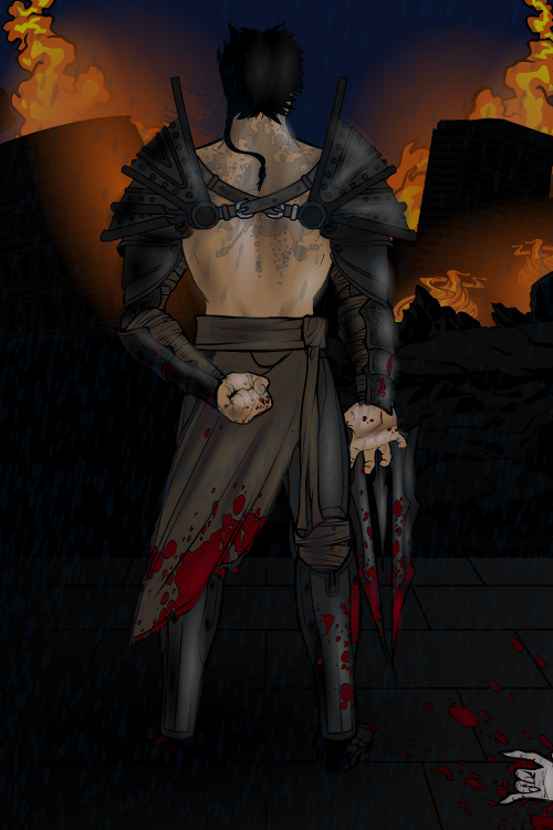
Character Of The Week: Hawk007- Blood And Fire

So, to kick off a new year of COTW's we're going to have this very interesting piece by Hawk. Now I'm sure everyone can tell why I've picked this. It's is very difficult to do a back facing pose on Heromachine and make it look good, we don't have items that facilitate such a pose, so you have to work around it and usually it looks slightly off, no matter how good you are.  Hawk has managed to get round this problem with what can only be described as "a lot of shading". If I had to nit-pick I'd say he could have used different gauntlets or paid a bit more attention to their placement, and trying to do something for the feet, rather than basically blacking it out, but those bits don't detract from the picture in too severe of a fashion, as I said, nit-picks. Overall, the item usage to make the pose work is excellent and the atmosphere is brilliantly done.

Gallery- Hawk's Nest

Continue reading

Character Design Challenge ♯151- Get In Shape

So, new year, new CDC's. For this years contests I'm going to be focusing more on the Challenge aspect rather than the Contest aspect. I'm also only planning to take the CDC's up to the 300th contest, which is going to be CDC197 under the current numbering, and then see what happens afterwards. As with the end of last year, I will be judging the contests and picking a winner at the end of each week, so polls will not be making a return.

Anyway, in line with the new CDC ideology, this weeks Challenge is for you to only use shapes in creating your character. And when I say character, I mean character, no random combinations of shapes into some form of abstract or minimalist art. You are only allowed to use items in the Insignia's or Backgrounds- Shapes/ Backgrounds- WordBalloons categories and nothing else.

As per usual, no limits on the number of entries and the contest will close at midnight Saturday (blog time). Please read the contest rules before entering, have fun and good luck.

Rules for posts, contests, and challenges that I am hosting: Original characters only, no copyrighted characters, no characters based on copyrighted characters, no characters based on RPG’s or other games. The characters must be your own design and not based on any character that might be copyrighted in any way. I have the right to delete any post that I believe crosses this line without warnings. Only post characters that you have either created for this contest specifically or you know for certain have never been entered to a contest before. If you aren’t certain, don’t enter it, because I’m not going to go back through all of the contests and check.

If you don’t know how to enter, there’s a handy little diagram below the jump.

Continue reading

Creators Club 2016

Hi guys, JR here with the formal announcement of this years Creators Club Poster.

This years poster is being done by Stulte and the theme is Magic. So what you guys need to do is create a self portrait of yourself, either realistic or idealised, as some form of Fantasy based magic user, be it Witch, Wizard, Mage or other. You can show magic use if you wish and use poses other than the standard base pose, however we must insist on a few things. 1. The character must be forward facing, 2. Faces must be visible, so no masks or face coverings please, and 3. No backgrounds. Shading is optional, so you don't have to shade if you don't want to. And obviously all entries must be full-body pictures.

Of course, as with all previous CCP's, for your entry to be acceptable you must complete the following criteria. If you don’t then you don’t get on the poster.

1. Your entry must be in .png format. You must title it in standard contest entry style i.e. Username- Creators Club Poster (for example I would title mine JR19759- Creators Club Poster). Don’t screenshot the picture and send that in, export it as a .png please.

2. You MUST include the text for your entry. Mandatory. This is incase Stulte needs to re-export any of the files in a bigger or smaller format. You can include it as an attachment in the email or just paste it into the email, but you have to have the text accessible.

3. Your email has to be titled something applicable to the Creators Club, so its easy to recognise as not-spam.

4. You only have one entry, so make sure you’re happy with it before you send it in. It doesn’t have to be the worlds best creation, this is only for fun after all, but we don’t want endless revisions.

After you've done that, send your entry to Stulte at creatorsclub2016@gmail.com . Submissions will be open until Feb 1st as of today, so you've got a whole month to do your entries, just don't leave it to the last minute and not give yourself enough time. This is open to everyone, so you don't have to be especially prolific or a Power User or anything, just a part of the community. And remember, this isn't a challenge or anything, so just have fun with it.

If you have any questions, just leave them in the comments and Stulte and myself will try to answer them as best we can. If Stulte has anything else to add, I'm sure he'll do so in the comments as well. But with that, I look forward to seeing what everyone comes up with.

JR out.