Author Archives: AFDStudios

Friend of HeroMachine author Ian Thomas Healy still needs to hear from you winners so he can get your prizes to you! He says:

Related to the Jackrabbit contest from last month: Okay, the contest is closed and the trailer is finished! You can see the final product at http://youtu.be/kQ4eWr9S86o. I used pictures from Keric, Melmo44, Mr. Nobody, and RobM, but since I had so few entries, I’ll send ebooks to HerrD and Calvary_Red as well. Send me an email with your format of choice (Kindle, EPUB, or PDF) so I can send you the ebook. ian AT ianthealy DOT com.

Mr. Nobody’s picture made me laugh out loud when I saw it. Great job! You win the signed ARC. When you email me, include your mailing address. Thanks for playing, everyone!"

HM2 Changes (ads)

Hi folks, if you visit HeroMachine 2 today, you might notice that I've reverted to the old version with the controls on the right and the ad integrated into the app. The ads, however, are now being served by Media.net as a test, since they don't mind this layout and they're not Google AdSense. I'll leave it like this for a week or so as a test, and will make some decisions based on the results at that time.

Subscriptions

After one work week, the new ad layout has proven to be a disaster, financially. That means two things in all likelihood:

  1. I'm going to have to go back to the old layout with the ad integrated, hoping that Google really only objected to the drop down menu covering the top ad and not the one in the app;
  2. The implementation of some sort of paid model.

I very much want to hear your thoughts on both of these but I imagine it's the second that's going to cause the most angst.

I should say at the outset that this is not set in stone. As always, your opinion matters very much to me. I'm just spitballing here; just like when I created HeroMachine, I'm trying to involve the community in coming up with solutions.

First, why am I considering this? The answer is simply that Google's new layout has cost me 75% of ad revenue. I can't live on that. And if I can't live on that it means I can't continue to host HeroMachine any more either. So something has to be done.

Second, I'm thinking that initially at least, all HM versions will continue to be free just as they are now, but that I'll add a "Premium Members" area to the site in exchange for some subscription fee. What would you get for that fee? Two things, mainly -- no ads at all on the page, and the ability to make the app window as big as your browser will allow. If you have a monitor that's 2400 pixels wide, you get HeroMachine 2400 pixels wide. You could do HUGE screen shots, see all the controls and items in crisp, crystal clear detail, and have an enormous palette to work with. All with no ads.

Does that seem like something worthwhile? More to the point, is it something you could see yourself paying for? And if so, what would be reasonable? My gut instinct is a dollar per month. That's $12 for a year, which doesn't seem like much since I used to charge $20 for a CD.

Alternatively, I could do what I used to in the CD days, and make it so the free version had only the "Standard" set of items. Anything else you tried to load would give you a "This set of items is available only for Premium members" sort of message. Is that better or worse?

Look, we'd all like to be able to continue in the current mode of it all being totally free for you to use. But that depends on Google ads which, as we've seen, isn't necessarily sustainable. It might be that there's no longer enough support out there to keep the site going on a paid model either, but I won't know until I try.

Again, this isn't set in stone by any means. I encourage and welcome your feedback, though as always I do ask that we be respectful towards each other.

http://www.dreamstime.com/stock-photo-set-fully-editable-vintage-premium-quality-labels-woodcut-style-eps-vector-illustration-image29732770

HM2 Printing

In moving around the controls for HM2, I accidentally broke printing. But I have now un-broken it, so print away!

New Layout Now Live!

106888
I've just updated HeroMachine.com with a new layout in response to the problems Google AdSense reported. Had I not made these changes, Google would have shut down my account and quite simply, I'd have had to close the site. There should be no effect on your character saves though, as always, hopefully you have text and/or image backups just in case. I confirmed this by loading previously saved characters using the new file.

I tried to make a virtue out of necessity, always keeping in mind while redesigning both the site and the apps what the best user experience would be and not just what would make Google happy. I hope on that front things are actually better now. Here are the major changes:

  • I removed the integrated 300x250 ad unit from all HeroMachine versions. The upshot is that you should have more space available to see your character, and you can now capture the screen in landscape mode without the ad being visible.
  • I also moved the controls in both HM2 and HM3 from the right side to the left. Partly this is to avoid having any clickable controls too near the ad in the right column, and partly it's because it always seemed like that was a more natural place for them to be. I only had them where they were to make the ad more prominent (that was decided by UGO back in the day).
  • The page is now 1080 pixels wide, which along with rearranging the apps should result in keeping the work area the same as it was when there was only a single column in the narrower layout. The standard site-wide side bar is also now present on the character creation pages.
  • Finally, the forums now have the standard site-wide side bar. Hopefully that will help integrate the blog and forums more closely to foster cross-discussion and visibility of things like contests.

From a business standpoint, I do worry that the new layout will not pay out nearly as well as the original. If that's the case I will have to try other ways to monetize the site so I can keep it going. That might include different ad placements, but it might also mean more radical changes like some sort of premium area based on a subscription model where no ads are served and the apps are full-screen, or making downloads available for sale, or even (as a last resort) going back to the pre-UGO days when there was a crippled version of the apps available for free and only paid users got the full slate of items. I'd rather not do that, but I have to pay the bills, you know?

Anyway, hopefully everything will work out fine and I won't need to make any more changes.

If you run into any problems with the new layout or the new app versions, or if you'd like to let me know what you think of the changes (hopefully without too much cursing!), please let me know in the comments section.

Let me know what you think about a new layout

As I mentioned earlier, I have to redesign the way the site is laid out to avoid getting the Google Hammer dropped on me. Basically the ads are too close to the content in the current layout.

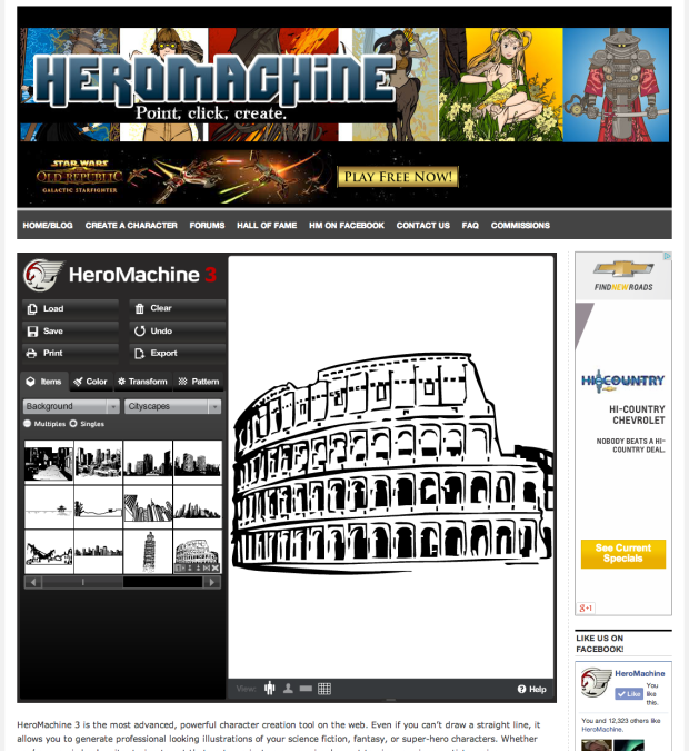
The good news is, the app itself has also gone under the knife, and I think there are a few good bits in there for you, the intrepid HeroMachine creator. Here's a screen capture of what I'm proposing:

hmnewad-screencap

And the stuff I hope you'll like about it?

  • The Google ad will no longer be present in widescreen mode, so you can once again do screen captures without having to crop. Hooray!
  • The character canvas is larger than in the current layout letting you see more of your creation.
  • I'm proposing to swap the tool buttons over to the left side, which always felt more natural to me.

None of this is set in stone, of course. I'll be continuing to make tweaks to the design over the weekend, so please let me know any thoughts you have on the new layout.

Changes coming 'round

I got a notice today from Google that the HeroMachine apps are in violation of their placement policies. Apparently they require 150 pixels between any Flash content and their ads. As a result, I'm going to have to make some major changes to the HM layouts. I only have three business days to get into compliance, so you're going to see some weirdness over the next few days. I apologize in advance for any frustration you run into.

Electrium vs. Surge

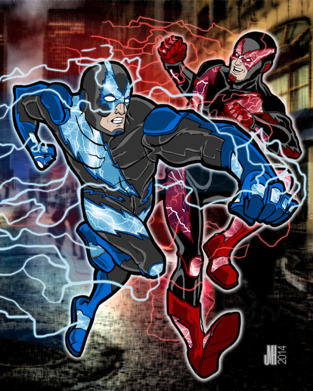
I worked with Brad Carter on another illustration of his characters, this time featuring the speedsters Electrium and Surge. He gave me the following writeup of what he wanted:

I want another battle scene but this time instead of 2 powerhouses it is 2 speedsters Surge and Electrium.

Surge's powers: Runs at the speed of light (fastest human alive) a skilled combatant snd get generate and manipulate positive lightning (lightning that comes from the sky) he can also utilize electronics byusing his lightning powers. his suit is made out of pure energy (no spandex) in the concepts you will see lighting bolts on his costume those glow with lightning energy running through them. Surge stand at 6'11 about 185lbs of athletic ness he's not muscle bound like titan but he is not skinny either he is the perfect build for an athletic speed runner

Electrium's powers: electrium is basically the reverse surge he has the same exact powers and capabilities the only difference is electrium can control negative lightning (which comes from the ground) and is more devastating then positive lightning his suit is also made out of energy the same way so no spandex the basically have energy based armor suits kinda like the green lanterns suit is made out of energy so around that concept. elstrium is the same size and build as surge.

basically the battle will be on the ground and they will be running side by side with lightning coming off of them symbolizing how fast they are going I want electrium to be running kinda leaned back ready to throw a lightning fist at surge and have surge in front of electrium as if he got a few steps ahead of him and jumped in the air while running to hit electrium with a lighting fist as well however if you think of a better idea we can do that as well have like a blured building in the background or something to make it look like they are running super fast I will send you the concepts of them

Brad also provided the following HM reference photos:

With that as our starting point, we were off to the races! So to speak. Ahem. I don't have the process photos to show you but the final result turned out pretty well. I ended up doing the coloring in Photoshop, which is a bit of a new approach for me.

Brad-Carter-Speedsters-web

Exporting in Chrome Broken Again

Chrome has apparently auto updated again and once more they've broken something, so the Export function isn't working in that browser at the moment. This happened once before and within a few days they updated again and it started working. I don't know what it is they break and I don't know how they fix it, but unfortunately all I can do is wait on them. In the meantime, Firefox continues to work properly, so if you don't want to do screen captures, that's your best bet.

Titan vs. Demora

I recently completed another commissioned illustration for an awesome guy currently serving the US overseas. Here is the description we started with:

Continue reading