Author Archives: AFDStudios

Wonder Woman vs. She-Hulk

We're going old-school DC vs. Marvel in this week's matchup, featuring two of the most powerful female heroes in each universe:

Each character has had a somewhat hit-or-miss history. Wonder Woman's had her powers taken away, been dressed up in a white bell bottom pantsuit, tied up and spanked by pretty much everyone, gone from passive secretary to mighty goddess and back again, and more. She-Hulk's gone from a joke to a lawyer to a pinup bikini model to the most fearful creature in the Marvel Universe.

In her private life, Wonder Woman is a princess, though I bet she's the only one with bullet-deflecting bracelets. In her private life, She-Hulk's a lawyer. I know which one of those *I* am more scared of.

At the meta level, Wonder Woman is one of the Big Three at DC, while She-Hulk's always been more of a sideline.

In terms of powers, I'd probably give She-Hulk the edge in strength since that's sort of her thing, but Wonder Woman is a trained warrior with the power of strength, toughness, and flight.

At the end of the day I'll go with the more popular character and say Wonder Woman would win an all-out brawl between the two. But what do you think>

[polldaddy poll="6396406"]

Wrapping up a plot old-school style

(From "Target Comics" volume 2, number 6, 1941.)

Caption Contest 125

I'm announcing a major change in the way contests work here on HeroMachine.com: I will not be offering custom items, portraits, or sketches of the day as prizes for the foreseeable future.

Instead, each week I'll put together a list of "Personal Favorites" from all the submissions, and then I'll select one as "Jeff's Favorite". That person will be the "Featured Creator of the Week" in the sidebar.

I've got to stop adding items to the program for a while so I can focus on doing the Left-Right conversions and get to a stable beta, so I can start selling it for those who want to download it. That doesn't mean I won't ever add new items, I just need to put that on hold for a while so I can hit the next milestone.

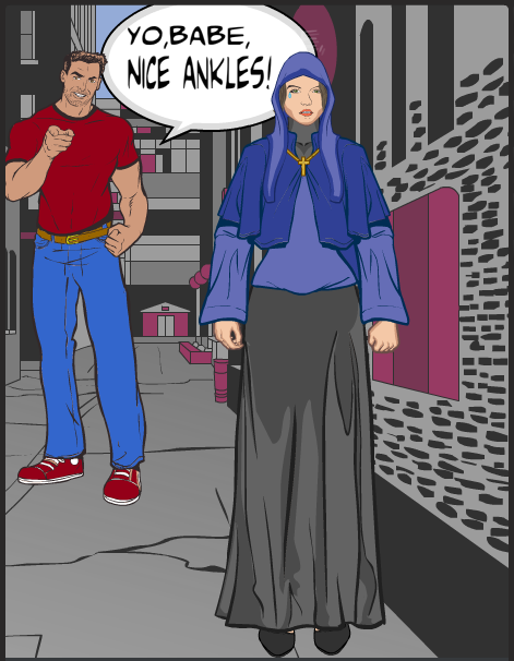
Having said that, it's time for another new Caption Contest! Your challenge this week is to come up with the best replacement dialog for this comics panel (which comes to us courtesy of the always awesome Glenn3's "Say What?" PhotoBucket site):

I'll pick out some as my personal favorites to highlight in a post next Monday, and then I'll choose one of those to bear the standard as the "Featured Creator of the Week" atop the right tool bar.

All entries must be left as a comment (or comments) to this post. Keep ‘em clean (appropriate for a late-night broadcast TV show), but most importantly, keep ‘em funny!

No limit to entries, but please, self-edit and only put up ones you genuinely think are good!

Character Contest 95 Results

We had a huge turnout for Character Contest 95, wherein you were challenged to come up with a character based on a country that was not the United States. We received 237 entries from sixty different people. Amazing! And the quality was stellar as well. In fact, I went ahead and uploaded all of the entries so you can have the same joy in viewing them as I did. Just click any one of the thumbnails below to start a slideshow of the whole set.

Continue reading

How to Win Friends and Influence People

(From "Target Comics" volume 2, number 7, 1941.)

META: Winning

I'm considering changing contests up around here so that there is no one "winner". I'll still pick out a handful of what I consider to be my favorites, but I won't single out one to receive a prize.

I think people are getting too hung up on that one thing, when in reality anyone who enters is a winner. And once there's just a handful of Finalists left, the selection of one person is pretty arbitrary. I mean, it's just my subjective opinion.

Thoughts?

Pop Quiz 18 Winner

Thanks to everyone who flew their Geek Flags proudly in yesterday's Pop Quiz! Absent the ones that gave me a "download.php" file when I right-clicked them (this means you if you don't see your entry here) and ZForce, whose web server was unfortunately down, here are all of the entries for your enjoyment:

Those are all really cool. The thing I like about the Pop Quizzes is that they let people show off their creativity in ways you wouldn't expect, and this week definitely delivered.

Among my favorites this week were Celtic Dragon, FRM, Harlequin, Jack, Johnny Gear, Kytana, whoever submitted "logo.jpg" (not eligible for a victory since there's no creator name on the file, but still a nice effort), NHA247, Thundersong, Vampyrist, and Wildcard. I thought all of those did a great job capturing a design that looked like it could be an actual flag. Many of the others were also nice designs, but I didn't think they looked "flaggy" enough, or were too plain, or were reproductions of existing flags.

Taken purely as an image of a flag, I loved Celtic Dragon's. But I can't pick it as the winner because it fits into the category of a (very awesome) reproduction of an existing design. I wish there'd been an explanation of what it represents if it's not just the USA's original, but alas, I can only judge by what I am given.

Ultimately, then, I find myself torn between Harlequin's design and Jack's. With Harlequin's, I love the color and the flow, but I sort of feel like it's almost more of a book than a flag, with the clasps and bindings and such on the top, bottom, and corners. I dig the detail of the writing, though, and I believe that this could be a real thing.

With Jack's, I find the colors a little lacking, but I can easily imagine this as a "United Federation" sort of flag representing four different nations, with each triangular piece the complete flag of that particular country. Then they're all bound together in the group flag. Or something. Again, with no real explanation it's hard to know.

This is a really tough choice. But after much thinking and wavering, I'm going to go with ... Jack. I feel like there's more of a story there waiting to be told, and overall it feels more like the sort of construction that would, practically speaking, be possible to put onto a real flag.

This was a close one, though, and could really have gone either way.

Congratulations to Jack and all of the other folks who took the time out on a busy weekend to play along. Thank you all!

Pop Quiz: Flags!

Happy Saturday, folks! To complement our current country-themed character design contest, your one-day quick-fire challenge this time out is:

Make a cool flag!

You could redesign the flag of an actual or fictional country, or a flag for a team of super-heroes, or a pirate ship flag, or anything else you can imagine fluttering in the wind. Or the vacuum of space, I suppose, though that wouldn't involve much fluttering. You can do a regular rectangular shaped flag, or a pennant, or some other awesome shape.

You only get one entry -- that's right, just one! So make it your best. Most of the other rules are the same as for a regular contest, but instead of a whole week I'll announce the winner either tonight or tomorrow morning. Elaborate backgrounds aren't necessary, though if you've got one it's fine.

  • All entries must be in JPG or PNG form (BMPs are too big), posted to a publicly accessible website (like ImageShack, PhotoBucket, the HeroMachine Forums, whatever);
  • Entries must be made as a comment or comments to this post, containing a link directly to the image and the character name;
  • Please name your files as [your name]-[character name].[file extension]. So DiCicatriz, for instance, would save his "Bayou Belle" character image as DiCicatriz-BayouBelle.png.
  • Please make the link go directly to the image (like this) and not to a hosting jump page (like this). Here's a quick-start guide on how to do that for various image hosting services.

The winner will receive their choice of either one item or one portrait to be included in the final HeroMachine 3 release, or one Sketch of the Day style drawing where you pick the subject and I draw it how I like.

Good luck!

The jonesing of a hero

(From "Target Comics" volume 2, number 6, 1941.)

Open Critique Day #43

My full-time (non-HeroMachine) job might keep me from actually getting to these before this evening, but it's time for another Open Critique Day!

If you have a HeroMachine illustration or another piece of artwork you've done that you'd like some help with, post a link to it in comments along with your thoughts on it -- what you think is working, what you're struggling with, etc. I will post my critique of the piece, hopefully giving some tips on how to improve it.

Of course everyone is welcome to post their critiques as well, keeping in mind the following guidelines:

  • Make sure your criticism is constructive. Just saying "This sucks" is both rude and unhelpful without giving specific reasons why you think it sucks and, ideally, some advice on how to make it better.
  • Each person should only post one illustration for critique to make sure everyone who wants feedback has a chance.
  • I will not critique characters entered in any currently running contest, as that doesn't seem fair to the other entrants. You can still post it if you like for the other visitors to critique, but I will not do so.

That's it! Hopefully we can get some good interaction going here and help everyone (me included!) learn a little bit today.

(Cartoon ©2007 John Crowther.