Home › Forums › The HeroMachine Art Gallery › harshit’s Gallery
- This topic has 8 replies, 5 voices, and was last updated 10 years, 7 months ago by
harshit.
-
AuthorPosts
-
March 25, 2014 at 2:59 am #971
harshitMember March 25, 2014 at 10:52 am #39128
Kaylin88100ParticipantFirstly, hi! It’s great that you’ve joined us and want to share your creations.

Secondly, whoa! That’s a very big picture!

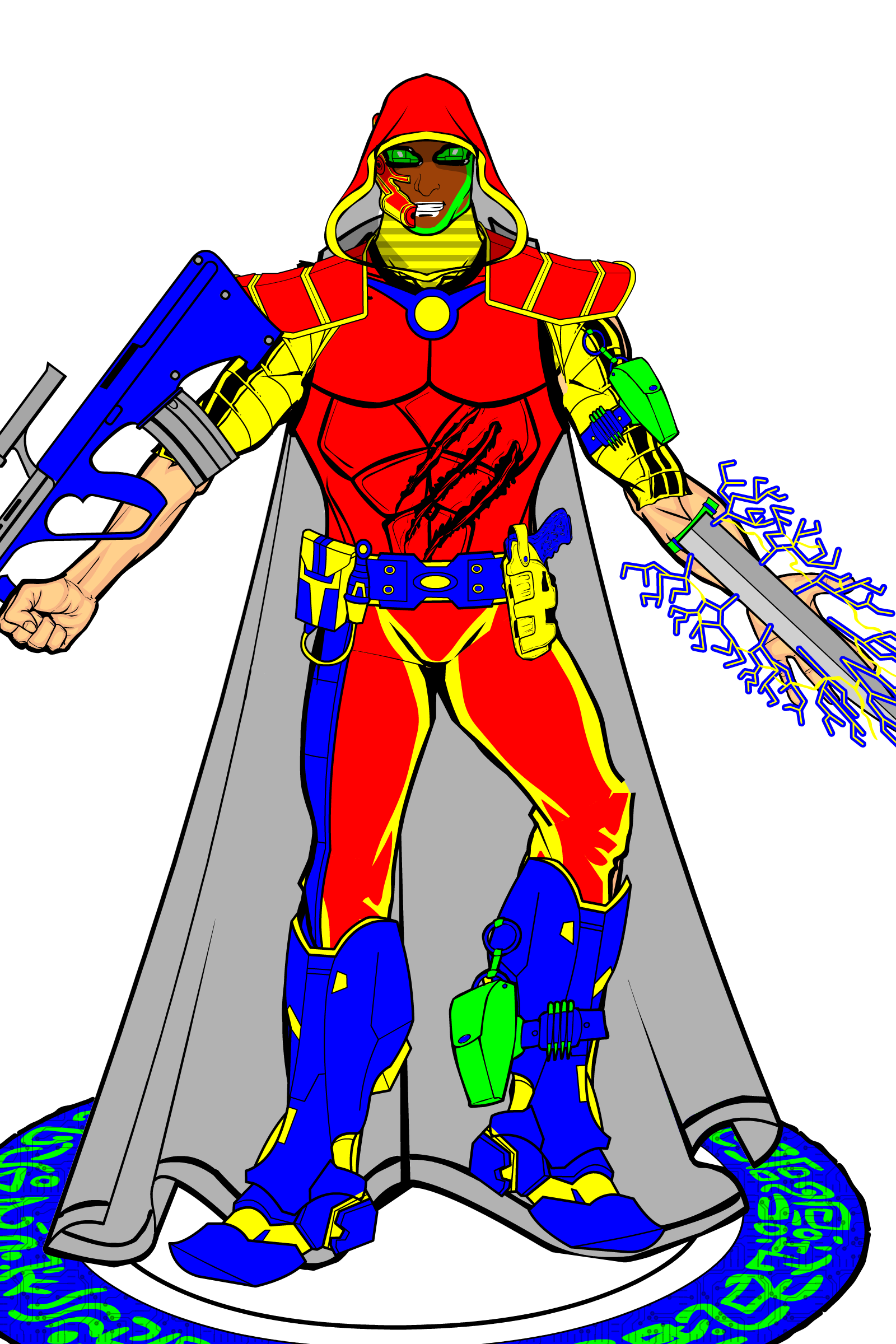
Do you think you could try uploading it at a smaller size, so it’s easier to see without having to click on the link? It’s not a big problem, just makes things a bit more user-friendly.Aside from that, I really like the character itself. The expression on his face gives him a bit of character, as does the slight modifications you’ve made to the basic stance. Experimentation is great! Normality is boring.
The bold, bright primary colours (yeah, I’m British – deal with it) make him really noticeable, especially against the plain white of the background. However, one issue this raises is that, while the cape does a really great job of creating a balance between the top and bottom halves of the character in terms of shape, it doesn’t seem to fit with the rest of his outfit in terms of colour – it actually seems to blend in with the background. This is made even worse by the fact that it isn’t really attached to his shoulders – it peeks over the top – and it looks like he’s standing on it! You could solve that one by resizing the cape slightly, making it a bit smaller so the top is hidden behind his back and the hem doesn’t drag under his foot.
Speaking of the colours, I think the combination of red, blue, yellow and green is a very bold choice, which does actually start to hurt the eyes after a while. It might be better to use multiple shades of just two colours, which would also make the character look a little less flat. For example, you might replace the red with dark green, and the yellow with light blue, leaving you with just greens and blues.
As a final point, I notice you’ve named this thread after the character – or is it the other way round? – but you might want to think about making a collection of all your characters, rather than starting a new topic for each one. That will not only make it easier for other people to find your characters, but it’ll avoid cluttering up the gallery with lots of small topics.
I think that’s about it. (Sorry for the loooong post) As I said, I really like this character and I think it’s a great start. I hope to see more of your creations in the future.
 March 25, 2014 at 4:07 pm #39134
HammerknightParticipantWelcome to the forums. Cool character.
March 26, 2014 at 12:16 pm #39141
hawk007ParticipantCool! Welcome to the forums! Just a few things I’m going to say.
First of all, you don’t have to make it so big. I mean, you can make it a little smaller.
Next, what kind of character is it? A super hero? Futuristic? I was just wondering, because depending on what it is, that’s a lot of stuff. I’m not saying a lot of stuff is bad, but it just seems like that’s a lot of different colors and items that kinda clash.
Anyway, good start, and I hope you post more.April 1, 2014 at 7:21 am #27916
harshitMember April 1, 2014 at 9:11 am #27918
KaldathKeymasterharshit please do not create a new topic for every character you post. I have merged your previous two characters into this thread and renamed it harshit’s gallery. Everyone is limited to a maximum of 3 Topics in the gallery section of the forums.
April 5, 2014 at 7:45 am #15231
harshitMember April 5, 2014 at 9:11 am #15234
HammerknightParticipantIf you are having any troubles posting to your threads just let one of us know and we will be happy to help.
April 9, 2014 at 8:35 am #39248
harshitMember
-
AuthorPosts
You must be logged in to reply to this topic.


