Home › Forums › The HeroMachine Art Gallery › Posters, Covers, & Cards › SPECTACULAR COMICS COVER GALLERY
- This topic has 53 replies, 12 voices, and was last updated 9 years, 11 months ago by
mcky909.
-
AuthorPosts
-
May 7, 2013 at 8:26 am #697
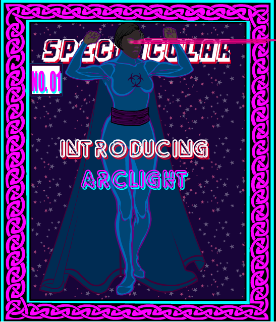
WMDBASSPLAYERParticipantAfter looking at RobM’s Sentinels series of covers, I finally decided to try my hand at it. Decided to feature my latest hero, Arclight. opinions and advice always welcome.
 May 7, 2013 at 9:20 am #23933
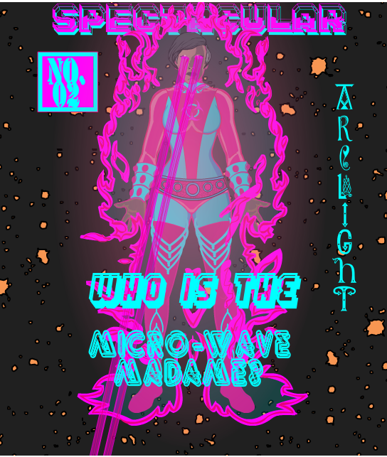
WMDBASSPLAYERParticipantSpectacular no. 02 The Micro-Wave Madame
 May 7, 2013 at 3:01 pm #23963
HarlekinMemberCritique.
So the first cover.For me the Lady dress is a little bit plain and too dark to the character a little bit lost in the composition. And need to mask the eyebeam to not goes out for the frame.
The second.
Little dizzy the colouring work. The aura, the cloth and the beam color is the same and the too light font colour made the picture confuse a little.
Advide.
First Cover.
So need to use little item and masking to made the cloth a little more attractive. And if you use dark background use light zypping behind the character or lighter outlines. The eyebeam is cool but masking in a square insignia to not goes out for the cover frame.Second Cover. Play a little with the colors, The same color schemes are confuse the eyes. I first don’t see to what you give the clothes because the “pink” or “purple” is to dominated. The title are also lost in the composition. I think if you change the fonts color, like red or yellow is more effective, and transparent the colors.
I hope this helps you, no one born artist, need to practice and find the borders of what you can do with the program.
May 7, 2013 at 8:28 pm #23986
prswirveParticipantYou’re improving fast! I didn’t even have the balls yet to attempt to do a cover. You’re off to a good start…
May 8, 2013 at 12:19 am #23993
Herr DParticipant. . . If you’d like a barcode, you might try masking the random-looking lines in Backplane/Auras 300% x, 90% y or so to a rectangle.
May 8, 2013 at 8:19 am #24022
WMDBASSPLAYERParticipantThanks, guys. I love and respect all of your work very much. Harly, I really appreciate that full critiquing. In the first cover I purposely wanted the eyebeams going off the page. I’ve played with the costume some and the second cover was me experimenting with a different look. I intend on keeping her color scheme, but I will consider what you said about the font colors. Could somebody tell me if and where I can find a tutorial on zypping. I see the term a lot but don’t remember seeing any how to’s. HerrD, thanks for the tip because I was wondering were RobM got the barcodes from. I thought he might have clipped them from actual comics.
May 8, 2013 at 2:34 pm #24058
RobMParticipantYup, full disclosure – that’s a photoshopped element.
May 8, 2013 at 3:04 pm #24059
KaldathKeymasterZypping is Just the term we use around here for Highlighting and shading using gradient items in the program like the gradient circles found in the background shapes section. It is named Zypping after the first HeroMachiner to use the technique Zyp. Here is a Tutorial Created by AMS
http://www.heromachine.com/forum/tips-tricks-how-tos-and-guides/how-to-highlightshade/
May 10, 2013 at 12:13 am #24192
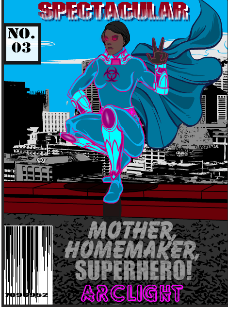
WMDBASSPLAYERParticipantThanks, RobM. I was really ticking myself off trying to get the barcode right. Thank you too, Kaldath. Here’s my third effort, done before I saw these latest comments.As you can see I did try a little shading under her right arm and next to her breast, as well as some highlight on the kneepads. I might redo this one later after more practice. I must say, I really like the font I used for her name in the second cover. I’ll definitely use that one again.
 May 11, 2013 at 10:21 am #24273
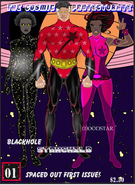
WMDBASSPLAYERParticipantEventually I want to tie most, if not all of my characters into one cohesive universe. I see them that way in my head but haven’t brought that out to make it obvious they’re all sharing the same world. Arclight can survive in space and may be made a part of the Cosmic Protectorate.
 May 12, 2013 at 2:57 pm #24336
RobMParticipantHere’s the text for HeroMachine created upc barcode
May 12, 2013 at 3:19 pm #24339
WeilynMemberSweet barcode!
May 15, 2013 at 1:47 pm #24552
WMDBASSPLAYERParticipantThanks Rob. I’ll check it out. And thank you, Weilyn. I was going crazy trying to size up the lines and mask it to the square insignia. Looking at it after the fact, I think it would really look cool if this was a horror title.
June 2, 2013 at 8:16 am #25668
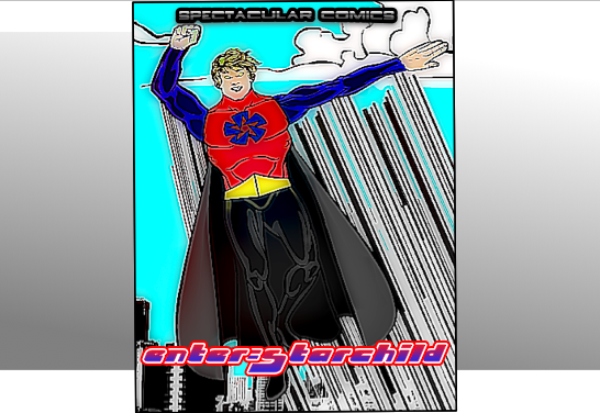
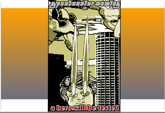
WMDBASSPLAYERParticipantHero Machine purists might not like these next covers, but if I did them all on HM, it might have taken forever, and I don’t think I can get all the effects I used on HM. Here is Starchild’s story as cover art.
 June 2, 2013 at 8:19 am #25669
WMDBASSPLAYERParticipant
-
AuthorPosts
You must be logged in to reply to this topic.

