Home › Forums › The HeroMachine Art Gallery › How Do I … ? › Showing a subtle power?
- This topic has 20 replies, 12 voices, and was last updated 11 years, 10 months ago by
khaalis.
-
AuthorPosts
-
May 2, 2013 at 6:11 am #688
khaalisParticipantHello again all. Since you were so wonderfully helpful last post, I thought I would throw this out there.
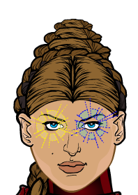
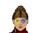
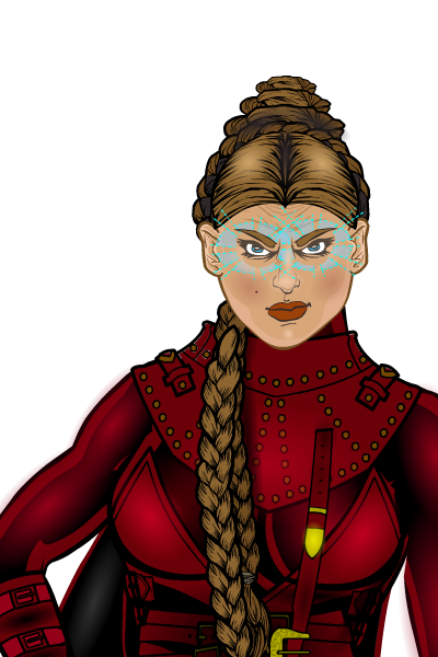
I am trying to come up with a way to subtly express a telepathic inquisitor’s power. Currently the only thing I have come up with is using what follows. (I had to crop this as the image is based on character from TV so I think that breaks the rules for posting.) I’ve included a close up and what it would like like from the full shot. I also included samples of the yellow and blue color schemes for comparison.
The problem is I’m not sure if its bold enough to come across or if its too subtle. I thought about rings around the head but that seems too blatant and over-the-top comic (this is more fantasy art look than supers comic, at least if I do well enough).
How would You express such a power? I’m curious to know how some of you long time experts would do it.
Thanks.

 May 2, 2013 at 12:12 pm #23595
HammerknightParticipantHere are a couple of ideas. Items in “Right Hand’/”Energy” , “Background” or “Backplane”/ “Auras” can be used. Make the colors fully trans. or partly trans.
May 2, 2013 at 3:35 pm #23600
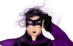
VampyristParticipantWould something like this work?

If so, it can be achieved by masking a gradient circle (color1 and line color transparent with color2 in color you wish) masked onto an energy effect (Color1, Color2, and Line color all transparent).May 2, 2013 at 6:33 pm #23605
KaldathKeymasteryou can also do glowing eyes via the use of zypping
May 2, 2013 at 7:16 pm #23607
livewyre1014Participantfor subtlety’s sake, the facial expression and body language of the character can speak volumes that no special effect could ever carry. Something to think about
May 2, 2013 at 9:55 pm #23619
Herr DParticipantTraditionally, arm and hand poses meant much more than facial expressions. Combining the two with context, say, the character leaning on a brick wall almost out of sight of what she’s doing . . . and using energy effects in gray in the middle of a foggy scene is less campy.
May 2, 2013 at 11:57 pm #23625
khaalisParticipantThank you one and all.
Hammerknight: The forehead rings might work. That’s a good idea.
Vampyrist: Thats a cool combination of effects, though I get more of a kind of smoky residue after an energy blast kind of feel from it. However, it gives me some ideas for mixing elements.
Kaldath: I’m still very new here so when you say zypping, you mean just the use of a gradiant circle in a “glow-like” color correct? Like the eye on Vampyrist’s sample?
Livewyre: Having scene the face, I take it you are saying its too expression neutral? You’d try to find a way to make the face more expressive, like more in concentration?
Herr D: Ok I’m going to take a chance here since I can’t really find anything that says the style this is based on is copyrighted and there are tons of nockoff costumes in RL out there, so… If a mod needs this taken down just go ahead and do it or let me know and I can take it down.
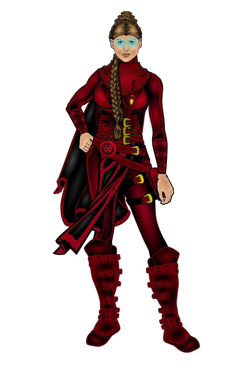
This is the full body shot of what I have so far.

PS: I really need to rework the boots as well since they don’t seem to fit the body even though if I shrink them any more the legs show.
May 3, 2013 at 5:20 am #23631
The Atomic PunkParticipantGreat design. Not sure about the eyes. But, that is what you are questioning. I agree with livewyre and Herr D that telepathic powers tend to be invisible. An expression or gesture of concentration works best. For drama, yes, glowing or discolored eyes are subtle.
As for her boots not fitting, mask her legs at the knee. With her shins hidden, you can re-size the boots as you like.
May 3, 2013 at 8:18 am #23643
khaalisParticipantThanks for all of that. I did mask the legs in 3 parts and it worked great. Still working and thinking about the eyes/power. I agree that it “should” in actuality be invisible, but that’s really hard to pull off in an art piece. I’ll have to see if I can make her look more “concentrating” facially but not sure where to go with that just yet. I may just go with some corner glow to the eyes.
May 3, 2013 at 9:58 am #23654
ScatmanMemberwell all and all the look is super!i really like her facial expression,but what really grabs me is the way you used the red and black,very good contrasting and great pose even if the boots are alittle big!Great design!
May 3, 2013 at 10:54 am #23660
Kaylin88100ParticipantEyebrows. It’s all in the eyebrows.
Pull them down low and angle them a bit – you can use insignias to cover up the ones that are attached to the rest of the face, and put in your own so you can mess around with the position. It’s very subtle, but most of facial expression is in the eyes and eyebrows – which is where you’re focusing anyway, so well done.
May 3, 2013 at 2:47 pm #23685
livewyre1014Participantthe expression on her face is somewhat bland. Try and give her a more emotive look, make the eyes a bit bigger, give her brow more character, that sort of thing. Hope this helps!!!
May 4, 2013 at 7:45 am #23715
khaalisParticipantSo how is this for a facial redesign?

As to the “power expression”, would a “third eye” centered just above her eyes and done in the same transparent blue of the current expression work better?
May 4, 2013 at 10:41 am #23727
RobMParticipantHow about the third eye as a sort of astral projection?
 May 4, 2013 at 1:00 pm #23728
livewyre1014Participantface is WAY better, love the expression…one more critique if I’m not too picky, but space out the eyes a little more. Too close to the nose haha. I personally try and “cast” my characters, using actors, models, athletes, singers, etc…so that I can get better faces.
-
AuthorPosts
You must be logged in to reply to this topic.

