"Lissom" was a tough contest concept. You had to not only make a lissom character, but a good illustration too, and while a lot were able to do one or the other, I only settled on eleven that did both. Here they are!
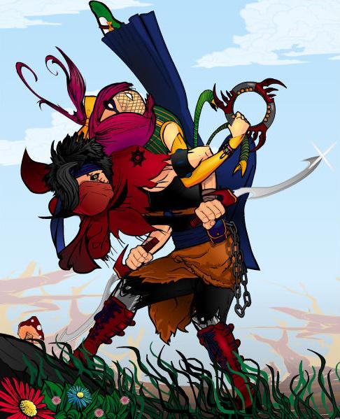
While I had some trouble sort of telling exactly what's going on here, once I did I really was charmed by Alvacascus' "Dual Lissom". I like the bright, vibrant colors of the characters and the environment's layout a lot. Having the small foreground tilted adds dynamism to the story, while the big sky gives the main character action center stage and room to breathe. The faded-out trees in the far background help establish a wide open space. A really lovely scene!
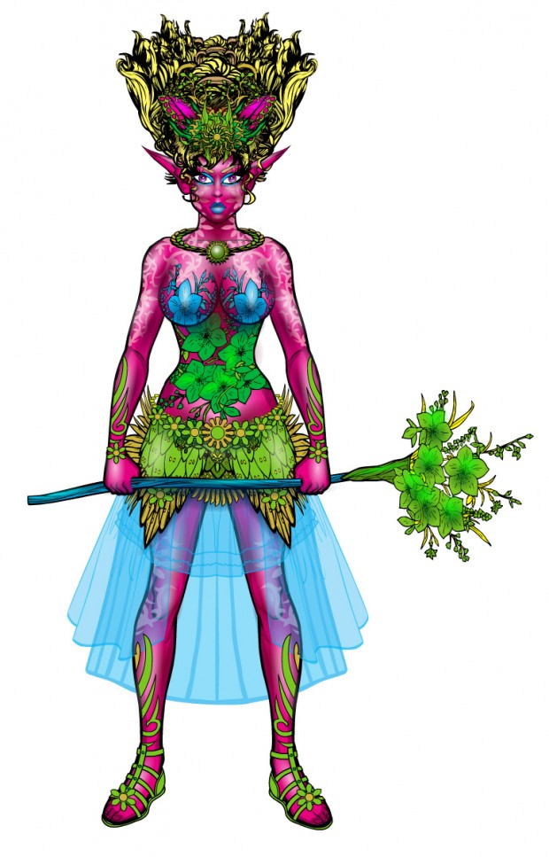
dblade has done the crazy-stuff-in-hair routine before, but I thought overall this was still an impactful and interesting design. The sky blue skirts and green plant elements set off against the magenta skin nicely. I love the burned-in white tattoos too. I can't say it screams "Lissom" but it still works.
Fuzztone nails "Lissom" with this great pose. The highlighting on the figure helps integrated it into the scene and give it weight, believability, and interest.
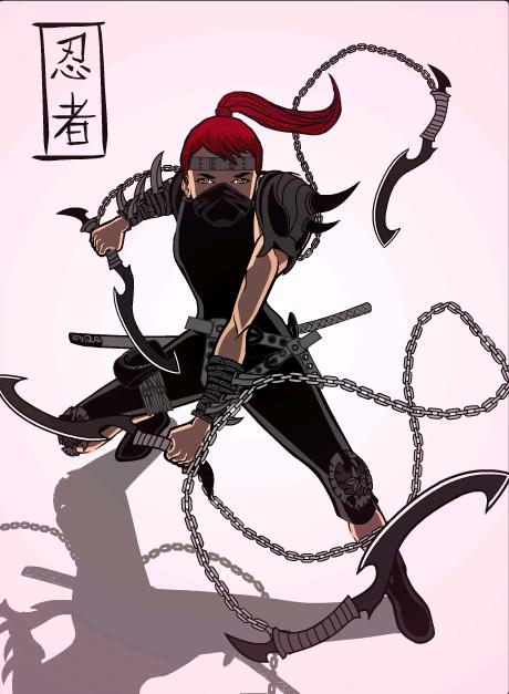
I love the way the flying chains in Gendonesia's "Ninja" make interesting negative shapes around the main character, who definitely looks lissom to me. The pale pink and white background merges well with the shadows to give the sense of an environment while not cluttering up the featured character at all. The shading and colors all complement each other well. The only issue for me is the Kanji (?) lettering and box in the corner. It's an awesome design element, really sealing the deal, but I don't think it came from HM, did it?
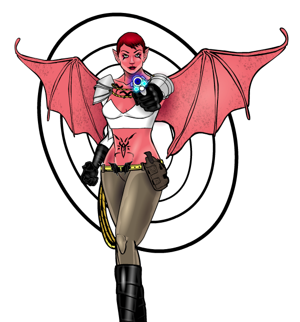
Headlessgeneral's "Lillian" has a lot going for it. I love the convincing body design and pose. The gun's awesome. And the concentric circles of the background are a great design element.
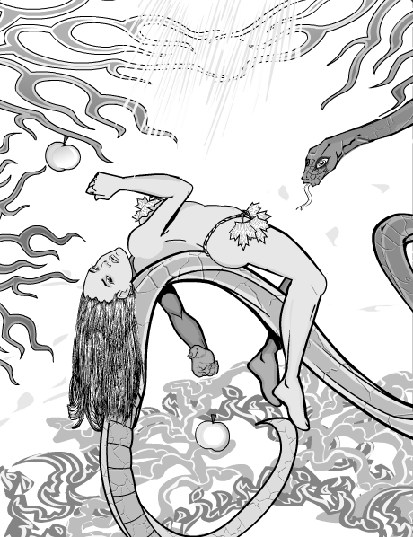
Kytana's "Eva and the Snake" has an almost lyrical elegance and grace to it. I love it.
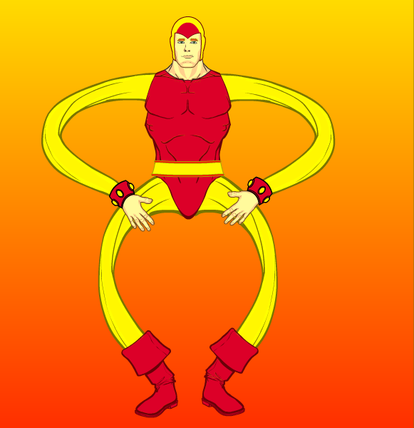
Admit it, Maniacmick's "Stretchy Wonder" makes you grin.
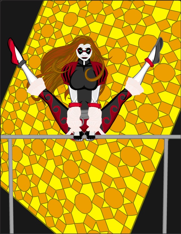
Syntax's "Harlequin" features a nifty pose, a fun character design, and an interesting background design element.
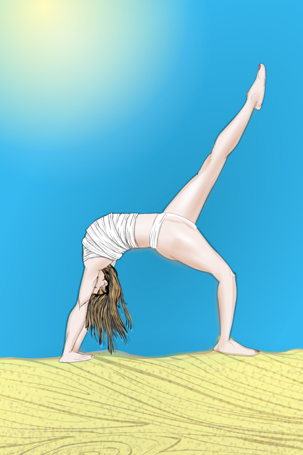
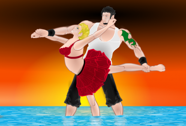
Tarkabarka luckily got some injections for his back, so he was able to give us "Dance in the Sun", a lovely composition.
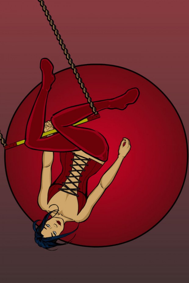
TJ had a couple of good entries, but I chose to feature "Daring Young Lass" for its neat pose and simple presentation. I do wish he or she had gone with some other color for the background disc, as it flattens the composition out a bit next to her same-color leathers.
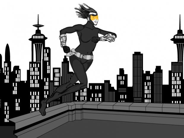
Finally, Trekkie's "Rooftop to Rooftop" has a great scene and concept, with a character design that brings it all home. I love the spot of yellow color in the facemask as a design element, that is very well done.
As you can see, we had some great Finalists this week with a tough assignment. But for my winner, I'm going to have to go with ... Alvacascus! Some visual confusion in the figures aside, I think it's an excellent composition with a lot of great elements to it.
Congratulations to Alvacascus and to all our finalists. Thanks also to everyone who took the time to enter, it's very much appreciated!

