Wow, we had a phenomenal number of absolutely outstanding entries for Character Contest 50: Lord Random III! This may be a record number of Finalists, I'm not sure, but regardless everyone should be very proud of themselves this week. I really appreciate all the hard work and creativity on display.
Without further ado, therefore, your Finalists! As a reminder, the challenge was to put together a concept using names randomly generated from the Seventh Sanctum site.
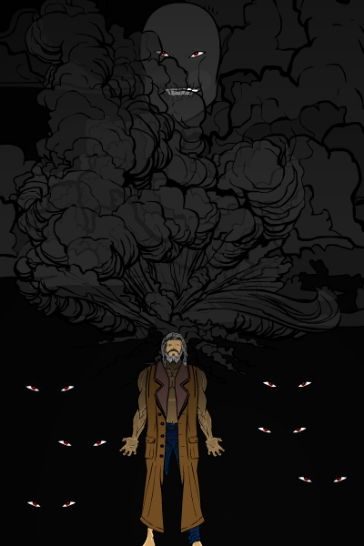
AcidMan322's "Dark Thought" was a nice composition in general. The idea of these ... well, dark thoughts actually emanating from his mind is done convincingly and the eyes in the background are neat.
Airia did a great job with "Illusion Beam". I like the background elements a lot and the pose works great.
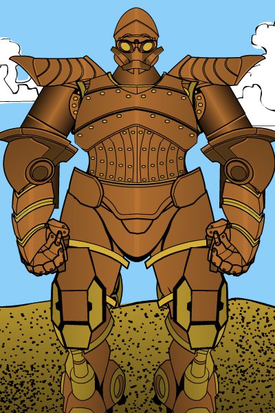
AJW's "Bronze Bane" is a great example of a self-assembled robot, using some unconventional pieces and a cohesive color scheme to inject a lot of character.
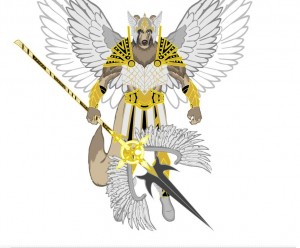
Asder used subtle line coloring to achieve a great look for his "Fly Wolf".
Atomic Punk only had one entry this week, but I think he nailed it. "Seer Hack" isn't an easy random name to get your hands around, but I thought the image was both funny and cool.
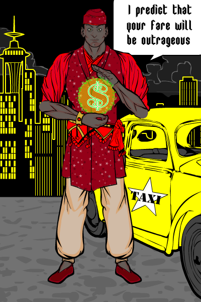
Blue Blazer's "Mecharapier" is a wonderful example of keeping it simple. I'd swear I've seen this one before, but maybe it was just while browsing the UGO Forums. Regardless, the black unitard with the metallic arm and shoulder garb is just perfect.
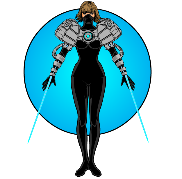
Brambles got a little lucky because the random name "Ghost Shaman" is awesome, but he kicked butt on the execution. I love the ghostly flames and headless faces. Plus the character design is very strong and I love his expression.
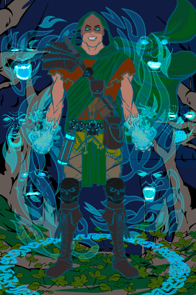
Cliff's poster-like "Serpent Burn" is great. I love the composition and the background elements, particularly the transparent flame effects on the snake.
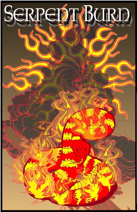
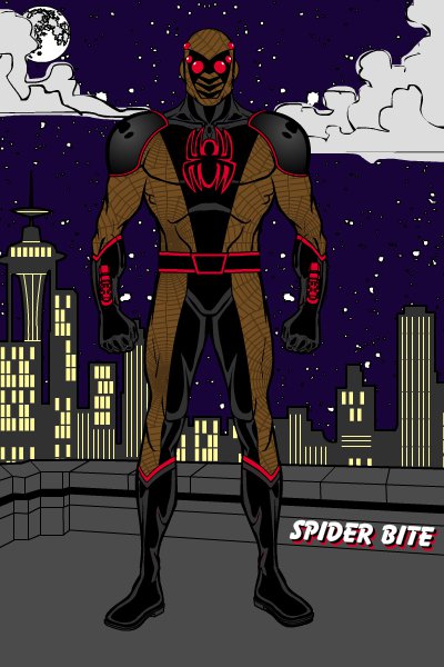
Danny Beaty has done a number of spider-related characters in the past (in fact, I think those spidery eyes are his contest prize from a while ago), but I think this one is the strongest in a long while. The background elements all make sense and fit, both in selection and color choice. The costume design and colors also go well together, and I love the spider web pattern in the brownish parts. The red elements accent the design rather than detract from it as well. An all around excellent effort!
If DiCicatriz isn't careful, I'm going to have to name the contest award after him. Once again he brings it this week, with ten -- TEN! -- high quality entries. I selected three for highlighting as a cut above the rest, but honestly, they're all very good. Do yourself a favor and check them out in the original contest thread, you won't be sorry.
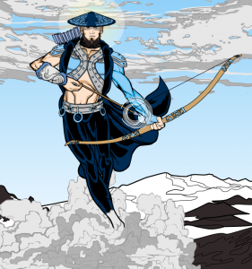
First up for him is "Cloud Hunter". Everything about this is made of Win, from the costume design to the pose to the way he really looks like he's running on the clouds. Simply spectacular.
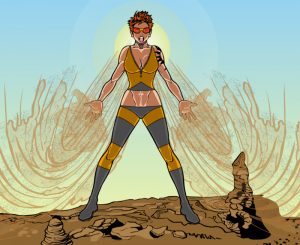
Next is his "Hot Gale", which I love equally for the outstanding design to the backstory. What sold this for me was the combination of the expression, the body positioning, and the way the patterning on that wind/wave effect completely looks like sandy wind. Great special effects.
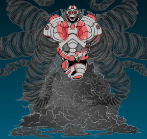
Finally is his "Typhoon Construct". If the Red Tornado looked like this instead of that yellow-arrow-adorned monstrosity, I'd start reading Justice League again!
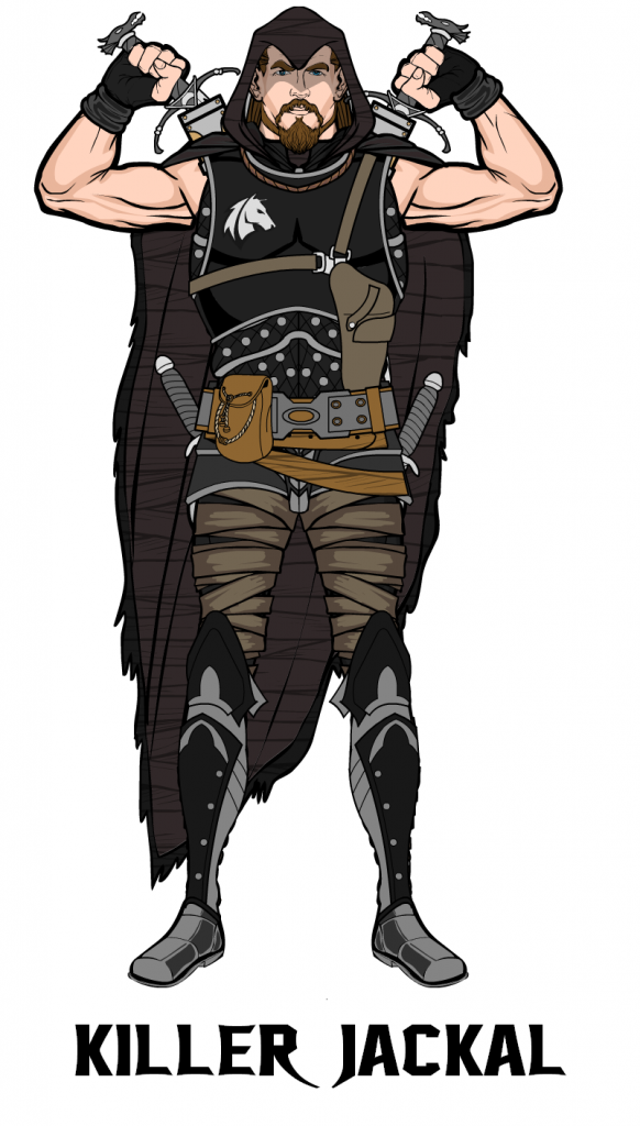
Felipe S Card turned in a very solid and convincing fantasy type character with "Killer Jackal". I like the colors, the pose, the weapons, and the general look of the guy. Well done!
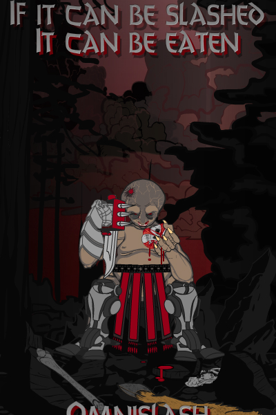
I'm not a big horror fan as you may know by now, but I love what Fishsticks did with "Omnislash". The poster speaks for itself, and I bet there's a Hollywood film deal in the works after seeing it.
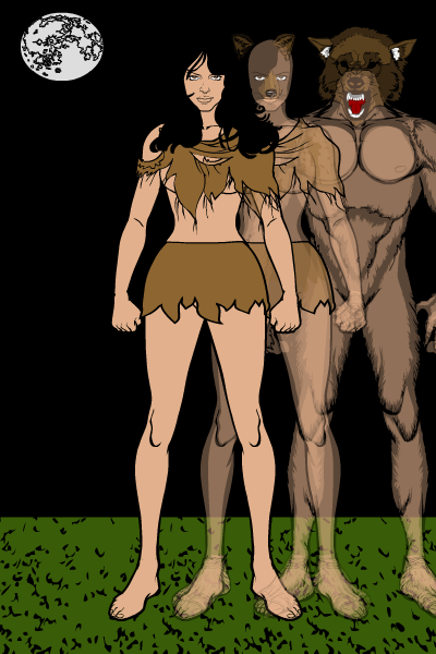
If Joel doesn't start using the proper URL for his ImageShack images, I might jump through the computer screen and strangle him. But I thought his "Seduce Morph" was a nice "progression" style image.
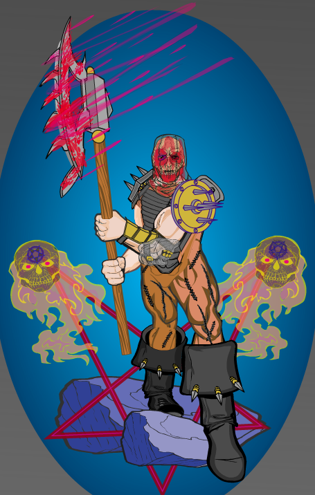
Another horror-style fantasy character, Kingslaughter's "Murder Slicer" has a funky vibe to it that I like a lot.
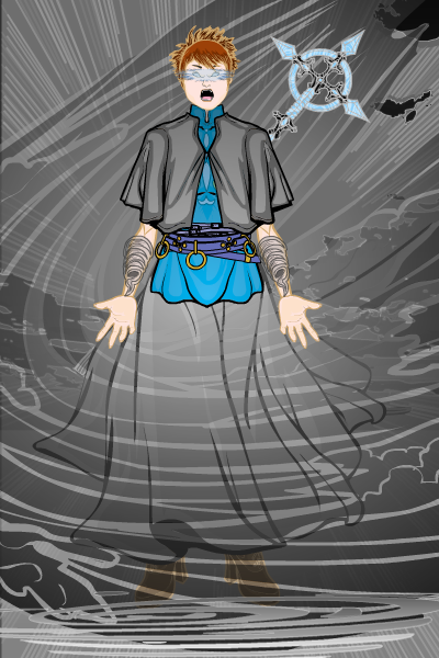
Knitesoul's "Mage Tornado" has some of the same feel as DiCicatriz' "Hot Gale", and also does a fantastic job making it look like the character is standing in a swirling maelstrom. I particularly like the tornado wrist guards, I thought that was a nice touch. Fading out the lines of the skirt and boots also helps make it look like she's standing behind a wind eddy. Nice job! The details definitely matter.
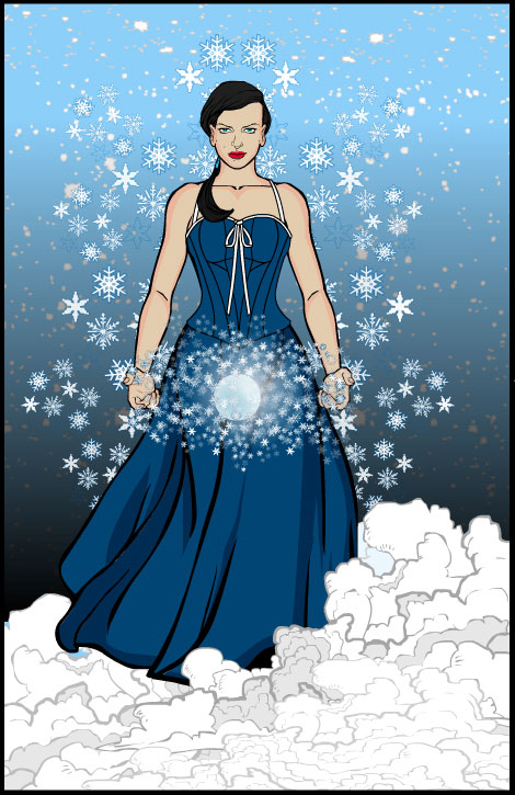
Me, Myself, and I did a nice job with "Snow Sapphire", with nothing incredibly fancy or outlandish. Just a solid, convincing, pleasing, effective design.
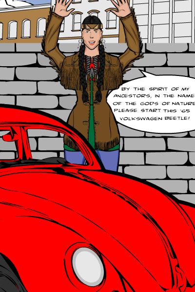
I admit, Myro's "Auto Shamaness" made me laugh. Finally, a super-hero with a power I can USE!
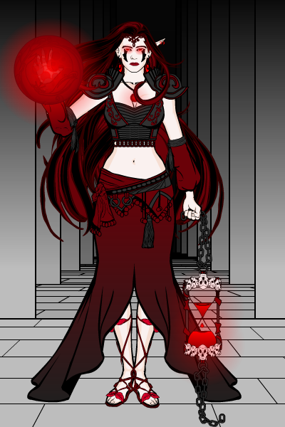
Oquies' "Blood Sorceress" has a great design, colors, and face, but what I loved the most was the skull-lined hourglass lantern thingie she's holding. That's cool!
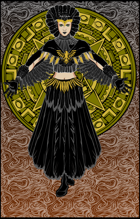
Rancid's "Royal Raven" does everything right, from the background elements and smoke to the feathered tail turned skirt.
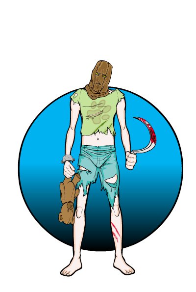
And now for something a little different, in the form of RhinoMan's sad, poignant, and disturbing "Mischild". The tilted head and the leg-held teddy bear in particular are quite effective at setting the somber mood.
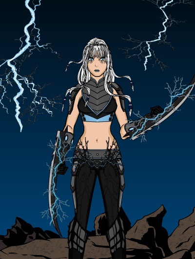
Sandcat's "Lightning Slice" works not only for the expected electrical arcs around the blades, but for that totally nifty effect on her hips. I don't quite know what that is or how it was done but it looks awesome as clothing detail.
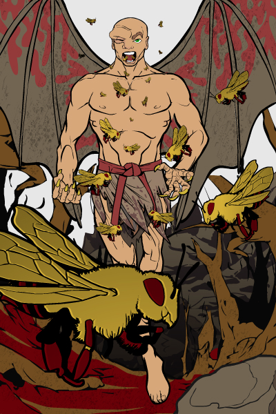
SpellCheckingQuill drwe "Aerial Plague" as their name, and nailed it. I love the colors, the facial expression on the figure (particularly that one eyebrow ridge being all distended), and the layering of the different-sized bees. I think this is a wonderful example of how composition -- the arrangement of the various main elements -- can make or break an image.
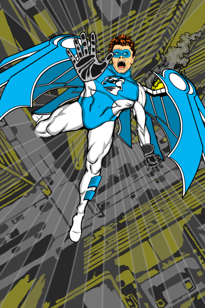
Finally, Watson Bradshaw's "Cobalt Talon" uses the "falling into the street" composition we've seen before, but it's very well done here.
As you can see, judging this week was tough! Tons of great entries that didn't even make it to Finalists, and then to have to choose one of the 25 above, it's a difficult assignment. But after going through them all several times, I have to say I keep coming back to one in particular, for excellence in overall composition, in fundamental character design, and in success at conveying a mood.
And that one is DiCicatriz' "Cloud Hunter"! I just love everything about this illustration, it stands out as exceptional even in a collection of truly excellent entries like these. Very well done, sir! Let me know what you'd like for your prize, it's certainly very well earned.
Thanks again to everyone who entered, and congratulations in particular to both DiCicatriz and all the Finalists for a very entertaining set of designs!

